• Membership
  • Books
  • Projects
  • Learning
  • About
  • Member Login
  • Data Underload  /  emergency room, fireworks, July 4

    Fireworks-related emergency department visits

    The fourth of July, or Independence Day in the United States, is the biggest day for beer and fireworks. The combination doesn’t always work out.

    Read More
  • FlowingData enters adulthood at 18

    July 3, 2025

    Topic

    Site News  /  birthday

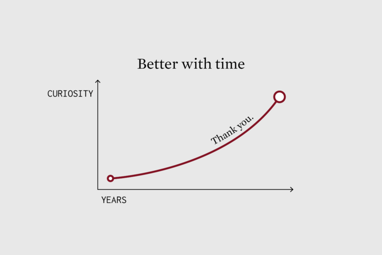
    Last week marked 18 years of FlowingData.

    That seems like a long time, especially on the internet. I didn’t know what I was getting myself into.

    There have been books. There have been many analyses and charts. There have been many shared projects.

    Still, my notebooks overflow and I’m excited about projects in the works. I grow more curious about data, analysis, and visualization with every new project, big and small.

    I feel lucky. I feel grateful.

    Thank you for reading. Thank you for sharing. Thank you for supporting.

    Let’s run it back.

  • Members Only

    Questions to visual answers

    July 3, 2025

    Topic

    The Process  /  questions

    One of the best and most direct ways to visualize data with clarity is to ask questions and answer with data.

  • Types of deadlines illustrated from beginning to end

    July 3, 2025

    Topic

    Infographics  /  deadline, Harriet Hand, illustration, Keri Facer

    Some deadlines come unexpected, some come staggered, and some come on a fixed schedule. They all shift the flow of work. Harriet Hand and Keri Facer, as part of their workshop on how we use time, illustrated the different types of deadlines.

    You can also get the above in print.

  • Rating all the U.S. airports

    July 2, 2025

    Topic

    Maps  /  airports, ranking, Washington Post

    There are great airports and there are really bad ones. Which one you get depends on your origin and destination. The Washington Post ranked over 450 U.S. airports to find the best, based on reader survey responses and Yelp reviews. Instead of just landing on the most popular airports, the focus is on what travelers value most, such as how easy it is to get to the terminal.

    Portland International topped the list. I was just at Long Beach Airport, which was number two, and it’s definitely a different feel from all other airports I’ve been to. It’s an oddly relaxing experience.

    WaPo also provides a map tool so that you can search for airports in your area. I actually saw the tool before the article and was so confused why they kept referencing ranks without showing an ordered list.

  • Table for science-backed vaccine recommendations

    July 2, 2025

    Topic

    Infographics  /  CDC, science, Scientific American, vaccination

    Jen Christiansen and Meghan Bartels provide a quick reference for Scientific American:

    Kennedy’s decision to replace ACIP wholesale and the comments he has made about deviating from standard vaccine policymaking practice suggest that new recommendations won’t be backed by established vaccine science—hence our reproduction of the vaccine recommendations as of the end of 2024.

    There are tables for young children, older children, and adults. Green represents a recommendation for everyone. Yellow represents a recommendation for a subset.

    It’s annoying that this is necessary, but it is necessary. It seems wise to keep watch on how these reproduced tables compare against shifting CDC recommendations.

  • AI slop on Last Week Tonight

    July 1, 2025

    Topic

    Artificial Intelligence  /  Last Week Tonight, slop

    Last Week Tonight with John Oliver digs into AI slop. It’s the fake generated stuff filling our feeds with content, inevitably leading us to question our existence and whether this internet thing was really all worth it.
    Read More

  • When a woman’s cycle stops

    June 30, 2025

    Topic

    Infographics  /  period, Reuters

    Many women lose their period while still of reproductive age. For Reuters, Daisy Chung, Minami Funakoshi, and Julia Wolfe explain why it happens and how some people can recover.

    In this situation — known as functional hypothalamic amenorrhea (HA) — the body shuts down the reproductive system to preserve energy for essential functions, such as keeping the heart beating. It’s an evolutionary strategy to prevent pregnancy when the body can’t support it — but the consequences can extend to all aspects of health.

    Careful illustrations and a soft water color aesthetic is used to approach the sensitive topic.

  • Overview of the GOP bill, a bar chart

    June 30, 2025

    Topic

    Statistical Visualization  /  bill, taxes, Washington Post

    The Washington Post starts with a bar chart to show the major changes from the bill. This provides a wide view, and a sidebar navigation takes you to short explanations of each category.

  • Cost and savings for each item in the GOP bill

    June 30, 2025

    Topic

    Infographics  /  bill, Medicaid, taxes, Upshot

    NYT’s the Upshot has a running list of the items in the bill with how much each will cost or save. The bill would add $3 trillion of debt. Reduced taxes accounts for most of that amount, and Medicaid takes the biggest hit. Items highlighted yellow indicate ongoing discussions.

  • Effects of the Republican bill on your taxes

    June 30, 2025

    Topic

    Infographics  /  bill, profiles, taxes, Washington Post

    The tax bill, that seems to be on its way to passing, will affect people differently, based on income and household. The Washington Post shows concrete examples of the changes to an individual’s taxes.

    I like the use of “profiles” to illustrate quick examples first. Then you can enter information for your own profile with income, state, filing status, and dependents to see how it affects you. The structure gives a point of reference to compare against.

  • Illustrated fears about AI-generated art

    June 27, 2025

    Topic

    Artificial Intelligence  /  Christoph Niemann, generative, New York Times

    Artist Christoph Niemann chimed in for the New York Times about his complicated feelings towards AI tools. “Is A.I. good or bad for the creative process?” The answers vary by purpose and where we find value, but in the end:

    Communicating emotions from person to person through writing, composing or painting is inefficient and inherently human. This is what makes a love letter, a doodle on a sandwich bag and (some) paintings in a museum precious. Automating the creation of art is like automating life, so you can make it to the finish line faster.

    The process of making anything, visualization included, seems easy at a superficial level: Get idea. Execute idea. But it is the people behind the ideas and the evolution of person and thought that generates value.

  • Harvard’s $2.6b of grants canceled by the government

    June 27, 2025

    Topic

    Statistical Visualization  /  funding, government, Harvard, Upshot

    For NYT’s the Upshot, Emily Badger, Aatish Bhatia, and Ethan Singer accounted for 900+ canceled federal grants and describe how the cancelations break the feedback loop of government-funded research.

    The money the government sends to Harvard is, in effect, not a subsidy to advance the university’s mission. It’s a payment for the role Harvard plays in advancing the research mission of the United States.

    This is the science model the U.S. has developed over 80 years: The government sets the agenda and funds the work; university scientists design the studies and find the answers. The president’s willingness to upend that model has revealed its fragility. There is no alternative in the U.S. to produce the kind of scientific advancements represented by these grants.

    A tour through a treemap highlights specific grants and an interactive version at the end lets you poke around.

  • Matching potential partners based on browser history

    June 26, 2025

    Topic

    Statistics  /  browser, dating, Dries Depoorter

    Ideally, your romantic partner for life has similar interests, hopes, dreams, and browsing behavior. At least that’s the premise of browser.dating, an actual service that you can sign up for.

    Browser.dating is a project by Dries Depoorter that explores digital connections through browsing patterns.

    We all leave unique digital footprints as we navigate the web. This project aims to find meaningful connections between people based on their browsing habits, creating a new kind of dating experience.

    With strong privacy measures in place, browser.dating analyzes your browsing history and matches you with users who have similar digital behaviors.

    Years ago, I often wondered about how we could use digital fingerprints in various ways to understand ourselves, but it never occurred to me think about coupling them.

    I’m looking forward to hearing about people who met through the tabs that they had opened, or even better, those who shared a common bond in FlowingData.

  • Members Only

    Visualization Tools and Learning Resources, June 2025 Roundup

    June 26, 2025

    Topic

    The Process  /  roundup

    This is the good stuff for June: tools to use, datasets to analyze, and resources to learn from.

  • Weather displayed as vintage 1990s forecast on the Weather Channel

    June 25, 2025

    Topic

    Infographics  /  Michael Battaglia, vintage, weather

    There was a time when you tuned in to the Weather Channel on something called television and all you saw was a cycle of forecasts. A saxophone tune played in the background and you waited for your city to show for a second.

    Michael Battaglia recreated the experience with a vintage weather view, but you can search for your location instead of waiting. The data comes via the National Weather Service API.

    Be sure to turn on the sound for that melodious saxophone.

  • Rubin Observatory releases first imagery of the night sky at enormous scale

    June 24, 2025

    Topic

    Maps  /  Rubin Observatory, space

    The Vera C. Rubin Observatory, jointly funded by the National Science Foundation and the Department of Energy’s Office of Science, released its first large scale image of the Southern Hemisphere sky. It is a sample of the 500 petabytes of data scheduled to be collected over the next ten years.
    Read More

  • Depth of bunker-buster bombs

    June 23, 2025

    Topic

    Infographics  /  bomb, New York Times, scale

     
    To show how deep bunker-buster bombs penetrate the ground, the New York Times used the long graphic method that requires a scroll to the end. The GBU-57, a.k.a. the Massive Ordnance Penetrator, goes down pretty far.

    See also: ocean depth and height of the sky.

  • Autism definition changed, which led to rise in diagnoses

    June 23, 2025

    Topic

    Statistics  /  Allen Frances, autism, New York Times, vaccination

    Allen Frances, a psychiatrist who chaired the group to update the Diagnostic and Statistical Manual of Mental Disorders in the 1980s, explains how a change in definition led to a sudden rise in autism diagnoses.

    Many large studies have come to the same conclusion: Vaccines don’t cause autism. The role, if any, of environmental toxins is still to be determined, but there is no known environmental factor that can explain the sudden jump in diagnoses. The changes we made to the diagnosis in the D.S.M.-IV can.

    Why did autism-related diagnoses explode so far beyond what our task force had predicted? Two reasons. First, many school systems provide much more intensive services to children with the diagnosis of autism. While these services are extremely important for many children, whenever having a diagnosis carries a benefit, it will be overused. Second, overdiagnosis can happen whenever there’s a blurry line between normal behavior and disorder, or when symptoms overlap with other conditions. Classic severe autism had so tight a definition it was hard to confuse it with anything else; Asperger’s was easily confused with other mental disorders or with normal social avoidance and eccentricity. (We also, regrettably, named the condition after Hans Asperger, one of the first people to describe it, not realizing until later that he had collaborated with the Nazis.)

    Please send to whom it may concern.

  • Satellite imagery shows avoided nuclear reactors in Iran

    June 23, 2025

    Topic

    Maps  /  Bloomberg, Iran, nuclear, satellite imagery

    Jonathan Tirone, reporting for Bloomberg:

    Notably absent from the latest International Atomic Energy Agency’s damage report are three research reactors operating at the Isfahan Nuclear Technology and Research Center. One of the so-called miniature neutron source reactors, made by China in 1991, runs on 900 grams (2 pounds) of bomb-grade uranium.

    It seems we’re going to see more satellite imagery in the coming weeks.

  • Page 1 of 395
  • 1
  • 2
  • 3
  • 4
  • 5
  • 6
  • ...
  • 395
  • >

Analyze, visualize, and communicate data usefully, beyond the defaults.

Become a member →

Recently for Members

July 3, 2025
Questions to visual answers

June 26, 2025
Visualization Tools and Learning Resources, June 2025 Roundup

June 19, 2025
Making Data Relatable

June 12, 2025
Comparing multiples

June 5, 2025
Caring Data

Second Edition

Visualize This: The FlowingData Guide to Design, Visualization, and Statistics (2nd Edition)

New tools, refined process.

Order: Amazon / Bookshop

Browse by Chart Type See All →

Glyph Chart Histogram Dot Plot Network Graph Spike Map Beeswarm Unit Chart Density Plot Box Plot Scatter Plot

Browse By Topic

  • Visualization

    Seeing data

  • Maps

    Seeing geographic data

  • Infographics

    Explaining data

  • Networks

    Connecting data

  • Statistics

    Analyzing data

  • Software

    Working with data

  • Sources

    Getting data

  • Design

    Making data readable

Made by FlowingData

  • The Process

  • Data Underload

  • Chart Everything

  • Guides

  • Books

  • Shop

  • About
  • Contact
  • Newsletter
  • LinkedIn
  • Instagram
  • Bluesky
  • RSS
Copyright © 2007-Present FlowingData. All rights reserved.