Chart Challenge for a Day

The 30-Day Chart Challenge tasks you with a visualization prompt each day in April. I’ve wanted to do it the past couple of years, but my schedule doesn’t really fit with the daily-thing-for-thirty-days genre of challenges. So my genius idea was to compress the challenge into one day.
Here are the prompts:
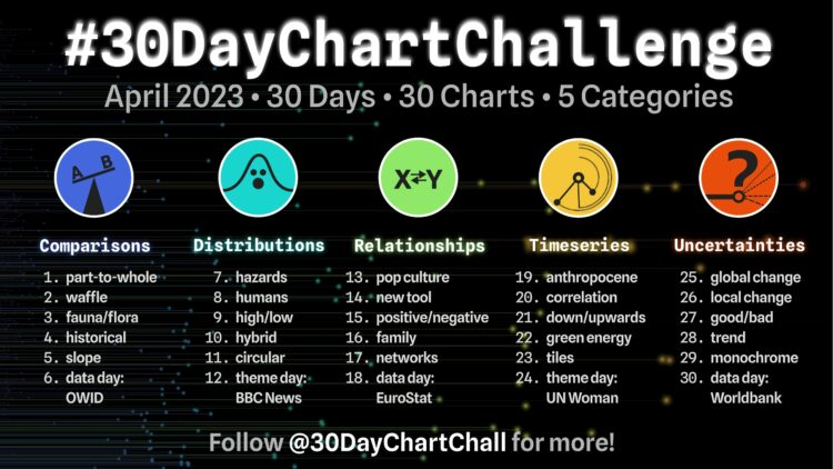
In addition to the challenge rules, mainly be nice and make your own charts, I set a few more ground rules:
- I was allowed to riff off charts I’ve made before, but I could not just copy and paste an image. I had to update with new data or use a different format. Something.
- Once I export a chart, it’s on to the next prompt.
- There is no time for considering what works best.
- Finish in a day.
Here is my attempt.
1. Part-to-whole
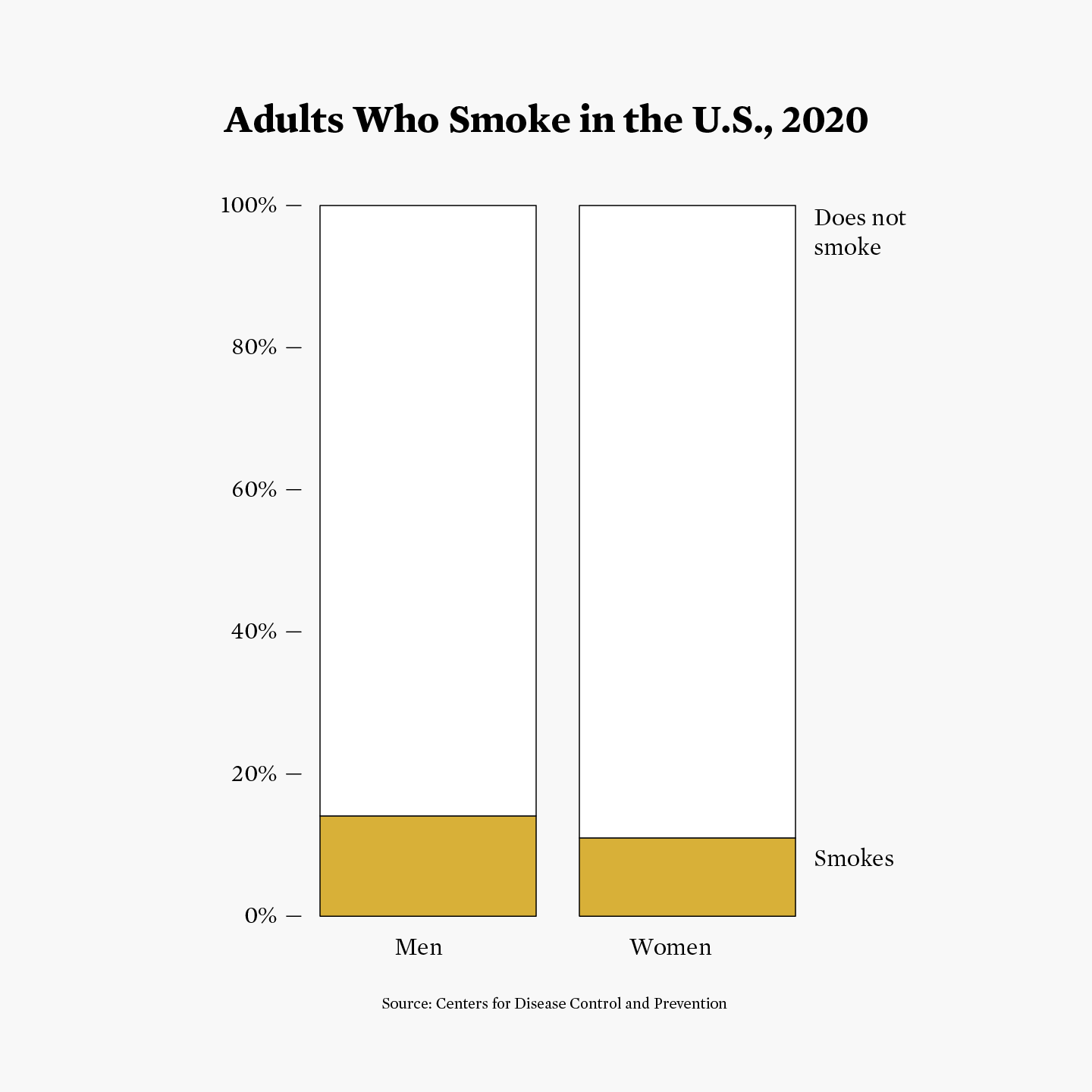
Updating from a 2016 graphic, I was surprised the Behavioral Risk Factor Surveillance System from the Centers for Disease Control and Prevention was still going.
2. Waffle
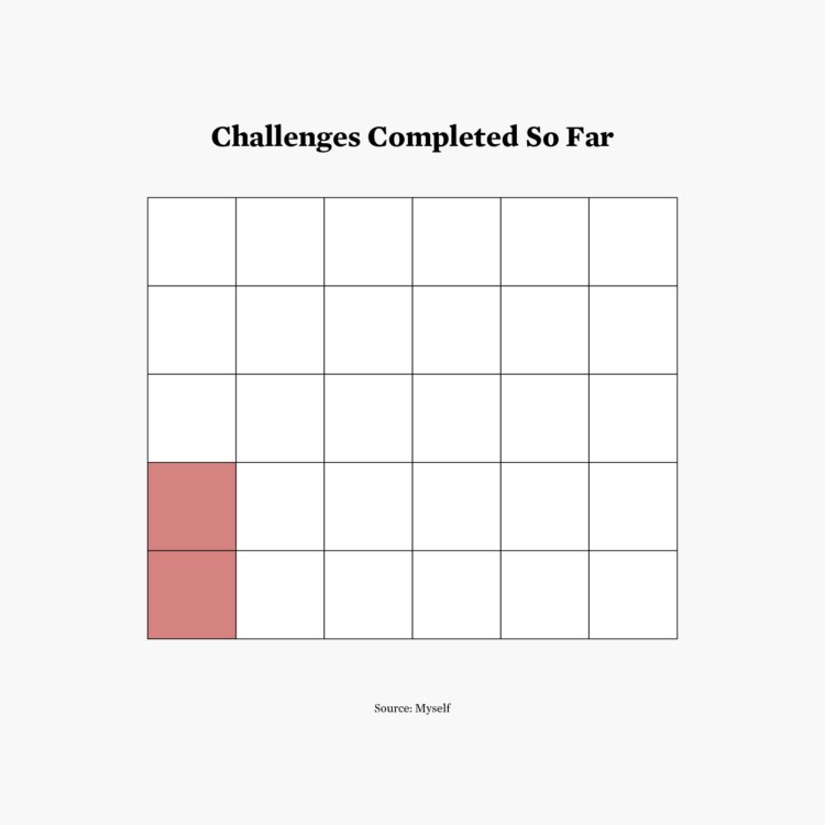
Just taking it one step at a time.
3. Fauna/flora
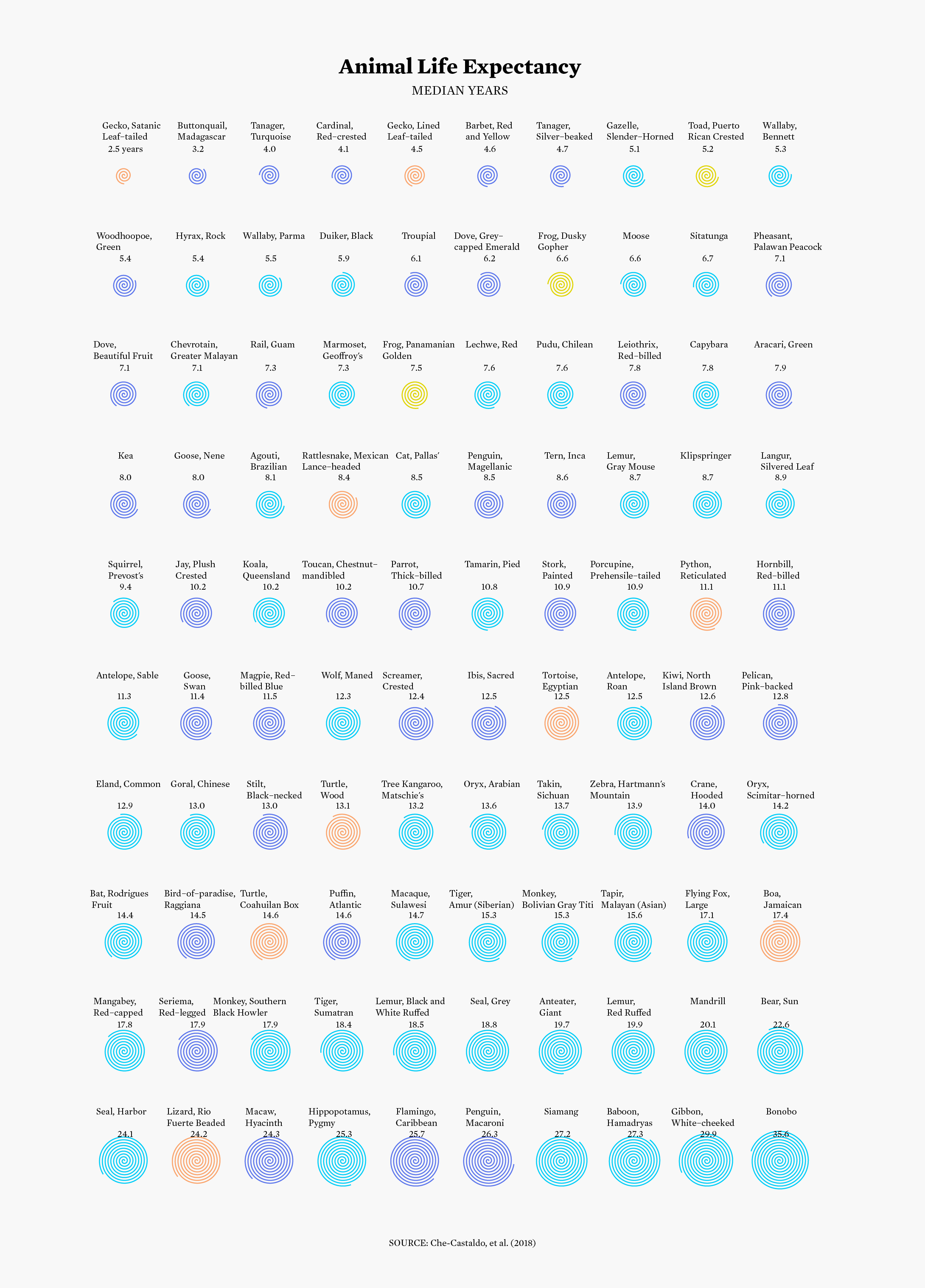
I actually started the challenge with this prompt, because I had to work with a new dataset, which would take longer. My minutes ticked away immediately, and despite many editing needs and questions about the data, the rest of the charts were not going to make themselves. At least I had spiral code to work with. Everyone loves spirals.
4. Historical
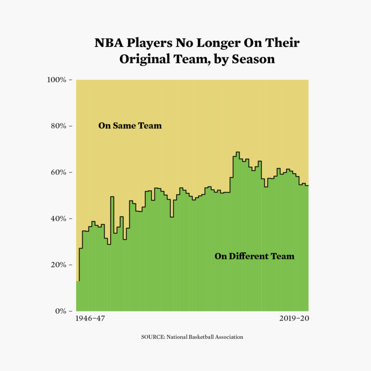
Why did I use so much time on fauna? Compacted an original chart from 2020.
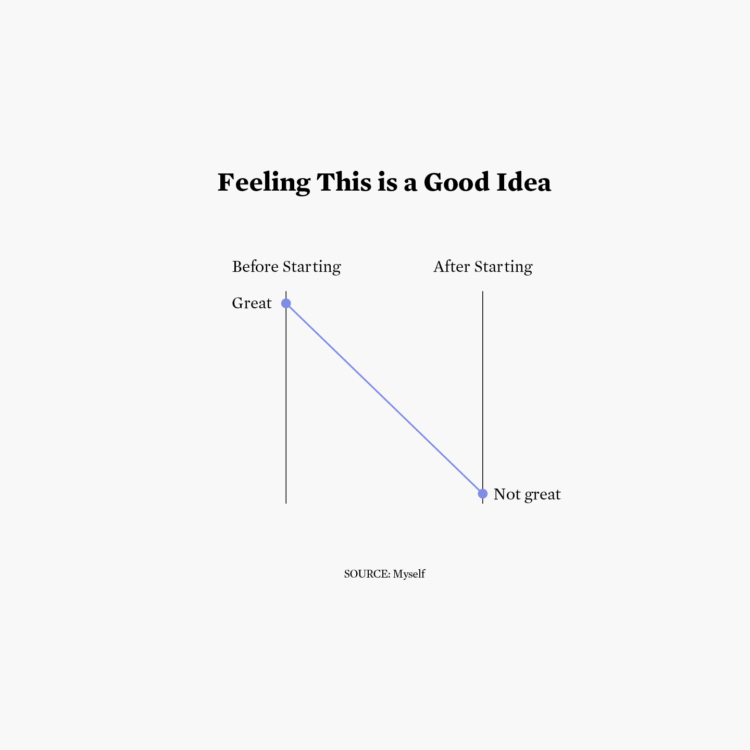
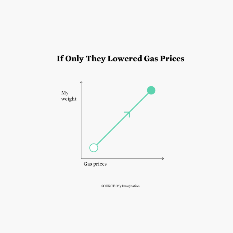
5. Slope
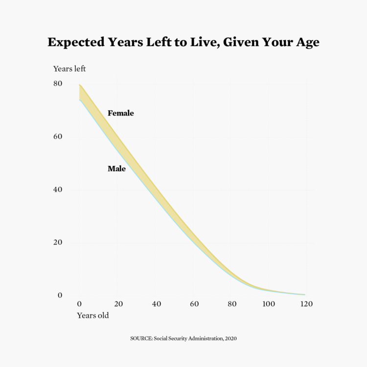
This is known as the slope of existential dread.
6. Data day: Our World In Data
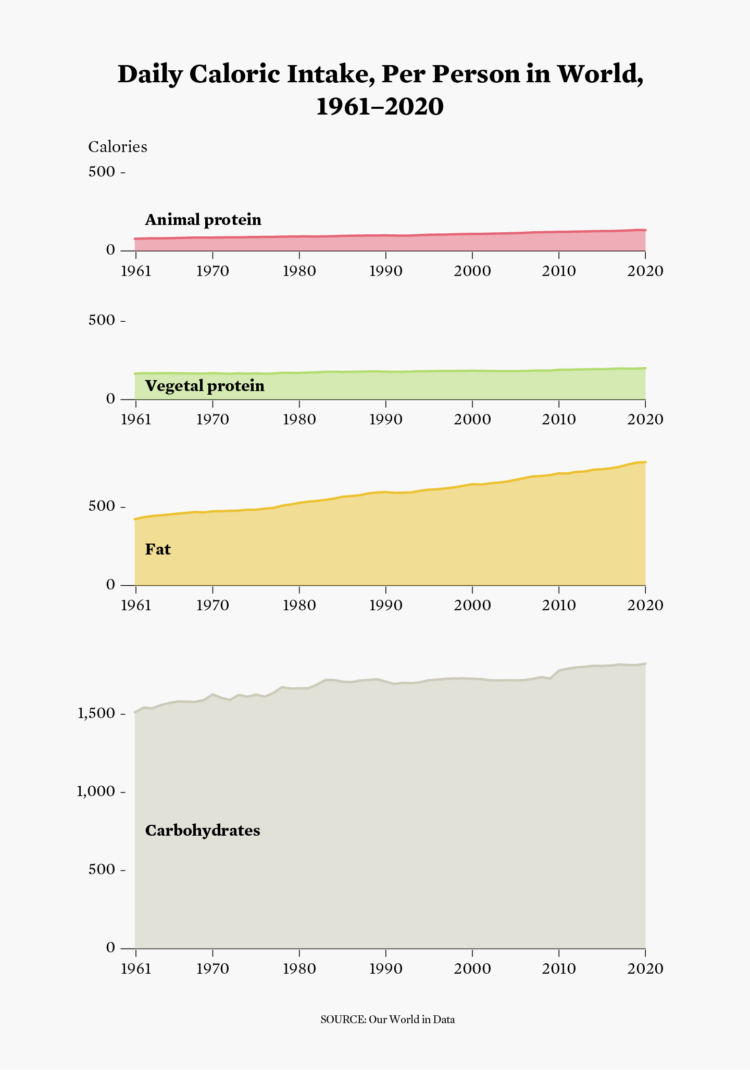
Learning my lesson from #3, I looked for a more straightforward dataset and representation. I was kind of surprised by low protein percentages, but maybe that’s because I’m American.
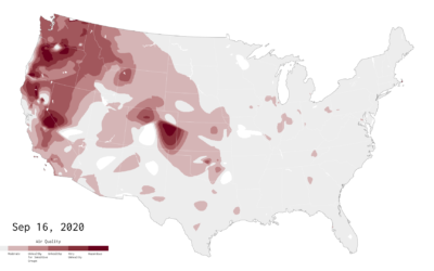
7. Hazards
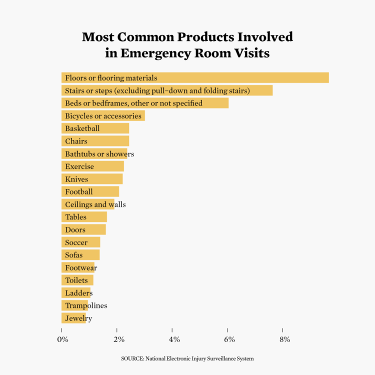
This is for 2022. I looked at this emergency room dataset in 2016, and like the risk data, I was surprised it was still going and up-to-date.
8. Humans
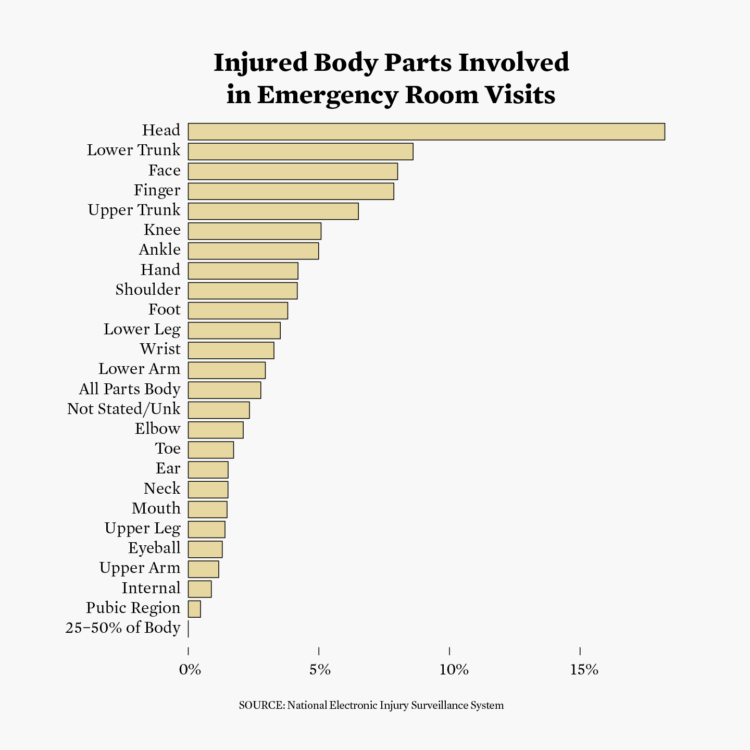
Same dataset as above but the body parts that got injured in 2022 instead. Poor head.
9. High/low
A whole nine charts in, thoughts about life choices begin.
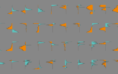
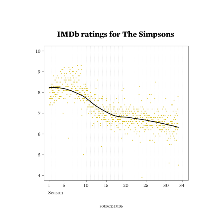
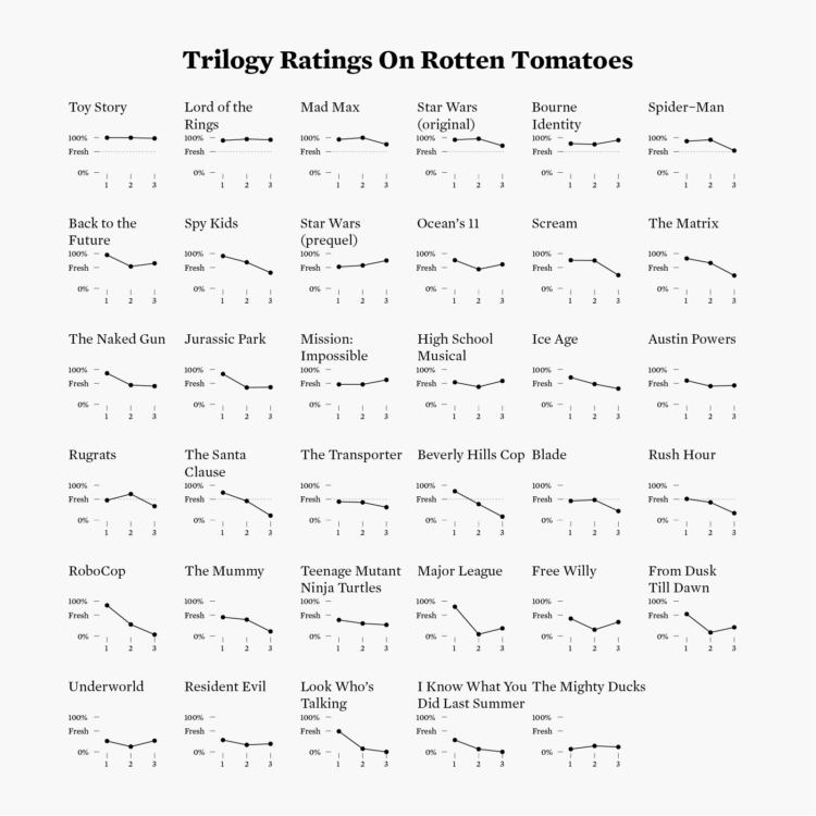
10. Hybrid
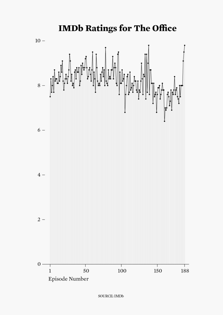
Dots, line, and thin vertical lines, which I’m realizing now just look like an area fill. No time for edits. Sorry, IMDb ratings.
11. Circular
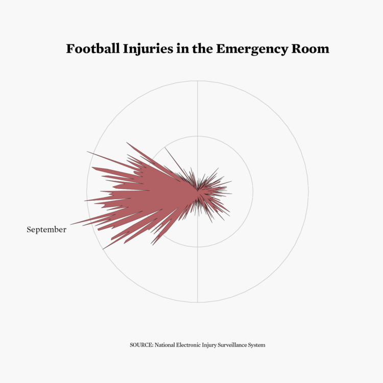
I could not put down the emergency room data.
12. Theme day: BBC News
Does BBC News have a consistent chart aesthetic? Do they make charts?
13. Pop culture
I prematurely hit export. Rules are rules.
14. New tool
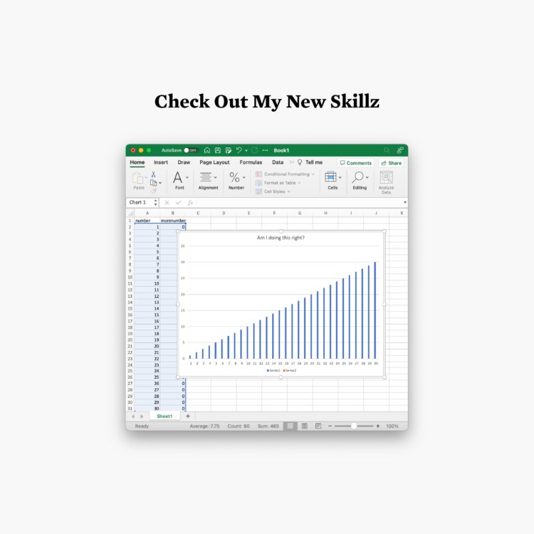
Genius.
15. Positive/negative
It’s a revised version of a 2019 graphic with smoothed gradient lines.
16. Family
Insert Fast & Furious reference.
17. Networks
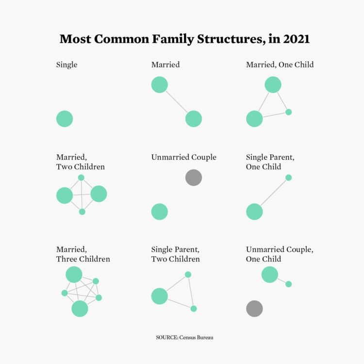
My Python script from 2016 (to aggregate family structures) needed just a couple of changes to work with the most recently available data. Big win.
18. Data day: EuroStat
Nope. Not getting sucked into a bigger dataset.
19. Anthropocene
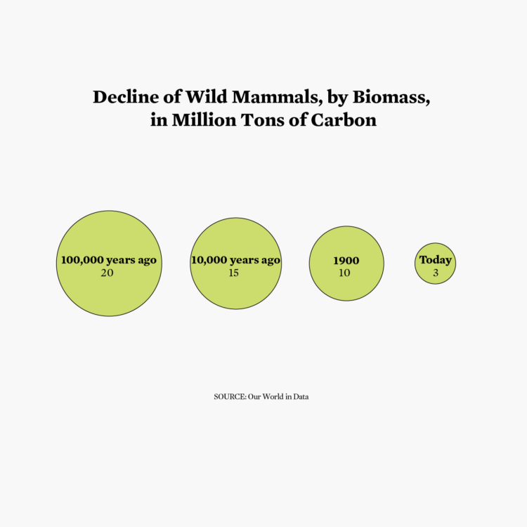
Is it bad that I had to look up anthropocene?
20. Correlation
Correlation equals causation. Everyone knows this.
21. Down/upwards
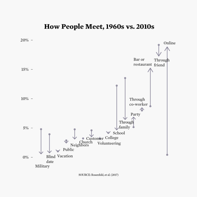
You can’t talk about up and down without arrows. Well, unless you use a bar chart race.
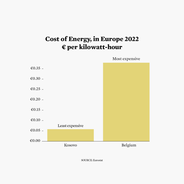
22. Green energy
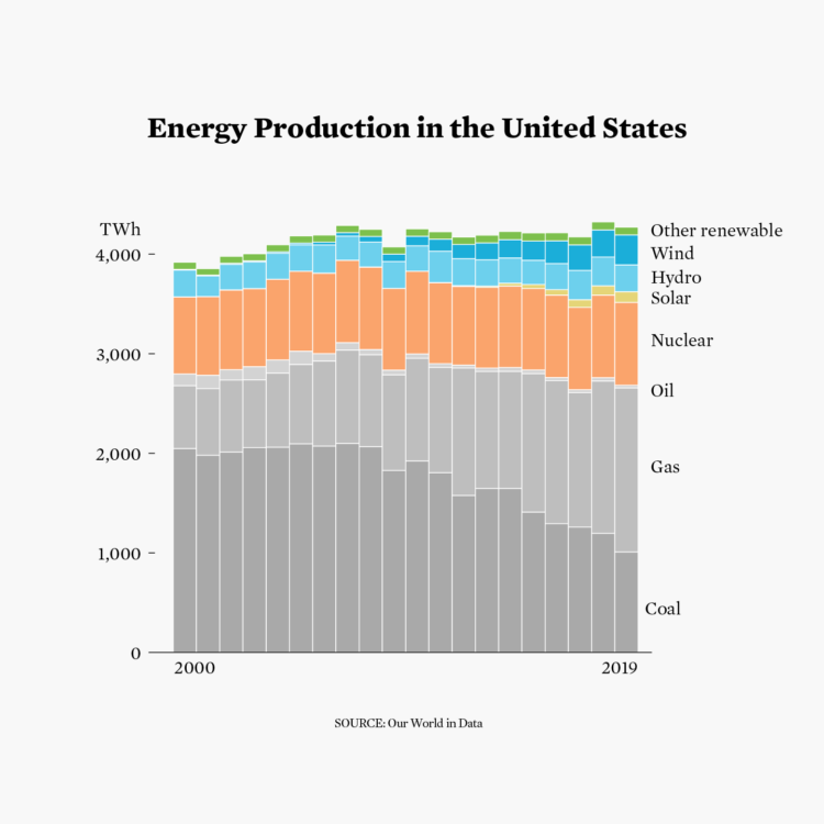
Go team green.
23. Tiles
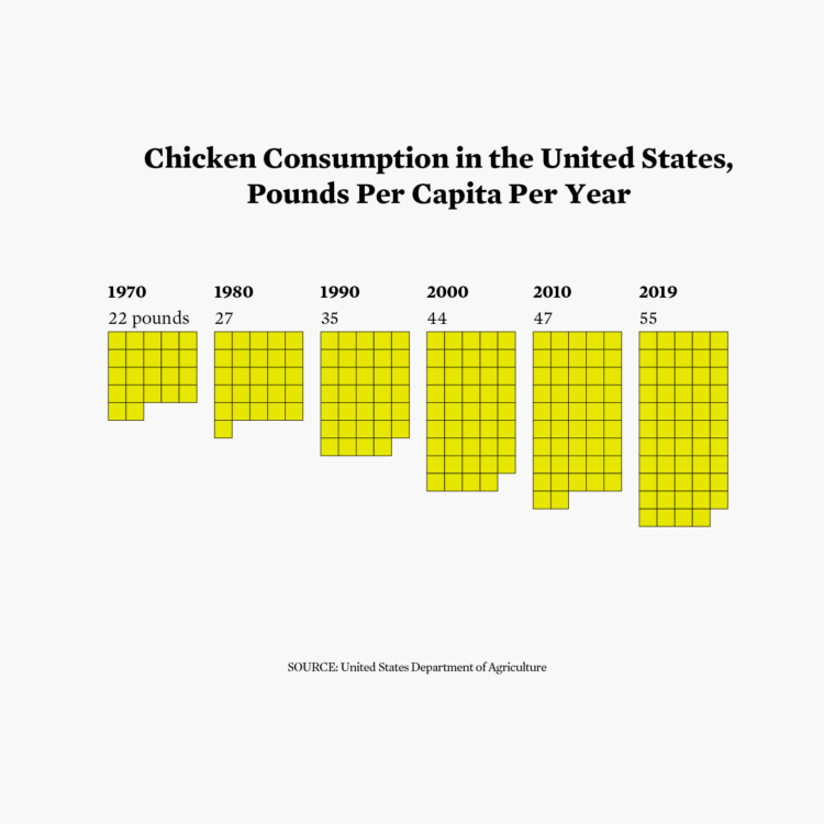
I’ve been on a unit chart kick. Also, here’s how you might make the same chart but with pictures of pigs.
24. Theme day: UN Women

The theme days in this challenge confuse me. Are we supposed to consider topics that match a theme or are we matching aesthetics? So here is an equal sign.
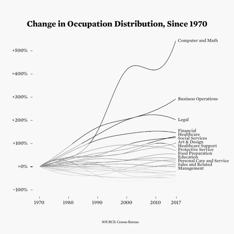
25. Global change
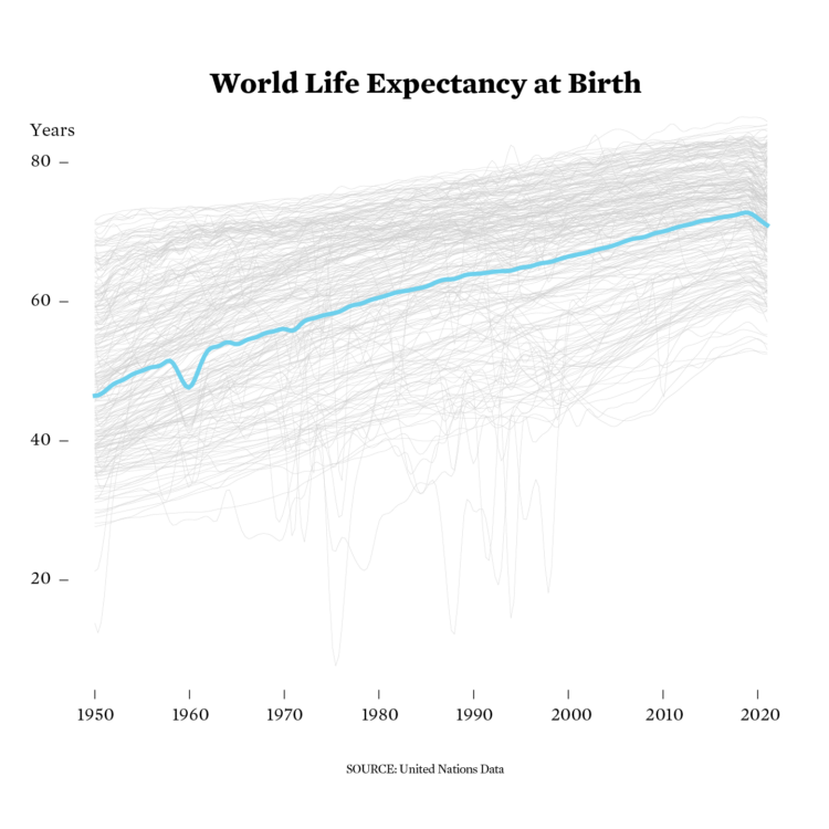
The lines generally head upwards, but the dips are brutal. I forgot to change the background color.
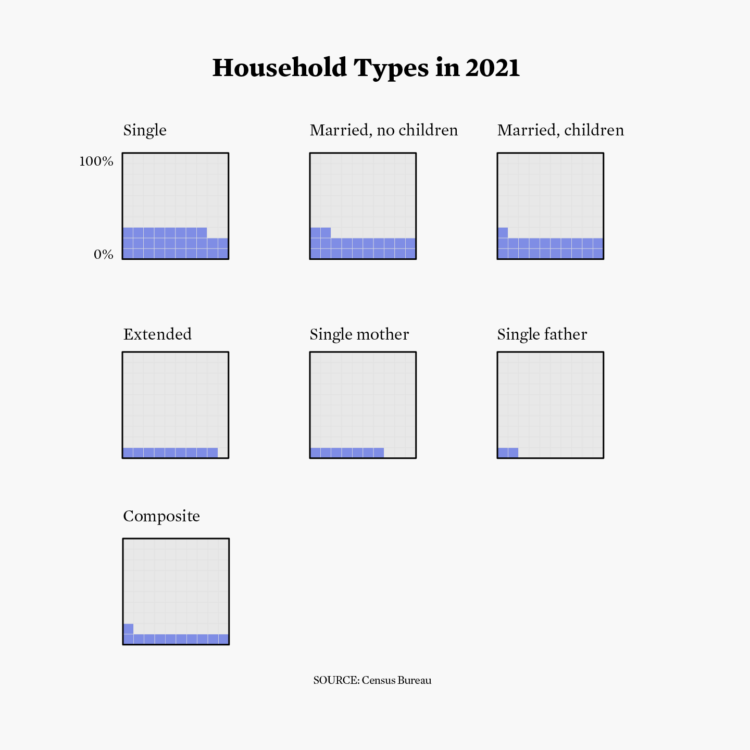
26. Local change
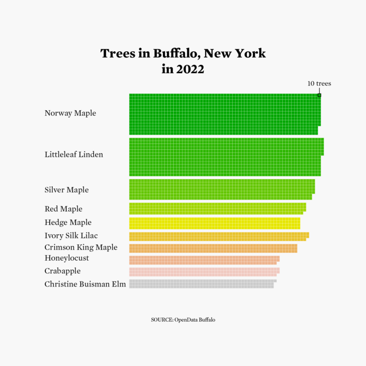
Hi, Buffalo. Hi, unit chart.
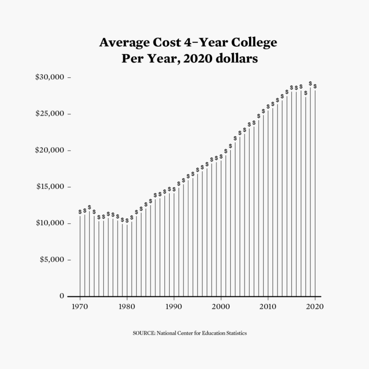
27. Good/bad
Hello, old dataset circa 2010.
28. Trend
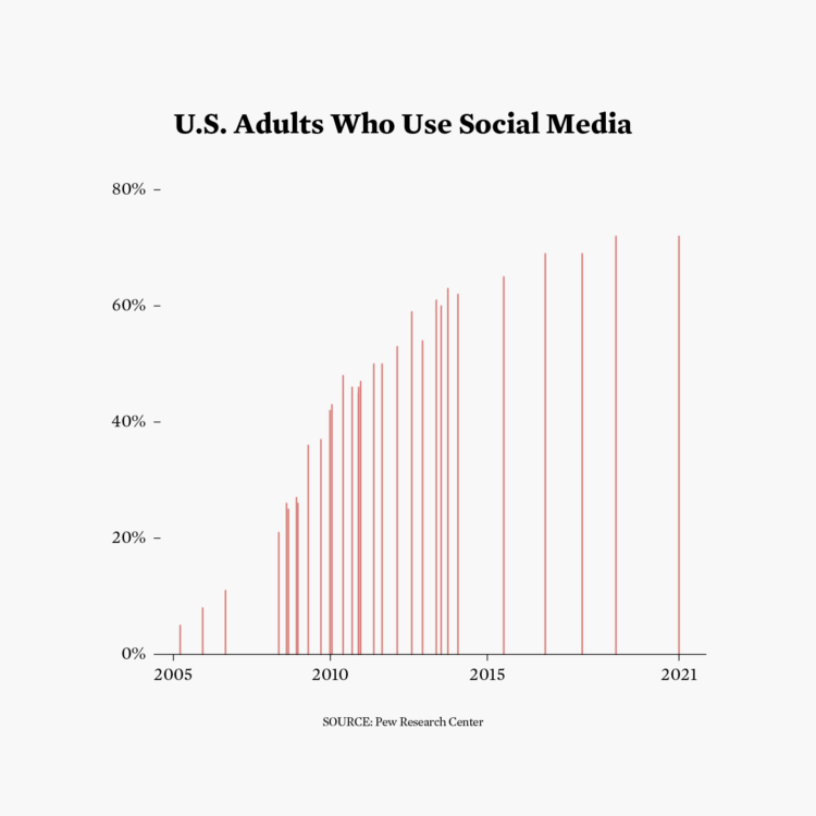
Maybe social media is not a fad.
29. Monochrome
Let’s make all charts monochrome.
30. Data day: World Bank
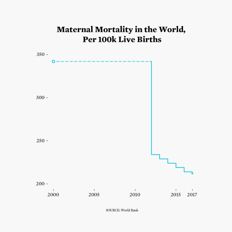
Still not zero, but baby steps.
That was a few more charts than I like to make in a day, but it was fun.
For a moment I thought I wasn’t going to finish when some pickle juice dripped on my mouse. I knew there was a reason I don’t eat lunch at my desk.
All the charts were made in R and edited in Adobe Illustrator, with the exception of the one glorious chart made in Microsoft Excel. This challenge also made me thankful that I’ve documented most of my code in the form of tutorials, so I didn’t have to start from scratch every time.
Check out others’ less time-crunched efforts on the Twitter.
Become a member. Support an independent site. Get extra visualization goodness.
See What You Get