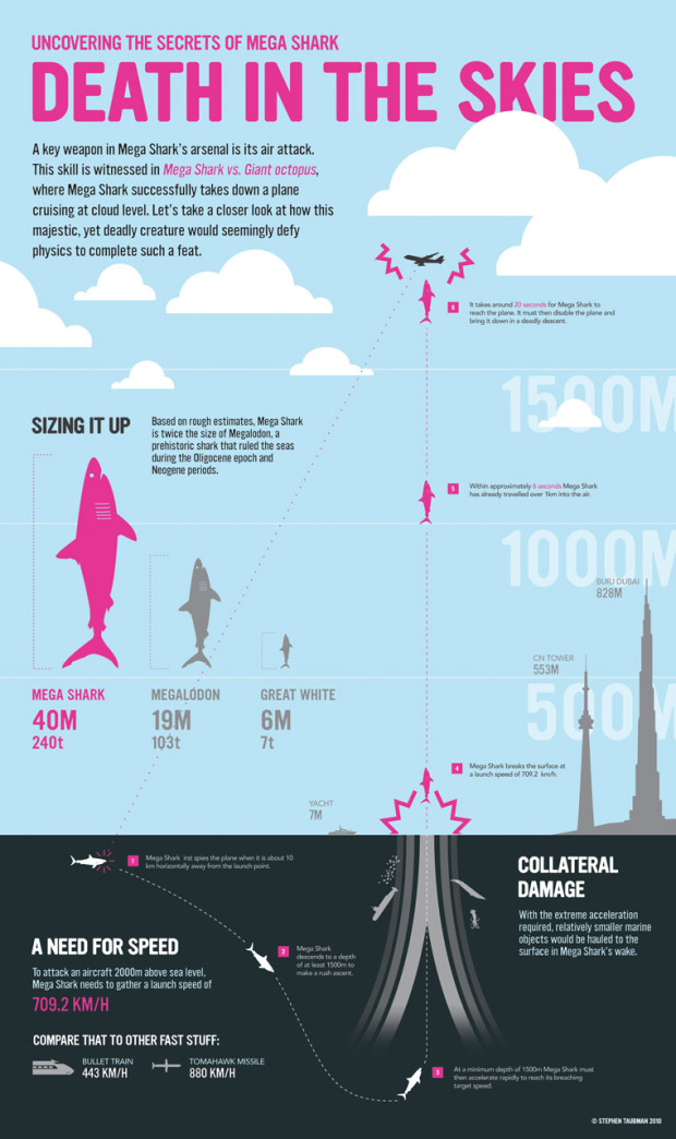
• Membership
  • Books
  • Projects
  • Learning
  • About
  • Member Login
  • Land Mass and Population by Country

    November 13, 2009

    Topic

    Infographics

    From Herald Daily is this giganto view of land mass and population size by country.
    Read More

  • How to Make a US County Thematic Map Using Free Tools

    There are about a million ways to make a choropleth map. The problem is that a lot of solutions require expensive software or have a high learning curve. It doesn’t have to be that way.

  • Join the Great American Hackathon

    November 11, 2009

    Topic

    News

    Sunlight Labs, one of my new favorite data groups, has partnered with Google, RedHat, Mozilla, and several others to get the open source community involved in open government projects. They’re calling it the Great American Hackathon and it’s happening December 12-13.

    For those unfamiliar with Sunlight, it’s an organization that promotes open government data and transparency, and they fund technology projects (mainly online apps) that move this idea forward.

    Organize an Event

    If you’re a developer or designer and want to help out, organize an event in your local area for December 12-13, and get as many people involved as you can. The more we make use of open government data, the more people that will see its usefulness, and the more people that care, the more the government will put into data. Get involved now.

  • The Pitching Dominance of Mariano Rivera

    November 11, 2009

    Topic

    Infographics

    The New York Yankees just won the World Series. I don’t know much about baseball, but I do know that Mariano Rivera, the Yankee closer, has a lot to do with the success of his team. Whether you like it or not, Rivera dominates batters with just a 0.74 ERA over 88 post-season games.

    The New York Times provides a batter-by-batter look at Rivera’s pitching since 1995. He’s pitched to 501 batters in the post-season. Only 14 runs have been scored off of him.

  • Class Size and SAT Scores By State

    November 10, 2009

    Topic

    Statistics

    Are there any differences in student performance between schools with small classes (as in students per teacher) and those with large classes?

    The natural response is yeah, of course, because if there are less students per teacher, each student gets more individual attention from the teacher. Then again, I went to pretty big elementary and high schools where some classes were in the high thirties. It didn’t seem all that bad.
    Read More

  • Unemployment Rate For People Like You – NYT Interactive

    November 9, 2009

    Topic

    Statistical Visualization  /  New York Times, unemployment

    Shan Carter, Amanda Cox, and Kevin Quealy of The New York Times explore 12-month average unemployment rates for just about any breakdown you can imagine. The main point: not everyone has been affected by the recession equally, and here’s how each group has felt it.

    Start with the filters up top for race, gender, age, and education level. The corresponding time series highlights blue.

    Change the filters – and here’s where the graphic gets a lot of mileage – the lit line moves up or down and the vertical axis updates, depending on what you were originally looking at. That up and down movement makes comparison between demographic groups much easier, especially because there are so many time series on a single plot.

    I’m impressed, NYT. Again.

  • 7 Visualization Groups On Flickr to Find Inspiration

    November 6, 2009

    Topic

    Visualization

    I’ve always thought of Flickr as a place where I can share my photos with friends and family; however, I’m starting to see there’s a whole lot more than that. It’s a great place to find inspiration for infographics and visualizations or to just browse the giganto collection of work from others.

    Here are some awesome data-related Flickr groups that are worth a look.
    Read More

  • Make Thematic Maps With Cartographer.js

    November 5, 2009

    Topic

    Maps, Software

    Like it or not, Google Maps mashups continue to be a Web favorite. It’s just so easy to use. Stick a few lines of javascript in your web page, and voila, you’ve got an interactive map. That’s for point-wise data though. It gets a little trickier beyond “you are here” pointers. Cartographic.js, in its first release, aims to make thematic mapping with the Google Maps API easier.
    Read More

  • Unemployment, 2004 to Present – The Country is Bleeding

    November 4, 2009

    Topic

    Data Sources, Maps  /  project

    The Bureau of Labor Statistics released the most recent unemployment numbers last week. Things aren’t looking good for the unemployed, I’m afraid.

    I showed my younger sister the maps. Her response: “It looks like the country is bleeding.”
    Read More

  • Fictional Character Interactions Over Time

    November 3, 2009

    Topic

    Infographics

    Popular nerd comic xckd takes a look at character interactions over time in Lord of the Rings, Star Wars, Jurassic Park, 12 Angry Men, and Primer. The horizontal axis is time and the vertical axis indicates which characters are together at any given time. The result is something that looks like famed Minard graphic. Well, sort of. And of course it’s all hand drawn, which adds to the nerd-ish charm.

    [Thanks, Wesley & Dave & Everyone else]

  • FlowingData is On CNN – A new way of looking at the world

    November 2, 2009

    Topic

    Site News

    Just a quick note. There’s an article up on CNN right now by Manav Tanneeru about the growth of visualization: A new way of looking at the world.

    There’s a blurb in there about your.flowingdata, but mainly read it for the other sources. There’s some nice tidbits from Martin Wattenberg, Ben Fry, et. al. Thanks, Manav for including me.

  • A Land Where Men and Women are Paid Equally

    November 2, 2009

    Topic

    Infographics

    We all know (or at least should know) about the pay gap between men and women in the workplace. This graphic from Shakeup Media was made to highlight that gap by comparing two cities in the UK at opposite ends of the spectrum. In one city women are paid way less than men while in the other, women are actually paid a tad more.

    The aesthetic is nice and the subject matter is important. I also like the use of the Easy Tooltip jQuery plugin.

    I just wish there was more focus on the actual pay gap. Instead it was more of an exercise in displaying demographics of two cities, where each section is separate from the other. Some annotation in the tooltips about the cities’ differing demographics would have tied things together nicely.

    [Thanks, Ryan]

  • Putting Cell Size in Perspective

    October 30, 2009

    Topic

    Infographics

    It’s hard for us, cognitively speaking, to imagine things that are really really big or really really small, so we need things to put things in perspective.
    Read More

  • Poll: Why Do You Read FlowingData?

    October 29, 2009

    Topic

    Polls

    I tend to post a wide array of subjects from the data spectrum, so I know all of you come from different view points and areas of study. Some are in academics, and others are casual readers. Some work with data for a living while others are more about design.

    So why do you read FlowingData? Punch in your answer in the poll below.

    {democracy:11}
  • Using Flickr as a Paintbrush

    October 28, 2009

    Topic

    Maps

    Andy Woodruff from Cartogrammar uses average color in Flickr photos to map the colors that people take the most pictures of. The above for example, shows the common colors of Harvard Square. Why all the red? It’s because there’s so many brick buildings.

    So in the end is a map that provides a different geographic view of what we’re used to seeing. We’re used to seeing the aerials or the designer-defined color coding of roads and land. This however, while portrayed as a view from above, is what people are seeing on the ground.

  • This Would Be Perfect for a Roomba Commercial

    October 27, 2009

    Topic

    Maps

    You know the Roomba from iRobot? It’s the robot vacuum cleaner that is supposed to do the work on its own so that you don’t have to. I’ve seen video of the thing picking up dirt and junk but I’ve always been skeptical that it would cover all areas.

    Well the above, from Signal Theorist, is the Roomba coverage over a half an hour. A camera was setup, the lights were turned off, and the above is a long exposure shot of the Roomba’s path. Not bad huh?

    [via Simple Complexity]

  • Failed Space Missions to Mars

    October 26, 2009

    Topic

    Infographics

    The above graphic shows missions to mars starting in 1960 to present (top to bottom). Paths are colored by country, and as you can see it’s been a lot of missions from Europe and the United States lately. Obviously the farthest we’ve gone is with the rover with more to come.

    (I couldn’t figure out where the graphic originally came from. Anyone know?)

    [via Fast Company | Thanks, Travis]

  • Information vs. Confusion

    October 23, 2009

    Topic

    Misc. Visualization

    You gotta love Jessica Hagy. If you’ve got the skills you should be able to widen the valley in that curve significantly.

    Have a nice weekend all.

    [via Cool Infographics]

  • Thank You FlowingData Sponsors

    October 22, 2009

    Topic

    Sponsors

    A BIG thank you to our sponsors. You keep FlowingData running smoothly, make it possible for projects like your.flowingdata and FlowingPrints to come alive, and most importantly, allow FlowingData to grow. We saw some 350k views this month and are quickly coming up on 25k RSS and email subscribers. Yikes.

    Xcelsius Present — Transform spreadsheets into professional, interactive presentations.

    NetCharts — Build business dashboards that turn data into actionable information with dynamic charts and graphs.

    InstantAtlas — Enables information analysts to create interactive maps to improve data visualization and enhance communication.

    Tableau Software — Data exploration and visual analytics for understanding databases and spreadsheets that makes data analysis easy and fun.

    IDV Solutions — Create interactive, map-based, enterprise mashups in SharePoint.

    Email me at nathan [at] flowingdata [dot] com if you’d like to sponsor FlowingData, and I’ll get back to you with the details.

  • Target Store Openings Since the First in 1962 – Data Now Available

    October 22, 2009

    Topic

    Data Sources

    FlowingData readers who have been around for a while will remember I made a map early this year that showed the growth of Target stores across America. It starts with the first one in 1962 and then goes from there. It was a follow-up to the Walmart map, which I shared the code and data for.
    Read More

  • Page 355 of 394
  • <
  • 1
  • ...
  • 352
  • 353
  • 354
  • 355
  • 356
  • 357
  • ...
  • 394
  • >

Analyze, visualize, and communicate data usefully, beyond the defaults.

Become a member →

Recently for Members

June 12, 2025
Comparing multiples

June 5, 2025
Caring Data

May 29, 2025
Visualization Tools and Resources, May 2025 Roundup

May 22, 2025
Conflicting points of view over the same data

May 15, 2025
Step Chart, Enhanced

Second Edition

Visualize This: The FlowingData Guide to Design, Visualization, and Statistics (2nd Edition)

New tools, refined process.

Order: Amazon / Bookshop

Browse by Chart Type See All →

Pie Chart Ternary Plot Small Multiples Strip Plot Stacked Bar Chart Choropleth Map Histogram Radar Chart Heatmap

Browse By Topic

  • Visualization

    Seeing data

  • Maps

    Seeing geographic data

  • Infographics

    Explaining data

  • Networks

    Connecting data

  • Statistics

    Analyzing data

  • Software

    Working with data

  • Sources

    Getting data

  • Design

    Making data readable

Made by FlowingData

  • The Process

  • Data Underload

  • Chart Everything

  • Guides

  • Books

  • Shop

  • About
  • Contact
  • Newsletter
  • LinkedIn
  • Instagram
  • Bluesky
  • RSS
Copyright © 2007-Present FlowingData. All rights reserved.