Designer Tiago Cabaco explains the conception of wine in this short animated infographic. Some of the effects, like the frame rotation, are a little overused. It actually made me a little dizzy, but it’s short. Still fun to watch.
Read More
-

Carpe diem. Seize the data, boys. Make your lives extraordinary.…
-
-
Big news. Former IBMers Fernanda Viegas and Martin Wattenberg just announced their new venture Flowing Media (no relation to FlowingData), a consultancy focused on visualization for consumers and mass audiences.
Those who read FD probably already know of the duo, but for those who don’t, I’m sure you’ve seen some of their work. They sit somewhere in between the art/design and technical side of visualization, which always provides for interesting results. I highly recommend them if you’re in need of some viz help. Needless to say, I’m a fan.
Seeing a trend?
This comes just a few months after Ben Fry’s decision to also venture out on his own (after being with Seed for a year). Like Fernanda and Martin, he’s also in Cambridge, interestingly enough. There must be something in the water over there.
If anything, this is yet another indicator of the growing popularity of data, and more importantly, a desire to do something with it. I’m totally guessing here, but I bet Fernanda and Martin’s inbox was chock-full of project possibilities/offers, which I’m sure played a big role in their decision.
I don’t know about you, but I’m excited about the opportunities out there after I graduate. It’s a great time for data scientists.
-
Designer Juan Pablo Bravo illustrates 100 Pixar characters to scale, from Wally B. and Luxo Jr. to Wall E. and Lotso, from the upcoming Toy Story 3. Main characters are highlighted in yellow. Catch the full giganto version of the graphic on Flickr.
Read More -
With the 2010 UK elections coming up, the Guardian explores possible outcomes, given a certain amount of swing votes. Three views are provided: a grid map (above), your traditional geographic map, and a bar chart. You can select a region of interest, and it stays highlighted as you switch between the options.
Read More -
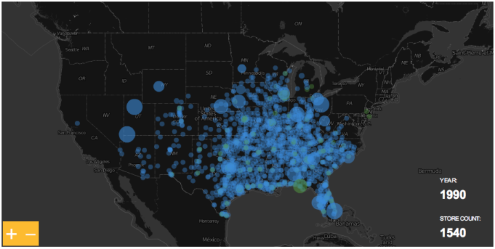
The ever so popular Walmart growth map gets an update, and yes, it still looks like a wildfire. Sam’s Club follows soon after, although not nearly as vigorously.
-
March was a really good month for FlowingData. Thanks again everyone for sending me link suggestions, sharing on Twitter, Facebook, StumbleUpon, etc, and just being all-around cool readers.
In case you missed them, here are the top posts from March, based on a combination of pageviews and comments.
- Data Underload #12 – Famous Movie Quotes
- Challenge: Let’s do something with these 3-D pyramids
- Think like a statistician – without the math
- Canada: the country that pees together stays together
- Mapping GitHub – a network of collaborative coders
- Japan, the strange country, in motion graphics
- Powerpoint and dying kittens
- How Genetics Works
- Graphical perception – learn the fundamentals first
- What burger chain reigns supreme?
From the Forums
There’s also some good stuff from the FD forums.
- Data Visualization Freelance Job – two-week gig in NYC for heartbeat digital.
- Health information design with geographic skills – another job opening.
- Infographic Designer/Illustrator Needed – noticing a trend here?
- Data analysis on elections and targeting for the DNC
- Minard redesign competition – remake the classic graphic. Win some posters.
If you’ve got job openings or data-related events, feel free to post your links there. And of course you’re always welcome to ask data visualization questions there too.
-
Matthew Bloch, Ford Fessenden, and Shan Carter continue the New York Times geographic sexiness with their recent interactive, mapping taxi flow across Manhattan over time. The scroll up top lets you move through times of the week, or just press play and watch it go. You can also roll over blocks to see rides per hour.
Read More -

Affording Health Care – Some weirdness going on with the area chart on the curve of the leg, but I like the aesthetic of the graphic overall.
Wolfram Alpha shifts focus to ubiquity – Lowered iPhone app price by 96% and brought back mobile version of website.
State of Twitter Spam – With lots of users comes more bad ones. Luckily Twitter has been making good steps forward.
FollowTheMoney – Updated so you can easily download all contribution records for your state, local officials, or committees. Create an account or sign in via Facebook.
P.S. Happy Easter!
-
Edward Tufte was officially appointed to a White House advisory role a few weeks ago. Tufte, along with other experts like Ben Shneiderman, have been providing input for the last year or so.
Tufte has a short chat (embedded below) with On the Media about what’s been going on with Recovery.gov. The main point: report data like The New York Times.
The first thing I said about a year ago when I met with them for the first time is that their model should be a first-rate news website… Once we got the news metaphor and got the intense mapping, that’s halfway there. I wouldn’t give it an A yet. There’s, you know, still a ways to go, and I know some of them, and I hope to, you know, find a few more.
Once Recovery.gov is further along, hopefully other government organizations follow suit, starting with Data.gov…or maybe Census…or the Bureau of Labor Statistics…or Centers for Disease Control and Prevention…
Listen to the six-minute interview below.
Read More -
Location-aware apps are the hot topic nowadays, and with all the tech-oriented people congregating at South by Southwest, there was a whole lot of checking-in to be done, especially with all the parties and get-togethers. Everyone wanted to know where everyone else was at.
SimpleGeo scraped the location stream, which was available on vicarious.ly, and mapped the check-ins over time.
I didn’t spot any particularly interesting patterns other than the occasional bar-hopping, but still fun to watch. Looks like Foursquare leads, with Gowalla taking a big chunk too.
To be honest, I still feel kind of uneasy about the whole location-sharing thing. Anyone care to share their experience?
[Thanks @mrflip]
-
As you know, there’s this big wave of transparency going on right now, and many organizations want to do more than just post a bunch of spreadsheets. They actually want to visualize it and share their data in a way that can be consumed by the general public. InstantAtlas aims to make that easy – without any code.
Read More -
Some people love ’em and others hate ’em. Now you can play with streamgraphs (seen here and here) yourself, whatever side you might be on. Lee Byron has made the code available on Github, under a BSD license.
It’s in Processing, and it’s not plug-n-play like many of you are probably hoping for, but on a quick skim, the code does look very readable and shouldn’t be too hard to grasp for those with a little bit of coding knowledge. I recommend reading Lee and Martin’s streamgraph paper first though.
-
March 22 was World Water Day, and TreeHugger posted this graphic on drinking water that is available in the world. The main point is that a very small percentage of water in the world is actually drinkable. It’s definitely a story worth telling, but the graphic doesn’t work at all. Even as a simple presentation of percentages (from UN-Water Statistics), it’s confusing.
How can we improve this graphic to tell the story more clearly? Discuss.
[Thanks, Donald]
-
GitHub is a large community where coders can collaborate on software development projects. People check code in and out, make edits, etc. Franck Cuny maps this community (with Gephi), based on information in thousands of user profiles.
Read More -
Design student Kenichi Tanaka animates the history of Japan for his final thesis project.
He pokes fun at his culture a little bit there in the beginning, yeah? I feel like something is getting lost in translation.
Update: The English version was taken down, unfortunately. Here’s the original Japanese version. The graphics are still in English, so you can probably understand most of it without the narration.
[Thanks, @pims]
-
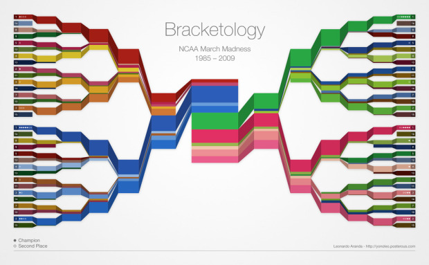
The Final Four is just about here. Who’s going to win it all? It’s anyone’s guess at this point, but what we can do while we wait is examine who’s won in the past. Leonardo Aranda takes a gander at who has won in each round since 1985, by ranking, with a color-coded bracket that resembles a stacked area chart.
I think if he used just two colors per corner (instead of entire palettes) and brightness indicating rank, it might be a bit easier to read in the first rounds. At the very least, you could find the Cinderella stories quicker, which is the most exciting part of the tournament a lot of the time.
I still like the concept though. It reminds me of Stephen’s crayon colors.
See the full-sized version here.
Who’s your money on?
[Thanks, Leonardo]
-
In a follow up to Apps for America, Sunlight Labs just introduced their next contest: Design for America.
This 10 week long design and data visualization extravaganza is focused on connecting the talents of art and design communities throughout the country to the wealth of government data now available through bulk data access and APIs, and to help nurture the field of information visualization. Our goal is simple and straightforward — to make government data more accessible and comprehensible to the American public.
There are three subject areas to appeal to different types of designers too. There’s data visualization, process transparency, and redesigning the government for a total of seven challenges each with a $5,000 top prize. Not bad, eh? Visit Sunlight Labs for more details.
By the way, I’m one of the judges (along with Charles Blow, Andrew Vande Moere, Nicholas Felton, and others). You’ve got about two months to show me what you got. Go on, I dare ya.
-
How to: make a scatterplot with a smooth fitted line
Oftentimes, you’ll want to fit a line to a bunch of data points. This tutorial will show you how to do that quickly and easily using open-source software, R.
Recently for Members
Second Edition
 Visualize This: The FlowingData Guide to Design, Visualization, and Statistics (2nd Edition)
 Visualize This: The FlowingData Guide to Design, Visualization, and Statistics (2nd Edition)
New tools, refined process.
Browse by Chart Type See All →


