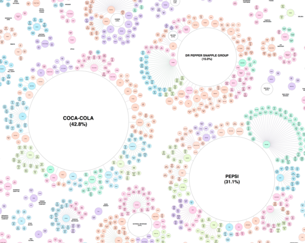
When you buy soft drinks and other beverages at the grocery store, most likely you’re buying something that is part of a bigger brand. We know this. When you buy Powerade or Sprite, you’re buying from the Coca-Cola brand. When you buy Gatorade or Mountain Dew, you’re buying from Pepsi. Canada Dry and 7-Up come from the Dr. Pepper Snapple group. How far is this reach though?
Read More
-
-
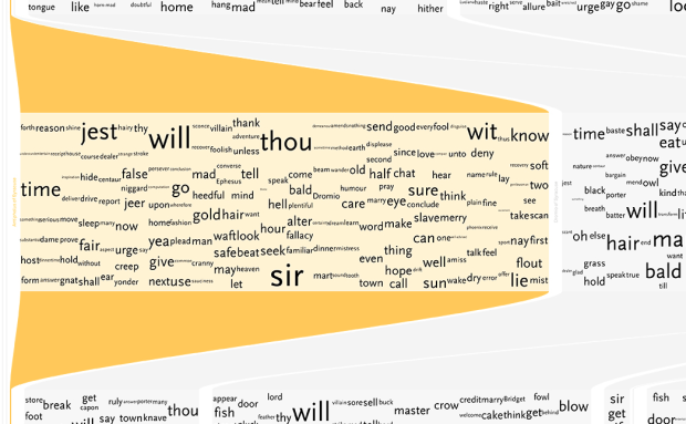
Shakespeare literature is confusing. That’s not even an opinion. It’s a fact. Stephan Thiel, for his B.A. thesis at the University of Applied Sciences Potsdam, takes a wack at understanding Shakespeare through a series of visualizations.
As a result, and based on data from the WordHoard project of the Northwestern University, an application of computational tools was explored in order to extract and visualize the information found within the text and to reveal its underlying narrative algorithm. The five approaches presented here are the first step towards a dicussion of this potentionally new form of reading in an attempt to regain interest in the literary and cultural heritage of Shakespeare’s works among a general audience.
The above is a sample from an exploration of the most frequently used words for each character. The major characters’ speeches are highlighted in yellow.
Read More -
Shady research from Harvard scientist Marc Hauser is confirmed:
On Friday, Michael D. Smith, dean of the Harvard faculty of arts and sciences, issued a letter to the faculty confirming the inquiry and saying the eight instances of scientific misconduct involved problems of “data acquisition, data analysis, data retention, and the reporting of research methodologies and results.” No further details were given.
This is why we don’t just accept any old data and why we care about the methodology behind the numbers. Stuff like this always reminds me of an exam question that asked us to investigate the data from an article in a prominent scientific journal. The analysis was all wrong.
Sometimes data is wrong out of ignorance. Other times it’s wrong because people make stuff up. I can understand the former, but why you would ever do the latter is beyond me.
[via]
Update: More details on what happened from research assistants’ point of view on the Chronicle. [thx, Winawer]
-
In a collaboration between SimpleGeo, who makes location data easier to access, and Stamen, who does all kinds of wonderful with maps, announced Polymaps today. It’s a free and open-source JavaScript library for image- and vector-tiled maps using SVG.
Polymaps provides speedy display of multi-zoom datasets over maps, and supports a variety of visual presentations for tiled vector data, in addition to the usual cartography from OpenStreetMap, CloudMade, Bing, and other providers of image-based web maps.
Because Polymaps can load data at a full range of scales, it’s ideal for showing information from country level on down to states, cities, neighborhoods, and individual streets. Because Polymaps uses SVG (Scalable Vector Graphics) to display information, you can use familiar, comfortable CSS rules to define the design of your data. And because Polymaps uses the well known spherical mercator tile format for its imagery and its data, publishing information is a snap.
The above is map using Flickr shapefiles. Here’s a map of pavement quality in San Francisco.
Read More -
Dating can be tough. What should you talk about? Where should you go? Most importantly, should you even be dating that person? Erik Bryan and Jennifer Daniel help you out with that last one. Not sure whether it’s appropriate to date that person or not? Consult this detailed flowchart. I know you’ve got a hot date tomorrow night.
Do you have a pre-exisiting personal relationship? Are you related? Is it your brother’s wife’s cousin? Make it happen, captain.
Is it your Xbox? Are you over 18? Do you want to not be alone for the rest of your life? Put down the controller and go take a shower. Your genitals will thank you. If, however, you are under 18… game on. Although, please proceed with caution. [via @jenniferdaniel]
-
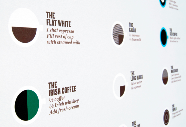
We saw this handy dandy coffee guide by Plaid Creative a while back. Oh so clean. Oh so informative. The world of fancy pants coffee drinks can be confusing, but it doesn’t have to be with this poster on your wall to guide you through the most difficult challenge in life: ordering coffee.
With some updates and corrections to the original, The Perfect Pour is now in poster form.
Read More -
Eric Fischer has been having a good bit of fun with maps lately. In his latest, he animates movements of the San Francisco MUNI (that’s their bus system) over the month of June 2010. Each second of in the video represents about an hour in real life.
As you might expect, traffic dwindles during the late/early hours from midnight to four in the morning. Then like clockwork, it picks up again. My knowledge of San Francisco geography has always sucked, so maybe a local can point out some of the interesting areas. If my orientation is correct though, that main street that runs from southwest to northeast and seems to stay lit through the night is Market.
This of course is reminiscent of Stamen’s Cabspotting, but much more raw, without any trails or ghostly footprints.
[Thanks, Laurie]
-
Weather in the private sector is over a $1.5 billion industry, and it’s largely because of the government’s open weather data. You can find what the weather is just about anywhere with just a few clicks of the mouse. It wasn’t always like that though. Clay Johnson, former director of Sunlight Labs, describes the history of open weather data, starting with Thomas Jefferson in the late 1700s.
Read More -
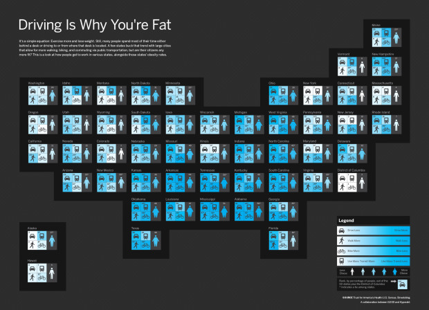
In a collaboration between GOOD and Hyperakt, they come out with a bold statement: driving is why you’re fat. They follow with a graphic that shows rankings by state for amount of driving, walking, biking, and use of mass transit.
Each state is represented by a four-square grid, colored so that lighter indicates more physical activity. Each grid is complemented with a fat/skinny icon, which represents rank for obesity.
I like how the grids are geographically-placed, but I’m not so sure about coloring by rank. Would it have been better to color by the actual metrics the ranks were based on? Does driving a lot really lead to obesity or do obese populations collectively prefer to drive more? Sound off with your constructive comments below.
-
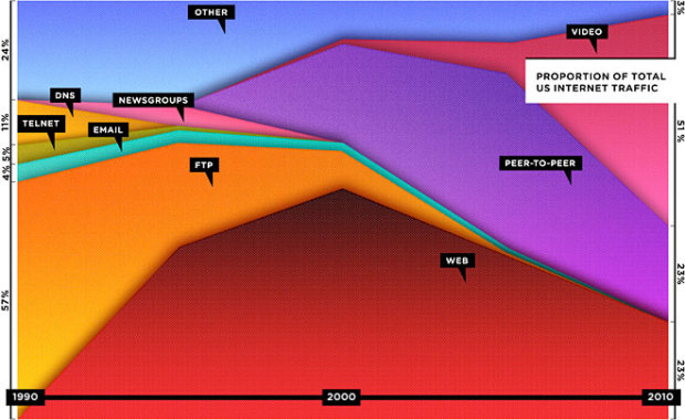
Wired has declared that the Web is dead in their September cover story, and they lead off with this stacked area chart showing the decline of browser-based consumption. Each layer represents a way to consume media via the Internet. Instead of the browser, the majority of US traffic, as estimated by Cisco, has shifted towards peer-to-peer, video, and tiny apps over browsers. Data accuracy questions aside, let’s not forget though that the number of total users is still growing, and that smaller portion using the Web is still billions of people.
My main concern is that the graphic only goes up to 2005. That’s ages ago by Internet time. What do the numbers look like now?
[via TechCrunch]
Update: Graphic now has correct timespan labels. So now it’s back to the debate of relative vs absolute values. [thx, Joanna]
Update again: What if the article had been about the growth in the number of ways we can interact with online media? Would we see this distribution differently?
-
Now that we’ve covered the 7 basic rules to graph design, it’s time…
-
When I first got in to graduate school, I really had no idea what I was getting in to. I thought it’d be like undergraduate studies, but harder. Not really. You definitely do a lot more unguided, independent work. You don’t have someone telling you what to do, so it’s up to you to figure out what you need to read and what you want to work on.
This illustrated guide to a PhD from computer science professor Matthew Might sums it up nicely.
By the end of high school, you know a little bit, by the end of a bachelor’s degree you start to specialize, and towards the end of a PhD, you’ve made it to the edge of human knowledge in a very small area of all there is to know in the world. Your job is to push that edge out some by the time you finish.
It’s all so clear to me now.
[Thanks, Max]
-
Add another toy to Stamen’s bag of tricks. The recently launched prettymaps by Aaron Straup Cope uses shapefiles from Flickr, urban areas from Natural Earth, and road, highway, and path data form OpenStreetMap, for an interactive map that’s well, pretty.
Read More -
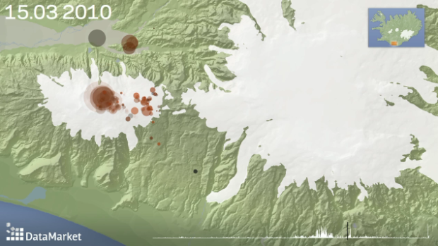
I’m late on this, but remember that volcano eruption in Iceland a few months back, and all the European airports had to shut down because of the giant ash cloud? DataMarket mapped the Iceland earthquakes in 2010, leading up to the eruption of Eyjafjallajökull.
This visualization shows earthquake activity leading up to eruptions in Eyjafjallajökull in South-Iceland in March and April 2010.
Each bubble represents a measured earthquake and the size of the bubble represents its magnitude. Deeper earthquakes are represented with darker colrs while shallow earthquakes are brighter. An earthquake slowly fades out as time passes. Yellow stars indicate eruptions.
Like you’d expect, it’s a stagnant in the beginning, then rumble, rumble, and boom. Eruption. Watch it unfold in the clip below.
Read More -
 “1945-1998” by Isao Hashimoto – Nuclear explosions conducted around the world between, um, 1945 and 1998. A counter on the top keeps track of explosions in each country. [thx, bernd]
Wikipedia’s Lamest Edit Wars – David McCandless looks at some petty back and forth. Rectangles represent documents, and are sized by number of edits.
Mood on Twitter – Cartograms representing mood on Twitter over time. Highest level of happy is early morning and late night. Not sure what measure of happiness is though. [thx, sune]
Radiolab and NPR Present Words – Beautiful video from the always entertaining and informative Radiolab. Similar to Moments.
-
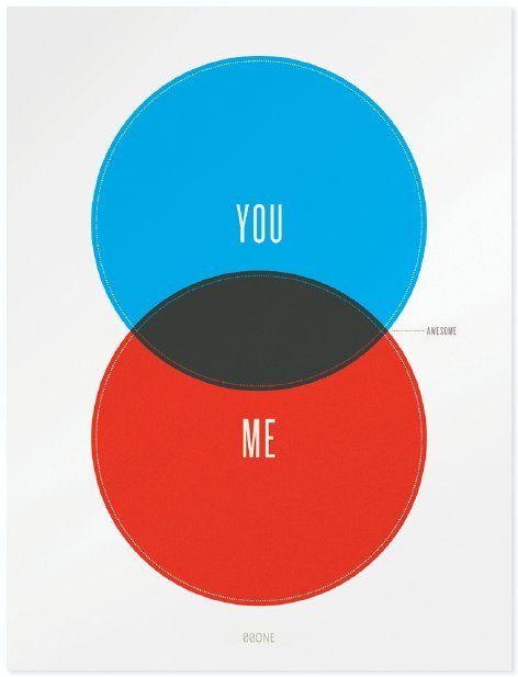
I used this diagram to convince my wife to marry me (j/k).
Buy the print by Nick Schmitz here. Have a good weekend!
[via swissmiss]
Update: Sheldon Comics has a slightly different take.
-
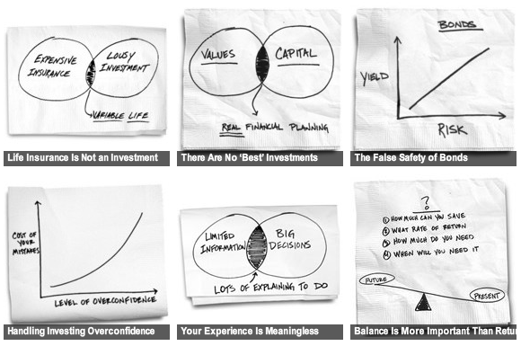
Carl Richards, a financial planner and a regular on The New York Times’ Bucks blog, uses graphs and diagrams to explain personal finance. And as you know, sketches are always twice as charming when they are on the back of a napkin. Together, the collection provides sound financial advice, so that you don’t end up poor and bankrupt, chasing the next Google or investing in entertainment.
[via Chart Porn]
-
My wife is an ER doc, so I hear about this sort of stuff all the time. Hospitals are going all-digital, and the exchange of data from doctor to doctor, from hospital to hospital, from patient to doctor, and doctor to patient is only going to get easier.
This expedited exchange of information will bring advantages such as fewer prescription errors, easier hospital transfers, and through sensors and mobile devices, professional health practitioners will be able to provide better care to those with chronic health conditions. This illustration from Chris Luongo explains a bit more.
Naturally, with all these benefits come plenty of challenges. Data privacy is huge here. Can you imagine if your medical charts ended up in some random hacker’s hands and then sold to the highest bidder? At least we might get more useful spam. I want big discounts on mis-spelled drugs that I actually need.
Seriously though. Data is blowing up, and there’s going to be monster demand for data scientists in the next ten years. See that wagon? Better jump on it while there’s still room.
[via Smarter Planet]
-
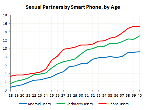
I should just automatically bring the OkTrends feed into FlowingData. In their never-ending quest to understand humankind, the group from online dating site OkCupid analyzes 11.4 million opinions on what makes a “great” photo – as in makes people want to date you. Some of the findings include: photos from Panasonic Micro 4/3s were best received, “photo attractiveness” decreased by age, and the Flash adds seven years.
There’s one finding that’s got everyone buzzing though. iPhone users have more sexual partners. See the graph above and below for the numbers.
Read More -
 Martin Wattenberg, who with his associate Fernanda Viégas, was just snatched up by Google, talks data and visualization in a lecture at MIT. For the most part, he focuses on past projects, which I am sure you’ve seen. However, even if you have seen all of Martin and Fernanda’s work, it’s still worth a watch as he highlights the interesting tidbits that each tool or piece can reveal. The rundown makes you appreciate the work that much more, in the same way you appreciate art when you know the story behind the picture.
The great thing about Martin and Fernanda is that they’re able to switch back and forth between art and science, which in turn gains the respect of the academic visualization world and attention from the masses.
Watch the full keynote below. It’s on the longish side, at about an hour, so you might want to bookmark it for later.
Read More






 Visualize This: The FlowingData Guide to Design, Visualization, and Statistics (2nd Edition)


