Do you know who you’ll be voting for this year? It can be tough deciding with all of the different issues and candidates. The commercials on TV don’t exactly help all that much either. VoteEasy, brought to you by Project Vote Smart and developed by Portland-based design firm Periscopic, helps you make an educated decision. Input the issues that matter to you, like abortion, public healthcare, or capital punishment, and VoteEasy will show you the candidates who best match your ideals in your area.
Read More
-
-
My many thanks to the FlowingData sponsors. I wouldn’t be able to do what I do without them. Check ’em out. They help you understand your data.
Tableau Software — Combines data exploration and visual analytics in an easy-to-use data analysis tool you can quickly master. It makes data analysis easy and fun. Customers are working 5 to 20 times faster using Tableau.
Zoho Reports — Offers an intuitive drag-and-drop interface that assists you to easily do in-depth reporting and visual analysis of your business data. It is best suited for SMBs using spreadsheets or custom software for data analysis.
Bime — Start small, connect all your data and answer deep business questions in minutes. Then enlight your partners and everyone in your organisation. Bime is a perfect balance of power and simplicity to help your organisation make better decisions.
Want to sponsor FlowingData? I’d love to hear from you. Contact me at [email protected] for details.
-
Matthew asks:
You say that you blog for fun and out of love for the subject. What kind of infographics give you the most pleasure? Are there kinds of infographics that you look for but don’t see?
How did your love of infographics begin?
Also, the recent documentary on info visualization “Journalism in the age of data” raised the question of how infographics can succeed in being beautiful without helping the reader gain insight into the data. As someone motivated by pleasure in infographics, does this concern you? Do you find yourself taking pleasure in this type of work? Can infographics that fail as knowledge tools succeed as art/design? Or when you speak of relishing infographics, are you referring to the pleasure of insight? To belabor this a bit: do you glean more delight from work that is beautiful or that yields insight?
My interest with data graphics goes all the way back to the fourth grade when I first learned how to make a bar chart in Excel. It was for my science fair project on what surface snails moved on the fastest (it was glass). Nothing fancy, and it was probably all default settings, but for some reason, that was fun to me.
Read More -
-
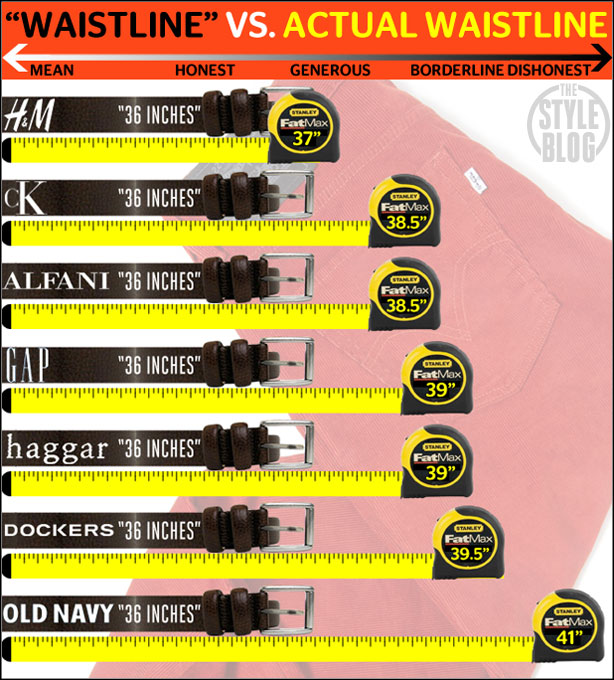
Ever notice how pants seem to fit differently from store-to-store even though they’re labeled as the same size? Why does the 36-inch at Old Navy feel kind of loose but the same size at The Gap feels like you had too many fries at lunch? Here’s your answer from the Esquire Style blog. The actual size (from this über-scientific study, I am sure) tends to be bigger than the size as advertised. A 36-inch waistline actually means 41 inches in Old Navy units.
Read More -
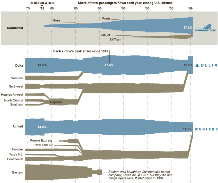
Airlines have been merging, going out of business, and growing since forever. Karl Russell for The New York Times shows just how much change there’s been during the past few decades:
The deregulation of the airline industry in 1978 led to a wave of mergers that continues to this day. But even as the legacy carriers have been consolidating and growing, they have been losing market share to low-cost carriers. Two of them, SouthWest and AirTran, have just agreed to merge and carried the most passengers in 2009 combined.
The thickness of each flow represents the share of passengers during a given year forming a blockish Sankey diagram. Brown flows are those that were absorbed by a larger airline.
It looks like anyone who’s not JetBlue, Southwest, or Alaska Airlines can only survive with mergers. I wonder why. [New York Times]
-
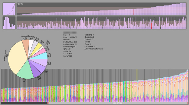
With thousands of applications, it can be tough deciding who to admit in to your program. The aptly named Admitulator, by Golan Levin, helps faculty sort things out:
Admitulator 2.0 (2010). A custom tool for quantitatively evaluating university applicants according to a diverse array of weighted metrics. The pie chart is the core interface for sorting and evaluating applicants; it allows faculty with different admissions priorities to explore and negotiate different balances between applicant features (such as e.g. portfolio scores, standardized test scores, grade point averages, etcetera). Built in Processing for the CMU School of Art.
Next stop: Match.com.
[Admitulator via @golan]
-
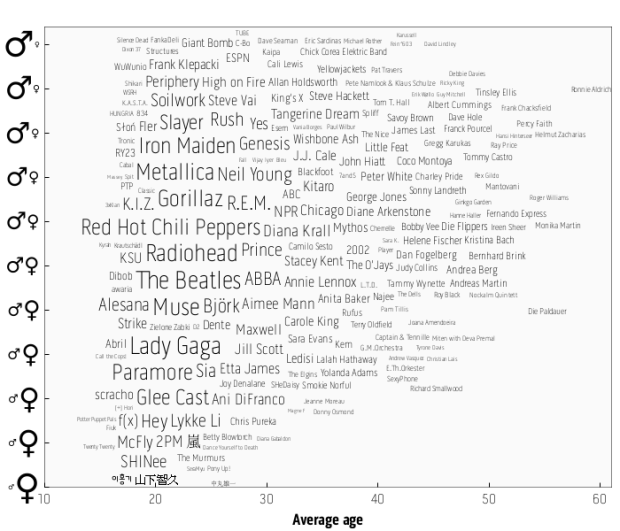
Last.fm intern Joachim Van Herwegen has a quick look at listening habits by age and gender:
The sizes of the artists’ names indicate how popular they are, while their position shows the gender mix and average age of their listeners. Based on the positions of the larger names, it’s already obvious which age category is most common amongst Last.fm users.
With age on the horizontal and gender breakdown on the vertical, artists on the bottom left are those popular among young girls. Top right are artists popular among older men. Red Hot Chili Peppers and Radiohead appear to hit the universal sweet spot.
I wonder how the graphs would vary across services. For example, I’ve been using Rdio for the past month, and nerd hipster music seems to be the hot theme around those parts. Hit up YouTube though, and everything is Bieberriffic. [Last.fm via Waxy]
-
-
In the words of Terrell Owens, get your popcorn ready, because this video (below) is awesome. During his Knight Journalism fellowship at Stanford, Geoff McGhee interviewed visualization trendsetters on how they deal and what they do with data in Journalism in the Age of Data:
Journalists are coping with the rising information flood by borrowing data visualization techniques from computer scientists, researchers and artists. Some newsrooms are already beginning to retool their staffs and systems to prepare for a future in which data becomes a medium. But how do we communicate with data, how can traditional narratives be fused with sophisticated, interactive information displays?
Martin Wattenberg and Fernanda Viègas kick things off with some of the work they did with IBM. Then it’s Ben Fry from Fathom, then Jeffrey Heer from Stanford, and then Steve Duenes, Matt Ericson, and Amanda Cox of The New York Times. Later on, there’s some Nicholas Felton on his Feltron Report and Eric Rodenbeck of Stamen, with several others.
Read More -
I answered a few questions for Amstat News not too long ago, and the questions were centered around why I, as a stat grad student, take the time to write for FlowingData and why others should give blogging a try. The questions were more from a career standpoint, but it really all comes down to this. It’s fun.
Read More -
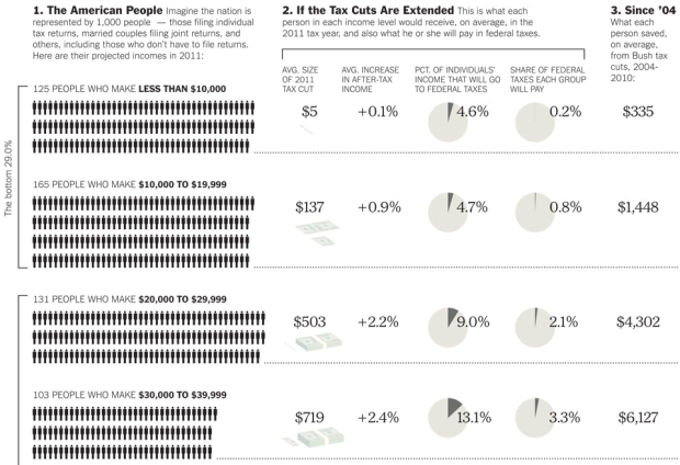
There are some major tax decisions to be made soon, and they’ll affect you differently, depending on what bracket you’re in. Bill Marsh of The New York Times takes a stab at showing the differences. The American population is put into context with a hypothetical population of 1,000. For example, if America was a population of 1,000 people, 125 of them would make less than $10,000. Piles of Benjamins shows average size of the 2011 tax cuts.
We saw the same tax topic explored by The Washington Post, except their’s was interactive and showed costs with Obama’s proposed plan. Which one works better? My vote is for NYT. It takes up a lot more space, but it’s much more straightforward and to the point.
-
The mockup examples are more cool factor than useful in this augmented reality book by Mark Lukas, but I’m sure an extra dimension could be of use somehow. I’m just not quite sure how yet. Watch the demo below.
Read More -
As many of you know, your.flowingdata, an application to help you collect data about yourself via Twitter, has been running for a while now. Some of you have been using it regularly; while others have stopped by every now and then. Whether you are frequent or infrequent user, we would like your help in understanding which visualization tools work best and to analyze your usage to help us improve the system.
Your participation in the study will only take about 5 minutes of your time. It will involve taking a brief survey to answer 8 questions.
If you are interested in participating, please click on the link below to log in to your.flowingdata and then click on the study invite link at top of the page to get started. Thank you for your interest!
If you have any questions, please feel free to email me at [email protected].
-
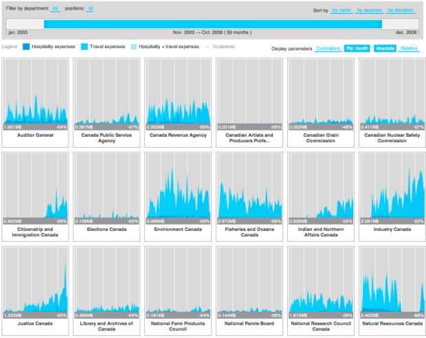
In an effort to make Canadian government expense data more accessible, FFunction designed the Expense Visualizer. A slider on top lets you filter by time, and small graphs show spending by different departments. Rearrange panels as you wish, and select among several scaling options as absolute values or relative. Bookmark your custom views or send them to others.
It took two years to make, but I’m pretty sure most of that time was waiting for all the groups to publish their data since the implementation itself is fairly straightforward.
A vertical axis probably would’ve been useful to see the values more easily. Or even better, a display of values as you rollover the graphs (like this).
[Thanks, Sébastien]
-
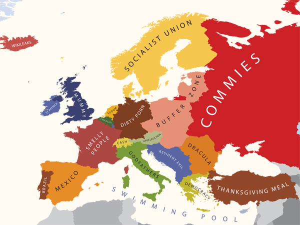
We tend to see the world in different ways, depending on what part of the world we live in. If you’ve never been to California, you probably associate it with Hollywood and surfers. If you’ve never been to the midwest, you think corn and potatoes. Of course, these regions have much more going for them and are a far more varied. Still, the stereotypes are amusing. I couldn’t help but chuckle when an old roommate came from Washington to Los Angeles and thought he was going to see movie stars on every block. Boy, was he surprised. It was only every other block.
Graphic designer Yanko Tsvetkov takes such notions of Europe in his series of stereotype maps, which themselves are stereotypes of stereotypes. The above is how the US sees Europe.
Read More -
In September 1940, Nazi Germany began bombing London for 76 consecutive nights in what is now known as The Blitz. There was tons of destruction obviously, but you’d never know it looking at the streets in current day. Historypin, which launched a few months back, places this important history in their most recent collection. Old pictures are pinned on top of a Google Maps street view so that you can see the destruction of the past and what the street looks like now.
Read More -
The NY Data Visualization and Infographics meetup is about to start, and you can tune in to the livecast below. It’s 4:20pm PST right now, so they’ll probably be starting soon. They’ve got a good speaking lineup, so it should be interesting.
Read More -
As most of you know, there are 33 Chilean miners trapped 2,230 feet underground. That’s about two Eifel Towers, and it’s going to be a few months before they’re rescued. In the meantime, the necessities of life are being sent down to the miners through a 3-inch bore hole. This simple graphic/cutout from Newsweek provide some perspective. [Newsweek]
-
Instead of breaking up demographics by defined boundaries, Bill Rankin uses dots to show the more subtle changes across neighborhoods in a map of Chicago using block-specific data US Census.
Any city-dweller knows that most neighborhoods don’t have stark boundaries. Yet on maps, neighborhoods are almost always drawn as perfectly bounded areas, miniature territorial states of ethnicity or class. This is especially true for Chicago, where the delimitation of Chicago’s official “community areas” in the 1920s was one of the hallmarks of the famous Chicago School of urban sociology.
Each dot represents 25 people of the map color’s corresponding ethnicity.
Erica Fischer, who has made a map or two, takes the next step and applies the same method to forty major cities. Here are the maps for Los Angeles, San Francisco, and New York, respectively. Same color-coding applies. You definitely see the separation, but zoom and you much more subtle transitions.
Read More







 Visualize This: The FlowingData Guide to Design, Visualization, and Statistics (2nd Edition)


