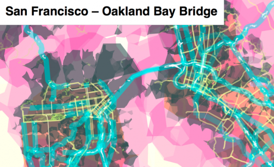
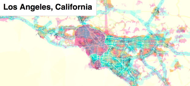
Add another toy to Stamen’s bag of tricks. The recently launched prettymaps by Aaron Straup Cope uses shapefiles from Flickr, urban areas from Natural Earth, and road, highway, and path data form OpenStreetMap, for an interactive map that’s well, pretty.
The white ghost-like shapes represent all the places where Flickr users have taken photos; the blue and green lines are OSM motorways and paths respectively; the orange shapes are urban areas as identified by Natural Earth. Unlike traditional maps most (and sometimes) all the data for a given layer is displayed, with only subtle variations in line width and other design considerations, regardless of zoom level.
Up top is the map for Los Angeles. Here’s the view of San Francisco. You can spot the bridge right away.

While nice to look at and fun to play with (as your browser starts going nuts over the processing), it’s from a technical standpoint prettymaps shines. prettymaps is actually a demonstration of what you can do with Stamen’s open-source TileStache and polymaps.
As you zoom in from the world view, you’ll be able to interact with all the individual components – the regions, the roads, and the bridges. What does this mean? It’s not just pre-generated tiles in your slippy maps. This is dynamic. It’ll put a strain on your browser now, as it’s on the edge of what modern browsers can handle now, but it gives you a taste of what’s to come.


 Visualize This: The FlowingData Guide to Design, Visualization, and Statistics (2nd Edition)

Pingback: Daily Links for August 16th | Akkam's Razor
Pingback: Linkwertig: Like.com, Hulu, prettymaps, Gmail » netzwertig.com