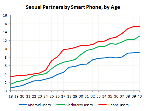
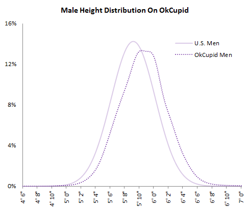
• Membership
  • Newsletter
  • Projects
  • Learning
  • About
  • Member Login
  • Driving habits and gas prices shift into reverse

    May 11, 2010

    Topic

    Statistical Visualization  /  Hannah Fairfield, New York Times

    Hannah Fairfield of the New York Times looks at driving habits and gas prices over the past six decades. Miles driven per capita is on the horizontal, and the adjusted price of gasoline is on the vertical. The drawn path indicates order in time.

    Americans have driven more miles every year than the year before, almost every year, but there’s been a swing as of late. High unemployment has meant less people driving to work, and less consumer spending means less freight moving across the country. As a result, the path appears to swing in the opposite direction.

    [Thanks, Craig]

  • The path to successful infographics

    May 11, 2010

    Topic

    Design, Infographics

    Most people don’t know what actually goes into a good infographic. There’s a lot more to it than just the design. There’s research, analysis, and fact-checking that you have to do long before you open Illustrator. Sarah Slobin, from the Wall Street Journal, explains how to create successful infographics. Have an idea, get the data, choose your tools, edit wisely, and above all else, pay close attention to detail.

  • Dreaming in numbers

    May 10, 2010

    Topic

    Data Art

    I don’t dream in numbers, but if I did, I’m pretty sure it’d look a lot like this. In Nature by Numbers, a short movie by Cristobal Vila, inspired by, well, numbers and nature, Vila animates the natural existence of Fibonacci sequences, the golden ratio, and Delaunay triangulation. Watch it. Even if you don’t know what those three things are, the video will rock your socks off.
    Read More

  • Nutritional facts redesigned

    May 10, 2010

    Topic

    Infographics

    Nutrition facts labels are uniform across products, but let’s imagine for a second that you could do whatever you want, just as long they showed certain bits of information. FFunction takes a stab at redesigning the standard milk carton under this premise. No cows, no fields of green, and no dairies. Just nutritional facts and full transparency on what’s going into your body.

    This wouldn’t work with a mass market, but hey, they’ve got my purchase. After all, data does a body good.

    [Thanks, Audree]

  • Evolution of Facebook privacy policies

    May 7, 2010

    Topic

    Infographics  /  facebook, Matt McKeon

    There’s been a lot of hullabaloo about Facebook’s newly installed privacy policies. It started out very closed, to just university students, and has expanded its reach, especially over the past year, to the more public Web. Matt McKeon, of the Visual Communication Lab, explores Facebook’s privacy policies, from 2005 to present.

    Rings represent the audience, starting with you in the middle all the way out to the entire Internet. Slices represent bits and interactions you have on Facebook. Click on the image to see how the policies changed over the years for each bit.

    Finally, you can also download the code (in the implementation section), which was written in Processing.js. I think I’m noticing a trend. Check it out here.

    [via Ben Fry]

  • Streamgraph code ported to JavaScript

    May 7, 2010

    Topic

    Software, Statistical Visualization

    Lee Byron open-sourced his streamgraph code in Processing about a month ago. Jason Sundram has taken that and ported it to JavaScript, using Processing.js.

    The algorithms are the same as that in the original, but of course the natural benefit is that people don’t need Java to run it their browsers. Jason has also added a few features including dynamic sizing, more straightforward settings, and some interaction with zoom and hover control. Really nice work.

    Grab the code, plus examples on GitHub.

    [Thanks, Jason]

  • Graph labels are for chumps

    May 7, 2010

    Topic

    Miscellaneous  /  axes, humor

    Yeah, it’s Friday. [Married to the Sea | via @levib]

  • Tracking the oil spill

    May 7, 2010

    Topic

    Infographics, Maps

    For those following the status of the oil spill, the New York Times provides a map tracking the spread. Press play to get the day-by-day. The oil is currently spreading to the west of the Mississippi delta, getting dangerously close to the oyster beds (in red).
    Read More

  • Guides  /  big infographics

    The Boom of Big Infographics

    Big information graphics have been around for a long time. They’ve come in…

    Read More
  • Best of FlowingData – April 2010

    May 5, 2010

    Topic

    Best of FlowingData

    As always, it was an interesting month for FlowingData. Thanks again, everyone for showing your support through retweets, likes, and stumbles.

    In case you missed them or are new to FD, here are the top posts from the last month, based on a combination of views and comments. The Walmart map came back to life recently with new data and a feature on CNNMoney.

    1. Watching the growth of Walmart – now with 100% more Sam’s Club
    2. Data Underload #18 – Sleep Schedule
    3. Explorations of real-world traffic
    4. Air traffic rebooted in northern Europe
    5. Trustworthiness of beards
    6. Data Underload #17: Famous Movie Quotes, p. 2
    7. A flowchart to decide what typeface to use
    8. 100 Pixar characters drawn to scale
    9. Data Underload #19: First Date vs. Reality TV First Date
    10. Streamgraph code is available and open source

    From the Forums

    There’s some good stuff in the forums too.

    • Example of bad Illustrations – Sometimes graphics make things more confusing.
    • Multi-series scatter plots – Looking for a way to make these.
    • Creating visualizations – What tools should you use?
    • Data Scientists and Engineers for Online Game Data Startup – Looking for a job?

    Have a question or something cool to share? Post it in the forums.

  • IBM Visual Communications Lab has an opening

    May 4, 2010

    Topic

    Miscellaneous

    There are a lot of job opportunities out there for visualization people. This is one of the more awesome ones:

    We are looking for a PhD-level researcher who is excited by data, visualization, and communication. A job candidate should have a history of designing and building innovative visualizations. An emphasis on large-scale user participation (e.g. collaboration, crowdsourcing, social communication) and on evaluation of hypotheses about user behavior is a plus. A successful candidate will have published in one or more areas of information visualization, computer-supported cooperative work, and human-computer interaction.

    No more Martin and Fernanda, but still good I am sure.

    [via @infosthetics]

  • How men and women label colors

    May 4, 2010

    Topic

    Infographics, Statistics

    Along the same lines of Dolores Labs’ color experiment, Randall Munroe of xkcd reveals the results of his color survey. He took a slightly different approach though. Here are some of the basic findings:

    If you ask people to name colors long enough, they go totally crazy.

    “Puke” and “vomit” are totally real colors.

    Colorblind people are more likely than non-colorblind people to type “fuck this” (or some variant) and quit in frustration.

    Indigo was totally just added to the rainbow so it would have 7 colors and make that “ROY G. BIV” acronym work, just like you always suspected. It should really be ROY GBP, with maybe a C or T thrown in there between G and B depending on how the spectrum was converted to RGB.

    A couple dozen people embedded SQL ‘drop table’ statements in the color names. Nice try, kids.

    Nobody can spell “fuchsia”.

    Read More

  • Planets make sweet music together

    May 4, 2010

    Topic

    Data Art

    SolarBeat is an audiolization by Whitevinyl that makes music with the planets. Each planet is assigned a note. As the planets orbit, a note is played each time a year passes on that planet. Result: the planets make sweet, sweet music together.

    [via Information is Beautiful | Thanks, John]

  • The (nerdy) data-driven life

    May 3, 2010

    Topic

    Self-surveillance

    Gary Wolf, of Wired and The Quantified Self, describes personal data collection and analysis in NYT magazine. Collect data about yourself, and you just might learn something.

    Humans make errors. We make errors of fact and errors of judgment. We have blind spots in our field of vision and gaps in our stream of attention. Sometimes we can’t even answer the simplest questions. Where was I last week at this time? How long have I had this pain in my knee? How much money do I typically spend in a day? These weaknesses put us at a disadvantage. We make decisions with partial information. We are forced to steer by guesswork. We go with our gut.

    That is, some of us do. Others use data.

    It all sounds great at first. But the story ends, as these types of stories almost always do, with a guy in a Google shirt walking around with one too many gadgets:

    Bo Adler, a young computer scientist at Fujitsu Laboratories of America, is one of the most committed self-trackers I’ve ever met: during his most active phase he wore a blood-pressure cuff, pulse oximeter and accelerometer all day long, along with a computer on a harness to collect the data. Adler has sleep apnea, and he is trying to figure it out. When he became too self-conscious going to the gym in his gear, he wore a Google T-shirt to throw people off. Maybe he was a freak, but at least people could mistake him for a millionaire freak.

    We data folk stick to our guns though:

    “My girlfriend thinks I’m the weird person when I wear all these devices,” Bo Adler says. “She sees me as an oddity, but I say no, soon everybody is going to be doing this, and you won’t even notice.”

    So proud. You tell ’em, Bo Adler. You tell ’em.

  • Design for America deadline approaching

    May 3, 2010

    Topic

    News

    Just a quick note. Sunlight Labs’ Design for America contest is coming up soon on May 15. There’s $40k in prize money up for grabs, so get your entries in soon. All forms of media are accepted – including sculptures.
    Read More

  • Data Underload

    Data Underload: One Thousand Posts

    On June 25, 2007 I published the first FlowingData post. Today, here is…

    Read More
  • Weekend Fodder – Death and Taxes

    May 1, 2010

    Topic

    Quicklinks

    Death and Taxes: 2011 poster – Jess’ annual look at government spending has hit the shelves. Use the code ‘flowingdata’ at checkout for buy one, get one free.

    2 Girls, 1 Cup reactions analysis – Paul Shen tracks the sound and movement of people’s reaction to the horrible video. The collage at the end is the best part. [via]

    Fernanda Viégas is an influential woman – As if you needed another reason to contract Flowing Media for your visualization needs. [via]

    China’s investments in foreign companies – An animated map of investments from 2005 to 2009. Kind of rough around the edges, but Interesting.

  • Find out whose Twitter fans are dumber

    May 1, 2010

    Topic

    Miscellaneous

    Stupid Fight compares fans on Twitter using “stupid indicators” like “OMG” and number of exclamation points. Congratulations, @flowingdata fans. You are smarter than @justinbieber fans. However, I regret to inform you that you are in the yellow. OMG.

    [via Waxy]

  • Cultural colors of emotion and character

    April 30, 2010

    Topic

    Data Art

    Some colors represent different things in different parts of the world, while others are universal. For example, in movies, villains are almost always portrayed in black and passion is going to bring out the red. But what about death? American culture usually calls for black. Hindu calls for white. David McCandless and Always With Honor explore these differences.

    [Thanks, @augustjoki]

  • Seeing the art in cartography

    April 30, 2010

    Topic

    Maps

    In much of the same spirit of the recent Cartographies of Time, the BBC is running a series on The Beauty of Maps. They’ve got two branches. The first is historical, which is an exploration of some of the world’s oldest existing maps. As a complement, the second is a study of digital worlds, or maps of virtual spaces.
    Read More

  • Page 342 of 392
  • <
  • 1
  • ...
  • 339
  • 340
  • 341
  • 342
  • 343
  • 344
  • ...
  • 392
  • >

Analyze, visualize, and communicate data usefully, beyond the defaults.

Become a member →

Recently for Members

May 8, 2025
When the data is not what it seems

May 1, 2025
Finding the Right Charts

April 24, 2025
Visualization Tools, Datasets, and Resources – April 2025 Roundup

April 17, 2025
Breaking Out of Chart Software Defaults

April 15, 2025
Line Chart with Decorative Neon Accents

Browse by Chart Type See All →

Donut Chart Line Map Treemap Spiral Chart Grid Map Stacked Area Chart Line Chart Spike Map Horizon Graph Moving Bubbles

Browse By Topic

  • Visualization

    Seeing data

  • Maps

    Seeing geographic data

  • Infographics

    Explaining data

  • Networks

    Connecting data

  • Statistics

    Analyzing data

  • Software

    Working with data

  • Sources

    Getting data

  • Design

    Making data readable

Get the Book

Visualize This: The FlowingData Guide to Design, Visualization, and Statistics

Available now.

Order: Amazon / Bookshop

Made by FlowingData

  • The Process

  • Data Underload

  • Chart Everything

  • Guides

  • Books

  • Shop

  • About
  • Contact
  • Newsletter
  • LinkedIn
  • Instagram
  • Bluesky
  • RSS
Copyright © 2007-Present FlowingData. All rights reserved.