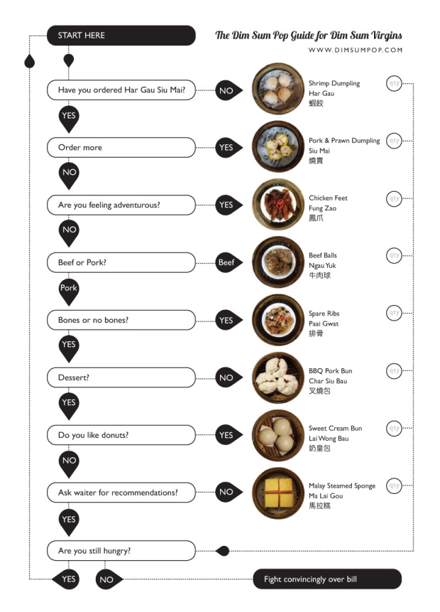
This guide on how to order dim sum is missing a lot food items, but gosh darn it, I love me some dim sum. Steamed and fried goodness on the cheap is what it’s all about. One small but very important thing I would change is that last bit. There is no such thing as, “Are you still hungry?” It should be, “Can you eat anymore?” When you feel like you can’t eat anymore, you eat a little more, and then fight over the check.
[Dim Sum Pop via @ehrenc]

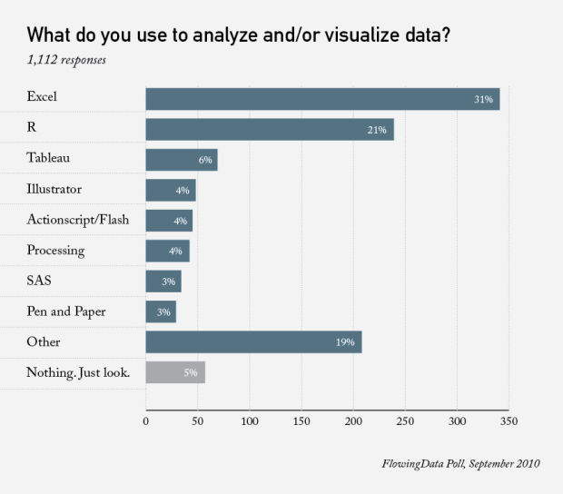
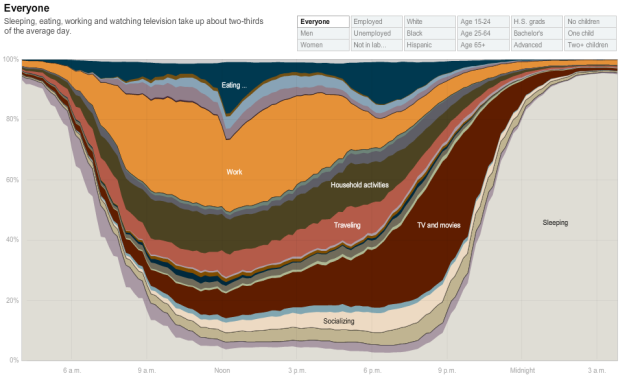
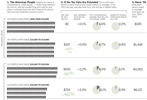
 Visualize This: The FlowingData Guide to Design, Visualization, and Statistics (2nd Edition)


