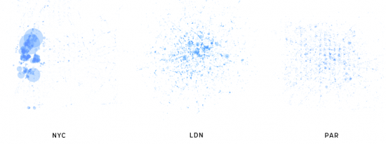
Foursquare, the location-based social network, lets people share their location with others in the form of checkins. Map all of those checkins, and you get a sense of social hotspots across a city. This is what Anil Bawa-Cavia did in his project archipelago. Based on 845,311 checkins and 20,285 locations, he mapped activity for New York, London, and Paris.
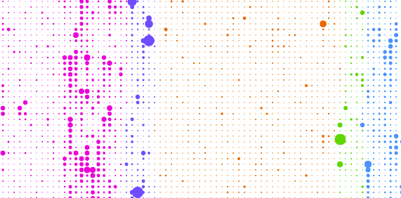
In these maps, activity on the Foursquare network is aggregated onto a grid of ‘walkable’ cells (each one 400×400 meters in size) represented by dots. The size of each dot corresponds to the level of activity in that cell. By this process we can see social centers emerge in each city.
Here are the maps for each city.

Take it a step further and categorize by nightlife, arts, shops, etc. and you quickly see where the popular areas in each.
Obviously there’s most likely a skew that comes out of who uses Foursquare and the types of places people check in. Also the circles are scaled on diameter rather than area, so that makes certain places look relatively more popular than they actually are. So take the maps at face value and make your own conclusions. It’s still an interesting look, albeit not as good as Eric Fischer’s Flickr maps showing where tourists and locals hang out.
[Thanks, Jodi]


 Visualize This: The FlowingData Guide to Design, Visualization, and Statistics (2nd Edition)

Pingback: Social life of Foursquare users mapped | VizWorld.com
Good to see the data behind the visualisations being provided as well.
I’ve used it to produce a map using Tableau Public for London:
http://public.tableausoftware.com/views/LondonTwitterMap/TwitterMap
Mark
long day at the office… twitter should read foursquare…
http://public.tableausoftware.com/views/LondonFourSquareMap/FourSquareMap
nice one, mark. it looks just like the original with interaction.
yup, nothing fancy. nice thing with tableau is you can overlay onto background map to give a bit more context when drilling in.
How did you export the foursquare data to be imported? Via API?
Great stuff – have a soft spot for visualization of big data sets. We’re actually putting on a Data Visualization contest for our blog community along these same lines. Best heat map (voted by readers) wins an iPad. Would love to your see your submissions / what other social data sets might produce. Here are the contest detailst: http://thisweekinrelevance.com/2010/09/07/twir-contest/
Pingback: Your City’s Foursquare Fingerprint | Gizmodo Australia