
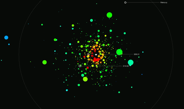
With Google’s recent data-related offerings, it shouldn’t come as much of a surprise that they’ve opened up their Public Data Explorer so that you can upload your own data. Previously, it was only available when you searched for something like “GDP” and a related dataset was supplied by an official provider.
[W]e’re opening the Public Data Explorer to your data. We’re making a new data format, the Dataset Publishing Language (DSPL), openly available, and providing an interface for anyone to upload their datasets. DSPL is an XML-based format designed from the ground up to support rich, interactive visualizations like those in the Public Data Explorer. The DSPL language and upload interface are available in Google Labs.
In terms of visualization, there’s isn’t anything new. You’ve got your maps, bar charts, and time series line charts, with the checkboxes on the left (like the snapshot below). Then there’s the chart types available via the charting API.
Read More


 Television actors can make boat loads of money. Some more than others. Hugh Laurie makes $400,000 per episode while Ashley Tisdale makes $30,000. TV Guide compiled a list of


 Visualize This: The FlowingData Guide to Design, Visualization, and Statistics (2nd Edition)


