• Membership
  • Newsletter
  • Projects
  • Learning
  • About
  • Member Login
  • Gamers mimic the real life football season

    February 10, 2011

    Topic

    Statistical Visualization  /  Madden, NFL, small multiples

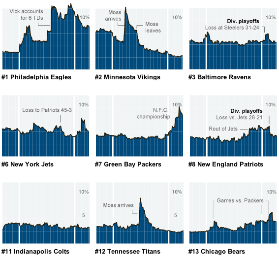
    As you might expect, people who play sports video games tend to play with teams when those teams are winning in real life. Anyone who plays online via their Playstation or Xbox can tell you this. I play NBA 2K11 sometimes, and it can get pretty boring playing the Lakers over and over again. Kevin Quealy for the New York Times investigates the phenomenon with data from Madden NFL, the most popular football video game of all time, and small multiples. I sense R and ggplot.

    A team loses, and there’s a dip in gameplay. A team wins or gets a new star player, there’s a spike.

  • OkCupid: Best questions to ask on a first date

    February 9, 2011

    Topic

    Statistics  /  dating, OkCupid

    OkCupid continues their analysis on the mysteries of the dating world, this time on the best questions to ask on a first date, or rather, the best questions to ask when you actually want to find out something else. Will your date have sex on the first date? Ask your date if he or she likes the taste of beer, because:

    Among all our casual topics, whether someone likes the taste of beer is the single best predictor of if he or she has sex on the first date.

    Well, okay, not entirely correct. The question is if they would consider sex, not if they’d actually do it. I’ve considered buying just about every Apple product, but all I have is the one Macbook. Still interesting though.

    I’m still waiting for LinkedIn to start doing this sort of analysis. I mean it’s more or less the same thing, except you’re trying to find a company to work for rather than a partner to, uh, have beer with. Who’s with me?

  • Looking for other livable planets

    February 9, 2011

    Topic

    Data Art  /  exoplanets, Kepler, space

    Jer Thorp, who has a knack for creating stuff that’s both useful and beautiful, continues his string of impressive work with this visualization for Boing Boing (video below). It shows possibly habitable planets, according to Kepler data. For those unfamiliar, the Kepler mission is to find possible habitable planets, or more precisely:

    The challenge now is to find terrestrial planets (i.e., those one half to twice the size of the Earth), especially those in the habitable zone of their stars where liquid water and possibly life might exist.

    The visualization imagines if all the exoplanets were orbiting a single star, which is physically impossible, but allows for comparisons for size, temperature, and path. There are a few views, starting with the exoplanets orbiting and then the animation transitions to something that sort of looks like an exoplanet mountain and then into a bubble plot.
    Read More

  • Data talks and keynotes from O’Reilly Strata conference

    February 9, 2011

    Topic

    News  /  conference, Strata

    The sold out O’Reilly Strata conference was a success down in Santa Clara, California, with the next one already scheduled for 2011 in New York. There were lots of interesting talks and lots of interesting people to talk to. I was only there for one day and didn’t nearly get to meet everyone I wanted to, but it was great seeing so many people who are excited about data packed into one place.
    Read More

  • Watch the world get fatter over the past three decades

    February 8, 2011

    Topic

    Statistical Visualization  /  BMI, health, interactive, Washington Post

    People are getting fatter everywhere. You know this. But there’s nothing like the numbers to actually show how we’re growing outwards and by how much. With this interactive, Wilson Andrews and Todd Lindeman, for the Washington Post, report:

    With a few exceptions, the average body mass index in most countries has risen since 1980, according to a project that tracked risk factors for heart disease and stroke in 199 countries over 28 years.

    Each circle represents a country, plotted by men’s BMI on the horizontal axis and women’s BMI on the vertical. Countries above the diagonal are countries where women have a higher BMI than the men, and vice versa for dots below the diagonal. Press play, and watch how BMI has changed from 1980 to 2008.
    Read More

  • Europe’s energy targets in perspective

    February 8, 2011

    Topic

    Infographics  /  bubbles, energy, interactive

    Designer Gregor Aisch has a look at energy usage in Europe. Click on a number of topics on the bottom to see how each country compares, or mouse over a specific country to get its details. Bubbles are color-coded according to relatively high or low levels (I think) and sized by population (I think). There isn’t a whole lot of explanation of what you’re actually seeing, but it has some interesting interactions in there. Maybe our European readers can add some context. Don’t forget to take it fullscreen and put it on autoplay.

    [publicdata.eu via @moritz_stefaner]

  • Annual Feltron report is up – this time with dad

    February 7, 2011

    Topic

    Infographics  /  Feltron, report, yearbook

    I think we’ve all grown accustomed to this by now. Designer Nicholas Felton, known for his quantified annual reports on his life for the past year, just put up his Report for 2010. This one though isn’t for Nicholas. It’s for his late father. It’s breakdowns for where he lived and traveled, postcards sent, and people he spent time with.
    Read More

  • Statistician cracks the scratch lottery code

    February 7, 2011

    Topic

    Statistics  /  lottery

    Statisticians everywhere are squealing in delight over this story on fellow statistician Mohan Srivastava, who used his know-how to crack the code of a tic-tac-toe scatcher lottery game. After winning three dollars on a scratcher ticket that was given to him as a gag gift, Srivastava got to wondering about the process of how tickets were made. As a geological consultant who figures out if areas are worth mining for gold, he wondered if he could do the same with this scatcher.
    Read More

  • Super weekend linkdump

    February 6, 2011

    Topic

    Miscellaneous

    Here are some links for you to accompany your bag of chips, bowl of chili, and plate of wings as you wate for the Super Bowl to start.

    Super Bowl FanMap — Who are people picking to win the big game in your area? ESRI is taking votes and mapping them. Packers are far ahead, leading 64 percent to 36. [via]

    Where the Streets Have Your Name — See where there are streets named after you. Yeah, you.

    d8taplex — A super alpha version of something that looks like a data search engine with graphs.

    Top-spending cities for personal care — Active north and sedentary south?

  • Most viewed YouTube videos of all time iconified

    February 4, 2011

    Topic

    Infographics  /  icons, YouTube

    Designer Ibraheem Youssef iconifies the most viewed YouTube videos of all time. Do you recognize what each icon represents? I’m embarrassed to say that I probably know one too many of them.
    Read More

  • Best companies to work for and what employees say

    February 3, 2011

    Topic

    Infographics  /  bubbles, CNN, jobs

    Fortune Magazine recently published their annual list of top companies to work for, with SAS, Boston Consulting, and Wegman’s taking the one, two, and three spots, respectively. To accompany the piece, this interactive, produced by Tommy McCall, shows what the employees have to say about their companies.
    Read More

  • Stock market predictions with Twitter

    February 3, 2011

    Topic

    Statistics  /  stocks, Twitter

    Apparently moods on Twitter can be used to predict the ups and downs of the stock market, according to work from Johan Bollen and Huina Mao of Indiana University-Bloomington: “Measuring how calm the Twitterverse is on a given day can foretell the direction of changes to the Dow Jones Industrial Average three days later with an accuracy of 86.7 percent.”

    I can’t wait until Twitter is used to predict when I want to eat and sleep, and my robot can cook me gourmet meals and provide turn down service accordingly. And it better be accurate to the minute. Anything less is failure.

  • Predicting crime before it happens

    February 3, 2011

    Topic

    Statistics  /  crime, prediction

    Christopher Beam for Slate explains research being done at UCLA in collaboration with the LAPD on predictive policing:

    Predictive policing is based on the idea that some crime is random—but a lot isn’t. For example, home burglaries are relatively predictable. When a house gets robbed, the likelihood of that house or houses near it getting robbed again spikes in the following days. Most people expect the exact opposite, figuring that if lightning strike once, it won’t strike again. “This type of lightning does strike more than once,” says Brantingham. Other crimes, like murder or rape, are harder to predict. They’re more rare, for one thing, and the crime scene isn’t always stationary, like a house. But they do tend to follow the same general pattern. If one gang member shoots another, for example, the likelihood of reprisal goes up.

    This happened in my neighborhood when I was in fifth grade. We lived in a pretty quiet neighborhood, but one morning a window was open. Someone had come into our house while we were sleeping and stole whatever was in immediate reach. They also stole my dad’s brand new bicycle from the garage. Same thing happened to my neighbor two days later.

    [Slate via @amstatnews]

  • Bill Gates’ infographics section from annual letter

    February 2, 2011

    Topic

    Infographics  /  Bill Gates, education, health

    Even Bill Gates has an infographics section. In his 2011 annual letter, Gates focuses on Polio and vaccines, and uses graphics to highlight spots. Most of them have to do with the decrease in number of Polio cases and increase in vaccine coverage, but there’s one graph that I gave a double take. It shows the correlation between IQ and disease burden. Question of the day: if we decrease disease burden in a country by improving healthcare (or availability of vaccines), will the country as a whole become smarter, or are better educated people generally healthier?

    [Gates Foundation | Thanks, Michael]

  • Chart doesn’t work for colorblind

    February 2, 2011

    Topic

    Design  /  colorblind, netflix

    In regards to a performance chart posted by Netflix, Andy Baio, who along with around 7 percent of men, is colorblind, explains why it’s so hard to read the chart. “When doing the right thing is this easy, it’s really disturbing when it’s dismissed as a waste of time.”

    [Waxy]

  • A history of Coen brothers filmography

    February 1, 2011

    Topic

    Infographics

    I post this graphic by Muller on the Coen brothers filmography mostly because, well, of the Coen brothers filmography. I also kind of like the name. Main characters are shown from most recent on down and connecting lines show previous Coen films that actor was in.

    [Muller | Thanks, Thomas]

  • Charted guide to fancy drinks

    January 31, 2011

    Topic

    Infographics  /  beverages, pies, recipe

    I’m partial to all things food and drink related, so naturally my eyes light up when they’re combined with charts. Fabio Rex illustrates what makes the perfect drink in a set of pie charts and annotated glasses. Below, Rex describes the perfect Mojito and above are breakdowns via pie chart of various other drinks.
    Read More

  • Adults with college degrees, over time

    January 31, 2011

    Topic

    Maps  /  choropleth, education, interactive

    The Chronicle of Higher Education lets you explore the percentage of adults with college degrees from 1940 up to present, by county. Press play and watch the national average go up from 4.6 percent to 27.5, or select a county for breakdowns and a time series.
    Read More

  • Find more of the data you need with DataMarket

    January 31, 2011

    Topic

    Apps, Data Sources  /  DataMarket, temporal

    Add another online destination to find the data that you need. DataMarket launched back in May with Icelandic data, but just a few days ago relaunched with data of the international variety. They tout 100 million time series datasets and 600 million facts. I’m not totally sure what that means (100 million lines, sets of lines?), but I take it that means a lot.

    Just over 2 years and countless cups of coffee after we started coding, DataMarket.com launches with international data. You can now find, visualize and download data from many of the world’s most important data providers on our site.

    At first glance DataMarket feels a lot like now defunct Swivel. Search for the data you want and you get back a list of datasets. The focus on only time series though is actually a plus in that they can provide more specific tools to visualize and explore. The current toolset isn’t going to blow you away, but it’s not bad.
    Read More

  • FlowingData is brought to you by…

    January 31, 2011

    Topic

    Sponsors

    My many thanks to the FlowingData sponsors. They help me keep the servers running and the posts coming. Check ’em out. They help you understand your data.

    InstantAtlas – Enables information analysts and researchers to create highly-interactive online reporting solutions that combine statistics and map data to improve data visualization, enhance communication, and engage people in more informed decision making.

    Tableau Software — Combines data exploration and visual analytics in an easy-to-use data analysis tool you can quickly master. It makes data analysis easy and fun. Customers are working 5 to 20 times faster using Tableau.

    Want to sponsor FlowingData? Contact me at [email protected] for more details.

  • Page 322 of 392
  • <
  • 1
  • ...
  • 319
  • 320
  • 321
  • 322
  • 323
  • 324
  • ...
  • 392
  • >

Analyze, visualize, and communicate data usefully, beyond the defaults.

Become a member →

Recently for Members

May 8, 2025
When the data is not what it seems

May 1, 2025
Finding the Right Charts

April 24, 2025
Visualization Tools, Datasets, and Resources – April 2025 Roundup

April 17, 2025
Breaking Out of Chart Software Defaults

April 15, 2025
Line Chart with Decorative Neon Accents

Browse by Chart Type See All →

Treemap Small Multiples Sankey Diagram Organogram Frequency Trails Bump Chart Unit Chart Difference Chart Choropleth Map Beeswarm

Browse By Topic

  • Visualization

    Seeing data

  • Maps

    Seeing geographic data

  • Infographics

    Explaining data

  • Networks

    Connecting data

  • Statistics

    Analyzing data

  • Software

    Working with data

  • Sources

    Getting data

  • Design

    Making data readable

Get the Book

Visualize This: The FlowingData Guide to Design, Visualization, and Statistics

Available now.

Order: Amazon / Bookshop

Made by FlowingData

  • The Process

  • Data Underload

  • Chart Everything

  • Guides

  • Books

  • Shop

  • About
  • Contact
  • Newsletter
  • LinkedIn
  • Instagram
  • Bluesky
  • RSS
Copyright © 2007-Present FlowingData. All rights reserved.