The New York Times has a set of sobering satellite photos of Japan. Sweep the slider back and forth to see before and after. Bright and sunny to barren, smoky, and flooded. Above shows the area of the Fukushima Daiichi Nuclear Plant. Below is what it looked like on November 15, 2009.
Read More
-
-
Remember when you played Telephone as a kid? No matter how simple the message seemed to be in the beginning, the end result was a garbled mess of nonsense. This is the straight line-drawing version of Telephone by Clement Valla. Five hundred individuals were asked to trace a straight line, but there was one catch:
Each new user only sees the latest line drawn, and can therefore only trace this latest imperfect copy. As the line is reproduced over and over, it changes and evolves—kinks, trembling motions and errors are exaggerated through the process.
Watch as a single straight lines turns into a mess of scribbles.
Read More -
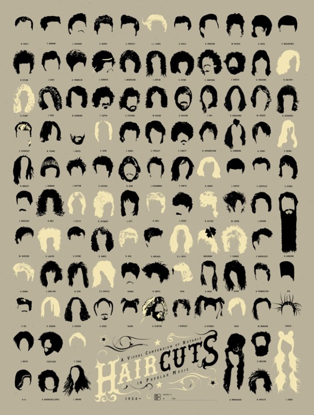
A Visual Compendium of Notable Haircuts in Popular Music from Pop Chart Lab has a look at, well, haircuts. Lots of long hair and sideburns.
From the pompadour to the moptop to the metal mane to whatever it is Lady Gaga has atop her head, here is a history of popular music as told through the notable haircuts on this signed, limited edition print.
If you pre-order a print by this weekend, you get 20 percent off.
See also Beatles hair history, trustworthiness of beards, and typographic moustaches.
[Pop Chart Lab via Laughing Squid]
-
There is so much data available and new data released every day, but not all of it is that interesting. Some is spotty and some doesn’t make sense. However, there is also a lot of exciting data to play with. Have you come across any datasets or sources that you think would be great to see and explore visually?
-
Mozilla tech evangelist Paul Rouget has a go at Internet Explorer 9 in a series of simple graphs, comparing it to Firefox 4. I think Rouget doesn’t like IE9. Not sure though.
The obvious progression of this series is to compare Firefox 4 to Chrome and Safari. I await the results.
-
Greg Ross highlights an old school graphic from The Strand Magazine, published in 1906. Authors are sized by how much the public read his or her work at the time.
The giant is Dickens, followed by Thackeray and the now largely forgotten Hall Caine. Lesser mortals, left to right, are Thomas Hardy, Mary Elizabeth Braddon, Marie Corelli, Rudyard Kipling, Mary Augusta Ward, J.M. Barrie, Arthur Conan Doyle, Stanley Weyman, Robert Louis Stevenson, Walter Scott, Henry James, Charlotte Brontë, George Meredith, Anthony Trollope, Charles Kingsley, Edward Bulwer-Lytton, Israel Zangwill, Charles Reade, and E.F. Benson.
I’m guessing that the drawing is subjective, or did they have data on book sales back then?
[Futility Closet | Thanks, Craig]
-
You know those compressed movie barcodes that we saw last week? Here’s a Python script by Benoît Romito to make your own. Run a .avi format movie through, and voila. Free gift idea: digitize some old home movies and make a personalized barcode for your family.
-
The Web is a game of pageviews, and outlets such as Twitter and Facebook are a way to rack up the counts. The more people who share your posts and articles, the more new people that visit your site. So what kind of articles are shared more often? How do people with interact with these articles? Yahoo! research scientist Yury Lifshits digs into Facebook likes for some ideas, using data collected from 45 sites, 100k+ articles, and 40 million reactions, between October 2010 and January 2011.
Read More -
 The Society for News Design announced the winners of their annual digital competition. The New York Times, an obvious frontrunner, took home the Gold Award and Best in Show for their coverage of the Haiti Earthquake, as well as a bunch of other awards. USA Today and The Washington Post also earned some nods, but big congrats to the NYT graphics and multimedia desks.
 -
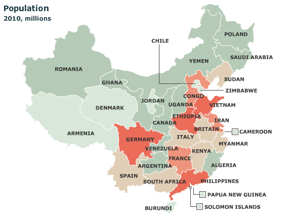
It’s easy to forget just how big some countries are. For example, China:
China is now the world’s second-biggest economy, but some of its provinces by themselves would rank fairly high in the global league. Our map shows the nearest equivalent country. For example, Guangdong’s GDP (at market exchange rates) is almost as big as Indonesia’s; the output of both Jiangsu and Shandong exceeds Switzerland’s.
Select among GDP, GDP per person, population, and exports. There’s a similar interactive for the United States.
[The Economist via Strange Maps | Thanks, Elise]
-
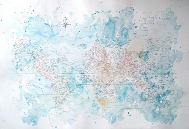
Typographic maps are all the rage these days. Instead of drawing well-defined boundary lines, you substitute words or names, and the landscape shows up on its own. Nancy McCabe’s maps, Charteis Graphein, are the latest addition to the genre. McCabe uses area names—oceans, countries, cities—for the letterpressed maps.
Read More -
Hot off the MIT Sloan Sports Analytics Conference, Sean Gregory argues for more “stats geeks” on the sidelines and in the huddle during the game.
[S]itting next to your team’s manager, a scruffy baseball lifer, in the dugout is not just another scruffy baseball lifer, spitting tobacco. Instead, by his side is a guy with a Ph.D. in theoretical physics, a beautiful mind who can calculate complex probabilities, in real time, in his head. He can tell you the odds of so-and-so throwing such-and-such a pitch to so-and-so on such-and-such a count.
It’s a fluffy article with not much on what the stat person would actually do, so you’ll have to imagine. Honestly, I hope sports statistics doesn’t come to that though. Unpredictability is what makes games so fun to watch.
[Time via @amstatnews]
-
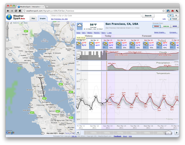
You know Matthew Ericson’s simple weather mashup? It shows only what you need to know for the day. WeatherSpark is the the opposite of that.
Read More -
 The World’s Billionaires — Forbes publishes their annual list of the world’s richest people. Four of the top ten are from the US, but the richest man in the world is now Carols Slim Helu (and family) of Mexico.
What if I had bought Apple stock instead? — Apple stock is at about $350 per share right now. If you had invested in Apple instead of buying that Apple PowerBook G3 250 in 1997, you’d have stock valued at $330,563.
Interview with Jer Thorp — PopTech asks the New York Times data artist in residence some questions about his work and what’s in store for the future.
Q&A with me — Visualizing asked me a few questions, and then I answered them.
-
The New York Times maps the reach of the 8.9-magnitude earthquake in Japan. The page will probably be updated as they find out more.
-
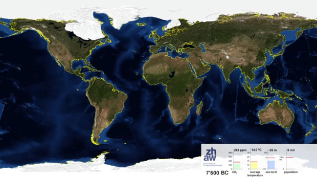
Adrian Meyer and Karl Rege of Zurich University of Applied Sciences visualize the melting poles, starting 21,000 years ago and advancing 1,000 years into the future.
End summer sea ice is shown. The yellow line shows the actual shoreline. The future projection is based on the assumption of complete cessation of carbon dioxide emissions in 2100 (IPCC A2). Because world population is rather uncertain we froze to its current value.
Check out the video below. Adding some speed could’ve made it more dramatic, but wow.
Read More -
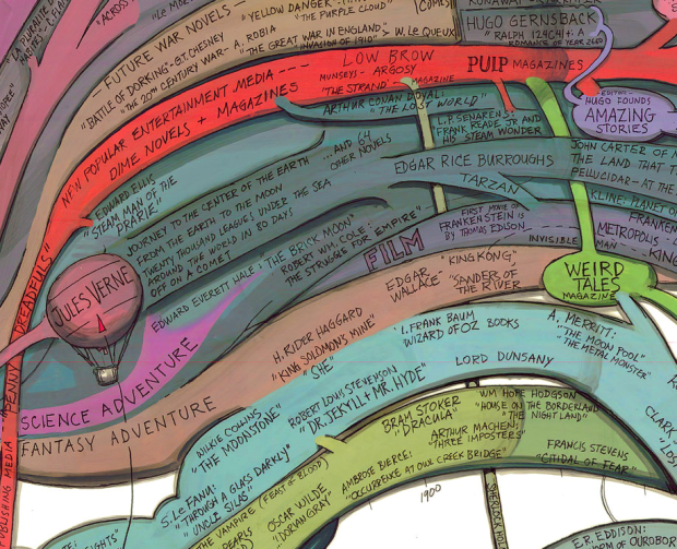
Artist Ward Shelley maps the history of science fiction in painstaking detail. See the way big version here. Accurate?
[Boing Boing via @brianboyer]
-
As we know, browsers keep getting better, and it grows easier every day to visualize data native in the browser, when you used to have to use Flash. In the early goings, the JavaScript visualization libraries felt clunky to their Flash counterparts, but the roles are changing. There’s Protovis, Polymaps, and Processing.js that help you make full use of modern browsers’ functionality.
Mike Bostock, who had a big hand in those first two, recently made Data-Driven Documents, or D3 for short, available to play with.
Read More -
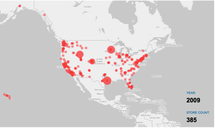
Costco is one of the best stores ever. It’s got everything you need in gigantic volumes and more, so you can imagine my delight when I stumbled on some store openings data I downloaded from Locations Complete a while back. Kind of the same feeling you get when you put on a jacket and find a twenty-dollar bill in the pocket.
I of course had to put the data into a growth map to watch how one of my favorite stores has grown since its first one a few decades ago. It’s not as wild as the Wal-Mart growth, which has thousands of locations, but it’s still fun to watch. Wal-Mart started in Arkansas and then spread outwards. In contrast, Costco, which has just over 400 locations (in the US), has focused on the coasts and has just started opening locations more inland.
Read More -
 I finally got a chance to take a closer look at O’Reilly’s most recent edition to their “Beautiful” series, Beautiful Visualization: Looking at Data through the Eyes of Experts, and it’s a good one. In case you’re not familiar, each book in the series is a collection of essays from people who work in the field. Essays range in topic, but they usually focus on a single project and discuss the steps it took to make said project. To be clear, Beautiful Visualization isn’t a how-to book, although you can learn a lot from the writings.
Read More








 Visualize This: The FlowingData Guide to Design, Visualization, and Statistics
