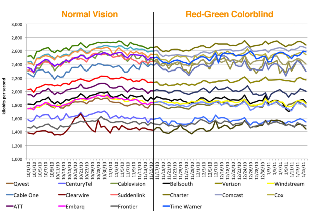
In regards to a performance chart posted by Netflix, Andy Baio, who along with around 7 percent of men, is colorblind, explains why it’s so hard to read the chart. “When doing the right thing is this easy, it’s really disturbing when it’s dismissed as a waste of time.”
[Waxy]
 Visualize This: The FlowingData Guide to Design, Visualization, and Statistics (2nd Edition)
No disrespect intended, but how is adjusting for colorblindness in this case “easy?” I’m *not* colorblind – quite the opposite, really – and I still had to constantly refer back and forth from graph to legend to figure out which line belonged to which ISP.
Which plugins exist for Adobe is frankly irrelevant since the presence of even the world’s simplest-to-use add-on for a >$500 application is about as “accessible” as the dark side of the moon. Are there no color-blind people on the GIMP project?
I bet 7% of the GIMP developers are colour blind.
Open Gimp, goto View->Display Filters->Colour Deficient Vision and play with it. :)
Or use Colour->Retinex Image Enhancement to improve the visibility of your image.
DataShade, it’s funny that you ask this after apparently clicking on the link and reading Andy Baio’s post.
Adjusting for colorblindness in this case is easy by applying one or both of the solutions that Andy provided. You seem to think that the second solution is not easy. Fine, try the first solution, which also addresses your complaint about constantly referring back and forth from the graph to the legend. Double win!
People interested in colorblind-safe schemes may want to take a look at Colorbrewer:
http://colorbrewer2.org/
It’s meant for maps but it works like a charm for graphs as well.
Agreed its still difficult to make out which line is which to a non colour blind person. This problem is something I have to take note of every time I produce a graphic (not always 100% successful!), to help me I use a little app called Sim Daltonism
It is a very poor design overall, being colorblind takes it to simply impossible to read!
oops. Its too early in the morning for actual sentences – correction: ‘being colorblind makes it impossible to read’
Colorblind or not, this one is very hard to read.
I’ve used this webpage before to check my graphs before handing to my color-blind advisor!
http://www.vischeck.com/
I saw this on reddit. Makes this data set considerably more readable for me.
http://www.parseerror.com/vis/netflix-isp-2011-01/
Much better. There is no trending behavior in the data that we need a timeline for, and the box plot removes any reliance on color.
Not sure about print versions, but any online version should support mouse-over information identifying the data sets. This makes color much less of an issue.