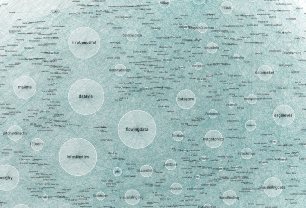
There are lots of people on Twitter who talk visualization. Moritz Stefaner had some fun with Gephi for a view of a whole lot of those people. He calls it the Vizosphere.
Read More
There are lots of people on Twitter who talk visualization. Moritz Stefaner had some fun with Gephi for a view of a whole lot of those people. He calls it the Vizosphere.
Read More

There are many brands on Twitter that exist to uphold an image of the company they represent. As consumers, we can communicate with these accounts, voicing praise or displeasure (usually the latter). Using a simple sentiment classifier1, I scored feelings towards major brands from 0 (horrible) to 100 (excellent) once a day for five days.
The above for example, shows scores for Netflix, Hulu, and Redbox. Netflix had the lowest scores, whereas Redbox had the highest. I suspect Netflix started low with people still upset over the price hike, but it got better the next couple of days. Then on Saturday, there was a score drop, which I’m guessing was from their downtime for most of Saturday. Hulu and Redbox, on the other hand, held more steady scores.
Read More
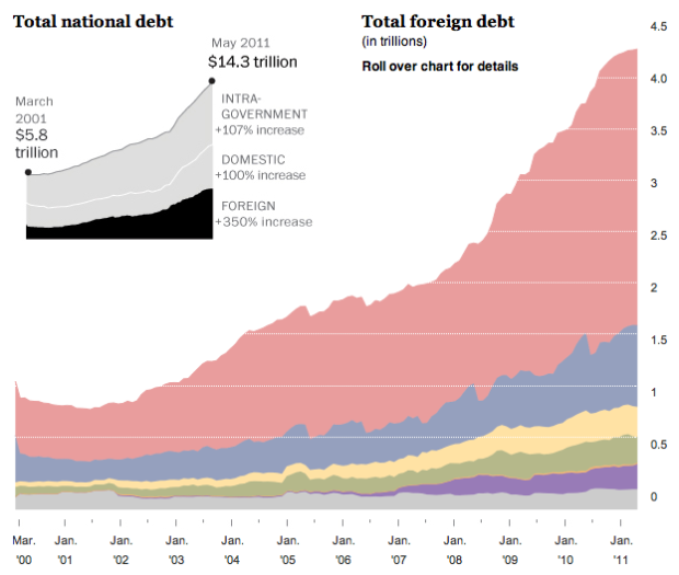
In May 2011, the United States owned $14.3 trillion in debt. A lot of that is money is owed to other countries. Heather Billings and Todd Lindeman of The Washington Post break foreign debt down by continent and then by country.
Read More

The phrase “you are what you eat” usually refers to health and weight, but the food in your fridge can say a lot about who you are, what you do, and where you’re from. Photographer Mark Menjivar used this premise in his series You Are What You Eat.
Read More
Poop. Doo doo. Crap. Shit. Oddly enough these are the first words of the Gates Foundation’s new informational video on reinventing the toilet. Learn about the toilet revolution and how to turn crap into valuable crap.
[Video Link | Thanks, Nigel]

Remember when Joshua Koffman was posting pictures of the guy who had this stolen Macbook? That was oddly fascinating, even if it was peeking in on a pretty mundane day-to-day. Brian House, who works at The New York Times R&D lab, did something similar sentiment but different approach.
Read More
BBC Radio 5Live has a new podcast up: Looking at ourselves. The first half takes a trip to the London Transport Museum, and in the second, I chat with Jamillah Knowles about visualization, data, and the book. Download the full podcast here. It’s weird how you sound completely different in real life from what you sound like in your head.
Last week I announced the release of Visualize This: The FlowingData Guide to Design, Visualization, and Statistics, and I have to admit: I was addicted to the listing on Amazon, which shows sales rank, that day. At its peak, it broke the Amazon overall top 100, all the way up to #77. Of course the dust has settled, but it’s still been doing well. I can’t thank you all enough for the support.
Read More
It’s easy to share static graphics. Save an image and then upload it to your own site. Boom, you’re done. However, when it comes to interactive graphics, which come in a variety of file formats, it’s not as straightforward. The Visualizing Player helps with this:
We love and respect what you create and we know how much effort goes into each piece (it’s why everything that gets uploaded to Visualizing is protected under a CC license). One of our core missions here at Visualizing is to build you the best possible platform and the most powerful tools for sharing those creations.
Now when you go to Visualizing, there’s an embed code accompanied with each graphic, and it’s easy to share any visualization on your own blog or site. The embed works for 7 formats: HTML5, Java, Flash, PDF, Video, Image, and URL.
Read More
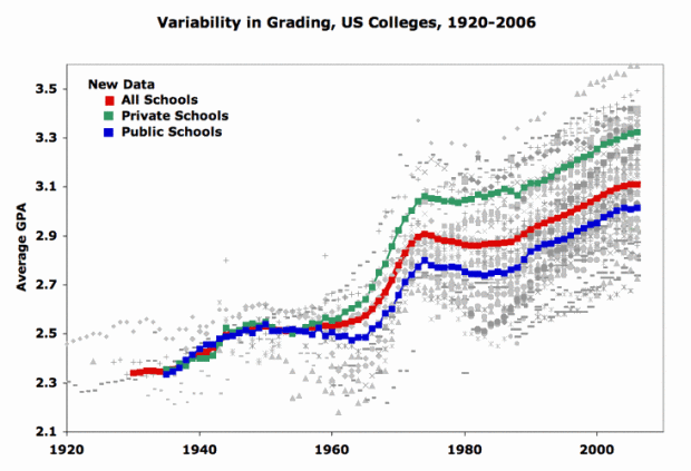
It’s a given that some colleges and programs give more A’s than others, but according to data collected by Stuart Rojstaczer from about 230 schools, it seems that average GPAs have been increasing overall.
Read More
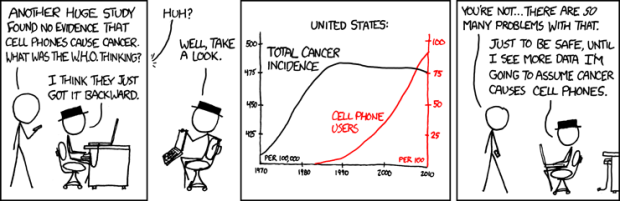
xkcd pokes fun at correlation and causation again. Funny every time.
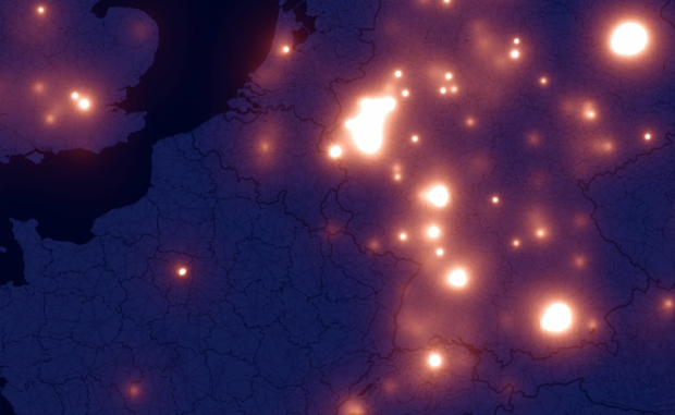
A few months ago there was a lot of hoopla around the iPhone and the recording of your location. Crowdflow wants to take advantage of this opportunity to build an open database of location traces that people can use for research. Using their existing data so far, from 880 phones, Michael Kreil of Crowdflow mapped people moving around in Europe (in Germany for the most part). The results are beautiful.
Read More
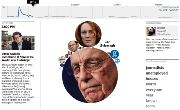
All kinds of crazy with News of the World went down this past week, and of course Twitter was abuzz with each development. Taking a page from the Stamen book, the Guardian looked at half a million tweets with the #notw hashtag and show you how the news unfolded.
The best part of the interactive is that there’s plenty of context to help you follow along as bubbles shrink and explode. On the bottom left are Guardian articles covering important events, the top right is the most retweeted tweet, and then you have the most frequently used words on the bottom right.
So if you weren’t following the story that closely, the graphic helps you understand in a hurry. At any given time, you know who’s involved, what happened, and what others were talking about.
[The Guardian | Thanks, Alastair]
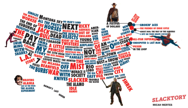
If you have Netflix, you know that there’s a section for local favorites, and it can change quite a bit depending on where you live. After moving a few times in the past couple of years, I’ve definitely seen local favorites that seem to reflect the culture or majority demographic in a city. Slacktory used this simple idea and looked up favorites in each state. The map above is the result.
There are quite a few amusing stereotypes in there, although I’m not sure what’s going on with a few of them. Beverly Hills Chi Hua Hua in Mississippi… Kindergarten Cop… A Little Princess?
What’s a Netflix favorite in your area?
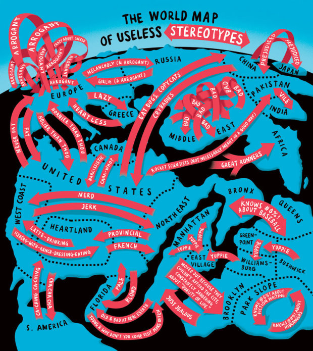
We saw Europe in the eyes of different countries a while back. Christoph Niemann, for The New York Times, runs with the idea and made this handy world map of stereotypes. My favorite is the arrogant arrows in Europe. True?
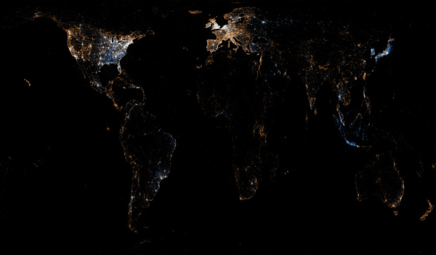
A while back we saw the history of the world according to Wikipedia. Erik Zachte, a data analyst
at the Wikimedia Foundation, takes it from the angle of those who are actually editing Wikipedia. The animated map shows edits from a single day (May 10, 2011, to be exact) when there were nearly 370,000 edits from around the world.
Read More
![]() If you’re like me, you’ve probably used Wikipedia at least once in the past week (or day… or hour). It’s had a huge impact on how we find information and keep history up-to-date. The online encyclopedia turned 10 this year, and to celebrate, WikiSym and the Wikimedia foundation recently launched a challenge: WikiViz 2011.
If you’re like me, you’ve probably used Wikipedia at least once in the past week (or day… or hour). It’s had a huge impact on how we find information and keep history up-to-date. The online encyclopedia turned 10 this year, and to celebrate, WikiSym and the Wikimedia foundation recently launched a challenge: WikiViz 2011.
WikiViz 2011 is about visualizing the impact of Wikipedia. We want to see the most effective, compelling and creative data-driven visualizations of how Wikipedia impacted the world with its content, culture and open collaboration model. Potential topics include: the imprint of Wikipedia on knowledge sharing and access to information; its impact on literacy and education, journalism and research; on the functioning of scientific and cultural organizations and businesses, as well as the daily life of individuals around the world.
There are lots of small datasets within Wikipedia articles, but Wikipedia itself is also one giant (open) dataset. For example, we’ve seen the history of the world according to tagged events as well as back and forth discussions for deletion.
Can you find something good? Judged by Moritz Stefaner, Andrew Vande Moere, and Kim Rees, among others, winners get to attend WikiSym on the house and of course get a mention or two.
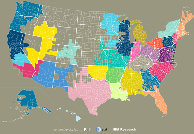
We often think of communities in the framework of government-set boundaries, but relationships can exist across states and counties. In a collaboration between researchers from AT&T Labs Research, IBM Research, and MIT SENSEable City Laboratory, these relationships are revealed through an analysis of SMS and call data.
Read More
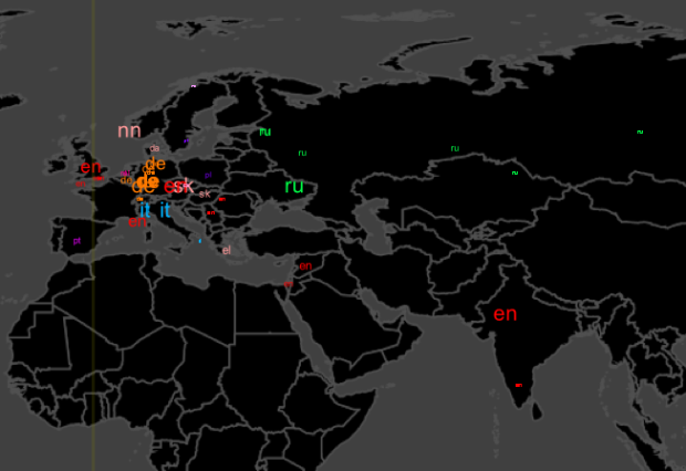
For all the maps by Eric Fischer I’ve posted, it’s amazing how little I actually know about him, but in his most recent series, See Something or Say Something, he places geocoded tweets and Flickr photos on the same map. Blue dots represent tweets with location and orange dots are Flickr photos. White dots are locations with both.
Read More
 Visualize This: The FlowingData Guide to Design, Visualization, and Statistics (2nd Edition)
New tools, refined process.


