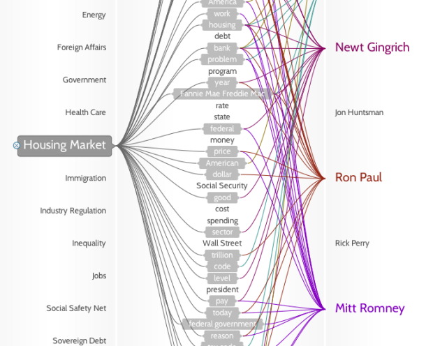
• I feel like I’ve been seeing and writing a lot about artistic visualization lately. Maybe it’s because summer’s ending and all the designers are finishing up their side projects. I dunno. In any case, Brendan Dawes provides you with a way to explore the news by doodling and scribbling. The piece is called DoodleBuzz. Type in a search term and then start doodling. News results (via the Daylife API) shoot off whatever path you draw.

    DoodleBuzz spawned from Brendan’s desire to browse the news in a way that was completely different from the usual top-down scrolling we’re used to seeing on the Web:

    DoodleBuzz was born out of an idea to create an entirely new way of exploring information – one that allows for a kind of “quiet chaos” that gives people the opportunity to explore unthought of paths and connections along their news gathering journey. You may start at Iraq but end up finishing on Britney, whilst taking in The Catholic Church, Global Warming and 50 Cent.

    I don’t know about you, but the “quiet chaos” gave me a small headache. What do you think? Go try it and let us know what you think in the comments.

    [via Data Mining]

  • PhD Comics has grown to be my favorite comic of the moment. It’s unbelievable how much I relate to all of it. I am not alone. Anyways, have you registered to vote yet? If not, get on it!

  • It’s hard to believe that it’s been almost a year since I was in Madrid at the Medialab-Prado for the Visualizar workshop. It was a two-week event where designers from all around got together and created projects focused on data. There was a wide variety of data-centric projects on Twitter, email, art, spam, and traffic (above). I worked with migration data. It was also a pretty diverse group – computer science, graphic design, and of course, me, the token statistician.

    Call for Projects and Papers

    Now it’s time for Visualizar 2008: Database City. There’s an open call for projects and papers with the idea of a database city. Imagine a city where there are displays that show energy consumption, pollution, or carbon footprint. What would that city look like? Would we act differently with that type of information right in front of us?

    From the Visualizar page:

    Urban environments, which are becoming increasingly dense, complex and diverse, are one of contemporary society’s largest “databases”, daily generating volumes of information that require new methods of analysis and understanding.

    How can we use the data visualization and information design resources to understand the processes governing contemporary cities and better manage them? What can we learn from studying traffic and pedestrian movement flows through the streets of Madrid? What would happen if we filled the streets with screens providing information updated each moment about water and electricity consumption?

    Important Dates

    This year’s workshop is also two weeks long from November 5 – 18 and no doubt you will learn a lot. The Medialab-Prado offers housing to participants at a youth hostel and will also consider covering traveling expenses on a case-by-case basis. Submission deadline is October 5.

  • Glenn Marshall has released his finished version of Metamorphosis, a beautiful piece of computer generative art programmed in Processing. I wish I knew a bit more about what I was seeing, but I can only guess that the branches and butterflies follow certain laws of nature and rules defined by the music (I hope). Nevertheless, it’s beautiful. Here’s the video below, but go to Vimeo to watch the video in all it’s HD glory.
    Read More

  • I’m headed to Chicago next week for Wired Magazine’s NextFest, “a premier showcase of the global innovations transforming our world.” So if you happen to be there, come find me and what I’ve been busy working on the past few weeks – the Personal Environmental Impact Report – or PEIR for short.

    Guest Post on FlowingData

    I’ll most likely be blogging and twittering the event, but what better time to get some different points of view from all of you? If you’d like to write a guest post, just email me your writeup by the end of this weekend with text (and images if you have them). I can’t guarantee I’ll put it up, but there’s a good chance I will. Last time I asked for guest posts, I put up all of them.

    What I’m Not Looking For

    I’m pretty open to any ideas related to data, statistics, and visualization. What I’m not interested in is self-promoting posts. It’s OK if you link to something, but it should be relevant. Plus, I’ll link to you anyways at the beginning of your guest post. Your content also has to be original – so no posts that you’ve already published on your own blog or somewhere else.

    Yup, that’s it. So if you’ve got something cool to talk about, send it my way. I’m looking forward to all of your interesting submissions.

  • The Interface Design Team at the University of Potsdam revealed maeve last week. It’s an installation that lets users place physical project cards on an interactive surface and see the relationships between those projects. Move cards over the surface and the network relationships (e.g. inspired by, social relation) follow. The more cards that you throw on, the more relationships that form.

    Here’s the demo video:

    Pretty. I would love to have one of these as my coffee table (sort of like the Microsoft one).

    [Thanks, Moritz]

  • Gotta love Fridays. Have a good weekend everyone. Go have yourself a slice of pie.

    [via Zoomdoggle | Thanks, Canna]

  • As promised, it’s time for a FlowingData contest. To the winner goes The Numerati by Stephen Baker, a book about how data play a huge role in our future. Indeed, it does. Stephen also keeps an interesting blog, and I encourage you to check it out.

    How to Win a Free Book

    It’s easy. Write a caption for the above graph and leave it in the comments below. Whoever comes up with the best caption by the end of 11:59pm on Sunday wins. By best, I mean whichever I find the most amusing or clever. For example – “drunkeness vs stupidity” or “The more I eat per day the fatter I will get.” You get the idea. I’m sure you all can come up with something much better.

    I’m making it one entry per person, so make it a good one, and make sure you use a valid email so that I can contact you if you win.

    Good luck! I’m looking forward to what you all come up with.

  • I’m pleased to welcome Tableau Software as FlowingData’s newest sponsor. I know that a lot of you already use Tableau for your data visualization and analysis needs, but for those of you who haven’t heard of it, Tableau is a tool that aims to make “databases and spreadsheets understandable to ordinary people” with an emphasis on statistical visualization and visual analysis.

    One of the co-founders is actually one of the founding members of Pixar, believe it or not. I don’t know about you, but that has awesome written all over it. Check it out for yourself and sharpen your visualization skills (hint) for the next FlowingData deconstruct/reconstruct project. Thanks, Tableau!

  • Dynamical systems are mathematical models used to describe the time-dependent position of a point’s position in ambient space. For example, a dynamical system could be used to describe the movement of a swinging pendulum. The way the pendulum moves is based on the laws of physics, but trajectory, velocity, acceleration, etc changes over time. Over at the University of Liverpool is a series of visualizations by mathematicians around the world that shows such dynamical systems.

    Lasse Rempe, a mathematician, describes the beauty of these visualization in this video on the BBC. Many more beautiful pieces in the video and explanation of the underlying structures.

  • Taking after Map of the Market, the New York Times uses tree maps to show a year of heavy losses by major companies. It’s a pretty sad state of affairs. Content aside though, this is certainly one of the reasons the Times is so popular among the infographics crowd. Data visualization isn’t just bar graphs and time series plots.
    Read More

  • This pseudo-map graphic from The New York Times shows how consumers in different countries spend their money. Squares represent selected countries and are sized and colored according to spending in 2007. As you might expect, the United States does some heavy spending on clothing and footwear.

    Does the graphic remind you of anything? The Times put up a different pseudo-map in force-directed graph format for the olympic medals. What do you prefer – pseudo-map or traditional?

  • This stream of consciousness video (below) from Current is complete with animated infographics and some lovely narration. I have no idea why the video was made or if there was a story behind where the video came from. However, I do know that the narrator’s voice is both reassuring and soothing, and I am ten times smarter after watching it.
    Read More

  • I keep stumbling on rants about how media coverage of presidential candidates is uneven, biased, etc. Everymoment Now provides a way to see what’s going on with the election from the coverage (and sort of statistical) standpoint. From Craig, the developer of Everymoment:

    In order to limit the scope I’ve decided to keep the focus (for now) on the 2008 US general election. It’s a timely, pertinent and, I believe, quite fascinating topic to study under this sort of data visualization lens. When all is said and done, you’ll be able to use this site to look back over the last 100 days leading up to the election and see how the shifts between candidates played out in the media. I think we all have a sense that things may get pretty nasty in the coming weeks. I feel that having a bird’s eye, hindsight view of how things went down, which stories the media focused on and how that ultimately influenced the final outcome will be an invaluable resource.

    Check out spikes in coverage of the candidates or even events and locations. Lots of sparklines and lots of bar graphs very nicely organized.
    Read More

  • Some of you might have noticed that FlowingData has a new sponsor in the sidebar. It’s Eye-Sys, an impressive visualization tool that aims to make complex data easy to understand. It serves a wide variety of data audiences with capabilities in traditional statistical visualization, GIS, and scientific visualization. Eye-Sys sports a drag and drop user interface that lets you hook visualization into data from both text files or databases. No need for programming. There’s a lot of cool stuff in their galleries, so I urge you check them out, if just to look at pretty pictures.

    On another note, keep an eye out for another FlowingData contest in the near future. Thanks, Eye-Sys!

  • Like what you see here? Subscribe to the feed to stay updated on what’s new in data visualization.

    In the not too distant past, the Web was all about sharing, broadcasting, and distribution. The tide is turning. The Web is moving towards the individual. Applications spring up every month that let people track, monitor, and analyze their habits and behaviors in hopes of gaining a better understanding about themselves and their surroundings.

    We saw what data can be recorded in the personal visualization project. Some data lend themselves to easy tracking while others are easier to monitor with the aid of an application. These 23 tools, to track the minutiae of everyday life, try to fill that niche.

    Is it information overflow or are we learning more about ourselves?
    Read More

  • There’s lots of free geographical data about what’s going on at the surface of our planet. It’s a different story for what going on underneath though. OneGeology aims to be the solution to that problem.

    OneGeology is an international initiative of the geological surveys of the world and a flagship project of the ‘International Year of Planet Earth’. Its aim is to create dynamic geological map data of the world available via the web. This will create a focus for accessing geological information for everyone.

    I’ve never been one for the geology, but if the data (and interactive maps) were easily accessible, there certainly would be a peak in interest.

    [via msnbc | Thanks, Samantha]

  • Michael comments, “Onionmap is nothing when compared to this Chinese site…They’ve practically mapped out the entire Shanghai (and quite a few other China cities) in a SimCity-like fashion! Amazing stuff!” He’s completely right. Edushi maps Shanghai with great detail. While OnionMap looks like Google Maps with SimCity sprinkles, Edushi is just straight up SimCity.

    Unfortunately my three years of Chinese classes in high school did me no good, and I don’t understand a thing on the site. Maybe someone can translate and let us know what Edushi is all about. Chinese CitySearch?

    [Thanks, Michael]

  • Like what you see here? Subscribe to the feed to stay updated on what’s new in data visualization.

    Last week was the end of our FlowingData personal visualization project. I asked readers to collect data about themselves or their surroundings and then visualize it some way. Thank you to everyone who participated. It put a smile on my face every time I got an email with “summer project” in the subject line :).
    Read More

  • Skyrails is an interactive graph visualization system that looks a lot like a video game. Explore relationships, visit nodes, and immerse yourself in the data. As I watch the demo video on YouTube, I feel like I’m seeing another world.

    You’ve got the standard ball and stick view. Whether it’s useful for analysis or deeper understanding of relationships between whatever is up for debate, but one thing’s for sure – it looks cool. Plus the code is open source.

    [Thanks, Atilla]