
Here is the good stuff for December in the last roundup for 2023.
Here is the good stuff for December in the last roundup for 2023.

Recharge, an art installation by Dries Depoorter, uses a system that detects when you close your eyes. Recharge yourself and your phone gets to also.
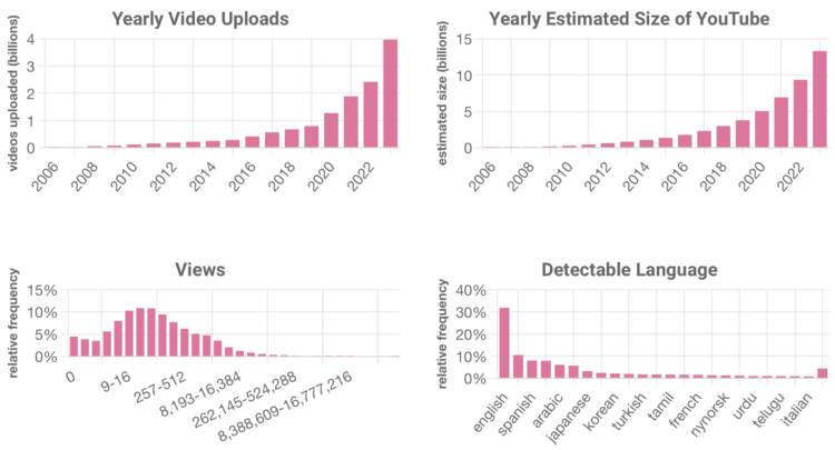
YouTube doesn’t offer numbers for how big they are, so Ethan Zuckerman and Jason Baumgartner estimated the size using a method they equate to drunk dialing.
Consider drunk dialing again. Let’s assume you only dial numbers in the 413 area code: 413-000-0000 through 413-999-9999. That’s 10,000,000 possible numbers. If one in 100 phone calls connect, you can estimate that 100,000 people have numbers in the 413 area code. In our case, our drunk dials tried roughly 32k numbers at the same time, and we got a “hit” every 50,000 times or so. Our current estimate for the size of YouTube is 13.325 billion videos – we are now updating this number every few weeks at tubestats.org.
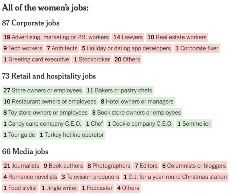
NYT’s The Upshot looked at 424 holiday movies released by the Hallmark and Lifetime networks since 2017. Like most forms of entertainment, the movies look identical from a zoomed out view. There’s a protagonist female who feels lost, finds her way and love in the process.
Get in closer and you see the nuances. Sometimes a couple has to save a candy shop instead of a bakery.
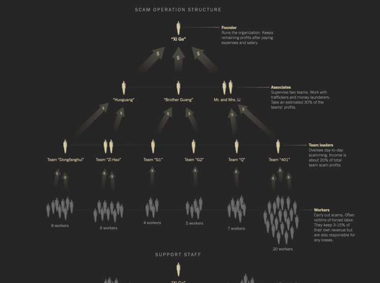
Neo Lu was scammed into a labor camp. In an effort to escape and expose the operation, he began to send information to The New York Times from within.
Mr. Lu said he pleaded to be freed, but his captors refused. They put him to work as an accountant, and over months he tracked millions of dollars in illicit income and managed their day-to-day expenses.
While he was still inside the camp, Mr. Lu contacted The New York Times. He sent hundreds of pages of financial records and photos and videos of the site, hoping to expose the operation at some point.
I was probably slack jawed most of the time while reading this. The graphics and photos about the inner workings and how the scam works, dubbed “pig butchering,” move the story forward.
Here are some fun things to make with data in case you’re looking for a chart-ish distraction.
Kurzgesagt illustrates the scale of the tiniest of things and the biggest of things by zooming in and out, but unlike videos before, they focus on human scale by comparing everything against it at each step.
[arve url=”https://www.youtube.com/watch?v=Z_1Q0XB4X0Y” /]
You’ve probably seen the Powers of Ten, which demonstrates the scale of things by zooming farther and farther away from the universe and then back in to the microscopic level.
However, once people fall out of view, you lose a sense of magnitude. It’s just this is really big and that is really small. With focus on the individual, the Kurzgesagt rendition keeps the scale close as if you’re standing right next to it instead of traveling to an unreachable place.
For Retool, Glenn Fleishman looks back to a time when data on the internet flowed more freely and you were able to direct the streams with a click-and-drag tool called Pipes for Yahoo!
With Pipes, any user could create entries for any number of data sources. While RSS was key, Pipes also let users grab other data and feed formats, like Atom, RDF (incorporated into RSS 2.0), and CSV (comma-separated values, a simple database and spreadsheet export format).
Pipes gave visibility into internal Yahoo sites and services, particularly Flickr, and eventually supported Yahoo Query Language (YQL), a project designed for interoperable in-house and third-party scripting across all of the company’s offerings. With a little elbow grease, you could even retrieve a web page and filter it for specific data.
The Microsoft Excel World Championship 2023 wrapped a couple weeks ago, and the three-hour final that was streamed is available for your viewing pleasure.
[arve url=”https://www.youtube.com/watch?v=UDGdPE_C9u8″ /]
I know I should be focused on the clicking and dragging and the hot keys, but it’s all about the commentary for me. I watched in fascination, like watching competitive tag on ESPN8.
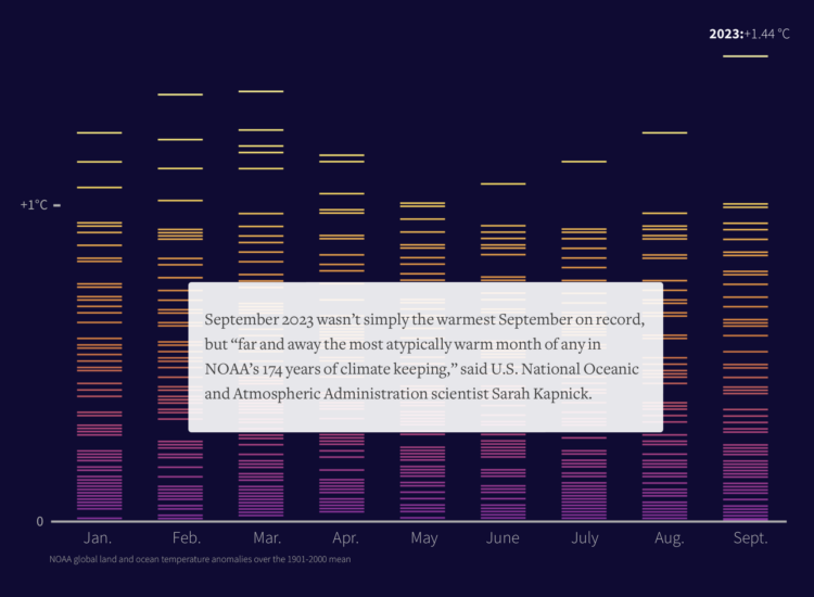
This year, 2023, was the hottest year on record. For Reuters, Gloria Dickie, Travis Hartman and Clare Trainor highlight the rising temperatures and the bad stuff that follows.
This year’s added warming has been like pouring gasoline on a fire. Extremes became more extreme. Warmer ocean waters fed stronger storms. Heatwaves persisted for weeks instead of days. And wildfires, feeding on dry forests and high temperatures, burned out of control.
An El Nino climate pattern, which emerged in the Eastern Pacific in June, is making things worse, scientists said. It’s boosting the warming caused by climate change, unleashing more catastrophic extremes.
Temperature extremes are still worth highlighting, but there are only so many ways to show an increase over and over again. Maybe someone can make a global warming exhibit that starts at the temperature highs of the 1800s and very quickly increases temperature to current highs. Throw in some VR with storms and wildfires.
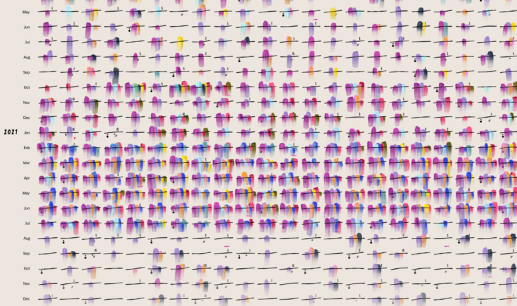
Giorgia Lupi, known for using data visualization to connect real life and numbers, has been dealing with long Covid for the past three years. In a visual guest essay for NYT Opinion, Lupi describes her experience of fear, pain, and hope using a spreadsheet and a diary of brush strokes.
I thought that if I collected enough data, I would eventually figure out what was going wrong. But no matter how much data I collected or how many correlations I tried to draw, answers eluded me. Still, I couldn’t stop tracking. My spreadsheet was the only thing I could control in a life I no longer recognized.
In 2015, Lupi worked on Dear Data, which focused on the little joys of life through visualization-based postcards. This moving piece uses a similar style but is on the opposite end of the emotional spectrum.
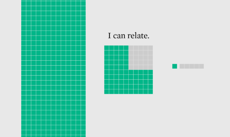
Numbers are challenging to understand for many (most?) people, so it can help to use units of measurement that are relatable to readers to reduce friction between data and clarity.
One million dollars is a lot of money, and for most people, it can seem so far out of reach it might as well be impossible. However, a lot of households have at least that in financial assets, which doesn’t count the value of non-financial assets like a house or car.
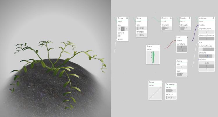
Generate your own plant with Max Richter’s interactive. Adjust leaf shape, density, and curvature. The plane updates in real-time in the browser.
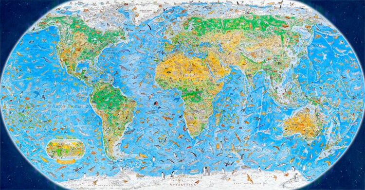
During a three-year span, Anton Thomas illustrated a world map of 1,642 animals native to each region. It’s called Wild World. The New York Times highlighted the work:
“We don’t see the latitude and longitude lines of maps,” he said. “We see the world, in our heads, through icons.”
For Mr. Thomas, this equates to a kind of “emotional geography,” where features with greater emotional heft — the New York City skyline, say, or the Golden Gate Bridge — may take up more space.
“There are animals the sizes of mountain ranges on my map,” he said. “But you know what? The African lion should tower over Kilimanjaro, if we’re drawing an emotional map.”
Prints for Wild World, among other illustrated maps, are available in Thomas’ shop.
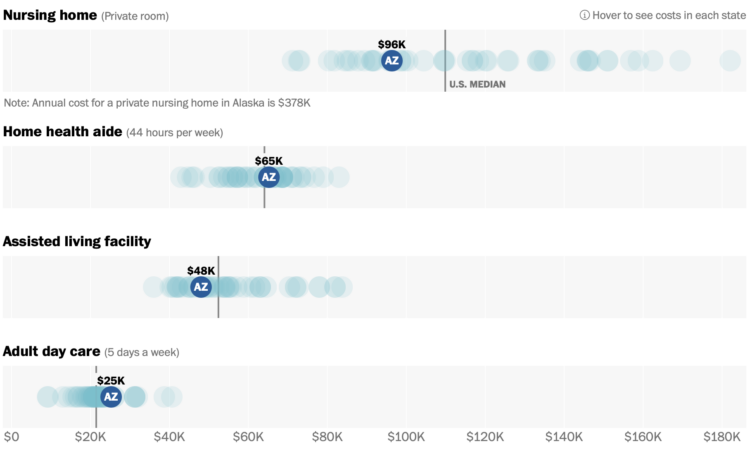
Assisted living can be expensive. For The Washington Post, Bonnie Berkowitz, Lauren Tierney, and Chris Alcantara show the variation in cost by state:
Two-thirds of Americans will need some type of long-term care as they get older, according to federal data, but the price, whether for in-home services, assisted living or a nursing home, can easily cost more per year than the average American makes. Medicare and other health insurers pay little, if any, of the bill.
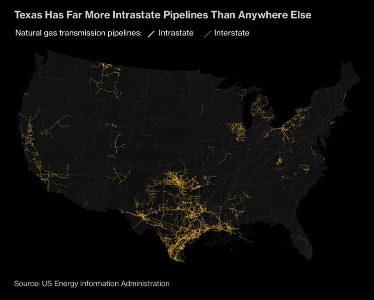
By keeping gas pipelines within the state, companies can avoid federal regulations. This is perhaps good for profits, but it is less of a positive for consumers when the energy companies can increase rates more freely. For Bloomberg, Rachel Adams-Heard, Naureen Malik, and Jeremy C.F. Lin have the maps and charts to show what this means in Texas, which has the most intrastate pipeline in the country.
Income tends to increase with age, because more work experience and education tends to lead to higher paying jobs. However, young people can also earn higher incomes. Using data from the most recent 2022 American Community Survey, let’s see what those people studied and what they do for a living.
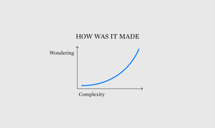
One of the best ways to learn how to visualize data is to recreate a chart, but sometimes it’s unclear how that chart got made. What tool was used? What are the steps to make the chart with your own tools?
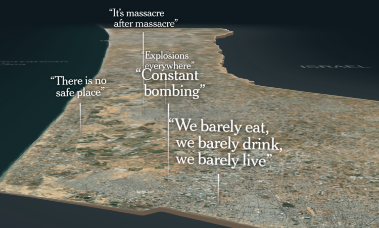
The New York Times put together an image of what life is like in Gaza right now: bombing, death, food and water shortage, and limited medical supplies. A 3-D basemap of the Gaza Strip sets the foundation of the story and layers of individual stories and overall destruction display on top.


 Visualize This: The FlowingData Guide to Design, Visualization, and Statistics
Available now.