Visualization tends towards familiarity and convenience, which is useful for getting things done and reading data quickly. But the familiar is also less fun and can be stifling.
Visualization tends towards familiarity and convenience, which is useful for getting things done and reading data quickly. But the familiar is also less fun and can be stifling.
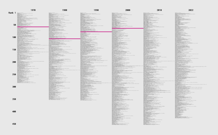
Job types changed over the years, because there were these things called computers that created occupations and shifted others. How did income change for different jobs, relative to everyone else? Use this chart to see how occupations ranked over the decades.
![]() I talked to Cole Nussbaumer Knaflic about my early motivations, FD origins, the new book, how I work, and data things. Listen to the episode here.
I talked to Cole Nussbaumer Knaflic about my early motivations, FD origins, the new book, how I work, and data things. Listen to the episode here.
Cole, who runs storytelling with data, came around not long after FD. Although she has a team now, I count Cole as one of the few long-term, independent visualization folks. It was fun to finally get to chat.
Stamen, whose design breakdowns I always appreciate, discusses why they took a different route to to show the uncertainty of wind speeds:
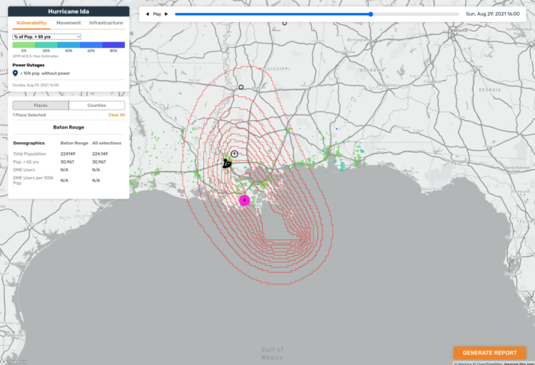
Wind speed probability data shows you the likelihood of sustained wind speeds that denote a category 1 hurricane (74+ mph). The way the data appears on a map is through concentric polygons that denote progressively less likely areas to experience a category 1 hurricane. We had bands showing the breakdown by 10%, but felt that given how much other data we needed to show, paring back the number of circles would be best. We ultimately decided on showing 90%, 50%, and 10% chance areas of category 1 hurricane. The team, and our stakeholders, agreed that this way of showing hurricane forecasting was far more precise than the cone of uncertainty. Wind speed probability data shows specific degrees of hurricane likelihood compared to only emphasizing one area like with the cone. Put simply, the cone of uncertainty tries to do too much at the cost of specificity.
See also: the challenges in reading the more common cone of uncertainty.

Ren Yuan visualized the GitHub commit history for the PyTorch library. The virtual rendering shows commits flying towards a repository with events sonified over time.
I wish this was a physical installation or could be experienced in VR. That would be fun.
Find Yuan’s other experiments with visualization and sonification on his site or his more frequently updated X feed. They will get the ol’ imagination going.
During the Dallas Stars away games during this year’s NHL playoffs, fans could attend watch parties at the home arena. The team used projectors and player tracking to show movements on the ice in real-time.
They should’ve used a colorblind-safe palette to differentiate the two teams instead of red and green. But this is a fun use of tracking technology that uses the hockey rink as a plotting space. I guess it brings the away fans closer to the game, too. Now do holograms.
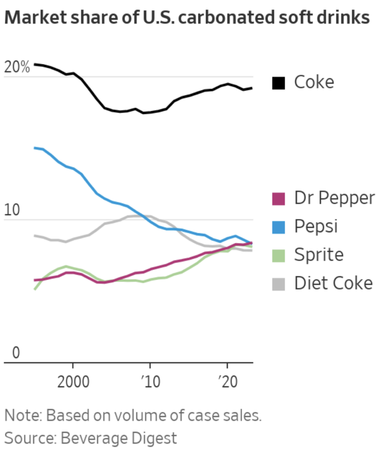
Dr Pepper steadily rose and Pepsi steadily declined over the past couple of decades. Now they’re tied, according to estimates from Beverage Digest. For the Wall Street Journal, Jennifer Maloney reports (Apple News link):
The 139-year-old soda brand is now tied with Pepsi-Cola as the No. 2 carbonated soft drink brand in America behind Coke. The regular versions of Pepsi and Dr Pepper are neck and neck in a spot that Pepsi has held nearly every year for the past four decades, according to sales-volume data from Beverage Digest.
You’ll always be number one in my book, Dr Pepper.
Sometimes the noise in a dataset makes it hard to see the worthwhile patterns when you visualize it. Here are chart options for you.

For NYT, Sam Anderson, with illustrations by Gaia Alari, tells the story of his family dog Walnut. The storytelling and animation format work well to depict the love of a pet.
For some reason, someone started cutting onions while I was reading.

Currently is a prototype ambient display that shows where your energy comes from. The display cycles through a set of radial stacked charts that provide the breakdown over time.
It reminds me of eco-related projects from the late 2000s. I like it.
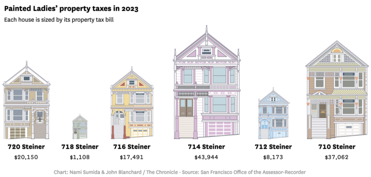
The Painted Ladies houses, which includes the house from the 1990s sitcom Full House, is a set of seven houses in San Francisco. Six of them are basically the same, but the annual property taxes are not. For the San Francisco Chronicle, Nami Sumida shows why through a set of charts and illustrations, using the differences as a way to explain California property taxes.
This is also why I will never move.

A Wheel of Fortune contestant employed strategies outlined in a NYT Upshot analysis and won in the bonus round:
Last December, the Upshot published a guide to Wheel of Fortune strategies, using data from more than 6,000 bonus-round puzzles. Our guide has influenced the behavior of at least one contestant. Scott Menke, a data analyst from New Jersey, won $52,690 in cash and prizes on an episode last month after creating a strategy based on our article, he said.
Data for good.
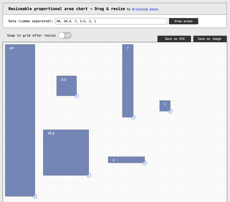
There might be times when you want to visualize data with area, but want to use irregular shapes that aren’t strictly squares. This straightforward tool by Krisztina Szucs lets click-and-drag for custom shapes. Enter values and drag the corners to make longer, shorter, wider, and narrower.

Here’s the good stuff for the month.
![]() I had a chat with Jon Schwabish on The PolicyViz Podcast. We talked about the new book and more generally, how data visualization changed over the past couple decades.
I had a chat with Jon Schwabish on The PolicyViz Podcast. We talked about the new book and more generally, how data visualization changed over the past couple decades.
You also get to hear me realize in real-time that I had not talked about these things out loud in a long while.
I mean it’s great and you should definitely listen. Jon’s podcast has been in my listening queue for years, so it was fun to be in an episode.
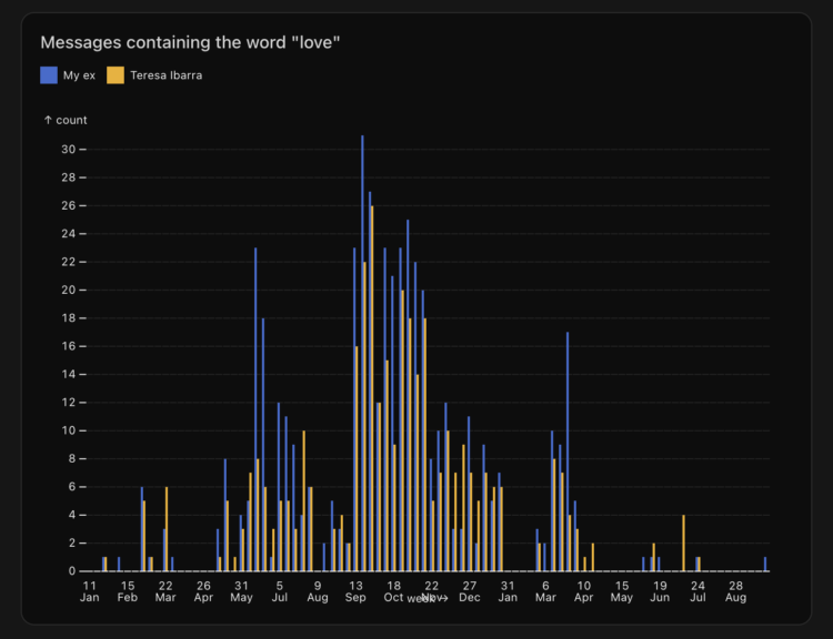
Teresa Ibarra used Facebook Messenger to text with her now ex-boyfriend almost a decade ago. She exported the messages and analyzed keywords and topics used over the one-year relationship.
I can’t say I recommend it — it was surreal and uncomfortable to read through messages from a decade ago. Programmatic analysis can reveal things about yourself, your partner, and your relationship that you may not want to know or accept. It’s also easy to intentionally or unintentionally manipulate data to favor a narrative.
I haven’t taken a statistics or data science course in forever, but I still think every student should have to collect and analyze data about themselves. You automatically get context for every data point because you lived it, so it’s easy to see how data doesn’t always match what happened in real life.
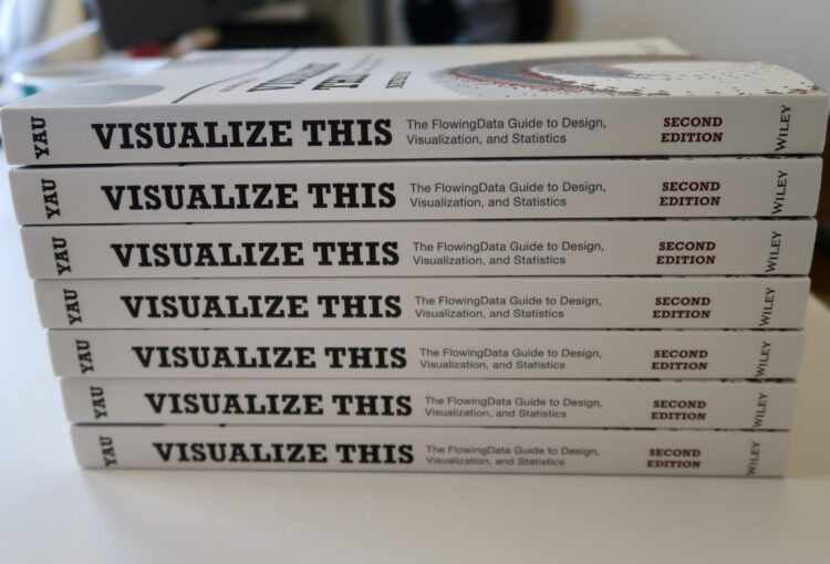
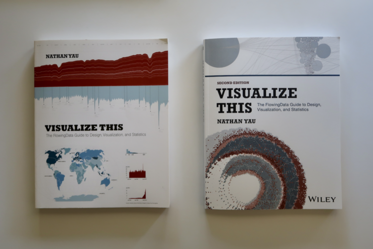
The second edition of Visualize This is published. The book made its way out this past week for those who pre-ordered (thank you!), but you can get a copy right away now.
This is a different book from the original. There is new software, new examples, and new methods that stem from a decade and a half more of visualizing and analyzing data, a polished process, and an evolving visualization field.
The end goal is still to get you making charts right away.
Learn how to ask questions about data, make any chart, and design around insights.
I wrote the first edition of Visualize This in 2010. At the time, visualization was more narrow in what it could and should be. If a chart didn’t tick certain boxes off a list, many dismissed it as garbage. Not very nice.
I wanted a nicer, more approachable book to help develop a reader’s curiosity in visualization and data through fun examples and step-by-step tutorials. Apply the analysis process, code, and design ideas in your work in a concrete way.
It seemed to succeed? Over the years, people whose work I enjoy and shared on FlowingData sent notes to tell me Visualize This was their introduction to visualization. And now it’s their career? Just, wow.
As data grew more common, visualization developed past the bar chart (still a go-to though). New visual forms and uses bubbled up. Data can move. You can interact with it. A beeswarm chart was barely a thing, and now it’s commonplace.
People have small computers in their pockets now. How do we show more on smaller screens? Instead of more pixels or to turn people’s phones and laptops into bricks of fire, you analyze the data, ask questions, and highlight insights. Focus.
Visualize This (2nd ed.) focuses more on this part of the process — making sense of data — which is the main reason FlowingData still exists. (Thanks for sticking with me.) Novelty in visualization will only get you so far.
Of course the visualization tools changed too. The upside of a book that uses current tools with step-by-step examples is that you can easily follow along on your computer. You can see the same thing on your screen as you do in the book.
The downside is when the tools fade or better tools come along to replace the dated ones. The first edition used almost a full chapter on Flash and ActionScript, which were killed off years ago. There was a section that used JavaScript, but it was with the Protovis library, which was the predecessor to the more current D3 library.
My own toolset also grew, which you see in this second edition. Again, I’m not trying to push you towards a specific tool. My goal is to help you decide which tool or subset of tools works best for you.
Visualize This (2nd ed.) covers point-and-click tools, such as Datawrapper, RAWGraphs, and the more general Adobe Illustrator, and also gets you started with R, Python, and HTML/CSS/JavaScript. In between the code and steps is the thought process and reasoning, which you can apply to your own tools and datasets. My thanks to Jan Willem Tulp for jumping on as technical editor to make sure all the software examples worked and made sense.
When I wrote the first edition, FlowingData was only three years old. I was still in school and had a ton of learning ahead of me.
FlowingData is going to be seventeen this year. I finished my PhD, worked with more data, made many more charts, and refined my process. FlowingData became my full-time job.
Along the way, I got married, had kids, saw new things, grew more white hairs, and well, I got older and experienced more.
Visualize This (2nd ed.) reflects how I work now and what I would teach a beginner now. If you want to better understand data, make charts that communicate to people, and produce nice things with real data, then Visualize This (2nd ed.) should help you get there now. Start at the beginning by working with raw datasets and analyzing for insights. Then follow through with finished data graphics.
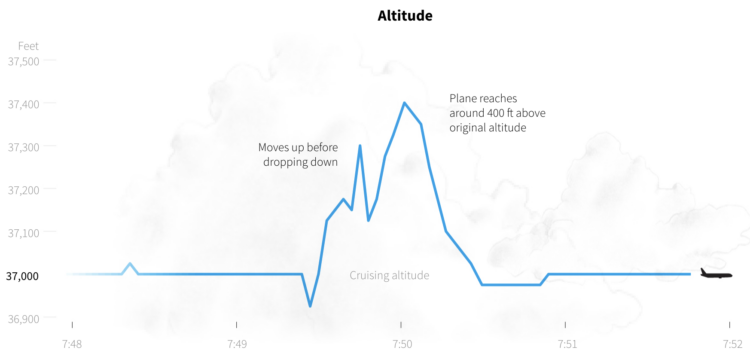
Last week, a Singapore Airlines flight experienced turbulence that led to one person dying of a heart attack. Reuters explains what happened on the flight and more generally, what happens during turbulence.
Turbulence or pockets of disturbed air can have many causes, most obviously the unstable weather patterns that trigger storms, according to an industry briefing by European planemaker Airbus.
The resulting water particles can be detected by weather radar. Crews plan ahead by studying turbulence and other weather forecasts, which have improved over the years, loading extra fuel when needed and monitoring weather radar during flight.
Maybe make people buckle up at all times when seated?
YouGov surveyed 2,000 adults asking them when was the best and worst decades for things like movies, fashion, and the economy. For the Washington Post’s Department of Data, Andrew Van Dam noted that there wasn’t so much a strong lean towards a certain decade as there was a tendency towards people’s age.
I think people just want to go back to a time when there was less to worry about and more freedom, which was late childhood and early teens for most.
In case you need a large dataset to train your chatbot — and who doesn’t these days amirite — WildChat might prove helpful.
The WildChat Dataset is a corpus of 1 million real-world user-ChatGPT interactions, characterized by a wide range of languages and a diversity of user prompts. It was constructed by offering free access to ChatGPT and GPT-4 in exchange for consensual chat history collection. Using this dataset, we finetuned Meta’s Llama-2 and created WildLlama-7b-user-assistant, a chatbot which is able to predict both user prompts and assistant responses.
Beats ripping off Scarlett Johansson dialogue.
 Visualize This: The FlowingData Guide to Design, Visualization, and Statistics (2nd Edition)
New tools, refined process.


