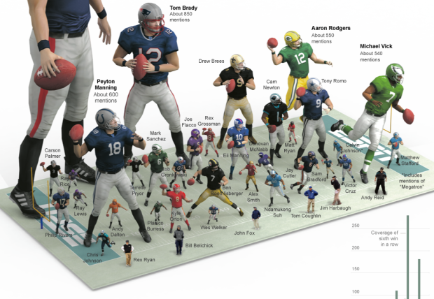
Like something from of a video game, this graphic from The New York Times shows the most mentioned NFL players and coaches this season. Players are scaled approximately by the number of mentions between August 1, 2011 to February 1, 2012 on ESPN’s SportCenter and Sunday NFL Countdown. The giant on the left is Tim Tebow, with 1,450 mentions. Bar graphs on the bottom highlight mentions over time for players of interest.
-
-
Data science has been covered at length during the past couple of years, and we tend to think of it as a field of study just a couple of years older than that. Jeff Hammerbacher and DJ Patil have played roles in further propagating the term as an actual profession in roughly the same timespan. So I was surprised to come across this rarely-cited 2001 paper by statistician William Cleveland, Data Science: An Action Plan for Expanding the Technical Areas of the Field of Statistics [pdf].
This document describes a plan to enlarge the major areas of technical work of the field of statistics. Because the plan is ambitious and implies substantial change, the altered field will be called “data science.”
For those unfamiliar, Cleveland’s work on graphical perception might ring a bell.
Read More -
-
-
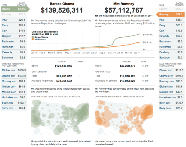
Presidential candidates have raised $186 million up to now, according to the Federal Election Commission. The New York Times lets you compare the amounts raised by each candidate, over time and space. Simply select a candidate on the left, and another on the right to see how they match up. Fundraising by candidates from previous elections, at the same time of year, are also included for context.
While not the focus of the interactive, the distributions for donation size at the bottom seem to be especially telling.
[New York Times via infosthetics]
-
-
Birds move. eBird shows us how.
Understanding patterns of bird occurrence at continental scales has long been one of eBird’s fundamental challenges. Only now, with 42 million records and ever more thorough coverage nationwide, is this becoming possible. Ongoing research at the Cornell Lab is currently producing cutting-edge graphics that we are pleased to share here. Day-by-day predictions of species occurrence allows these models to shine a spotlight on the most awe-inspiring of natural spectacles: the ebb and flow of bird migration.
Cutting edge? No. They are thorough though, with maps (in the form of animated gifs) for a large number of species.
[eBird | Thanks, Ed]
-
-
-
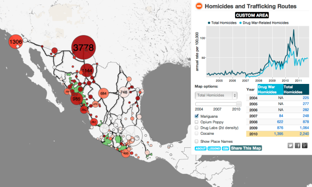
Diego Valle-Jones maps homicides and trafficking routes in Mexico.
To unclutter the map and following the lead of the paper Trafficking Networks and the Mexican Drug War by Melissa Dell, I decided to only show the optimal highways (according to my own data and Google Directions) to reach the US border ports from the municipalities with the highest drug plant eradication between 1994 and 2003 and the highest 2d density estimate of drug labs based on newspaper reports of seizures. The map is a work in progress and is still missing the cocaine routes, but hopefully I’ll be able to add them shortly.
There’s lots to look at and interact with here. To start, there are bubbles that cluster homicides by region and major highway routes in black.
Click on any bubble and you get a time series for the corresponding area, going back to 2004. Or if you like, draw your own polygon to see the time series for specific regions. Pointers on the time series highlight significant events. There’s also a slider that lets you see numbers on the map for different years. A layer underneath the bubbles lets you see high density areas for marijuana, opium, and drug labs.
Take a look at the full map for yourself. This is nice work by Valle-Jones.
[Diego Valle-Jones | Thanks, Diego]
-
You would think that something so concrete, carefully recorded by authorities, wouldn’t be too tough to tabulate, even if at a large scale. Not so.
Homicide is a “serious crime that many people are concerned with, it is well-measured, and it is to a large degree well-reported and -recorded,” says Alfred Blumstein, a criminologist at Carnegie Mellon University. “That is not to say that there aren’t a variety of ways for fudging the measurement.”
Among the factors that cloud homicide numbers: gaps between police-reported numbers and counts by public-health organizations. The discrepancy is wide in many African countries and some Caribbean ones. The United Nations attributes the disparity to several factors, including definitional differences—whether honor killings should count—a lack of public-health infrastructure in some countries, and undercounting—possibly deliberate—by police.
I think this is something the common public often doesn’t understand about data. The numbers are entered and analyzed on a computer, so it’s easy to mistake data for mechanical output. It must be accurate, right? That’s usually not the case though, especially when it comes to data collection outside a controlled lab setting.
The game always changes when humans are involved. Not everyone responds to surveys, definitions of events vary across organizations, estimation methods change every year, and the list goes on.
For those who do stuff with data, you have to deal with that uncertainty, and as data consumers, you have to remember that numbers don’t automatically mean fact.
-
-
-
-
-
 I thought this riveting post on the New York Times Bits blog about the rise of the toilet texter deserved a graphic. Since their graphics department is no doubt busy with elections, I took the liberty. I am — the 91 percent.
I got the numbers straight from the Bits post, but you can download the full report from 11mark for all the demographics. You have to register though, and I didn’t want to be the guy who creates an online account to just read a report on what people do while they make dooty. I have standards.
-
-
-
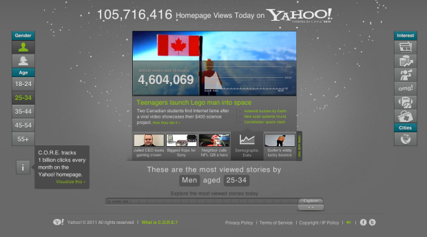
Yahoo is not what it used to be, but many parts of it are still alive and well. In a follow-up to their email interactive, Yahoo, along with visualization firm Periscopic, explores the popularity of articles that appear on the Yahoo homepage. It’s a visualization that shows activity within the Content Optimization and Relevance Engine (C.O.R.E. for short).
The focus is on the center, which has the same layout as that of the stories on the Yahoo homepage. Story on top, and links to more stories on the bottom. Except in the interactive, you can see demographics of those who viewed the story. The slider on the bottom lets you go back up to 24 hours to see what was hot during each hour.
It gets more fun when you use the buttons on the left and right to view popular stories among age and gender cohorts and button on the right that let you see stories by categories. The rotating particles, each representing a clickable story, in the background provide a final flourish.
Oh, and extra nerd points for HTML5.
[Yahoo]


 Visualize This: The FlowingData Guide to Design, Visualization, and Statistics (2nd Edition)


