This talk by Bret Victor caught fire a few days ago, but I just got a chance to watch to it in its entirety. It’s worth the one hour. Victor demos some great looking software that connects code to the visual, making the creation process more visceral, and he finishes up with worhtwhile thoughts on the invention process.
-
-
-
You knew this was coming, right? The New York Times describes the point guard fundamentals — dribble penetration, ball screen, and isolation — of Jeremy Lin in this animated Linfographic. For each play, the players of interest are outlined, and the frame shifts so that you can see where the players have been, relative to where they currently are. It’s a simple concept executed well.
I’m familiar with this stuff already, but I imagine this being pretty useful for people just tuning into the game, due to their sudden case of Linsanity. Today’s game against Dallas is gonna be a hot ticket.
-
-
-
-
In the 1980s, students and researchers at UCLA, led by marketing professor Alan Andreasen, found some interesting spending patterns when people approach major life events.
[W]hen some customers were going through a major life event, like graduating from college or getting a new job or moving to a new town, their shopping habits became flexible in ways that were both predictable and potential gold mines for retailers. The study found that when someone marries, he or she is more likely to start buying a new type of coffee. When a couple move into a new house, they’re more apt to purchase a different kind of cereal. When they divorce, there’s an increased chance they’ll start buying different brands of beer.
These findings turned out to be the backbone of work by statistician Andrew Pole, who was hired by Target to analyze their data and increase sales. Somewhere along the way, the marketing department at Target asked Pole if there was a way to predict that a customer was expecting a child. Birth records are freely available, so it’s easy to send baby-related coupons and advertisements to new mothers, but Target wanted first dibs, before that baby came out.
As you might expect, Pole found 25 products that were strong indicators and soon he had an estimate of pregnancies with a pregnancy prediction score.
Pole applied his program to every regular female shopper in Target’s national database and soon had a list of tens of thousands of women who were most likely pregnant. If they could entice those women or their husbands to visit Target and buy baby-related products, the company’s cue-routine-reward calculators could kick in and start pushing them to buy groceries, bathing suits, toys and clothing, as well. When Pole shared his list with the marketers, he said, they were ecstatic. Soon, Pole was getting invited to meetings above his paygrade. Eventually his paygrade went up.
Creepy or just good marketing? I say the latter.
[New York Times | Thanks, Paul]
-
-
-
 Taking the next step in the Wolfram|Alpha experiment, Wolfram launches a Pro version that lets you plug in your own data and get information out of it.
The key idea is automation. The concept in Wolfram|Alpha Pro is that I should just be able to take my data in whatever raw form it arrives, and throw it into Wolfram|Alpha Pro. And then Wolfram|Alpha Pro should automatically do a whole bunch of analysis, and then give me a well-organized report about my data. And if my data isn’t too large, this should all happen in a few seconds.
I haven’t had a chance to try it yet, but the sense I get from others is that the part about data not being too large is key. Apparently it’s still in the early stages and can’t handle much data at once. The main hook is automated summaries, model fitting, and some graphs, but if you know enough to interpret the models appropriately, shouldn’t you know enough to derive them?
I’d love to hear initial thoughts from those who have tried it. For those who haven’t, it’s $4.99 per month, but there’s a two-week free trail.
[Wolfram]
-
-
-
-
-
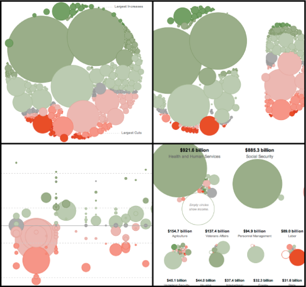
With Obama’s recent budget for next year proposed, Shan Carter et. al of The New York Times let you explore the plan in their new interactive. It provides four distinct views of what the breakdowns look like, all the while keeping a distinct link between each click with smooth transitions and consistent objects (much of which was handled with Mike Bostock’s D3).
Initially, a view of all spending is shown at once. Each bubble represents a chunk of spending, and each is colored by the change from last year. Green shows more money and red means less, and as indicated on the chart, spending is oriented from largest increase to largest cut, top to bottom.
Next tab: types of spending. This is when the magic happens. Instead of skipping to a new graphic, the existing bubbles divide to show mandatory and discretionary spending. Jump to the next view to see changes to discretionary spending, and finally see spending shown by department.
The transitions make this graphic. It’s often useful to see data from different angles, and the smooth transitions (rather than abrupt jumps) let you see how things are and how they have changed, effectively. This is fine work.
-
-
-
-
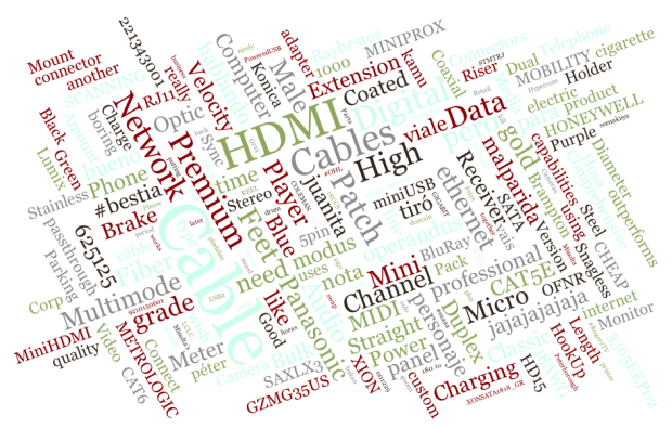
For those who die a little inside every time they see a word cloud: shield your eyes. For the less dramatic, Jason Davies, in his latest D3 bucket-o-fun, created an interactive word cloud that lets you search on Twitter, Wikipedia, or your own URL. Change one of the parameters such as angle, number of words, and scale, and oh yes, the words move. Once you’re satisfied with your creation, you can export it as a PNG or SVG.
Don’t worry. Davies does recognize the non-analytical nature of word clouds at the end of his explanation.
The code is also available on GitHub in case you want to have a go with it.
[Word Cloud | Thanks, Jason]


 Visualize This: The FlowingData Guide to Design, Visualization, and Statistics (2nd Edition)


