
Esquire invited a handful of map-makers to represent the United States outside its borders.
Red state, blue state, big state, small state, north and south and east and west: How we define our similarities and differences with each other often comes down to where we see ourselves on the map of America. But what if we threw out the standard-issue version and started over with something new?
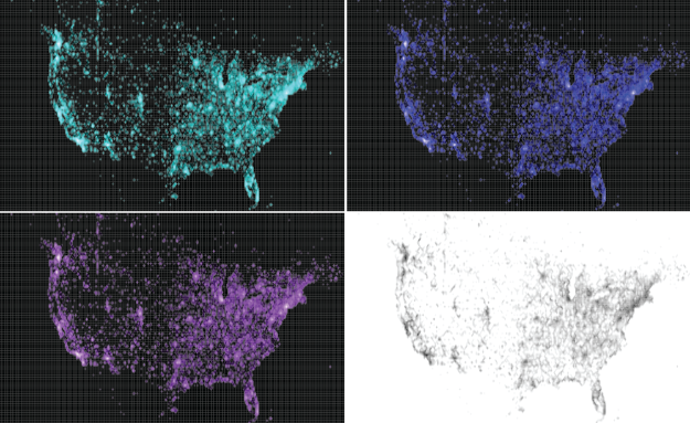
Esquire’s online format doesn’t do the maps justice though. A lot of the images are too small to see the details. In particular, don’t miss Eric Fischer’s high-resolution cartogram and Stamen’s interactive on where the money went. Fischer’s map shows density of geotags, but zoom in, and you can see major cities in detail. Stamen’s map uses IRS data in a twist to the migration map, showing county-level monetary gains and losses.


 Visualize This: The FlowingData Guide to Design, Visualization, and Statistics (2nd Edition)


