ProPublica has been tracking members of Congress who oppose and support SOPA. You can view by party and chamber, and you can even sort by campaign contributions from movie, music, and television. Above shows the quick change from January 18 to 19.
-
-
-
-
-
-
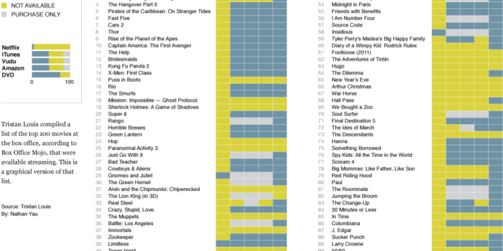
After seeing Tristan Louis’ list that tallied the streaming availability of 2011’s top 100 box office hits, I was curious what it looked like graphically. So I put together this little number. Blue means available, yellow means not, and gray means it’s only available for purchase. The last column for DVD simply means it’s available (since DVDs are of course not streaming).
Netflix streaming still isn’t a place to find the big movies (as any Netflix customer can tell you), with only five of the top 100 available. There is greater streaming availability from iTunes, Amazon, and Vudu, but those of course aren’t fair comparisons to Netflix, given that the latter is subscription-only.
My main takeaway is that if you’re deciding between the non-subscription services, it looks like price is the main thing to look at, since there doesn’t seem to be much variability in availability (although it could be different for smaller movies). As for Netflix, subscribe for the television and for the movies less so.
[Tristan Louis via Waxy]
-
-
Using Color Scales and Palettes in R
Color can drastically change how a chart reads and what you see in your data, so don’t leave it up to chance with defaults.
-
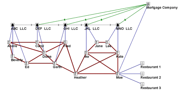
In working with tenants to help their city attorney convict a group of slumlords, an economic justice organization collected public data on housing violations that were going unfixed. They tried standard mind mapping and organization software, but the relationships were too complex to unearth anything useful. So they eventually used social network analysis, revealing money exchanging hands in such a way that allowed owners to strip the value from buildings without actually fixing them.
The analysis results, combined with the city’s investigation, allowed key convictions and court-awarded finances for tenants to move elsewhere.
Sounds like a good reason for Data Without Borders.
[Valdis Krebs via kottke]
-
-
In 2010, NASA released a map that shows world forest heights. Robert Simmon, using data from The Woods Hole Research Center, has produced an even higher resolution map, down to the management scale:
In the end, the research team was able to construct a map with higher resolution and more precise detail than any large-scale map of forest biomass ever made. The map reveals the checkerboard patterns of logging in the old growth of the Pacific Northwest and the highly managed tree farms of the Southeast. In the Midwest, trees outline the rivers and the edges between farms, while forests re-emerge on land that was once cleared for crops. In the Mid-Atlantic and New England, lands that were stripped bare in the early years of the nation are now tree-covered again—though with many urban developments amidst the forest.
[NASA | Thanks, Michael]
-
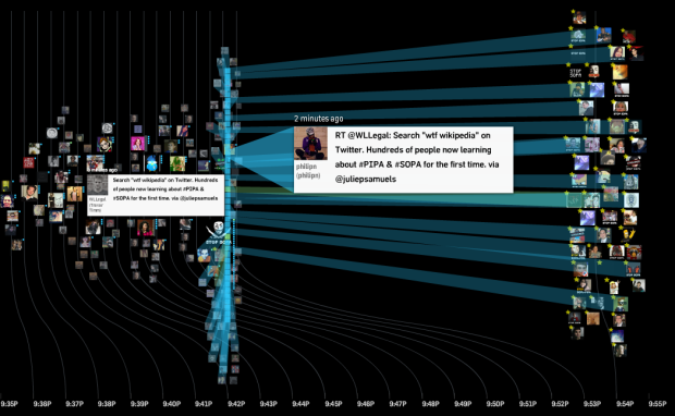
While SOPA and PIPA are no laughing matter (join the strike), the reaction from those on Twitter who don’t know what’s going on is great entertainment. Do a search on ‘wtf wikipedia‘ for tweets from confused individuals who are trying to find information on stuff. I’m just going to leave Twitter trackers Revisit and Spot, by Moritz Stefaner and Jeff Clark, respectively, open all day. “OMG I’m doing homework and Wikipedia is blacked out wtf !!!!!!!!!!!!!!!!!!!!!”
-
-
-
-
-
If you play darts just trying to hit the bullseye, you aren’t playing for maximum output. Don’t fret though. DataGenetics is here to help with mathematical advice on how to play the game based on your skill level (Update: This is very similar to the dart work by Ryan Tibshirani, et al.):
The optimal strategy for aiming depends on your skill as darts player. A very skillful player should aim for the middle of the triple 20; Much of the time he will hit his target, and the times he misses will be few enough that his average score will still be high.
A very poor player should aim close to the bullseye, as just hitting the board will be an achievement (and a scoring one at that!). Aiming for the center maximizes the chances of hitting something.
But what happens between these two extreme?
I was a kid the last time I threw darts, and I was more interested in throwing them as high as I could in the air watching them stick into the grass. Maybe it’s time to try it the right way.
See also optimal gameplay for Battleship, Risk, and Candyland.
[DataGenetics via infosthetics]
-
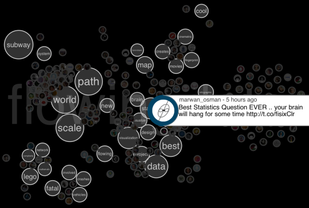
Twitter is an organic online location, full of retweets, conversations, and link sharing. Jeff Clark tries to show these inner workings with his newest interactive, Spot. Enter a query in the field on the bottom left, and Spot retrieves the most recent 200 tweets. You then can choose among five views: group, words, timeline, users, and source.
Read More -
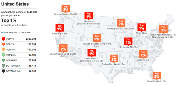
Accompanying an article on the variations of the wealthiest one percent, The New York Times provides this interactive map to see what percent you’re in. Simply enter your household income and see how you compare in metropolitan areas with over 50,000 households.
Nation-wide, a household income over $383,000 puts you in the top one percent. However, a lower household income of $179,000 puts you in the top one percent in Flint, Michigan. The same wage in San Diego, California puts you only in the top eight percent.
Also: what jobs the top one percent have.
Update: There was also a fine print version.





 Visualize This: The FlowingData Guide to Design, Visualization, and Statistics (2nd Edition)


