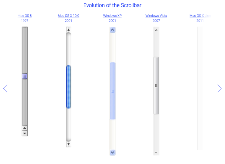
Sébastien Matos used a straightforward view to show the evolution of the scrollbar, dating back to the Xerox 8010 Information System from 1981.
Sébastien Matos used a straightforward view to show the evolution of the scrollbar, dating back to the Xerox 8010 Information System from 1981.

Deep Sea Vision, an ocean exploration company based in South Carolina, announced Saturday that it captured compelling sonar images of what could be Earhart’s aircraft at the bottom of the Pacific Ocean.
The discovery was made possible by a high-tech unmanned underwater drone and a 16-member crew, which surveyed more than 5,200 square miles of ocean floor between September and December.
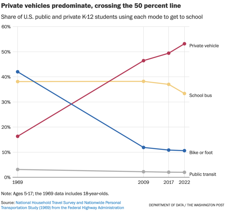
For WP’s Department of Data, Andrew Van Dam notes the decline of the school bus and the rise of the private vehicle to bring kids to school. The estimates are based on responses to the National Household Travel Survey conducted by the Federal Highway Administration.
I rode the bus when I was a kid, until I switched to riding my bicycle. I am now a parent who drives my kids to school. So this data strikes the a chord.
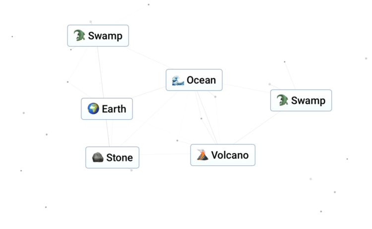
Start with water, fire, wind, and earth and see what you can craft by combining elements. Neal Agarwal made a game, Infinite Craft, that uses Llama 2, a large language model, to build just about anything.
It’s a LLM version of Little Alchemy. [Thanks, Charlotte]
There was a time when big infographics ruled, and then their popularity faded as quickly as it came. It wasn’t because of their size though, which might have been the only thing right about them.

I wrote a book! It’s the second edition of Visualize This. It focuses on the how of visualization with practical examples that you can apply to your own data. You’ll learn how to use a variety of tools and work through the full visualization process, from data to visual analysis to publication-ready graphics.
This second edition is loosely based on the first, but this is a brand new book. The examples are new, the tools are refreshed, and I rewrote almost every word. It turns out a lot can change over a decade and a half.
You can pre-order Visualize This now.
I hope it’ll help all of you have more fun with data.
More updates to come.
Alastair Humphreys, using a 20 by 20 kilometer map of where he lives, explored one square kilometer at a time as if he were traveling farther. For the Guardian:
Travelling around my unremarkable map for a year gave me much to remark on. It was one of the most interesting journeys of my life and shifted my perspective on the way we choose to travel. It made me calmer and healthier. It fostered feelings of curiosity, awe, gratitude and a deeper awareness of nature than I had experienced before. The more you look, the more you see. The more you see, the more you learn and care. Your local map is a fractal of the world at large. Embrace it, care for it, cherish it, and discover it. You might just find that a single map is enough exploration for an entire lifetime.
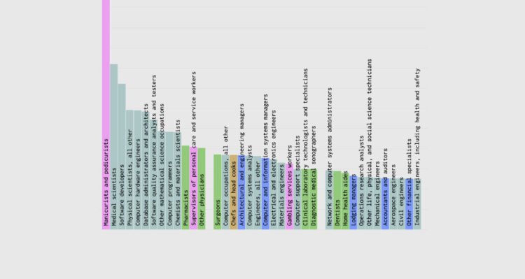
Some jobs are worked commonly by people of a certain race or ethnicity more than others. Farm managers are almost all white, postal service processors are half black, manicurists are 65% Asian, and drywall installers are 75% Hispanic. This chart shows the percentage of employed persons 16 years and older who are a given race or ethnicity for each job. It’s based on 2023 data from the Bureau of Labor Statistics.
Usually you see a railway map from a local perspective, because it’s meant to show how you get from point A to point B. As a learning experiment, Zhaoxu Sui mapped major railways worldwide. It’s not comprehensive but still interesting to think about, in case you’re trying to get to China from Europe by train.
You can grab the full PDF version here.
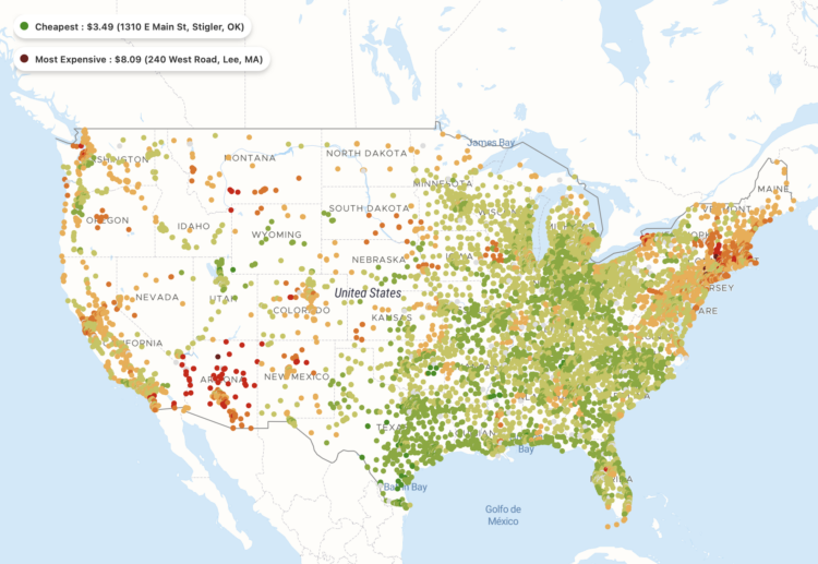
A map, by Pantry & Larder, shows the cost of a Big Mac at each McDonald’s in the United States, as of early 2023. As you might expect, the prices are higher on the east and west coasts. The most expensive Big Mac was in Lee, Massachusetts for $8.09. I assume shipping to Hawaii and Alaska brings prices up in those states.
But what’s going on in Montana and Arizona? Based on Regional Price Parity, Montana tends to cost less compared to the national average, and Arizona is right in the middle. Then again, when you adjust for cost of living, the two states are right next to each other towards the bottom for income, so I guess it makes sense.
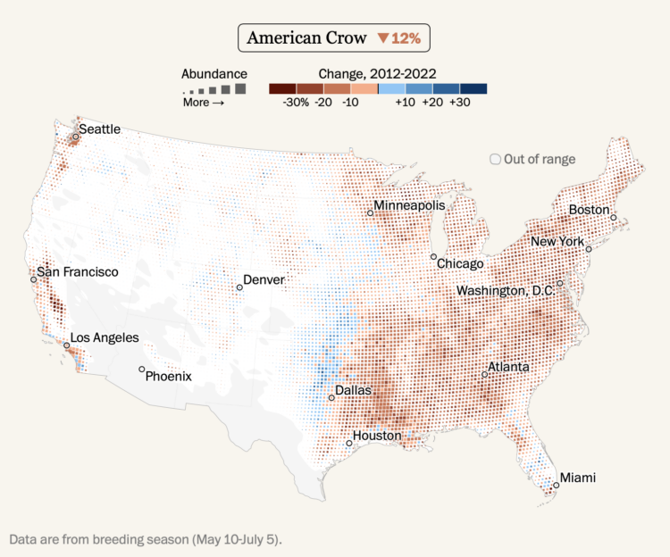
Using data from the crowdsourced database eBird, Harry Stevens mapped the shifts in bird populations for the Washington Post. Increased building and climate change have led to population declines for many species over the past decade, but some species, such as the blue jay, have seen growth.
Be sure to check out the interactive at the end that lets you search the full species list.
Diligent birders log data on eBird, which they can use to keep track of their own observations. Collectively, researchers can then generate reliable models with the data. The scale of this project continues to amaze.

Here’s the good stuff for January.
[arve url=”https://www.youtube.com/watch?v=pezlnN4X52g” /]
For Numberphile, Simon Anthony explains the Phistomephel Ring. The shape always contains the same numbers as the corners do. Math magic!
Meant to be comprehensive more than a curated collection, the Journalist’s Toolbox AI provides many links to tools that might help you data more efficiently. Or at least use more AI-ish things.
There’s still a long way to go before AI is reliable enough to analyze and make sense of data. A lot of these things still feel like half-baked gimmicks. However, for the mechanical, repetitive tasks that can be easily defined, such as scraping or coding chores, some of these resources might be useful.
You can always count on the site for updates on visualization, data, and statistics. There’s also RSS and email. But someone told me you should meet the people where they are, so here are the other places you can find FD.
Instagram — Visual. More common to post less frequently. I have a feeling this might be where I end up in my social media travels.
X/Twitter — There was a time when I had a Twitter app open all the time while I wrote my books and dissertation. It was a fun place for ideas and to share things. It’s in a weird place now, and it doesn’t seem to be getting better. So I’m still around, for now.
LinkedIn — Whoa. I have no idea what I’m doing in this career-focused place. But every couple of weeks someone posts one of my projects as their own and it gets thousands of interactions, so here I am.
YouTube — I animate data sometimes that works better in video format.
Reddit — The visualization-centric Subreddits can be overly critical and seem to have a high ratio of armchair chart experts. But I also want to know who took the flowingdata username and never posted many years ago. (It might have been me.)
Bluesky — As Twitter alternatives go, this might be it. I’m not sure if I want an alternative though.
Threads — Or maybe this? I don’t know it’s too much.
Mastodon — I’m here. It doesn’t seem like it’s for me. It took me three tries to spell mastodon correctly.
Facebook — Kind of. There’s been an FD page for years but I often forget it exists.
Social media is at a crossroads, so I’m kicking the tires on everything at this point. See you there.
In an effort to find a suspect in a 1990 murder, there was a police request in 2017 to use a 3-D rendering of a face based on DNA. For Wired, Dhruv Mehrotra reports:
The detective’s request to run a DNA-generated estimation of a suspect’s face through facial recognition tech has not previously been reported. Found in a trove of hacked police records published by the transparency collective Distributed Denial of Secrets, it appears to be the first known instance of a police department attempting to use facial recognition on a face algorithmically generated from crime-scene DNA.
This seems like a natural progression, but it should be easy to see how the pairing of the tech could cause all sorts of issues when someone’s face is poorly constructed and then misclassified with facial recognition. What’s the confidence interval equivalent for a face?
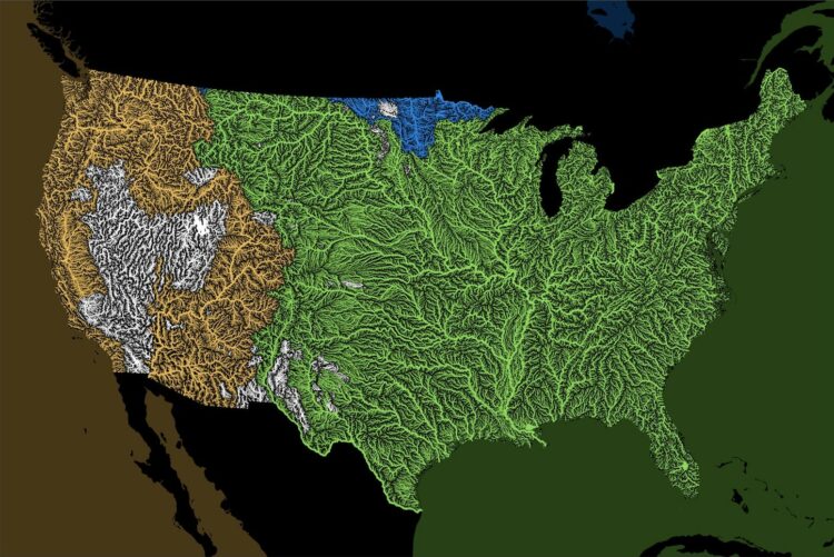
Rivers drain into oceans. Grasshopper Geography color-coded the rivers in the world by the ocean they drain into and made a series of maps.
But what is an ocean drainage basin map, I hear most of you asking? A couple of years ago I tried to find a map that shows in which ocean does each of the world’s rivers end up. I was a bit surprised to see there is no map like that, so I just decided I’ll make it myself – as usual. Well, after realizing all the technical difficulties, I wasn’t so surprised any more that it didn’t exist.
It reminds me of the map that shows where a raindrop ends up.
If you’re into basketball data, Sravan Pannala is keeping a running list of data sources, apps, and visualization on the topic. I can always use more basketball data, so I’ll bookmark this for later.
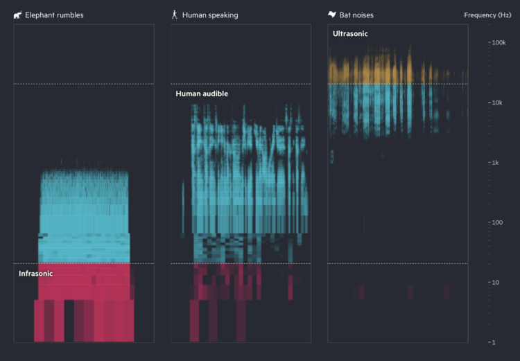
Financial Times highlights how researchers are using AI to try to learn what animal sounds mean and to communicate back. Turn on the sound for maximum effect.

Welcome to The Process, the newsletter for FlowingData members that looks closer at…


 Visualize This: The FlowingData Guide to Design, Visualization, and Statistics
Available now.