• Membership
  • Newsletter
  • Projects
  • Learning
  • About
  • Member Login
  • Algorithmic road trip to visit a street named after each day of the year

    February 29, 2024

    Topic

    Maps  /  algorithm, Ben Ashforth, OpenStreetMap, road trip

    [arve url=”https://www.youtube.com/watch?v=MwRbr-MjwII” /]

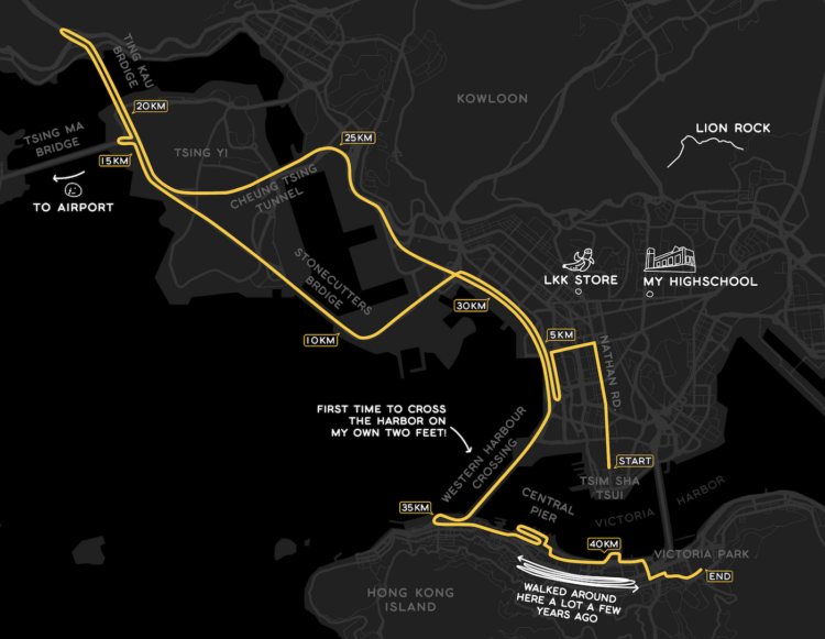
    Ben Ashforth set out to visit a street named after a day of the year for each date. He used OpenStreetMap to find the streets and then algorithmically routed a trip. Then he followed through and went on the trip. In a five-minute lightning talk, he describes the journey. See a photo for every day here. [via Waxy]

  • Data Underload  /  golf, McDonald's

    McDonald’s Locations vs. Golf Courses

    I read that there are more golf courses than there are McDonald’s locations in the United States, which seemed surprising. There are about 16,000 golf courses and 13,000 McDonald’s locations. How could this be? Obviously, there are a lot of McDonald’s locations, but where are all these golf courses? Some maps made it clear.

    Read More
  • Interactive LED basketball court

    February 27, 2024

    Topic

    Infographics  /  basketball, display

    [arve url=”https://www.youtube.com/watch?app=desktop&v=752_rIE53Tk” /]

    During the 2024 NBA All-Star weekend, the basketball court was essentially a giant LED screen on the second day. The company behind the panels talked about the technical side for a WTHR news segment, shown above.

    The court was fun to watch but also distracting. It draws your eyes to the ground when the action is ahead and above the rim. So the technology seems less than ideal for an actual game. Maybe good as an expensive practice and training tool? I couldn’t believe not a single shot chart was shown during the three-point contest.

  • Map of most common domesticated animals

    February 26, 2024

    Topic

    Maps  /  animals, domestic, John Johnson

    Based on data from the USDA Census of Agriculture, this map by John Johnson shows the predominant domesticated animal in each county in the United States. It nonchalantly includes humans.

  • Data Underload  /  age, rest, sleep, well-being

    Feeling Rested with Age

    How much you sleep each night matters, but more importantly, it’s about the quality and if you feel rested when you wake up. This seems to shift with age as responsibilities and sleep patterns change.

    The following chart shows how rested people felt, based on answers to the American Time Use Survey.

    Read More
  • Members Only

    Looking for a Denominator

    February 22, 2024

    Topic

    The Process  /  comparison, denominator

    To decide if values are high or low, sometimes you have to divide the numbers for a relative comparison instead of an absolute one.

  • Love: math or magic?

    February 22, 2024

    Topic

    Statistics  /  love, This American Life

    This American Life tells the tales as old as time:

    When it comes to finding love, there seems to be two schools of thought on the best way to go about it. One says, wait for that lightning-strike magic. The other says, make a calculation and choose the best option available. Who has it right?

    Spoiler alert: there is a mix of practicality and feel. They each inform the other.

  • Data-driven running journal

    February 21, 2024

    Topic

    Self-surveillance  /  K.K. Rebecca Lai, marathon

    K.K. Rebecca Lai ran her first marathon. She recounts her training and the day of the event with a series of maps and charts. It reads like a data-driven journal entry, which I am always up for.

  • Rise of Caitlin Clark, scoring machine

    February 20, 2024

    Topic

    Statistical Visualization  /  basketball, Caitlin Clark, Washington Post

    Caitlin Clark, a basketball guard for the University of Iowa, has been steadily adding to her point total over the past four years. Clark broke the NCAA record this past week. But as we all know, it’s not official until there’s a step chart that shows the rise over time.

  • Data Underload  /  race, work

    Race and Occupation

    About 22 percent of physicians in the United States are Asian, but Asian people only make up about 6 percent of the full working population. Compare the former to the latter, and you could say that Asian people are about 3.5 times more likely to be physicians.

    Are there other jobs that jump out? What’s it like for other races and ethnicity?

    Read More
  • Members Only

    Better or Less Bad

    February 15, 2024

    Topic

    The Process  /  criticism

    People like to judge charts by pointing out all the things that are wrong, which is limiting in practice.

  • BrailleR, a R package to improve access for blind users

    February 15, 2024

    Topic

    Coding  /  accessibility, braille, R

    From CRAN:

    Blind users do not have access to the graphical output from R without printing the content of graphics windows to an embosser of some kind. This is not as immediate as is required for efficient access to statistical output. The functions here are created so that blind people can make even better use of R. This includes the text descriptions of graphs, convenience functions to replace the functionality offered in many GUI front ends, and experimental functionality for optimising graphical content to prepare it for embossing as tactile images.

    Has anyone tried this yet? It sounds really useful.

  • Diva-ness of national anthem renditions

    February 14, 2024

    Topic

    Infographics  /  diva, music, Pudding

    You’ve probably heard various renditions of The Star-Spangled Banner, and sometimes singers put a little extra something in the anthem. A bit of flourish. Some attitude. For The Pudding, Jan Diehm and Michelle McGhee quantified that extra something into what they’ve dubbed a Diva Score.

    Out of the 138 versions they scored, the highest belong to Chaka Khan at the 2020 NBA All-Star game and Patti Labelle at the 2008 World Series.

  • Consumer confidence in current economic conditions

    February 13, 2024

    Topic

    Statistical Visualization  /  confidence, inflation, Nate Silver, New York Times, spending

    For NYT Opinion, Nate Silver compares consumer confidence between two surveys. The University of Michigan’s Index of Consumer Sentiment focuses more on personal spending, whereas the Conference Board’s Consumer Confidence Survey. Usually, the estimates follow each other, but there’s been a split the past few years, as shown in the difference chart above.

  • Data Underload  /  football, Super Bowl

    When and How Many Super Bowl Wins, by Team

    The Kansas City Chiefs beat the San Francisco 49ers in Super Bowl LVIII. That’s three championships for the Chiefs in the last five years. How does that compare to teams who won previous Super Bowls over the past 58 years?

    Read More
  • Your body as a processing plant, digesting a hot wing

    February 12, 2024

    Topic

    Infographics  /  digestion, spicy, Washington Post

    Your body goes through a special process to digest spicy food. The sting, the sweating, the sting afterwards. For the Washington Post, Bonnie Berkowitz, Aaron Steckelberg, and Szu Yu Chen illustrate with a factory metaphor and a personified chicken wing.

  • Investor expectations for interest rates compared to reality

    February 9, 2024

    Topic

    Statistical Visualization  /  invest, rate, Wall Street Journal

    This chart by Eric Wallerstein for the Wall Street Journal shows expectations against reality. They often don’t match up.

    See also: how rate projections change over time.

  • Members Only

    Organizing Data

    February 8, 2024

    Topic

    The Process  /  organization

    This week’s topic comes through a FD reader who asks how I manage and organize data from analysis through visualization.

  • Statistical Atlas  /  age, education

    Highest Education Level and Age Distributions

    When you’re a kid, most (if not all) of the people you know who are your age are in the same grade as you. Education paths start to diverge towards the end of high school and after.

    Read More
  • Speed puzzling times and strategies

    February 7, 2024

    Topic

    Infographics  /  puzzle, Washington Post

    There are competitions where people complete jigsaw puzzles as quickly as they can, and some teams take it very seriously. Because of course. For the Washington Post, Chris Alcantara shows the times and strategies of the quickest puzzlers.

    I would not be good at this.

  • Page 29 of 391
  • <
  • 1
  • ...
  • 26
  • 27
  • 28
  • 29
  • 30
  • 31
  • ...
  • 391
  • >

Analyze, visualize, and communicate data usefully, beyond the defaults.

Become a member →

Recently for Members

May 8, 2025
When the data is not what it seems

May 1, 2025
Finding the Right Charts

April 24, 2025
Visualization Tools, Datasets, and Resources – April 2025 Roundup

April 17, 2025
Breaking Out of Chart Software Defaults

April 15, 2025
Line Chart with Decorative Neon Accents

Browse by Chart Type See All →

Bar Chart Race Difference Chart Variable Width Bar Chart Box Plot Gantt Chart Calendar Bar Chart Voronoi Diagram Packed Bubble Chart Density Plot

Browse By Topic

  • Visualization

    Seeing data

  • Maps

    Seeing geographic data

  • Infographics

    Explaining data

  • Networks

    Connecting data

  • Statistics

    Analyzing data

  • Software

    Working with data

  • Sources

    Getting data

  • Design

    Making data readable

Get the Book

Visualize This: The FlowingData Guide to Design, Visualization, and Statistics

Available now.

Order: Amazon / Bookshop

Made by FlowingData

  • The Process

  • Data Underload

  • Chart Everything

  • Guides

  • Books

  • Shop

  • About
  • Contact
  • Newsletter
  • LinkedIn
  • Instagram
  • Bluesky
  • RSS
Copyright © 2007-Present FlowingData. All rights reserved.