Run for your lives. The red concentric circles on the green squiggly are headed your way. From The Onion:
[via @civilstat]
Run for your lives. The red concentric circles on the green squiggly are headed your way. From The Onion:
[via @civilstat]

By Francisco Javier Aragón Artacho, “This is a walk made out of the first 100 billion digits of pi in base 4 with the following rules for the steps: 0 right, 1 up, 2 left, 3 down.” [via]
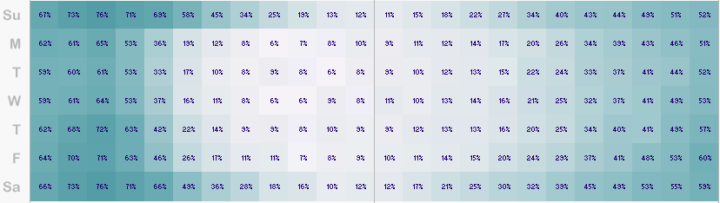
I made a graphic a while back that showed traffic fatalities over a year. John Nelson extended on that, pulling five years of data and subsetting by some factors: alcohol, weather, and if a pedestrian was involved. And he aggregated by time of day and day of week instead of calendar dates.
Read More
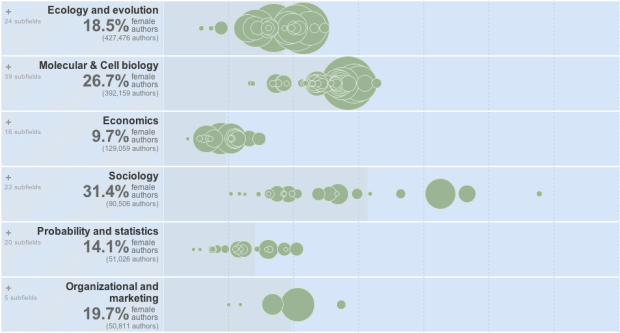
The Chronicle of Higher Education has a look at the percentage of academic papers published by women, over the past five centuries.
The articles and authors described in this data were drawn from the corpus of JSTOR, a digital archive of scholarly papers, by researchers at the Eigenfactor Project at the University of Washington. About two million articles, representing 1765 fields and sub-fields, were examined, spanning a period from 1665 to 2011. The data are presented here for three time periods, the latest one ending in 2010, and a view that combines all periods.
Percentage of female authors is on the horizontal, and each bubble is a subfield sized by total number of authors. The graphic starts with publishing for all years, but be sure to click on the tabs for each time span to see changes.
The data is based on the archive of about two million articles from JSTOR, and a hierarchical map equation method is used to determine subfields.
The gender classification they used for names seems like it could be nifty for some applications. Gender is inferred by comparing names against the ones kept by the U.S. Social Security Administration, which includes gender. If a name was used for female at least 95 percent of the time, it was classified as a female name, and the same was done with male. Anything ambiguous was not included in the study.
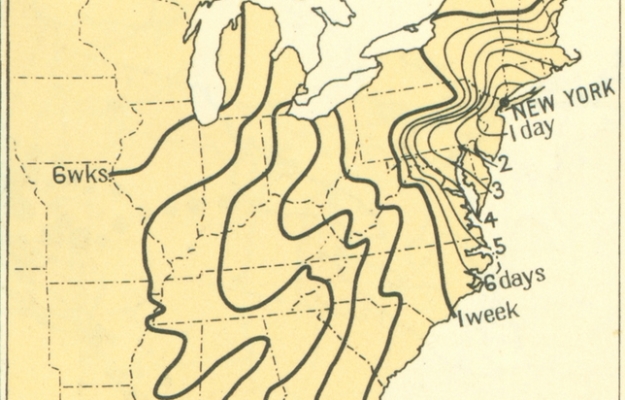
From the 1932 Atlas of the Historical Geography of the United States, these maps paint the picture of transportation in the 1800s. Each line represents how far one could travel in some amount of time, starting from New York. For example, it took about a month to get to Louisiana.
Read More
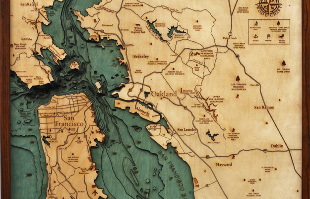
Below the Boat produces beautiful laser-cut wood maps:
Starting with a bathymetric chart (the underwater equivalent of a topographic map), the contours are laser-cut into sheets of Baltic birch and glued together to create a powerful visual depth. Select layers are hand-colored blue so it’s easy to discern land from water, major byways are etched into the land, the whole thing’s framed in a custom, solid-wood frame and protected seamlessly with a sheet of durable, ultra-transparent Plexiglas.
They should go all the way with it and do “above sea level.” [via kottke]

A group of researchers at Michigan State University, led by Phil Howard, explored the network of wine in the United States.
No other section of the supermarket offers as many choices as the wine aisle. A typical retailer is likely to have hundreds of unique wines on its shelves. Just three firms, however, account for more than half of the wine sales in the United States. What impact does this industry concentration have on consumer choices? To answer this question we conducted an inventory of wine offerings at 20 retailers in Michigan. We recorded more than 3,600 unique varieties of wine, and traced their relationships with more than 1,000 different firms.
So there’s a ton of variety, but like the beer and soda industry, sales are dominated by a handful of firms. Want to play with the data yourself? That’s available here.
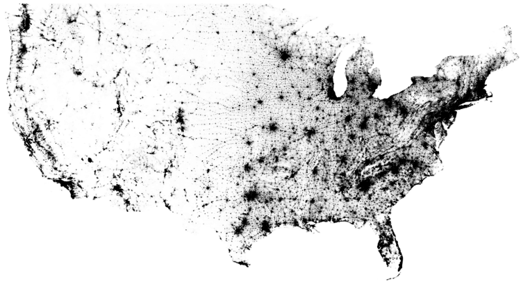
In the 2010 United States Census, 308,745,538 were counted, and Brandon Martin-Anderson from the MIT Media Lab mapped almost all of them (308,450,225 points to be exact). I like the flow-like pattern in the east, which you can see matches the terrain by comparing against a geographic map.
See here for more on the methodology. In a nutshell, he used block-level data as the starting point, uniformly filled blocks with points, and the rest was image processing.
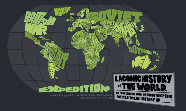
Cartographer Martin Elmer made a truncated history map of the world:
This map was produced by running all the various countries’ “History of _____” Wikipedia article through a word cloud, then writing out the most common word to fit into the country’s boundary. The result is thousands of years of human history oversimplified into 100-some words.
More on the map here.
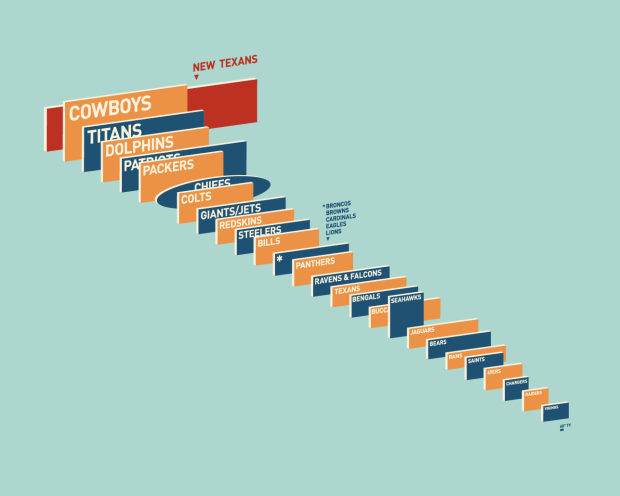
On news of the Houston Texans getting ready to build the largest video screens in professional sports, Reddit user dbeat compared the sizes of current NFL screens to the future giant. It’s just slightly bigger than the one in my living room. [via Deadspin]
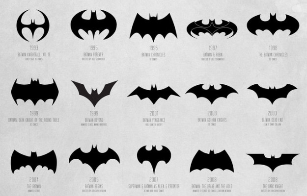
Available in print. See also: a video version. Still no confirmation for whether or not if Batman in fact does smell or if Robin laid an egg.
 Visualize This: The FlowingData Guide to Design, Visualization, and Statistics (2nd Edition)
New tools, refined process.


