• By way of Rafa Irizarry from Simply Statistics, a plot of Nate Silver’s probabilities for Barack Obama winning a state versus the percentage of vote in each state, as of midnight EST.

    I guess that’s pretty (100%) good. Looks like the folks at Princeton didn’t do half bad either. It’s a win for Obama and a win for statistics. Well, good statistics, at least. (Looking at you, University of Colorado.)

    Update: Drew Linzer at Emory and the Huffington Post Pollster also did well. All in all, it was a good night for statistics.

  • As the results roll in tonight, you have plenty of options to keep track of who won what and where. These should cover all of your bases.

    New York Times coverage — Up to their old tricks, they have a map, big board, and network calls. The paths to the White House interactive will also be updating live.

    NPR big board — Updating every 15 seconds, this is the display that NPR hosts and election staff are watching. And of course, there’s also news coverage.

    Huffington Post map — Like the others, updates every 30 seconds. Also indicates where polls have closed.

    Is Obama president? — Finally, if all you care about now is the result, the minimalist Guardian and Real Clear Politics collaboration provides that. See also Romney version.

    (There are a ton more, but these are the ones I’ll be watching.)

  • Following their animated and narrated visualization on political contributions over time, VisPolitics maps Boston political donations in MoneyBombs.

    This video of the Boston metropolitan area reveals the geographic distribution of political donations made by individuals throughout 2012. We identify two types of temporal bursts of campaign contributions. We call both “moneybombs” because they reveal a temporal clustering. The first type occurs when many small donations are given on the same day to a candidate. We call this a grassroots moneyb omb. The second are bursts of extremely large donations, that take advantage of campaign finance laws and allow individuals to donate more than the traditional $5,000 limit. We call this the Joint Committee moneybomb.

    Like in the first project, the narration provides a clear view of the data in front of you. There are also videos for just presidential donations and Republican and Democratic donations.

    [Thanks, Mauro]

  • With the election tomorrow, Mike Bostock and Shan Carter for the New York Times map the 512 possible paths to the White House. Select state wins, and the paths update accordingly. For example, select an Obama win in Florida, and it doesn’t look good for Romney.

    If Mr. Romney loses Florida, he has only one way to victory: through all the other battleground states. He has led most polls there, however, and is the favorite. If Mr. Romney wins Florida, he has 75 paths open to him.

    The interaction feels game-like.

  • In something of an homage to the Genealogy of Pop & Rock Music by Reebee Garofalo, designer Larry Gormley visualized 100 years of film.

    This graphic chronicles the history of feature films from the origins in the 1910s until the present day. More than 2000 of the most important feature-length films are mapped into 20 genres spanning 100 years. Films selected to be included have: won important awards such as the best picture Academy Award; achieved critical acclaim according to recognized film critics; are considered to be key genre films by experts; and/or attained box office success.

    Available in print for 34 bones.

  • For the Made by Humans exhibit at the Hyundai Vision Hall in South Korea, Universal Everything turns basic movements into a visual spectacle. Pretty. From the Creators Project:

    As the founder and creative director of Universal Everything, Matt Pyke leads a creative mission to create gorgeous visual spectacles on screen that, while they will never be attained in physical reality, reinterpret the nuances of natural human motion.

    His effectiveness with capturing movements and transforming them into sweeping animated forms allows him to show us shapes we have never seen before while preserving the individual human element in all his creations.

    [via Fast Company]

  • Political analyst and statistician Nate Silver has gotten some flack lately for consistently projecting a 70-plus percent chance of a Barack Obama win this election. But as Jeff Leek explains, the criticism doesn’t spawn from Silver being wrong. Rather, it comes from the critics’ misunderstanding of statistics. Leek provides a quick lesson on how Silver makes his predications and how the methods apply to other things, like the weather.

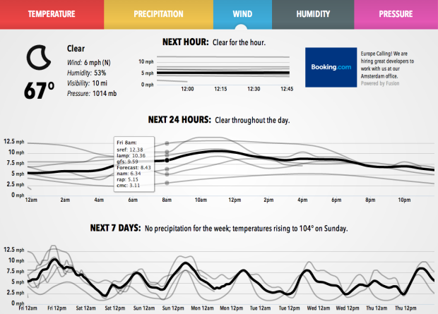
    Now, this might seem like a goofy way to come up with a “percent chance” with simulated elections and all. But it turns out it is actually a pretty important thing to know and relevant to those of us on the East Coast right now. It turns out weather forecasts (and projected hurricane paths) are based on the same sort of thing — simulated versions of the weather are run and the “percent chance of rain” is the fraction of times it rains in a particular place.

    So Romney may still win and Obama may lose — and Silver may still get a lot of it right. But regardless, the approach taken by Silver is not based on politics, it is based on statistics.

    Don’t fear the black box.

  • The New York Times provides a detailed look at the Sandy aftermath, across states and locally. With millions of people losing power in a short amount of time, the outages map and chart is the most dramatic.

    More than six million customers lost power Monday as Hurricane Sandy felled trees, downed power lines and flooded substations. The storm led to power failures in at least 17 states, including more than a million customers in Pennsylvania and New Jersey and about 660,000 in New York City.

  • Electionary, the new iPad app from TargetPoint Consulting, lets you browse national election data, from 1976 through 2008.

    Electionary is an election resource center that grants users access to over 30 years of county, state, and national election data. Electionary transforms election results into an easy to understand, interactive, and visual format. Users are able to see detailed election results and voter turnout percentages from across the country. Users can compare election results side-by-side and see how one county or state has changed over time or see how two counties or states are different.

    There were a few spots interaction-wise when it didn’t do what I was expecting, such as pinch or double tap to zoom, or when I switched years, the map would re-center on the selected state or county instead of staying where I had panned. But if you’re interested in historical elections data, Electionary ain’t bad, and I can only imagine there’ll be un update after elections night.

  • The New York Times has an updated version of their hurricane tracker up with map, satellite, and radar views. Stay safe, east coasters.

    See also the live wind map by Martin Wattenberg and Fernanda Viegas, which has proven useful a couple of times this year.