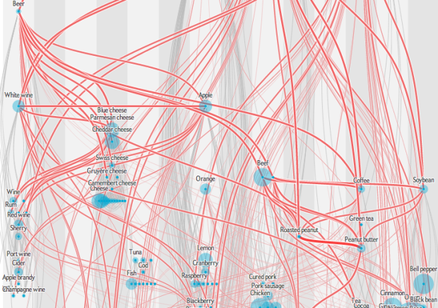
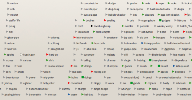
• Membership
  • Newsletter
  • Projects
  • Learning
  • About
  • Member Login
  • Stop motion video: Food you can buy for $5 in different countries

    April 24, 2013

    Topic

    Infographics  /  finance, food, video

    This stop motion video from BuzzFeed shows how much food you can buy for $5 USD in different countries. For example, five bucks will get you 7 pounds of rice in the United States and 12 pounds in China. The video is straightforward, but the animation of food appearing and disappearing — or rather, added and taken away — lends well to the context that you wouldn’t get from a quick chart.
    Read More

  • Flowchart for movie time travel →

    April 23, 2013

    Topic

    Infographics  /  flowchart, humor, movies

    Mr. Dalliard provides this handy flowchart to organize time travel movies. And yes, I immediately looked for Back to the Future and backtracked.

  • Orbiting planets found by NASA Kepler mission

    April 22, 2013

    Topic

    Infographics  /  Jonathan Corum, New York Times, space

    The Kepler mission by NASA has discovered more than 100 planets that orbit stars. Jonathan Corum for The New York Times visualized the ones with known size and orbit using small multiples. Scroll all the way down for our solar system as a point of reference.

    Kepler's tally of planets

  • Shot charts show evolution of Lebron James

    April 19, 2013

    Topic

    Maps  /  basketball, LeBron James, shot chart

    With the start of the NBA playoffs tomorrow, it’s worth coming back to Kirk Goldsberry’s analysis on the evolution of Lebron James’ shot preference. James used to hang around the 3-point line a lot, but he spends a lot more time in the low post these days.
    Read More

  • Time-lapse: Package shipped with a hidden camera

    April 18, 2013

    Topic

    Data Art  /  shipping, time-lapse

    Designer Ruben van der Vleuten was curious about the shipping process, so he did what anyone would do. He installed a camera in a cardboard box and shipped it to himself. Below is a time-lapse video of the package’s journey.

    [via Co.Design]

  • Fictional villains chart

    April 17, 2013

    Topic

    Visualization  /  cartoon, humor

    No comment necessary. [Thanks, Tom]

  • Guides  /  data literacy

    Flexible data

    Data is an abstraction of something that happened in the real world. How…

    Read More
  • Wealth distribution in America

    April 16, 2013

    Topic

    Infographics  /  finance, video

    This video clearly describes the distribution of wealth in America using a set of transitioning charts. The graphics are good. The explanation is better.

  • Visualizing the Paris metro system

    April 15, 2013

    Topic

    Maps  /  Dataveyes, metro, Paris

    Data visualization group Dataveyes looks closer at the Paris metro system from a time and crowd point of view.

    This visualization offers to challenge the way we traditionally view our 2D metro maps. Métropolitain takes on an unexpected gamble: using cold, abstract figures to take the pulse of a hectic and feverish metropolis. The metro map is no longer arbitrarily dictated by the spatial distance between two points. By playing around with two extra variables — time and crowds — users can transform the map, view it in 3D and unveil the true reality behind their daily commute.

    No doubt inspired by the Travel Time Tube Map of the London Underground by Tom Carden, Métropolitain lets you select a station and the lines morph to represent how long it takes to get to other stations. A layer underneath is a heatmap that shows annual incoming traffic per station.

    Finally, you can switch between 2-D and 3-D. I’m not sure if the extra dimension adds much from an understanding point of view, but it is fun to play with. [via infosthetics]

  • Locations of every photo from International Space Station

    April 12, 2013

    Topic

    Visualization  /  space

    Over the last 12 years, astronauts have taken a lot of pictures from the International Space Station. About 1.1 million of them. And they’re all archived on NASA’s servers. Nathan Bergey mapped them.

    Most of the photos are taken of land. Coastlines, islands and cities seem to be popular targets. So much so that it’s possible to make out basic continents. This makes sense, photos of clouds over an otherwise blank ocean get old after a while. I’m sure every astronaut has taken at least one photograph of the town they grew up in.

    Above is the use of small multiples to show pictures taken during separate missions.

  • Doing good with data

    April 12, 2013

    Topic

    Visualization  /  Periscopic

    Periscopic founders Kim Rees and Dino Citraro spoke with Co.Design on what makes good visualization.

    “I don’t think the goal of vizualization should be that precog understanding, giving you something so quickly that you don’t have to think about it; I think the goal should be that you do have to think about it,” she says. “I want people to have a brain, to have a say. I think it’s becoming only more important as we tackle more nuanced information. I don’t want the computer or the creator to tell me what to believe. I want an opening to say, ‘let me look into that machine.'”

  • Personal space per person in various countries

    April 11, 2013

    Topic

    Infographics  /  CNNMoney, population

    How much space is there per person in different countries? Andrew Bergmann for CNNMoney took a look.

    Population density measures the amount of people in a given area, generally per square kilometer or mile. It’s difficult to get a clear image of what these vast spaces actually represent, so I thought that it would be interesting to flip the equation on its head and figure out how much space there is on average per person.

    The interactive shows 20 countries and each is represented by a circle sized by average square feet per person. Of course, as with population density, this data is broad with land distribution and usage to consider, but it’s informative from a general viewpoint. Although the math might be slightly off in the square feet calculation. Or maybe that’s just rounding.

    I’m surprised I haven’t seen something like this before. See population density from the more traditional point of view here, here, and here. Oh, and here. I think the last one is my favorite.

  • Page 241 of 392
  • <
  • 1
  • ...
  • 238
  • 239
  • 240
  • 241
  • 242
  • 243
  • ...
  • 392
  • >

Analyze, visualize, and communicate data usefully, beyond the defaults.

Become a member →

Recently for Members

May 8, 2025
When the data is not what it seems

May 1, 2025
Finding the Right Charts

April 24, 2025
Visualization Tools, Datasets, and Resources – April 2025 Roundup

April 17, 2025
Breaking Out of Chart Software Defaults

April 15, 2025
Line Chart with Decorative Neon Accents

Browse by Chart Type See All →

Scatter Plot Unit Chart Surface Plot Small Multiples Parallel Coordinates Donut Chart Stacked Area Chart Streamgraph Density Plot Timeline

Browse By Topic

  • Visualization

    Seeing data

  • Maps

    Seeing geographic data

  • Infographics

    Explaining data

  • Networks

    Connecting data

  • Statistics

    Analyzing data

  • Software

    Working with data

  • Sources

    Getting data

  • Design

    Making data readable

Get the Book

Visualize This: The FlowingData Guide to Design, Visualization, and Statistics

Available now.

Order: Amazon / Bookshop

Made by FlowingData

  • The Process

  • Data Underload

  • Chart Everything

  • Guides

  • Books

  • Shop

  • About
  • Contact
  • Newsletter
  • LinkedIn
  • Instagram
  • Bluesky
  • RSS
Copyright © 2007-Present FlowingData. All rights reserved.