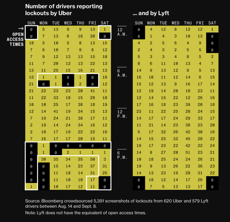
• Membership
  • Newsletter
  • Projects
  • Learning
  • About
  • Member Login
  • About a dog

    June 6, 2024

    Topic

    Infographics  /  dogs, New York Times, pets, storytelling

    For NYT, Sam Anderson, with illustrations by Gaia Alari, tells the story of his family dog Walnut. The storytelling and animation format work well to depict the love of a pet.

    For some reason, someone started cutting onions while I was reading.

  • Currently, a light display that shows where your energy is from

    June 5, 2024

    Topic

    Data Art  /  energy, light, Universal Everything

    Currently is a prototype ambient display that shows where your energy comes from. The display cycles through a set of radial stacked charts that provide the breakdown over time.

    It reminds me of eco-related projects from the late 2000s. I like it.

  • California property taxes, through the Painted Ladies houses

    June 4, 2024

    Topic

    Infographics  /  Painted Ladies, San Francisco Chronicle, taxes

    The Painted Ladies houses, which includes the house from the 1990s sitcom Full House, is a set of seven houses in San Francisco. Six of them are basically the same, but the annual property taxes are not. For the San Francisco Chronicle, Nami Sumida shows why through a set of charts and illustrations, using the differences as a way to explain California property taxes.

    This is also why I will never move.

  • Wheel of Fortune analysis for the win

    June 3, 2024

    Topic

    Statistics  /  Scott Menke, Upshot, Wheel of Fortune

    A Wheel of Fortune contestant employed strategies outlined in a NYT Upshot analysis and won in the bonus round:

    Last December, the Upshot published a guide to Wheel of Fortune strategies, using data from more than 6,000 bonus-round puzzles. Our guide has influenced the behavior of at least one contestant. Scott Menke, a data analyst from New Jersey, won $52,690 in cash and prizes on an episode last month after creating a strategy based on our article, he said.

    Data for good.

  • Simple tool for proportional area charts

    May 31, 2024

    Topic

    Apps  /  area, Krisztina Szűcs

    There might be times when you want to visualize data with area, but want to use irregular shapes that aren’t strictly squares. This straightforward tool by Krisztina Szucs lets click-and-drag for custom shapes. Enter values and drag the corners to make longer, shorter, wider, and narrower.

  • Members Only

    Visualization Tools and Learning Resources, May 2024 Roundup

    May 30, 2024

    Topic

    The Process  /  roundup

    Here’s the good stuff for the month.

  • On the PolicyViz Podcast →

    May 30, 2024

    Topic

    The Book  /  Jon Schwabish, podcast, PolicyViz

    I had a chat with Jon Schwabish on The PolicyViz Podcast. We talked about the new book and more generally, how data visualization changed over the past couple decades.

    You also get to hear me realize in real-time that I had not talked about these things out loud in a long while.

    I mean it’s great and you should definitely listen. Jon’s podcast has been in my listening queue for years, so it was fun to be in an episode.

  • Analysis of text messages with an ex-boyfriend

    May 30, 2024

    Topic

    Self-surveillance  /  relationships, Teresa Ibarra, texting

    Teresa Ibarra used Facebook Messenger to text with her now ex-boyfriend almost a decade ago. She exported the messages and analyzed keywords and topics used over the one-year relationship.

    I can’t say I recommend it — it was surreal and uncomfortable to read through messages from a decade ago. Programmatic analysis can reveal things about yourself, your partner, and your relationship that you may not want to know or accept. It’s also easy to intentionally or unintentionally manipulate data to favor a narrative.

    I haven’t taken a statistics or data science course in forever, but I still think every student should have to collect and analyze data about themselves. You automatically get context for every data point because you lived it, so it’s easy to see how data doesn’t always match what happened in real life.

  • Visualize This: Publication Day, Fourteen Years Later

    May 29, 2024

    Topic

    The Book  /  learning, publishing, writing

    The second edition of Visualize This is published. The book made its way out this past week for those who pre-ordered (thank you!), but you can get a copy right away now.

    This is a different book from the original. There is new software, new examples, and new methods that stem from a decade and a half more of visualizing and analyzing data, a polished process, and an evolving visualization field.

    The end goal is still to get you making charts right away.

    Learn how to ask questions about data, make any chart, and design around insights.

    Changing Visualization

    I wrote the first edition of Visualize This in 2010. At the time, visualization was more narrow in what it could and should be. If a chart didn’t tick certain boxes off a list, many dismissed it as garbage. Not very nice.

    I wanted a nicer, more approachable book to help develop a reader’s curiosity in visualization and data through fun examples and step-by-step tutorials. Apply the analysis process, code, and design ideas in your work in a concrete way.

    It seemed to succeed? Over the years, people whose work I enjoy and shared on FlowingData sent notes to tell me Visualize This was their introduction to visualization. And now it’s their career? Just, wow.

    As data grew more common, visualization developed past the bar chart (still a go-to though). New visual forms and uses bubbled up. Data can move. You can interact with it. A beeswarm chart was barely a thing, and now it’s commonplace.

    People have small computers in their pockets now. How do we show more on smaller screens? Instead of more pixels or to turn people’s phones and laptops into bricks of fire, you analyze the data, ask questions, and highlight insights. Focus.

    Visualize This (2nd ed.) focuses more on this part of the process — making sense of data — which is the main reason FlowingData still exists. (Thanks for sticking with me.) Novelty in visualization will only get you so far.

    Better Tools

    Of course the visualization tools changed too. The upside of a book that uses current tools with step-by-step examples is that you can easily follow along on your computer. You can see the same thing on your screen as you do in the book.

    The downside is when the tools fade or better tools come along to replace the dated ones. The first edition used almost a full chapter on Flash and ActionScript, which were killed off years ago. There was a section that used JavaScript, but it was with the Protovis library, which was the predecessor to the more current D3 library.

    My own toolset also grew, which you see in this second edition. Again, I’m not trying to push you towards a specific tool. My goal is to help you decide which tool or subset of tools works best for you.

    Visualize This (2nd ed.) covers point-and-click tools, such as Datawrapper, RAWGraphs, and the more general Adobe Illustrator, and also gets you started with R, Python, and HTML/CSS/JavaScript. In between the code and steps is the thought process and reasoning, which you can apply to your own tools and datasets. My thanks to Jan Willem Tulp for jumping on as technical editor to make sure all the software examples worked and made sense.

    A Shifted Perspective

    When I wrote the first edition, FlowingData was only three years old. I was still in school and had a ton of learning ahead of me.

    FlowingData is going to be seventeen this year. I finished my PhD, worked with more data, made many more charts, and refined my process. FlowingData became my full-time job.

    Along the way, I got married, had kids, saw new things, grew more white hairs, and well, I got older and experienced more.

    Visualize This (2nd ed.) reflects how I work now and what I would teach a beginner now. If you want to better understand data, make charts that communicate to people, and produce nice things with real data, then Visualize This (2nd ed.) should help you get there now. Start at the beginning by working with raw datasets and analyzing for insights. Then follow through with finished data graphics.

    Get the Book

  • Flight turbulence on the Singapore Airlines flight, visually explained

    May 29, 2024

    Topic

    Infographics  /  flights, Reuters, Singapore Airlines, turbulence

    Last week, a Singapore Airlines flight experienced turbulence that led to one person dying of a heart attack. Reuters explains what happened on the flight and more generally, what happens during turbulence.

    Turbulence or pockets of disturbed air can have many causes, most obviously the unstable weather patterns that trigger storms, according to an industry briefing by European planemaker Airbus.

    The resulting water particles can be detected by weather radar. Crews plan ahead by studying turbulence and other weather forecasts, which have improved over the years, loading extra fuel when needed and monitoring weather radar during flight.

    Maybe make people buckle up at all times when seated?

  • When feelings of nostalgia peak

    May 28, 2024

    Topic

    Statistical Visualization  /  great, nostalgia, Washington Post, YouGov

    YouGov surveyed 2,000 adults asking them when was the best and worst decades for things like movies, fashion, and the economy. For the Washington Post’s Department of Data, Andrew Van Dam noted that there wasn’t so much a strong lean towards a certain decade as there was a tendency towards people’s age.

    I think people just want to go back to a time when there was less to worry about and more freedom, which was late childhood and early teens for most.

  • WildChat, a dataset of ChatGPT interactions

    May 24, 2024

    Topic

    Data Sources  /  ChatGPT, WildChat

    In case you need a large dataset to train your chatbot — and who doesn’t these days amirite — WildChat might prove helpful.

    The WildChat Dataset is a corpus of 1 million real-world user-ChatGPT interactions, characterized by a wide range of languages and a diversity of user prompts. It was constructed by offering free access to ChatGPT and GPT-4 in exchange for consensual chat history collection. Using this dataset, we finetuned Meta’s Llama-2 and created WildLlama-7b-user-assistant, a chatbot which is able to predict both user prompts and assistant responses.

    Beats ripping off Scarlett Johansson dialogue.

  • Dashboard for L.A. Dodgers baseball

    May 24, 2024

    Topic

    Statistical Visualization  /  baseball, dashboard, Dodgers, Matt Stiles

    To keep track of performance, Matt Stiles made the Dodgers Data Bot, which provides a dashboard view of various baseball metrics sourced by Baseball Reference.

    This repository — a growing work in progress — feeds Dodgers Data Bot, a statistical dashboard about the LA Dodgers’ performance.

    The code executes an automated workflow to fetch, process and store the team’s current standings along with historical game-by-game records dating back to 1958. It also collects batting and pitching data, among other statistics, for the same period. These records are processed and used to bake out the site using the Jekyll static site generator, in concert with Github Pages, and D3.js for charts.

    Thumbs up for personal projects. You can find the code on GitHub.

  • Members Only

    Writing a Book About Visualization

    May 23, 2024

    Topic

    The Process  /  book, writing

    Reading the words of my younger self and revisiting that guy’s process was… educational.

  • Energy surges due to solar storm

    May 23, 2024

    Topic

    Maps  /  Bloomberg, energy, solar, storm

    The recent solar storms brought pretty lights to the night sky in some parts of the country, but they can also bring challenges to the power grid. For Bloomberg, Hayley Warren, Denise Lu, and Naureen Malik look at the surges through the lens of data collected by Whisker Labs Inc.

    While no significant failures were reported, there is potential for these surges to cause major damage. The last time a storm this strong struck Earth, there were power outages in Sweden and damaged transformers in South Africa, according to the US Space Weather Prediction Center. Strong solar storms can also affect radio signals, global navigation systems, satellites and even pipelines. SpaceX’s Starlink unit said on its website that it experienced “degraded service” that its team was investigating.

  • Change in housing prices where you live

    May 22, 2024

    Topic

    Maps  /  cost, housing, Washington Post

    I don’t know about you, but where I live, the housing prices keep going up, and they just seems way too high. Is it like this everywhere? For The Washington Post, Kevin Schaul and Rachel Lerman made maps that show the increase or decrease, but mostly increase, in house prices by ZIP Code.

  • Visualize This (2nd ed.): A real book that’s almost here

    May 21, 2024

    Topic

    The Book  /  published

    Visualize This is a real book now! The official publication date is May 29, but you might get it early if you order now, depending on where and when you order it.

    The publication process is interesting, because you write and write and make lots of charts over many months. There’s editing and revision. It’s on your mind constantly. Then there’s a gap when your part is done and your publisher (for me, Wiley) takes over. All of a sudden, the book is printed, you hold it in your hands, and it’s satisfying.

    Get a copy today: Amazon — Wiley — Bookshop.org

  • Mapping Hacker News

    May 21, 2024

    Topic

    Maps  /  Hacker News, Wilson Lin

    Wilson Lin used an abstract map to visualize 40 million posts and comments from Hacker News. He calls it the Hackerverse. Lin described the full process of scraping, using text embeddings to map words to locations, and making an interface that worked with thousands of points:

    What can we do with the 30 million comments? Two things I wanted to try to analyze at scale were popularity and sentiment. Could I see how HN feels about something over time, and the impact that major events has on the sentiment? Can I track the growth and fall of various interests and topics, and how they compare against their competition?

  • Visualization of flying into a black hole

    May 20, 2024

    Topic

    Infographics  /  black hole, NASA, space

    Assuming you were still alive flying into a black hole, NASA’s Goddard Space Flight Center visualized what the views might look like.
    Read More

  • Visualize This (2nd ed.): Finding the Best Visualization Tools

    May 17, 2024

    Topic

    The Book  /  writing

    There are a lot of tools to visualize data. Some are visualization-specific. Some are tools that let you make charts but are focused on other data things. New apps come out with new features that promise new things. This can make it tricky to find the best visualization tool.

    Also, the “best” depends on what you want to visualize and how you want to do it. A data dashboard on a projected screen carries different requirements than an exploratory tool on a laptop, which carries different requirements than a data story that scrolls on your phone. Look for the tools that are best for you.

    Read More

  • Page 24 of 391
  • <
  • 1
  • ...
  • 21
  • 22
  • 23
  • 24
  • 25
  • 26
  • ...
  • 391
  • >

Analyze, visualize, and communicate data usefully, beyond the defaults.

Become a member →

Recently for Members

May 8, 2025
When the data is not what it seems

May 1, 2025
Finding the Right Charts

April 24, 2025
Visualization Tools, Datasets, and Resources – April 2025 Roundup

April 17, 2025
Breaking Out of Chart Software Defaults

April 15, 2025
Line Chart with Decorative Neon Accents

Browse by Chart Type See All →

Barcode Chart Moving Bubbles Mosaic Plot Gantt Chart Spiral Chart Streamgraph Square Pie Chart Stacked Bar Chart Sankey Diagram

Browse By Topic

  • Visualization

    Seeing data

  • Maps

    Seeing geographic data

  • Infographics

    Explaining data

  • Networks

    Connecting data

  • Statistics

    Analyzing data

  • Software

    Working with data

  • Sources

    Getting data

  • Design

    Making data readable

Get the Book

Visualize This: The FlowingData Guide to Design, Visualization, and Statistics

Available now.

Order: Amazon / Bookshop

Made by FlowingData

  • The Process

  • Data Underload

  • Chart Everything

  • Guides

  • Books

  • Shop

  • About
  • Contact
  • Newsletter
  • LinkedIn
  • Instagram
  • Bluesky
  • RSS
Copyright © 2007-Present FlowingData. All rights reserved.