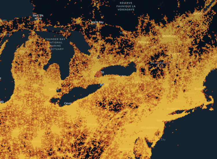
• Membership
  • Newsletter
  • Projects
  • Learning
  • About
  • Member Login
  • Emotional overlap Venn diagrams

    August 6, 2024

    Topic

    Infographics  /  emotion, Inside Out

    I’m hearing murmurs that the Venn diagram is making a comeback. Six Seconds made a pair-wise matrix to show the emotions that stem from combining the emotions from the Inside Out movie.

  • Queuing systems and crowd engineering

    August 5, 2024

    Topic

    Infographics  /  crowds, queuing, Wall Street Journal

    [arve url=”https://www.youtube.com/watch?v=L2XfHREa0j0″ /]

    There’s a science to getting thousands of people to wait in line without things getting out of control. The Wall Street Journal spoke to crowd expert Brett Little to explain the different types of queues and how to strategically funnel people away from the venue when an even finishes.

  • Making illicit fentanyl

    August 2, 2024

    Topic

    Infographics  /  drugs, fentanyl, Reuters

    The process of making fentanyl might not be as complicated as one would hope. However, you might be surprised to know that illegal producers aren’t always consistent and can be sloppy, which is why tens of thousands of people die from overdoses. For Reuters, Daisy Chung, Laura Gottesdiener, and Drazen Jorgic explain the process of getting ingredients, producing the drug, and shipping to the United States.

  • Members Only

    Evaluating Bad Visualization

    August 1, 2024

    Topic

    The Process  /  criticism

    Bad charts and maps are common, but there’s usually a better response than pointing and laughing. Not all the time, but usually.

  • Decline in data for AI bots to scrape

    August 1, 2024

    Topic

    Data Sharing  /  AI, Data Provenance Initiative, ethics, scraping

    The Data Provenance Initiative audited 14,000 web domains to see how sites currently restrict scraping for the purpose of adding to AI datasets like C4, RefinedWeb, and Dolma. Sites are putting up more barriers:

    Our longitudinal analyses show that in a single year (2023-2024) there has been a rapid crescendo of data restrictions from web sources, rendering ~5%+ of all tokens in C4, or 28%+ of the most actively maintained, critical sources in C4, fully restricted from use. For Terms of Service crawling restrictions, a full 45% of C4 is now restricted. If respected or enforced, these restrictions are rapidly biasing the diversity, freshness, and scaling laws for general-purpose AI systems. We hope to illustrate the emerging crisis in data consent, foreclosing much of the open web, not only for commercial AI, but non-commercial AI and academic purposes.

    Bots used to be a welcome thing to see in your web analytics, because it meant that your site was indexed by a search engine. Real people could find your site. However, bots for the purpose of generative AI take everything and those who run sites don’t get much, if anything, in return. The decline in data availability seems warranted.

  • Scrolling map on receipt paper

    July 31, 2024

    Topic

    Maps  /  Aaron Koelker, physical, receipt

    Aaron Koelker printed a six-foot long map on receipt printer earlier this year. He put it in a route sheet holder for more practical usage. Seems like a good end-of-world product, if you’re into that sort of thing.

  • Data Underload  /  BMI, height, obesity, weight

    American Height and Weight

    The chart below shows the distribution of height and weight, based on responses to the 2022 BRFSS survey. Using body mass index (BMI), which is calculated with height and weight, most people fall into the categories of overweight or obese.

    Read More
  • Embroidered landscapes

    July 29, 2024

    Topic

    Maps  /  embroidery, physical, Victoria Rose Richards

    Victoria Rose Richards uses embroidery to depict aerial views and landscapes. The above was inspired by a local creek:

    I was once again directly inspired by my local landscape, copying the shape of the nearby estuary for this creek. Rather than an estuary though, I wanted to depict a receded river bed with dry mud and creeping plants starting to form across the base. Completed with grass, fresh crops and sprinkles of birds.

    It’s one of two pieces still available in Richards’ shop.

  • Illustrated guides to Olympic sports

    July 26, 2024

    Topic

    Infographics  /  Catherine Tai, illustration, Olympics, Reuters

    Reuters, with illustrations by Catherine Tai, has visual guides to all of the Olympic sports. (Trampoline is tucked into the Gymnastics category in case you’re looking.) For each sport, there’s a schedule, a leading illustration, and a set of visuals that show you important moves or terminology.

    It’s very good, especially for the sports you might not be familiar with.

  • Olympic data journalism

    July 26, 2024

    Topic

    Statistics  /  Alberto Cairo, data journalism, Olympics, Simon Rogers

    Speaking of the Olympics, Alberto Cairo and Simon Rogers talked about the warm-blooded aspects of covering sports that make data more meaningful.

    When approaching data visualisation for the Olympics, focus on the humanity of the games by integrating socio-economic, political, and historical stories alongside sports performance. Engage readers by placing them at the centre of visualisations, allowing interactive and fun experiences that reflect the current times and issues. Use handcrafted visuals for warmth and personality, and don’t hesitate to create your own datasets or collaborate with others to overcome data access challenges.

    Everyone knows these athletes are the best in the world, but it’s the more human aspects of their stories that make the performances all the more unbelievable.

  • How Olympic athletes combat the heat

    July 26, 2024

    Topic

    Infographics  /  Bloomberg, heat, Kristian Blummenfelt, Olympics, sports

    A part of outdoor sports is that you must deal with the weather, which is a challenge when it’s really hot and you have to run as fast as you can for a couple of hours. Bloomberg illustrates the challenges and how athletes might cope:

    The harder the human body works, the hotter it gets. Roughly 80% of the energy generated by performing muscular exercises is released as heat, according to Mike Sawka, an environmental physiologist and professor at Georgia Tech. When external temperatures are cool, it’s easy for the body to dissipate that heat through thermal radiation and sweat. But when temperatures soar, and especially when it’s humid, the body struggles to keep up.

    There’s a section that shows triathlete Kristian Blummenfelt’s core temperature against his skin temperature with two line charts during a race. Coupled with the annotation, the charts work well to show the attempts at keeping his body cool and the eventual heat stroke as his body hits its limit.

  • Members Only

    Visualization Tools and Learning Resources, July 2024 Roundup

    July 25, 2024

    Topic

    The Process  /  roundup

    Here’s the good stuff for July.

  • Clean energy from fracking

    July 25, 2024

    Topic

    Infographics  /  fracking, power, Washington Post

    We usually hear about fracking in a negative context, but for the Washington Post, Harry Stevens illustrates how a company aims to convert geothermal heat to usable electricity with zero emissions.

  • Gunman and countersnipers’ points of view during shooting

    July 24, 2024

    Topic

    Infographics  /  New York Times, perspective, shootings

    The New York Times collected drone footage and built a 3-D model to reconstruct the scene of the rally. They show four lines of sight: from the location of the gunman and three countersniper teams. You get a sense of distance and obstructions, which partially explain how the gunman could’ve been missed in surveillance.

  • Data Underload  /  age, cognition, NHIS

    When Working Gets Harder With Age

    Our physical, mental, and emotional abilities change as we get older, and this can affect the kind of work we do. The National Health Interview Survey (NHIS) asks people if they’ve run into such limitations. These charts show the shifts by age, based on the 2023 sample.

    Difficulties increase steadily over the years, but if we’re lucky enough to reach our 80s, there appears to be a steeper drop.

    Read More
  • Cryptocurrency-funded politics

    July 22, 2024

    Topic

    Statistical Visualization  /  cryptocurrency, dashboard, election, Molly White, politics

    Those who run cryptocurrency companies have much to gain from policies that favor them. Follow the Crypto by Molly White tracks the spending:

    Cryptocurrency companies have raised hundreds of millions of dollars to put towards buying crypto-friendly politicians and ousting those who have spoken up for stricter regulations to protect consumers in an industry that is fraught with hacks, scams, and fraud. Although parts of the industry have tried to portray this as a grassroots effort, the reality is that a very small number of crypto companies, and the billionaire executives and venture capitalists behind them, are spending millions with a singular goal: to obtain favorable crypto policy, no matter the cost.

    Like political contribution dashboards before it, the site uses data from the Federal Election Commission.

  • Nate Silver critiques the new 538 forecast model

    July 19, 2024

    Topic

    Statistics, Visualization  /  election, FiveThirtyEight, forecast, Nate Silver, uncertainty

    Nate Silver, who left Disney and the FiveThirtyEight brand last year but took his forecast models with him, is not a fan of the new models on 538, developed by G. Elliott Morris:

    I thought the 538 model seemed basically reasonable when it was first published in June, showing the race as a toss-up. But its behavior since the debate — Biden has actually gained ground in their forecast over the past few weeks even though their polling average has moved toward Trump by 2 points! — raises a lot of questions. This may be by design — Morris seems to believe it’s too early to really look at the polls at all. But If my model was behaving like this, I’d be concerned.

    Moreover, some of the internal workings of the model are strange, or at least appear that way based on the information Morris has made publicly available.

    Silver has his own forecast. It currently places more weight on polls, which makes possible outcomes a lot less favorable for Joe Biden.

    There’s much uncertainty around the election right now, so I wouldn’t lean on any forecast numbers at this point. But I like learning the thought process behind the models.

  • Overlap between area codes HTTP response headers

    July 19, 2024

    Topic

    Maps  /  area code, Doug Sillars, HTTP, humor

    Like many, you’ve probably wondered what HTTP response headers are also area codes in the real world, or vice versa. Doug Sillars has you covered with HTTP Area Codes. This is very important.

  • Members Only

    Sliding for Data

    July 18, 2024

    Topic

    The Process  /  slider

    The slider, a common UI element with a range and a handle that you can drag, has been around for a long time. It’s proven to be useful for visualization.

  • Where immigrants in the U.S. came from

    July 18, 2024

    Topic

    Statistical Visualization  /  immigration, Washington Post

    A lot of immigration talk in the U.S. focuses on Mexico, but immigrants come from other places, of course. Using immigration records from the past decade, the Washington Post provides a breakdown with a streamgraph and a series of maps.

    The records come from the Department of Justice, which are released monthly via a FOIA request. (Sidenote: the download speed for this data seems super slow.)

  • Page 21 of 391
  • <
  • 1
  • ...
  • 18
  • 19
  • 20
  • 21
  • 22
  • 23
  • ...
  • 391
  • >

Analyze, visualize, and communicate data usefully, beyond the defaults.

Become a member →

Recently for Members

May 8, 2025
When the data is not what it seems

May 1, 2025
Finding the Right Charts

April 24, 2025
Visualization Tools, Datasets, and Resources – April 2025 Roundup

April 17, 2025
Breaking Out of Chart Software Defaults

April 15, 2025
Line Chart with Decorative Neon Accents

Browse by Chart Type See All →

Word Cloud Square Pie Chart Pictogram Grid Map Packed Bubble Chart Stacked Area Chart Spiral Chart Area Chart Variable Width Bar Chart

Browse By Topic

  • Visualization

    Seeing data

  • Maps

    Seeing geographic data

  • Infographics

    Explaining data

  • Networks

    Connecting data

  • Statistics

    Analyzing data

  • Software

    Working with data

  • Sources

    Getting data

  • Design

    Making data readable

Get the Book

Visualize This: The FlowingData Guide to Design, Visualization, and Statistics

Available now.

Order: Amazon / Bookshop

Made by FlowingData

  • The Process

  • Data Underload

  • Chart Everything

  • Guides

  • Books

  • Shop

  • About
  • Contact
  • Newsletter
  • LinkedIn
  • Instagram
  • Bluesky
  • RSS
Copyright © 2007-Present FlowingData. All rights reserved.