How to Read and Use Histograms in R
The chart type often goes overlooked because people don’t understand them. Maybe this will help.
The histogram is one of my favorite chart types, and for analysis purposes, I probably use them the most. Devised by Karl Pearson (the father of mathematical statistics) in the late 1800s, it’s simple geometrically, robust, and allows you to see the distribution of a dataset.
If you don’t understand what’s driving the chart though, it can be confusing, which is probably why you don’t see it often in general publications.
Not a bar chart
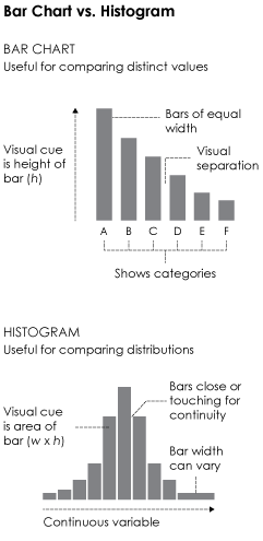 One of the most common mistakes is to interpret histograms as if they were bar charts. This is understandable, as they’re visually similar. Both use bars placed side-by-side, and bar height is a main visual cue, but the small differences between them change interpretation significantly.
The main difference, shown in the graphic on the right, is that bar charts show categorical data (and sometimes time series data), whereas histograms show a continuous variable on the horizontal axis. Also, the visual cue for a value in a bar char is bar height, whereas a histogram uses area i.e. width times height.
This means you read the two chart types differently. The bar chart is for categories, and the histogram is for distributions. The latter lets you see the spread of a single variable, and it might skew to the left or right, clump in the middle, spike at low and high values, etc. Naturally, it varies by dataset.
Although bar widths are typically the same width.Finally, because histograms use area instead of height to represent values, the width of bars can vary. This is usually to see the long-tail better or to view dense areas with less noise.
Main note: Bar charts and histograms are different.
Now let’s look closer at the histogram to see how this works in practice.
Histogram deconstructed
For preservation, I’ve also included the data file in the download of this tutorial.For a working example, we’ll look to the classic one: the height of a group of people. More specifically, the height of NBA basketball players of the 2013-14 season. The data is in a downloadable format at the end of a post by Best Tickets.
If you don’t have R downloaded and installed yet, now is a good time to do that. It’s free, it’s open source, and it’s a statistical computing language worth learning if you play with data a lot. Download it here.
Also set your working directory to wherever you saved the code for this tutorial to.Assuming you have the R console open, load the CSV file with read.csv().
# Load the data.
players <- read.csv("nba-players.csv", stringsAsFactors=FALSE)
There are several variables including age, salary, and weight, but for the purposes of this tutorial, you’re only interested in height, which is the Ht_inches column.
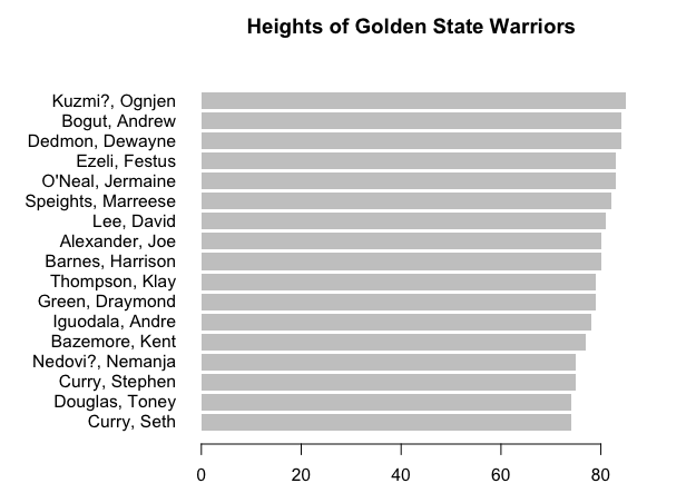
First a bar chart. It doesn’t make much sense to make one for all the players, but you can make one for just the players on the Golden State Warriors.
warriors <- subset(players, Team=="Warriors")
warriors.o <- warriors[order(warriors$Ht_inches),]
par(mar=c(5,10,5,5))
barplot(warriors.o$Ht_inches, names.arg=warriors.o$Name, horiz=TRUE, border=NA, las=1, main="Heights of Golden State Warriors")
You get a bar chart that looks like the following:
Similarly, you can make one for the average height of players, for each position.
avgHeights <- aggregate(Ht_inches ~ POS, data=players, mean)
avgHeights.o <- avgHeights[order(avgHeights$Ht_inches, decreasing=FALSE),]
barplot(avgHeights.o$Ht_inches, names.arg=avgHeights.o$POS, border=NA, las=1)
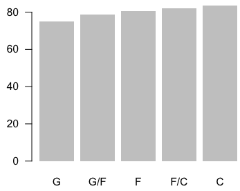 In the first bar chart, there’s a bar for each player, but this takes up a lot of space and is limited in the amount of information it shows. The second one only shows aggregates, and you miss out on variation within the groups.
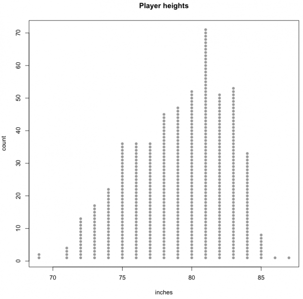
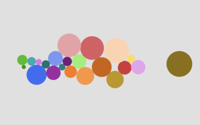
Let’s try a different route. Imagine you arranged players into several groups by height. There’s a group for every inch. That is, if someone is 78 inches tall, they go to the group where everyone else is 78 inches tall. Do that for every inch, and then arrange the groups in increasing order.
You can kind of do this in graph form. But substitute the players with dots, one for each player.
htrange <- range(players$Ht_inches)	# 69 to 87 inches
cnts <- rep(0, 20)
y <- c()
for (i in 1:length(players[,1])) {

	cntIndex <- players$Ht_inches[i] - htrange[1] + 1
	cnts[cntIndex] <- cnts[cntIndex] + 1
	y <- c(y, cnts[cntIndex])

}
plot(players$Ht_inches, y, type="n", main="Player heights", xlab="inches", ylab="count")
points(players$Ht_inches, y, pch=21, col=NA, bg="#999999")
You get a chart that gives you a sense of how tall people are in the NBA. The bulk of people are in that 75- to 83-inch range, with fewer people in the super tall or relatively short range. For reference, the average height of a man in the United States is 5 feet 10 inches.
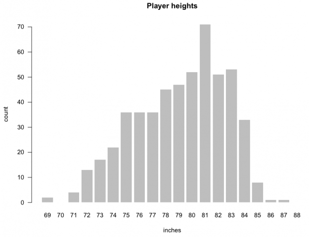
Or you can convert those dots to bars for each height.
barplot(cnts, names.arg=69:88, main="Player heights", xlab="inches", ylab="count", border=NA, las=1)
Notice that each bar represents the number of people who a certain height instead of the actual height of a player, like you saw at the beginning of this tutorial. Looks like you got yourself a histogram.
Make some histograms
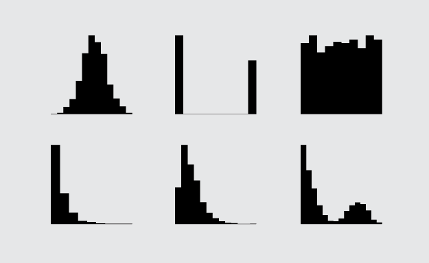
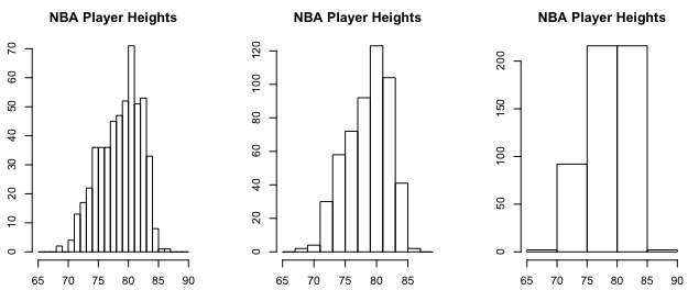
You don’t have to actually count every player every time though. There’s a function in R, hist(), that can do that for you. Pass player heights into the first argument, and you’re good. You can also change the size of groups, or bins, as they’re called in stat lingo. Instead of a bin for every inch, you could make bins in five-inch intervals. For example, there could be a bin for 71 to 75 inches (inclusive) and another for 76 to 80. Again, the interval you choose depends on the data and how much variation you want to see.
par(mfrow=c(1,3), mar=c(3,3,3,3))
hist(players$Ht_inches, main="NBA Player Heights", xlab="inches", breaks=seq(65, 90, 1))
hist(players$Ht_inches, main="NBA Player Heights", xlab="inches", breaks=seq(65, 90, 2))
hist(players$Ht_inches, main="NBA Player Heights", xlab="inches", breaks=seq(65, 90, 5))
This is how the same data can be showed in different ways.
If you recall, the width of bars doesn’t have to be uniform.
par(mfrow=c(1,3), mar=c(3,3,3,3))
hist(players$Ht_inches, main="NBA Player Heights", xlab="inches", breaks=c(seq(65, 75, 2), 80, 90))
hist(players$Ht_inches, main="NBA Player Heights", xlab="inches", breaks=c(65, 75, seq(80, 90, 2)))
hist(players$Ht_inches, main="NBA Player Heights", xlab="inches", breaks=c(65, seq(70, 80, 1), 90))
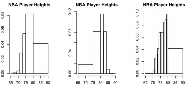
I suggest you do this with care. For one, you might confuse some, and two, it’s possible you might obscure interesting parts in your data. Doesn’t hurt to try variations.
Back to the beginning.
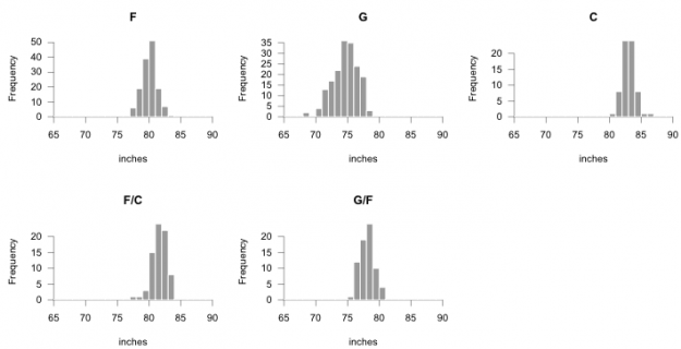
You looked at average height per player. That was just one number to represent of bunch of players who played a position. The distribution for each position is more interesting.
par(mfrow=c(2,3), las=1, mar=c(5,5,4,1))
positions <- unique(players$POS)
for (i in 1:length(positions)) {
	currPlayers <- subset(players, POS==positions[i])
	hist(currPlayers$Ht_inches, main=positions[i], breaks=65:90, xlab="inches", border="#ffffff", col="#999999", lwd=0.4)
}
This provides a more specific view of player heights. For example, forward slash centers average over 80 inches tall, but there are many a few inches taller and a few inches shorter.
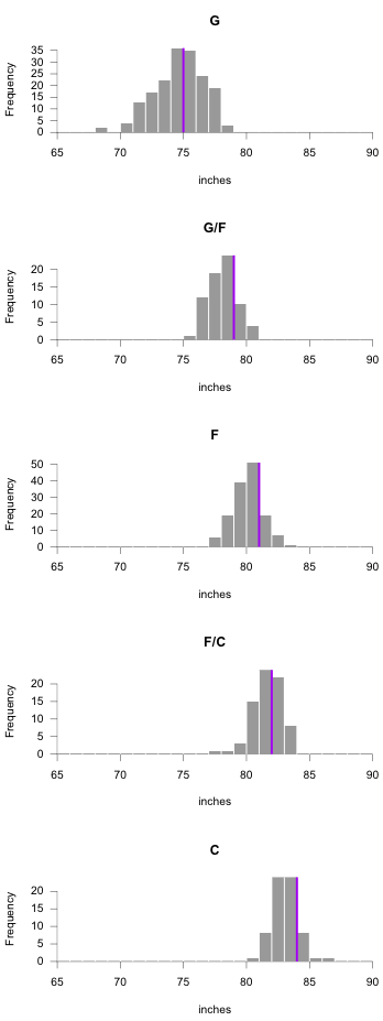
Here’s a finished graphic with histograms arranged vertically, and here’s another with histograms flipped on their side.It can also help to arrange multiple histograms in a logical order for better comparison. Notice the consistent scale on the horizontal. By default, the horizontal axis spans the range of the dataset, but you can specify breaks in the hist() function, so that it’s consistent across all facets. The code below also adds a median line (for kicks).
par(mfrow=c(5,1), las=1, mar=c(5,5,4,1), xaxs="i", yaxs="i")
for (i in 1:length(avgHeights.o$POS)) {
	currPlayers <- subset(players, POS==avgHeights.o$POS[i])
	htMedian <- median(currPlayers$Ht_inches)
	h <- hist(currPlayers$Ht_inches, main=avgHeights.o$POS[i], breaks=65:90, xlab="inches", border=NA, col="#999999", lwd=0.4)
	maxFreq <- max(h$counts)
	segments(h$breaks, rep(0, length(h$breaks)), h$breaks, maxFreq, col="white")

	# Median line
	lines(c(htMedian, htMedian), c(-1, maxFreq), col="purple", lwd=2)
}
The layout below does take up some space, but it’s useful when you explore your dataset.
Wrapping up
Hopefully, this sheds a little bit of light on the classic statistical visualization. It takes some getting used to, especially if they’re brand new to you, but they can help you see a lot in your data, so it’s worth the tiny bit of trouble. Distributions are typically far more interesting than aggregates.
Made possible by FlowingData members.
Become a member to support an independent site and learn to make great charts.
About the Author
Nathan Yau is a statistician who works primarily with visualization. He earned his PhD in statistics from UCLA, is the author of two best-selling books — Data Points and Visualize This — and runs FlowingData. Introvert. Likes food. Likes beer.
4 Comments
Add Comment
You must be logged in and a member to post a comment.
I have zero ideas what you’re doing in the code pasted below. I tried running it individually but I can’t make any sense out of it. The for loop going over each player name is clear, but I don’t understand what’s going on beyond.
for (i in 1:length(players[,1])) {
cntIndex <- players$Ht_inches[i] – htrange[1] + 1
cnts[cntIndex] <- cnts[cntIndex] + 1
y <- c(y, cnts[cntIndex])
}
Hi Kenny, so this is to make that plot with the columns of stacked dots. Each iteration of the for-loop makes a single dot per player.
The
cntsvector, which starts at all 0s, keeps track of how many players have been placed at each height so far. The indices for thecntsvector are from 1 to 20 though, so thecntIndexis a quick calculation to get the index based on the current player’s height.Then the y-coordinate is added to the
yvector for use in thepoints()function (after the loop).So overall, the loop is there to calculate the y-coordinates for each player’s circle.
Hope that helps?
That makes sense. I think I’ll have to go over it a few times before I fully understand it though. Do you have any tutorials, or book recommendations, that deal specifically with these sort of problems? I’m sticking with this because base R is really fun.
I’ve used ggplot2 mostly. It’s interesting to see the actual workings behind hit. As for small multiples: creating them in ggplot2 is so simple, I’m happy to see the actual functionality behind it.
The most introductory tutorial I have is this one on getting started with charts in R:
https://flowingdata.com/2012/12/17/getting-started-with-charts-in-r/
The visualization in R course should also be helpful:
https://flowingdata.com/visualization-in-r/
If you really want to know how the sausage gets made, the textbook R Graphics by Murrell describes R graphics in full detail.
Faceting with ggplot2 seems to be a fan favorite for small multiples. I’ve done it like the above so many times though that it’s easier for me to make it like this.