-
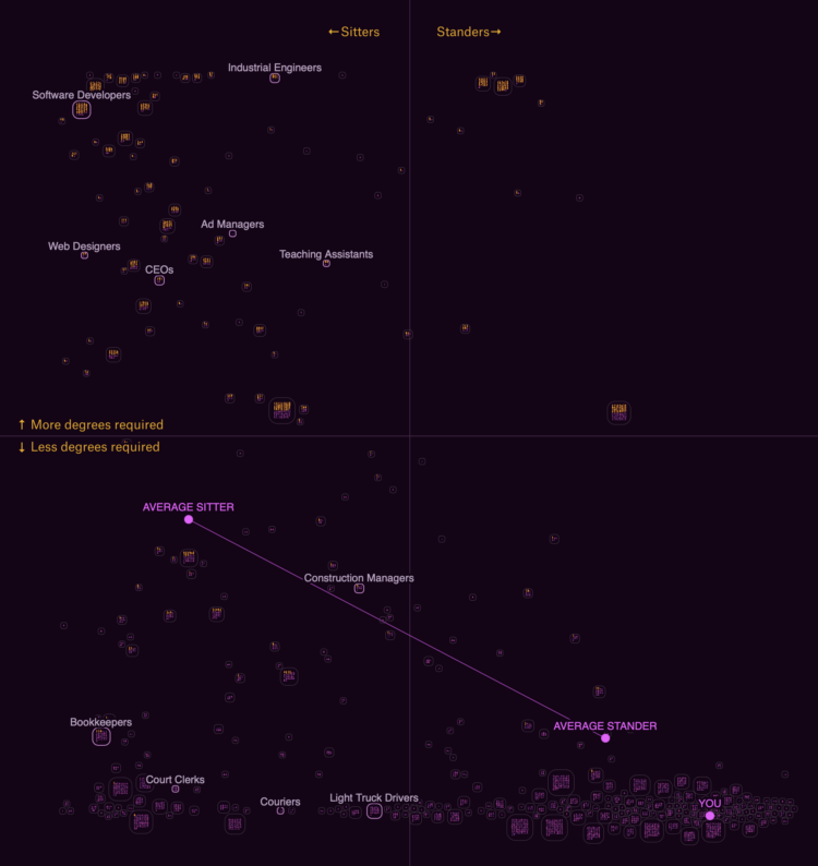
The Survey of Consumer Finances from the Federal Reserve asks people about their assets and debt, which are used to estimate net worth. With the most recent release for 2022 (the survey runs every three years), see how your household’s net worth compares against others’.
-
There are food shortages in Guatemala. For Reuters, Cassandra Garrison, Clare Trainor and Sarah Slobin used a height chart to show stunted growth as an indicator.
A few tortillas and a half bowl of reheated beans were all Maria Concepcion Rodriguez had to feed her six children in the isolated village of El Aguacate, one day in August.
Only her three-month-old breastfed baby had height commensurate with her age. The others were stunted by undernourishment. They looked too young for their years.
-
Data for the 2022 Survey of Consumer Finances, from the Federal Reserve Board, was made available recently. It comes out every three years, so you can see how income and savings have changed over time, broken down by demographics.
For example, the above shows that net worth increased, across age groups, since the last release in 2019. The chart is from the SCF’s “chartbook,” which isn’t the most elegant thing in the world, but it works.
-
Mike Breen is a well-known NBA basketball announcer. When a player hits a big three-pointer, Breen often uses his catchphrase, “Bang!” Someone counted all the times he yelled the phrase for each player, because sure why not. Stephen Curry and Klay Thompson are a cut above the rest.
-
When I was a kid, I remember uncomfortably walking past the book section at a grocery store where I would see a bunch of books with a muscular man, probably Fabio, clutching to a woman as he looked deeply into her eyes. Times have changed. For The Pudding, Alice Liang analyzed the shifting style of the romance novel cover.
-
The Google Maps API lets you access high-resolution 3D map tiles now. Robert Hodgin has been experimenting with the new data source using Houdini, which is 3D graphics software that might as well be black magic.
-
For The New York Times, K.K. Rebecca Lai and Jennifer Medina show the changing checkboxes over the past couple centuries:
Over the centuries, the census has evolved from one that specified broad categories — primarily “free white” people and “slaves” — to one that attempts to encapsulate the country’s increasingly complex demographics. The latest adaptation proposed by the Biden administration in January seeks to allow even more race and ethnicity options for people to describe themselves than the 2020 census did.
What we measure and how we measure is a reflection of what we’ve cared about.
-
Members Only
-
One of the most straightforward ways to help others better understand the scale of an unfamiliar place is to compare it to familiar places. For The Washington Post, Dylan Moriarty and Bonnie Berkowitz show Gaza next to a handful of major U.S. cities.
-
Julia Janicki, Daisy Chung, and Joyce Chou explore Taiwan’s aging population, where in 2021, pets outnumbered children. I like the experimental views in this piece. More of this please.
-
This is how the most common causes have changed over time for people aged 0 to 85.
-
Peter Atwood used NASA data to depict the wildfires in Canada this year. The realistic rendering of the fires as burning embers and smoke activity is something.
-
Solar power is clean and all, but what happens when the sun is blocked by the moon and there’s suddenly no sunlight for a fixed period of time? For Bloomberg, Naureen Malik, with graphics by Denise Lu, describes the preparations that power companies will take during this weekend’s solar eclipse.
-
The moon is going to get in the way of the sun this Saturday. For The New York Times, Jonathan Corum has the map of when and how much sun coverage we’ll see in the western hemisphere.
-
Members Only
-
Cloud formation depends on temperature and moisture levels, so in places of high humidity like the East Coast and Pacific Northwest, the clouds form lower. In dryer places like the southwestern United States, the clouds don’t form until higher up. For The Washington Post, Kasha Patel and Dylan Moriarty have the maps that show the contrast over the seasons.
-
Members Only
Heatmaps in R usually require or assume a rectangular dataset with the same sized cells all the way through. Sometimes data is unevenly spaced though, in which case you can either reformat your data to squeeze it into a function, or you can draw it ad hoc. This tutorial is for the latter.
-
Star Trek and related might be fictional, but they usually reference real stars, planets, and galaxies. Overview Effect mapped, charted, and spreadsheeted the possible real-life locations in space of the fictional places.
-
Claudia Goldin, an economist at Harvard, has won the Nobel Prize in Economics. A big part of her studies are rooted in the collection and analysis of centuries-old data:
Women are vastly underrepresented in the global labour market and, when they work, they earn less than men. Claudia Goldin has trawled the archives and collected over 200 years of data from the US, allowing her to demonstrate how and why gender differences in earnings and employment rates have changed over time.
Goldin showed that female participation in the labour market did not have an upward trend over this entire period, but instead forms a U-shaped curve. The participation of married women decreased with the transition from an agrarian to an industrial society in the early nineteenth century, but then started to increase with the growth of the service sector in the early twentieth century. Goldin explained this pattern as the result of structural change and evolving social norms regarding women’s responsibilities for home and family.
Amazing.
The illustrations by Johan Jarnestad that accompany the announcement are also really useful.