
You’ve probably heard about herd immunity by now. Vaccinations help the individual and the community, especially those who are unable to receive vaccinations for various reasons. The Guardian simulated what happens at various vaccination rates.
Luckily, the measles vaccine — administered in the form of the MMR for measles, mumps and rubella — is very effective. If delivered fully (two doses), it will protect 99% of people against the disease. But, like all vaccines, it’s not perfect: 1% of cases are likely to result in vaccine failure, meaning recipients won’t develop an immune response to the given disease, leaving them vulnerable. Even with perfect vaccination, one of every 100 people would be susceptible to measles, but that’s much better than the alternative.
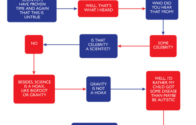
If you’re still unsure, please consult this flowchart to decide.


 Visualize This: The FlowingData Guide to Design, Visualization, and Statistics (2nd Edition)


