State Rorschach

That’s Mimal the elfin chef with a pan of fried chicken. He is named after the first letter of each state that he is composed of: Minnesota, Iowa, Missouri, Arkansas, and Louisiana. It’s an old gag but it still amuses me, and it always unburies the age-old question. Do the states make Mimal or does Mimal make the states? The question is so deep and profound that I don’t dare try to answer it.

Mimal came across my desk the other day, and as I stared longingly at his pan of fried chicken, I wondered:

“Are there more Mimals among us? What other characters are hidden in our boundaries? And are these clues that I can pass on to Nicholas Cage to find the next national treasure, or does he already know about them? Am I just wasting my time?”

I brushed off my insecurities and fear and began the journey. And began it did. Here’s what I found.

States and shapes

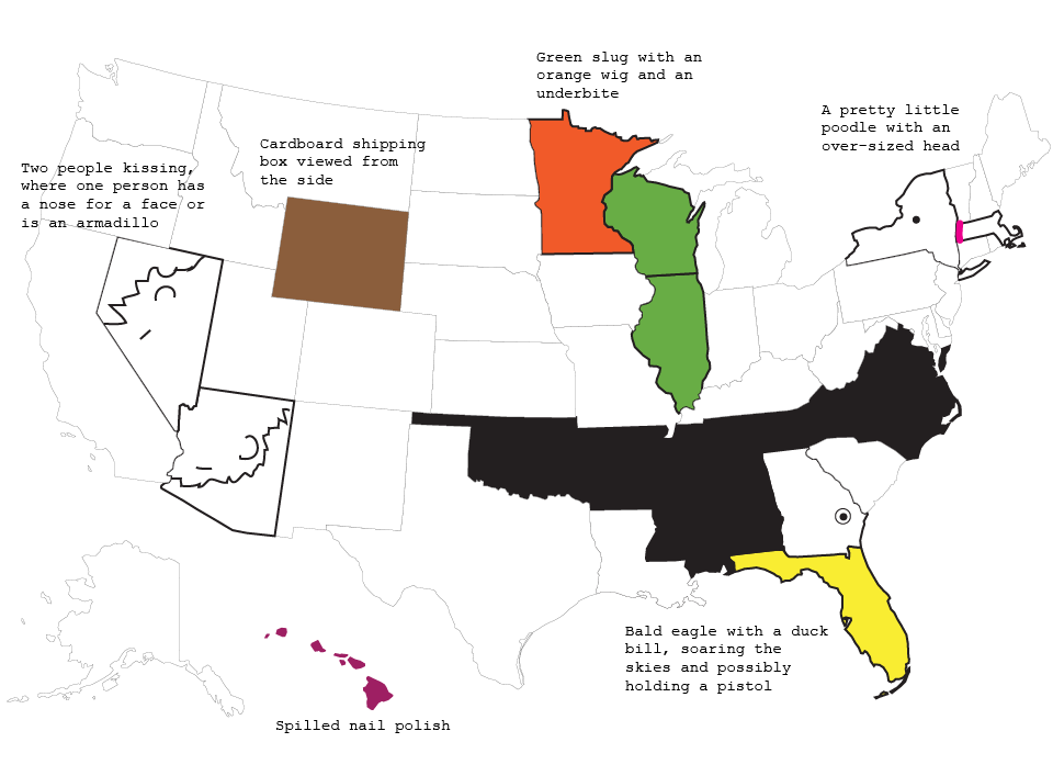
Here’s the thing though. If you stare at the states long enough, your mind tricks you into seeing anything. I mean, come on. Green slug with an orange wig and an underbite? That’s a stretch.

But this. This my friends is glaringly obvious, and like Mimal, once I saw this I could not believe it was there all along, right in front of me.

Smiley county

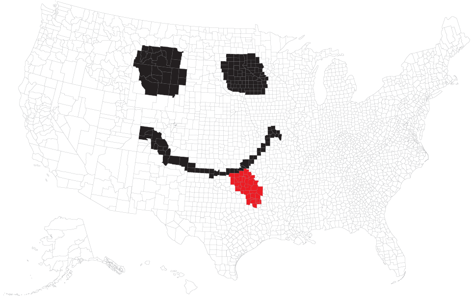
Life, as we know it, will never be the same.

Become a member. Support an independent site. Make great charts.

See What You Get

Learn to Visualize Data See All →

How to Map Geographic Paths in R

As people and things move through a place, it can be useful to see their connected paths instead of just individual points.

Interactive Time Series Chart with Filters

Time series charts can easily turn to spaghetti when you have multiple categories. By highlighting the ones of interest, you can direct focus and allow comparisons.

How to Make a Grid Map with Histograms in R, with ggplot

Layout multiple charts in a single view. Then adjust the scales appropriately for maximum comparability and a unified graphic.

How I Made That: Searchable Time Series Chart

When there are too many options or categories, it can be helpful to make the data searchable.

Favorites

10 Best Data Visualization Projects of 2015

These are my picks for the best of 2015. As usual, they could easily appear in a different order on a different day, and there are projects not on the list that were also excellent.

Cycle of Many, a 24-hour snapshot for a day in the life of Americans

This is a 24-hour snapshot for a day in the life of Americans.

Best Data Visualization Projects of 2016

Here are my favorites for the year.

10 Best Data Visualization Projects of 2017

It was a rough year, which brought about a lot of good work. Here are my favorite data visualization projects of the year.