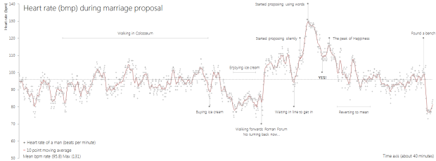
• Membership
  • Newsletter
  • Projects
  • Learning
  • About
  • Member Login
  • Out, liar.

    September 2, 2014

    Topic

    Miscellaneous  /  humor, outlier

    By Ben Shabad, full-time graduate student and part-time cartoon-drawing person.

  • PlotDevice: Draw with Python

    September 2, 2014

    Topic

    Software  /  PlotDevice, Python

    You’ve been able to visualize data with Python for a while, but Mac application PlotDevice from Christian Swinehart couples code and graphics more tightly. Write code on the right. Watch graphics change on the right.

    The application gives you everything you need to start writing programs that draw to a virtual canvas. It features a text editor with syntax highlighting and tab completion plus a zoomable graphics viewer and a variety of export options.

    PlotDevice’s simple but com­pre­hen­sive set of graphics commands will be familiar to users of similar graphics tools like NodeBox or Processing. And if you’re new to programming, you’ll find there’s nothing better than being able to see the results of your code as you learn to think like a computer.

    Looks promising. Although when I downloaded it and tried to run it, nothing happened. I’m guessing there’s still compatibility issues to iron out at version 0.9.4. Hopefully that clears up soon. [via Waxy]

  • Emotional dynamics of literary classics

    September 1, 2014

    Topic

    Statistics  /  Computational Story Lab, happiness, literature

    As a demonstration of efforts in estimating happiness from language, Hedonometer charts emotion over time for literary classics. The above is the collection of charts for Adventures of Huckleberry Finn by Mark Twain.

    I wish I could say this meant something to me, but comparative literature in high school was never my strong suit. From a totally superficial point of view though, the chart in the top left shows happiness metrics — based on the research of Peter Dodds and Chris Danforth — through the entirety of the book. The chart on the right shows a comparison of book sections, which you can select in the first chart.

  • Louisiana is drowning

    August 29, 2014

    Topic

    Maps  /  levees, Louisiana, ProPublica

    Louisiana is quickly losing much of its coast to the Gulf of Mexico. ProPublica and The Lens just launched an interactive project that shows you by how much and tells the story of those affected.

    In 50 years, most of southeastern Louisiana not protected by levees will be part of the Gulf of Mexico. The state is losing a football field of land every 48 minutes — 16 square miles a year — due to climate change, drilling and dredging for oil and gas, and levees on the Mississippi River. At risk: Nearly all of the nation’s domestic energy supply, much of its seafood production, and millions of homes.

    There is a lot to look at and learn about, but the most telling is when you zoom in to specific regions indicated by squares on the map. Use the timeline that appears at the top of the map to see how the coastline, based on satellite imagery, has diminished since 1932. It’s disconcerting.

  • How to Make Dot Density Maps in R

    Choropleth maps are useful to show values for areas on a map, but they can be limited. In contrast, dot density maps are sometimes better for showing distributions within regions.

  • Interactive tool shows impact of terrorism

    August 28, 2014

    Topic

    Infographics  /  Periscopic, terrorism

    The Global Terrorism Database, maintained by the University of Maryland, is an open source database that catalogs terrorism events since 1970 through 2013. Data visualization firm Periscopic visualized the incident-level data in A World of Terror.

    There are over 3,065 organizations and groups listed in the GTD. To identify the top 25 organizations who used terrorist tactics, we determined the groups with the most killings, the most wounded, and the most incidents. We wanted to make sure we were inclusive of all actions, including those that neither wounded nor killed. We aggregated these 3 lists and took the top 25 organizations (most were in the top 30 for all 3 categories). These top 0.8% of groups account for over 26% of the 125,087 incidents.

    The midsection of each group shows number of incidents by month and year. The darker the brown, the more incidents on record. Then on the top and bottom shows number of people killed in red and wounded in orange, respectively. Finally, click on the map in the top left for more information about the organization.

    Spend some time with this one. Periscopic shows a lot without it ever feeling like too much.

  • Graph-based video game

    August 27, 2014

    Topic

    Data Art  /  Metrico, video games

    Last year, Metrico, an infographic-based puzzle game for the PlayStation Vita, was announced for future release. It’s out now.

    I must’ve been in a pissy mood from too many spam-fographics in my suggestions inbox last year, because I brushed this game off for whateversville (and seemed upset about it). Metrico totally seems like a game I would like though. You essentially navigate a 3-D world of graphs, and the terrain changes based on your own actions and button pushes. Just don’t use the game design as an idea bucket for your next slide deck. [via Wired]

  • Face tracking coupled with projection mapping

    August 26, 2014

    Topic

    Data Art  /  face tracking, projection mapping

    Projection mapping — the use of projected images onto physical objects to turn them into something else — continues to grow more impressive. Nobumichi Asai and team combined it with face tracking to completely change a person’s face to someone and something else.

    Slightly creepy. Super fascinating. [via Boing Boing]

  • Finding small villages in big cities

    August 25, 2014

    Topic

    Statistical Visualization  /  communication, MIT Senseable City Lab, mobile, social

    Daily life in cities tends to differ from daily life in small towns, especially by who we interact with. The MIT Senseable City Lab and the Santa Fe Institute studied this social aspect — individuals’ contacts by city size — through anonymized mobile phone logs. As expected, those in cities with greater populations tended to have more contacts. However, when the researchers looked at who knew who, the results were more constant.

    Surprisingly, however, group clustering (the odds that your friends mutually know one another) does not change with city size. It seems that even in large cities we tend to build tightly knit communities, or ‘villages,’ around ourselves. There is an important difference, though: if in a real village our connections might simply be defined by proximity, in a large city we can elect a community based on any number of factors, from affinity to interest to sexual preference.

    Read the full paper for more details.

  • Introvert’s heart mapped

    August 22, 2014

    Topic

    Maps  /  Gemma Correll, humor, introvert

    Cartoonist Gemma Correll mapped the introvert’s heart, from recluse corner to the town of online ordering. Seems about right.

    It’s also available in print, so that you can decorate your cave.

  • Mapping plastic in the ocean

    August 21, 2014

    Topic

    Maps  /  environment, National Geographic, plastic

    In research efforts to understand marine debris, Andres Cozar Cabañas et al recently published findings on plastic debris in the open ocean. National Geographic and geographer Jamie Hawk mapped the data.

    Extent of ocean plastic

  • Track your sleep with Sense

    August 21, 2014

    Topic

    Self-surveillance  /  Kickstarter, sleep

    Entering the market of self-surveillance for sleep, via Kickstarter, Sense promises to be a smarter tracker that you don’t have to wear.
    Read More

  • Feltron Annual Report 2013

    August 21, 2014

    Topic

    Self-surveillance  /  Nicholas Felton, report

    In his ninth edition of the personal report, Nicholas Felton looks at communication through his phone, email, Facebook, and physical mail.
    Read More

  • When the world sleeps

    August 20, 2014

    Topic

    Statistical Visualization  /  Jawbone, sleep

    An additional hour of sleep can make a huge difference in how you feel the next day (especially when you have kids). It’s the ability to concentrate for long periods of time versus the ability to stare at a clock until your next break. I got the Jawbone UP24 band to try to improve on that, and I still wear it every night to better understand my sleep habits.

    So, it only seems natural for Jawbone to look closer at how people sleep as a whole in a couple of interactive graphics. Select your city to see how people sleep in your neck of the woods.

    Every now and then we see a set of graphics that shows America’s sleep habits, based on data from the American Time Use Survey. The Jawbone data is likely more accurate though, which makes it more interesting. The former depends on survey participants’ memories and doesn’t factor out things like reading in bed. The latter is actual sleep.

  • Everywhere Jonny Cash went, man

    August 20, 2014

    Topic

    Maps  /  humor, Johnny Cash

    Johnny Cash says he went to a lot of places in his song, “I’ve Been Everywhere.” Iain Mullan had some fun with the location list for Music Hack Day London and mapped each place as the song plays.

    Also related to songs and location: where Ludacris claimed to have hoes.

  • Unintentional Venn diagram suggests opposite meaning

    August 19, 2014

    Topic

    Mistaken Data  /  Reuters, venn diagram

    Most people probably wouldn’t think much about this poster that shows the values of Thomson Reuters. But when you think of the graphic as a Venn diagram, it’s hard to see much else.

  • Not automatic

    August 19, 2014

    Topic

    Statistics  /  data wrangling, Jeffrey Heer, New York Times

    It’s an absolute myth that you can send an algorithm over raw data and have insights pop up.

    — Jeffrey Heer in For Big-Data Scientists, ‘Janitor Work’ Is Key Hurdle to Insights by Steve Lohr

  • Crisis Text Line releases trends and data

    August 19, 2014

    Topic

    Data Sources  /  Crisis Text Line

    Crisis Text Line is a service that troubled teens can use to find help with suicidal thoughts, depression, anxiety, and other issues via text messaging. The long-term hope was to anonymize and encode these text messages so that researchers and policy-makers could better understand something typically kept private to the individuals.

    Following through, the organization recently released a look into their data and a sample of encoded messages. (There’s a link to download the data at the bottom of the page.)

    The visual part of the release shows when text messages typically come in, and you can subset by issue, state, and days. It could use some work, but it’s a good start. Hopefully they keep working on it and release more data as the set grows. It could potentially do a lot of good.

  • Talking Ferguson on Twitter and localness

    August 18, 2014

    Topic

    Maps  /  Ferguson, Twitter

    For trending topics, Twitter likes to show an animated map of how a lot of people talked about something at once. They pushed one out for Ferguson tweets. Naturally, the map looks a lot like population density. So instead, Eric Huntley aggregated and normalized for a more useful view.

    Ultimately, despite the centrality of social media to the protests and our ability to come together and reflect on the social problems at the root of Michael Brown’s shooting, these maps, and the kind of data used to create them, can’t tell us much about the deep-seated issues that have led to the killing of yet another unarmed young black man in our country [5]. And they almost certainly won’t change anyone’s mind about racism in America. They can, instead, help us to better understand how these events have been reflected on social media, and how even purportedly global news stories are always connected to particular places in specific ways.

    You won’t find answers to the more important questions on Twitter.

  • Map of military surplus distribution

    August 17, 2014

    Topic

    Maps  /  military, New York Times, weapons

    With the situation in Ferguson, the New York Times mapped the distribution of military surplus through Defense Department program. Equipment, especially assault rifles, have gone to most parts of the United States.

  • Page 215 of 392
  • <
  • 1
  • ...
  • 212
  • 213
  • 214
  • 215
  • 216
  • 217
  • ...
  • 392
  • >

Analyze, visualize, and communicate data usefully, beyond the defaults.

Become a member →

Recently for Members

May 15, 2025
Step Chart, Enhanced

May 8, 2025
When the data is not what it seems

May 1, 2025
Finding the Right Charts

April 24, 2025
Visualization Tools, Datasets, and Resources – April 2025 Roundup

April 17, 2025
Breaking Out of Chart Software Defaults

Browse by Chart Type See All →

Calendar Packed Bubble Chart Bubble Chart Surface Plot Difference Chart Organogram Bar Chart Race Ternary Plot Line Map Dot Plot

Browse By Topic

  • Visualization

    Seeing data

  • Maps

    Seeing geographic data

  • Infographics

    Explaining data

  • Networks

    Connecting data

  • Statistics

    Analyzing data

  • Software

    Working with data

  • Sources

    Getting data

  • Design

    Making data readable

Get the Book

Visualize This: The FlowingData Guide to Design, Visualization, and Statistics

Available now.

Order: Amazon / Bookshop

Made by FlowingData

  • The Process

  • Data Underload

  • Chart Everything

  • Guides

  • Books

  • Shop

  • About
  • Contact
  • Newsletter
  • LinkedIn
  • Instagram
  • Bluesky
  • RSS
Copyright © 2007-Present FlowingData. All rights reserved.