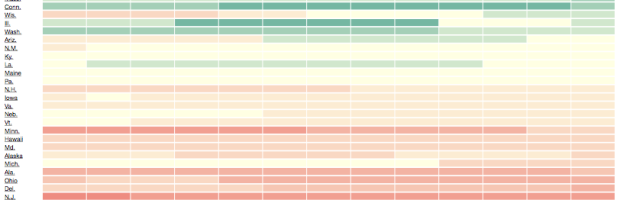
Your standard choropleth map shows geographic areas colored by a single variable. You’re reading this, so you’ve seen them before. What if you have two variables? Then maybe a bivariate choropleth map. Cartographer Joshua Stevens describes the method and how to make one in open-source mapping software QGIS.
Read More
-
-

Flight arrival and departure times are often thought of in terms of “on time” or “delayed.” To determine the “best” airline, we look for the airline with the highest rate of on time flights. That makes sense, until you consider that many airlines pad their schedules with extra minutes.
Read More -
Sisi Wei and Charles Ornstein for ProPublica highlight reported data breaches to the U.S. Department of Health and Human Services that affected at least 500 people, since October 2009. Of the 1,142 reports, there were only seven fines.
Read More -
Mathematician Hannah Fry talks about love in terms of three “mathematically verifiable” tips: how to win at online dating, when to marry, and how to avoid divorce.
Read More -
Quick and simple. It is a common theme in visualization that preaches clarity in as little time as possible, and it is certainly applicable in a variety of places. But is there a place for complexity in visualization that encourages people to carefully read what the data is about? Giorgia Lupi, design director at Accurat, thinks so.
Read More -
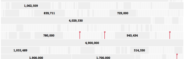
Workers’ Compensation, a promise to pay medical bills and some of your wages if you’re injured on the job, has been been on the decline over the past decade. ProPublica shows the changes from several angles — state reforms, cost to the employer, and employee compensation — with three interactive graphics.
Read More -
Sharif Corinaldi moved from New York to Berkeley for graduate school and was in search of a mate. However, after a bit of non-success with online dating sites, he figured a 0.0025 percent chance of finding a match, which meant about 400 messages sent before any success. So, he built a bot to browse and search for him. He accidentally left it running one night.
Read More -
The Girl Scouts, known for their annual cookie sales, uses two bakers. These two bakers make similar but different cookies, so Thin Mints in one area of the United States might not be the same as another. Gasp.
Read More -

On Broadway, by Daniel Goddemeyer, Moritz Stefaner, Dominikus Baur, and Lev Manovich, provides a slice-by-slice view of the street that goes through Manhattan. Instead of a map like you might expect from such a project, the piece uses “a visually rich image-centric interface, where numbers play only a secondary role.”
Read More -
In her 2012 piece Stranger Visions, Heather Dewey-Hagborg used DNA found in public left in chewed gum, cigarette butts, and hair to construct estimated face busts.
Read More -
By Emily McDowell, this recounting of dates initiated by the internet is funny. Fittingly posted on Valentine’s Day, a sample:
Estimated percentage of profiles containing the description “fun-loving”: 80
Estimated percentage of people who do not actually love fun: 0
Estimated percentage of single people in Los Angeles who both work and play hard: 85
Estimated number of times I rewrote my profile: 7
Estimated number of times I wore the same dress on first dates: 28
Estimated number of times I switched my own “body type” check box: 12
-
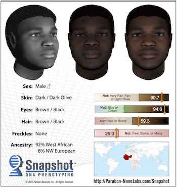 Parabon NanoLabs is working on a service that provides face estimates using DNA found at crime scenes. Pretty cool.
 But, before anyone gets too excited, keep in mind that the estimates are still really rough.
Greytak agrees Snapshot is not super-precise, nor is the science ready for it to be. “Our goal is not to produce a profile that is perfectly accurate and there is only one person you’ve ever seen who could match that profile,” she says. “Really our goal is to produce something that will look similar enough to a person that it will jog a memory and, at the same time, make it clear which people it is not.”
There was an art project a few years ago that was something like this. The artist used DNA in gum and hair that she found in public spaces, and I could’ve sworn I shared it. Anyone know what I’m talking about? Update: It was Stranger Visions. (Thanks, Thomas.)
-
I think there are people who still go to the Department of Motor Vehicles without an appointment. Because who doesn’t like a good session of waiting in line? Lucky for you, Gene Ekster put together a simple time series that shows the average wait time throughout the day.
Read More -
The R site has a new face. It looked dated for years — maybe decades — so I’m glad it got a refresh (with further updates in the coming months I assume). I felt like the old look was such a turn off that I had to reassure newcomers that even though the site looks like crap, the computing language itself is in fact not crap.
Read More -
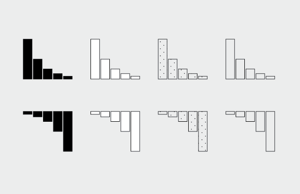
How to Make and Use Bar Charts in R
The chart type seems simple enough, but there sure are a lot of bad ones out there. Get yourself out of default mode.
-
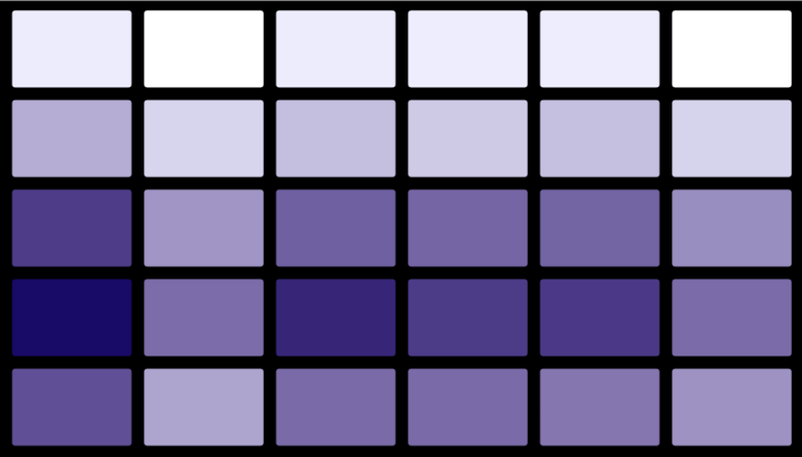
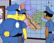 A heat map is a grid of numbers colored by value. I wrote a quick tutorial on how to make the now common statistical visualization. But at some point in the past few years, a heat map came to mean a geographic map with stuff on it. Cartographer Kenneth Field explains what these maps with stuff on it actually are and provides you with the “more established, more accurate and perfectly good terms.”
Extra point for incorporating The Simpsons:
Heat maps have become a popularist way to label a surface representation of data that occurs at discrete points. On one hand the search for a better way of showing point based data which avoids death by push-pin is a sound cartographic approach. Imagine simply looking at a map of points and trying to make sense of the patterns. Chief Clarence ‘Clancy’ Wiggum would certainly struggle to make sense of the pattern of crime in Springfield just from coloured dots.
-
Placement of Daily Double clues, from season 1 to 31. Watch them play out.
-

In football video game Madden, NFL players are scored based on skill, which determines how they play in the game. Neil Paine, with graphics by Reuben Fischer-Baum, describes more than you ever thought you wanted to know about the scoring process in an in-depth look for FiveThirtyEight. At the heart of the process is Donny Moore, who is in charged of most of the (subjective) number assignments.
Read More -
Inspired by the Python libraries RoboBrowser and BeautifulSoup, the rvest package by Hadley Wickham helps you scrape web data via R in a similar way.
Parse tables into data frames, navigate around a website, and of course, extract bits from a page. I’ll stick to BeautifulSoup, but I’m saving this for later. I’m sure it’ll come in handy sooner rather than later.
-
Planet Money goes back to a 1984 article by Steven Levy that discusses this new thing called a spreadsheet. It was taking the place of the paper version that accountants manually edited, added to, and taped together.
Read More
Recently for Members
Second Edition
 Visualize This: The FlowingData Guide to Design, Visualization, and Statistics (2nd Edition)
 Visualize This: The FlowingData Guide to Design, Visualization, and Statistics (2nd Edition)
New tools, refined process.
Browse by Chart Type See All →


