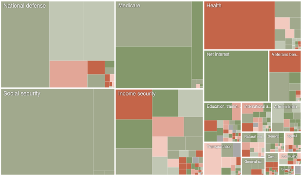
President Obama announced his 2011 budget proposal. How does it compare to last year’s budget? Shan Carter and Amanda Cox of The New York Times compare the two plans. Red indicates a decrease in the percentage of the budget dedicated to the respective area, and green is for growth. Zoom in for a better view of the smaller areas.
Big decreases for Medicaid grants, veteran benefits, and unemployment insurance. Major increase for education, Medicare, and administration of justice.
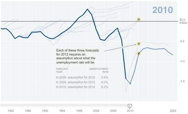
This of course takes budget forecasting into account, which Cox shows isn’t all that accurate sometimes.
[via @nytgraphics]
 Visualize This: The FlowingData Guide to Design, Visualization, and Statistics (2nd Edition)
do you know what software amanda cox used to create the second graphic you present here?
most likely R-produced plot ported to Flash.
Does anyone know of any treemap libraries that offer the zooming capabilities used here? Most of the visualization packages I’ve looked into allow you to highlight specific regions dynamically but not zoom in like this.
I do global health research on causes of death, and I have a hierarchy of causes that would work great as a treemap. But at the most detailed level of ~300 causes, the boxes get so small that some sort of zooming is almost required. The transition between projected and actual is also nice, because I have a 60 year time series that would be nice to animate….
Any suggestions would be greatly appreciated!
your best bet would probably be start with Flare and then customize. i don’t know of any libraries that enable that off the bat.
Pingback: An Exploration of Biological Records « WebGlide - Data-Visualization