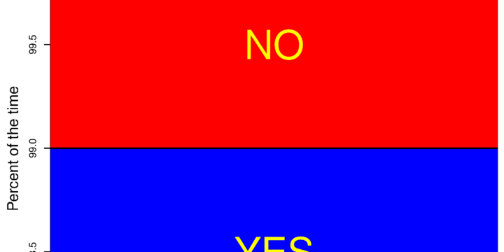
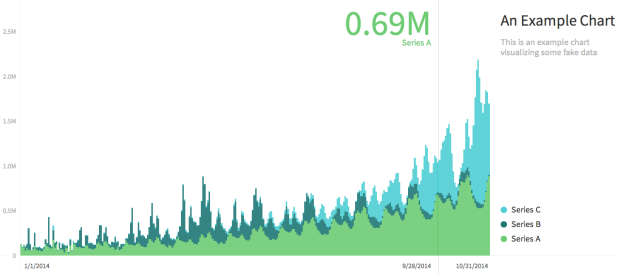
Sweet, I guess Fox News had it right all along. I’m going to save a ton of space by truncating my vertical axes from now on. I just might go back and retrofit all of my old charts too. [via Reddit]
Sweet, I guess Fox News had it right all along. I’m going to save a ton of space by truncating my vertical axes from now on. I just might go back and retrofit all of my old charts too. [via Reddit]
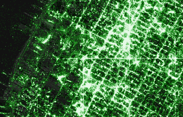
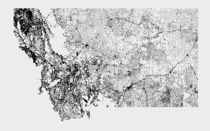
Eric Fischer, known around these parts for his detailed dot maps, describes his process along with a code release.
I’ve been tracking geotagged tweets from Twitter’s public API for the last three and a half years. There are about 10 million public geotagged tweets every day, which is about 120 per second, up from about 3 million a day when I first started watching. The accumulated history adds up to nearly three terabytes of compressed JSON and is growing by four gigabytes a day. And here is what those 6,341,973,478 tweets look like on a map, at any scale you want.
I’ve open sourced the tools I used to manipulate the data and did all the design work in Mapbox Studio. Here’s how you can make one like it yourself.
Three main steps (not including data collection): filter out noise and duplicates, generate map tiles, and style to your liking.
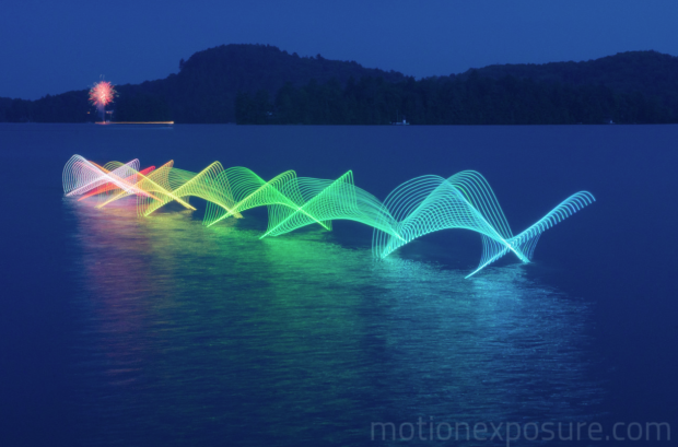
Motion Exposure, a photography project by Stephen Orlando, captures movement patterns with light.
I’m fascinated with capturing motion through time and space into a single photograph. Using LED lights with custom color patterns and long exposure photography, I’m able to tell the story of movement. This technique reveals beautiful light trails created by paths of familiar objects. These light trails have not been artificially created with Photoshop and represent the actual paths of the objects.
The above shows kayaking movements, which is just one of many activities including canoeing, soccer, karate, and bike polo. See it all in the Orlando’s galleries. [via Colossal]
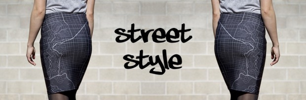
Monochome, a new service brought to you by Rachel Binx, lets you make custom clothes printed with maps. It’s not just major cities though. No that’s for chumps. Using OpenStreetMap data, you select a location, choose the style of map, and pick your clothing item, and you’ve got your custom map print to wear. You can currently choose among a tank top, pencil skirt, flare skirt, and t-shirt.
Get your order in this week to ensure you receive your item for Christmas. Even if you’re not looking to get anything, it’s kind of fun to play around with the interface that lets you create an item.
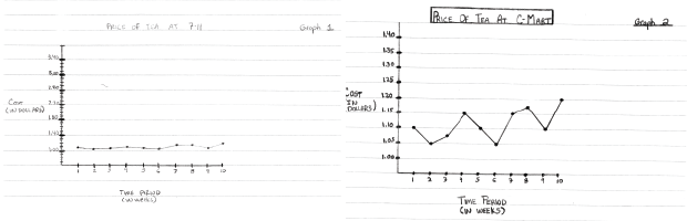
Like many, I’ve been listening to Serial every week, but I always just listened through my podcast app. So I missed this little bit from Adnan Syed way back in the second episode. He sent the two graphs above to the host Sarah Koenig. The graphs show tea price changes over time for two stores and Syed asks Koenig which store she would get her tea from. She says the first one, which has a more steady price.
Look again, Adnan said. Right. Their prices are exactly the same. It’s just that the graph of C-Mart prices is zoomed way in — the y-axis is in much smaller cost increments — so it looks like dramatic fluctuations are happening. And he made the pencil lines much darker and more striking in the C-Mart graph, so it looks more…sinister or something.
This was Adnan’s point: See how easy it is to look at the same information, but, depending on how it’s presented, come to two different conclusions about what it means? The 7-11 graph is the “innocent” graph. The C-Mart graph is the “guilty” graph. But they contain the same information.
See also: the baseline.
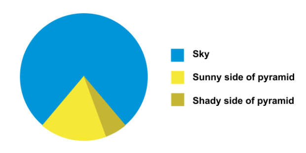
This pyramid pie chart just might take the pie chart humor crown from the amount-of-pie-eaten pie chart. (Who made this?)

For today only, everything, and I mean everything (all THREE items) is on sale in the FlowingData shop. Currently available: the Famous Movie Quotes poster, the Chart-Topping Songs poster, and a signed copy of Data Points.
Buy any one item and get the second for 50% off (discount code: CYBER50). Buy any two items and get two for free (discount code: CYBERFREE2). It works with multiples of the same item too. Just enter your code at checkout.
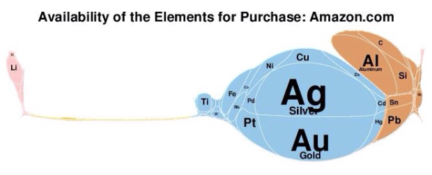
Along the same lines as the scaled Periodic Table, Elemental Cartograms by chemistry professor Babak Sanii and his students lets you make your own scaled Periodic Table of Elements. Simply edit the provided spreadsheet, upload, and you’ve got your cartogram.
Normally, I’m not so thrilled with cartograms because of how they mess things up with shape, but that’s with geographic maps. You don’t have to worry about preserving borders so much with the Periodic Table.
Make your own or check out examples of the cartograms in use.
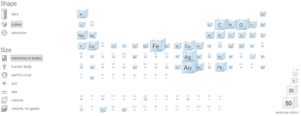
Inspired by a diagram from 1976, the Big Picture group at Google Research built a Periodic Table where elements are scaled based on their use in the world.
Read More

Sterling Crispin reverse engineered facial recognition algorithms and produced masks that only kind of look human. Although the computer sees it differently.
This research has resulted in the production of a series of 3D printed face masks which were algorithmically evolved to satisfy facial recognition algorithms. It is important to understand the the goal of creating these masks isn’t to defeat facial recognition or provide something undetectable, simply covering your face with your hand will do that. Rather, my goal is to show the machine what it’s looking for, to hold a mirror up to the all-seeing eye of the digital-panopticon we live in and let it stare back into its own mind.
Creepy results. [via Kyle Chayka]

Because that’s what happens when you eat ten full plates of turkey and pie. However, Bonnie Berkowitz and Lazaro Gamio for the Washington Post go into some of the specifics of holiday eating. The last bit of the feelings section (part of it shown above) on permanently heavy:
After the first 750 calories or so, your body begins to store a larger percentage of food as fat. A 2000 study found that the average adult gains a pound during each holiday season and usually never loses it.
Wait — really?

Part celebration of Samantha Cristoforetti, the first Italian woman to fly into space, and part social network above the clouds, Friends in Space by Accurat lets you follow Cristoforetti on the six-month long journey to the International Space Station.
Read More
Charted is a tool used internally at Medium that they recently released into the wild. It’s for the quick-and-dirty times when you just need to see quick results.
Charted is open-sourced and available for anyone to use at charted.co. The publicly-hosted charted.co works with files that are already publicly accessible to anyone with the link (e.g., Dropbox share links). For protected or sensitive data, you can serve your own instance of Charted on your secure network, which is what we do at Medium.
It’s a stripped down charting tool built for a specific type of data, so there are of course limitations. But there’s also potential to customize for your own needs. Or if you have a simple time series that you frequently glance at, Charted might come in handy. [Thanks, Derek]

This is what you get when you cross a histogram and piano keys to show note distribution of songs. It’s the pianogram. View examples such as Fur Elise or the classic Chopsticks, or punch in your own MIDI-formatted song for a taste of the distribution ivories.
Read More
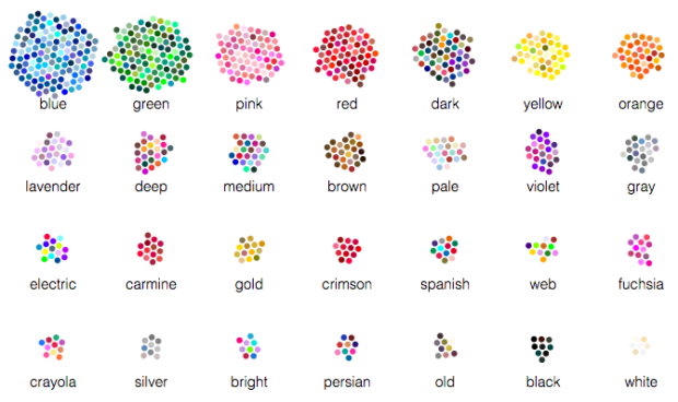
Color exists on a continuous spectrum, but we bin them with names and descriptions that reflect perception and sometimes culture. We saw this with gender a while back. Wikipedia has a short description on culture differences and color naming.
Muyueh Lee looked at this binning through the lens of English versus Chinese color naming. More specifically, he looked at Chinese color names on Wikipedia and compared them against English color names. This comes with its own sampling biases because of higher Wikipedia usage for English speakers, but when you divide by color categories, it’s a different story.
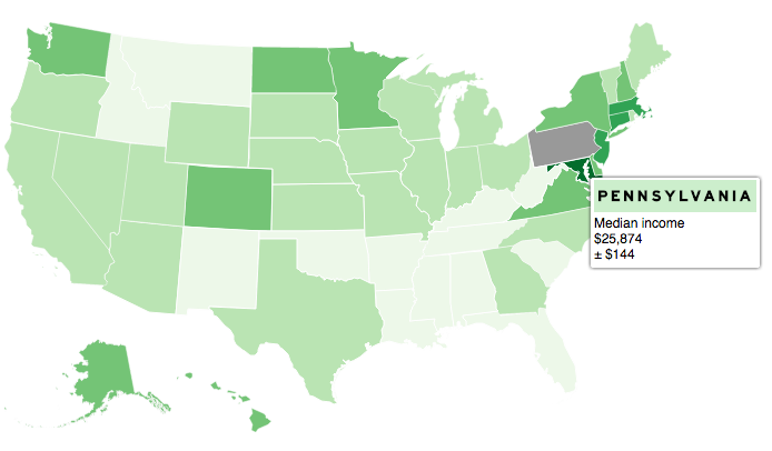
Despite the frequent use of choropleth maps online, they’re still kind of tricky to produce for beginners. Landline, an open source JavaScript library from ProPublica, aims to make it a little bit easier. Given a GeoJSON file, Landline provides an interactive choropleth map with tooltips that works on multiple devices.
Still in its early stages, the library lets you make state and county maps, as well as customize to your own needs. Underscore.js and Raphael.js are its two dependencies, so it plays nice with those libraries also.
Alinea is a restaurant by Grant Achatz known for deconstructing flavors and piecing them together again for bites of deliciousness. They have a cookbook that describes how they make their food, but the recipes are so complex that no casual cook would ever try them. I actually have a copy myself, and it’s never gone past the coffee table.
Read More
Geographic data is often available as a shapefile, and there’s plenty of heavy software to get that data in a map. R is an open source option, and as a bonus, much of the work can be done in a few lines of code.
Personal data from Facebook, Twitter, and email are already used, so sure why not. Fitbit-generated movement data is now used in the courtroom.
The young woman in question was injured in an accident four years ago. Back then, Fitbits weren’t even on the market, but given that she was a personal trainer, her lawyers at McLeod Law believe they can say with confidence that she led an active lifestyle. A week from now, they will start processing data from her Fitbit to show that her activity levels are now under a baseline for someone of her age and profession.
It will “back up what she’s been saying,” says her lawyer, Simon Muller of McLeod Law.
Sounds okay. This quote stuck out for me though:
Now we’re looking at longer periods of time though the course of a day, and we have hard data.
Hard data. I’d have to see it, but I’m pretty sure there’s some fuzziness and uncertainty there. I wonder if the defense has a go at an analysis that shows the opposite of the plaintiff’s claims.
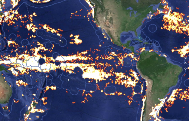
Global Fishing Watch is an initiative to place some accountability on global fishing, an activity typically a challenge to track.
Read More


 Visualize This: The FlowingData Guide to Design, Visualization, and Statistics
Available now.