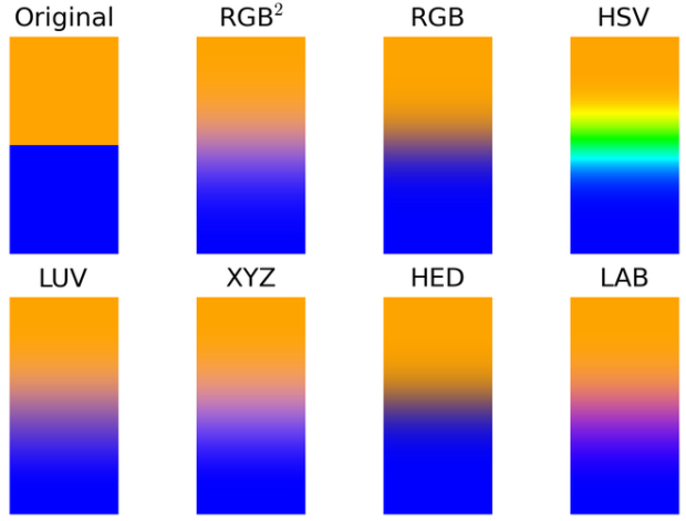
• Membership
  • Newsletter
  • Projects
  • Learning
  • About
  • Member Login
  • Cookie ingredient variants

    December 24, 2014

    Topic

    Infographics  /  food, physical

    For the holiday cookie makers, this one from Tessa Arias is for you. Merry Christmas.

    Chocolate chip cookie guide

    I’m tempted to try this by varying single ingredients at a time.

  • Holiday lights from space

    December 24, 2014

    Topic

    Maps  /  lights, NASA, space

    You’ve likely seen the classic globe image that shows Earth at night. It’s a composite image using data collected over a nine-day period, so you kind of see what the planet looks like if it were night at the same time everywhere. While interesting in its own right, it lacks a time component. The researchers are on it and noticed an increase in light during the holiday months.
    Read More

  • Most decade-specific words in Billboard song titles

    December 23, 2014

    Topic

    Statistical Visualization  /  songs, text

    David Taylor looked for words in Billboard song titles that appeared during a given decade more than other decades. Then he charted usage for the top five of each decade, going back to 1890.
    Read More

  • News that China blocks

    December 22, 2014

    Topic

    Infographics  /  China, firewall, ProPublica

    China blocks sites from its citizens. We know this. But, what do they block and to what extent? Sisi Wei for ProPublica tracked major news homepages with the help of transparency site GreatFire.org and archived the pages for the sampled days.
    Read More

  • Visualization  /  best-of

    The Best Data Visualization Projects of 2014

    It’s always tough to pick my favorite visualization projects. Nevertheless, I gave it a go.

    Read More
  • Collection of physical visualizations

    December 18, 2014

    Topic

    Data Art  /  physical

    I’m pretty sure there’s a ton of untapped potential in data represented physically. Maybe not in the analytical insights sense but in that fuzzy unmeasured way of feeling data somehow. That might be my new point of interest for next year, and it’ll probably involve beer and LEGOs. Pierre Dragicevic and Yvonne Jansen maintain a chronological list of physical visualization, dating back to 5500 BC up to present.

  • Using baseball bats to display data

    December 17, 2014

    Topic

    Data Art  /  baseball, physical, sports

    When a baseball player is hitting well, commentators will sometimes say that it looks like he’s hitting with a bigger bat out there. The ACME Catalog, a creative technology studio, took the phrase to a more literal sense. They used baseball bats to represent on-base plus slugging (OPS), “the ability of a player both to get on base and to hit for power,” for standout players during the regular season versus the World Series.
    Read More

  • Increasing rates of men who don’t work

    December 16, 2014

    Topic

    Statistical Visualization  /  Amanda Cox, employment, Upshot

    Recent data from the Census Bureau suggests the rate of non-working men has increased. As more women go to work and more men stay at home to take care of the kids, you’d expect for the number of stay-at-home dads to contribute significantly to that rate. But maybe not. There are more noticeable factors to consider like retirement age, disability, and going to school. Amanda Cox for the Upshot has graphs for you.

    See also where the men aren’t working.

  • When data gets creepy

    December 15, 2014

    Topic

    Data Sharing  /  Ben Goldacre, privacy

    You make and publish bits of data about yourself, intentionally and unintentionally, and it goes to the indexed public web or to companies’ private black boxes. Ben Goldacre explains why it’s worth caring about these traces. It’s less hoorah and more example-driven than these sort of articles tend to be, and there’s isn’t a single mention of being awash in data.

    At the simplest level, even the act of putting lots of data in one place — and making it searchable — can change its accessibility. As a doctor, I have been to the house of a newspaper hoarder; as a researcher, I have been to the British Library newspaper archive. The difference between the two is not the amount of information, but rather the index. I recently found myself in the quiet coach on a train, near a stranger shouting into her phone. Between London and York she shared her (unusual) name, her plan to move jobs, her plan to steal a client list, and her wish that she’d snogged her boss. Her entire sense of privacy was predicated on an outdated model: none of what she said had any special interest to the people in coach H. One tweet with her name in would have changed that, and been searchable for ever.

    Before you say you’re not the woman on the phone and that you have nothing to hide, also read this.

  • Revealing location history via your phone’s Wi-Fi

    December 15, 2014

    Topic

    Data Sharing  /  privacy, Wi-Fi

    When you have your phone’s Wi-Fi turned on, even if you’re not connected to anything, you broadcast the networks you’ve connected to, which in turn can reveal your location history. Ars demonstrated with a handful of test phones and a low-powered Wi-Fi monitor.

    The results were not surprising to us, but they are still eye-opening, and indicative of the security and privacy risks that result from wandering around with Wi-Fi turned on but not connected. We were able to match specific devices with recent (and some not really recent) movements of the owners of the phones—where they worked, where their homes were, and in some cases where they had shopped recently—using publicly available Wi-Fi base station mapping data.

    Off goes the Wi-Fi.

  • Heartbeat during marriage proposal

    December 12, 2014

    Topic

    Self-surveillance  /  health, heart, proposal

    The moments leading up to a marriage proposal can be both exciting and nerve-racking. Will s/he say yes? What if I fumble up the words? Am I walking towards a disaster? Then it happens, everything blurs together, and the moment makes its way back to normal.

    Reddit user sesipikai tracked his proposal during a trip to Italy. He happened to be wearing a heart rate belt, and you can see the rise and fall of beats per minute leading up to the question.

    Walk. Ask. She says yes. Bask in the happiness. Find a bench.

    Ah, the little bits of narrative totally make the chart.

  • How to Download and Use Online Data with Arduino

    Before you can do anything with data, you have to get it into the application. Working with an Arduino is no different. Although the process is changes, if you’re used to working with desktop software.

  • Physical infographics

    December 11, 2014

    Topic

    Data Art  /  photography, physical

    Photographer Marion Luttenberger used physical objects and people as her visual cues in lieu of digital bars and lines. The results are striking. Note: The annotation is in German but nothing Google Translate can’t handle.

    Reminiscent of Peter Orntofts’ series from a few years ago.

  • Book genres for visualization

    December 10, 2014

    Topic

    Visualization  /  Fernanda Viegas, lunch talk, Martin Wattenberg

    Martin Wattenberg and Fernanda Viegas from Google Research ran with the book metaphor for visualization in their talk at Tapestry 2014. Unlike some who bash projects that don’t fit a narrow specification, Wattenberg and Viegas argue that visualization spans various genres. The key is to know your genre and create accordingly.
    Read More

  • Data-ish physical gift things

    December 9, 2014

    Topic

    Miscellaneous  /  gifts

    Gift-buying season is in full swing, and it’s time to get stuff for your loved ones. But, it has to be tangible, because stuff that occupies space in the physical world is how you tell someone you love him or her by that amount. I know this, because the UPS truck that delivers to my neighborhood had an additional trailer rigged to the back full of it.

    Here are some data-ish printed things to show your loved ones that you care. We’re approaching last-minute territory for packages that don’t arrive with an Amazon smiley on the side.
    Read More

  • Understanding segregation with a simulation

    December 9, 2014

    Topic

    Infographics  /  Nicky Case, segregation, simulation, Vi Hart

    In 1971, Nobel laureate economist Thomas Schelling proposed that a desire to have neighbors of the same race — even a small percentage — can lead to segregation. The model has been simulated through a variety of interactives before, but in Parable of the Polygons, Vi Hart and Nicky Case put extra effort into teaching the model, bringing playfulness to an otherwise serious subject.

    Two groups of people are encoded as shapes — squares and triangles — and they take you through each step of the model. Use the sliders to adjust thresholds and population distributions, and run the simulation. The shapes on the left move if they’re looking for similarity, and the line chart on the right shows segregation over time.

    You end up with an understanding of how segregation works (however simplified this model might be) and a glimmer of hope of how we might shift directions.

    Worth a try.

  • Detailed visualization of NBA shot selection

    December 8, 2014

    Topic

    Statistical Visualization  /  basketball

    Sports loves conditional distributions. What does Joe Billy Bob typically do against such and such team? How does play differ in wins and losses? And a lot of the data is easily accessible, which makes it straightforward to answer these questions. Buckets, by Peter Beshai, uses NBA data to explore shot selection with plenty of conditionals.
    Read More

  • Player shows tremendous growth towards Godzilla

    December 8, 2014

    Topic

    Miscellaneous  /  basketball, humor

    TNT described NBA player Anthony Davis’ growth and accompanied the discussion with a graphic that showed a picture of Davis over the years. To drive the point home I guess they made the image of Davis bigger each step. SB Nation had some fun with predictions of Davis’ future. The NBA is going to have a heck of time adjusting the rules for Godzilla.

  • Baseline matters

    December 5, 2014

    Topic

    Miscellaneous  /  axes, humor

    Sweet, I guess Fox News had it right all along. I’m going to save a ton of space by truncating my vertical axes from now on. I just might go back and retrofit all of my old charts too. [via Reddit]

  • Make your own detailed tweet maps

    December 4, 2014

    Topic

    Maps  /  Eric Fischer, mapbox, Twitter

    Eric Fischer, known around these parts for his detailed dot maps, describes his process along with a code release.

    I’ve been tracking geotagged tweets from Twitter’s public API for the last three and a half years. There are about 10 million public geotagged tweets every day, which is about 120 per second, up from about 3 million a day when I first started watching. The accumulated history adds up to nearly three terabytes of compressed JSON and is growing by four gigabytes a day. And here is what those 6,341,973,478 tweets look like on a map, at any scale you want.

    I’ve open sourced the tools I used to manipulate the data and did all the design work in Mapbox Studio. Here’s how you can make one like it yourself.

    Three main steps (not including data collection): filter out noise and duplicates, generate map tiles, and style to your liking.

  • Page 208 of 391
  • <
  • 1
  • ...
  • 205
  • 206
  • 207
  • 208
  • 209
  • 210
  • ...
  • 391
  • >

Analyze, visualize, and communicate data usefully, beyond the defaults.

Become a member →

Recently for Members

May 8, 2025
When the data is not what it seems

May 1, 2025
Finding the Right Charts

April 24, 2025
Visualization Tools, Datasets, and Resources – April 2025 Roundup

April 17, 2025
Breaking Out of Chart Software Defaults

April 15, 2025
Line Chart with Decorative Neon Accents

Browse by Chart Type See All →

Organogram Chord Diagram Line Map Beeswarm Choropleth Map Variable Width Bar Chart Pyramid Chart Line Chart Table Horizon Graph

Browse By Topic

  • Visualization

    Seeing data

  • Maps

    Seeing geographic data

  • Infographics

    Explaining data

  • Networks

    Connecting data

  • Statistics

    Analyzing data

  • Software

    Working with data

  • Sources

    Getting data

  • Design

    Making data readable

Get the Book

Visualize This: The FlowingData Guide to Design, Visualization, and Statistics

Available now.

Order: Amazon / Bookshop

Made by FlowingData

  • The Process

  • Data Underload

  • Chart Everything

  • Guides

  • Books

  • Shop

  • About
  • Contact
  • Newsletter
  • LinkedIn
  • Instagram
  • Bluesky
  • RSS
Copyright © 2007-Present FlowingData. All rights reserved.