How to Make a Heatmap – a Quick and Easy Solution
A heatmap is a literal way of visualizing a table of numbers, where you substitute the numbers with colored cells. This is a quick way to make one in R.
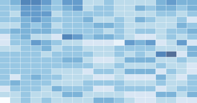
A heatmap is basically a table that has colors in place of numbers. Colors correspond to the level of the measurement. Each column can be a different metric like above, or it can be all the same like this one. It’s useful for finding highs and lows and sometimes, patterns.
On to the tutorial.
Step 0. Download R
We’re going to use R for this. It’s a statistical computing language and environment, and it’s free. Get it for Windows, Mac, or Linux. It’s a simple one-click install for Windows and Mac. I’ve never tried Linux.
Did you download and install R? Okay, let’s move on.
Step 1. Load the data
Like all visualization, you should start with the data. No data? No visualization for you.
For this tutorial, we’ll use NBA basketball statistics from last season that I downloaded from databaseBasketball. I’ve made it available here as a CSV file. You don’t have to download it though. R can do it for you.
I’m assuming you started R already. You should see a blank window.
Initial R window when you open it. Exciting, I know.
Now we’ll load the data using read.csv().
nba <- read.csv("http://datasets.flowingdata.com/ppg2008.csv", sep=",")
We’ve read a CSV file from a URL and specified the field separator as a comma. The data is stored in nba.
Type nba in the window, and you can see the data.
What the data looks like when you load it into R
Step 2. Sort data
The data is sorted by points per game, greatest to least. Let’s make it the other way around so that it’s least to greatest.
nba <- nba[order(nba$PTS),]
We could just as easily chosen to order by assists, blocks, etc.
Step 3. Prepare data
As is, the column names match the CSV file’s header. That’s what we want.
But we also want to name the rows by player name instead of row number, so type this in the window:
row.names(nba) <- nba$Name
Now the rows are named by player, and we don’t need the first column anymore so we’ll get rid of it:
nba <- nba[,2:20]
Step 4. Prepare data, again
Are you noticing something here? It’s important to note that a lot of visualization involves gathering and preparing data. Rarely, do you get data exactly how you need it, so you should expect to do some data munging before the visuals. Anyways, moving on.
The data was loaded into a data frame, but it has to be a data matrix to make your heatmap. The difference between a frame and a matrix is not important for this tutorial. You just need to know how to change it.
nba_matrix <- data.matrix(nba)
Step 5. Make a heatmap
It’s time for the finale. In just one line of code, build the heatmap (remove the line break):
nba_heatmap <- heatmap(nba_matrix, Rowv=NA, Colv=NA, col = cm.colors(256), scale="column", margins=c(5,10))
You should get a heatmap that looks something like this:
Default cyan to purple heatmap
Step 6. Color selection
Maybe you want a different color scheme. Just change the argument to col, which is cm.colors(256) in the line of code we just executed. Type ?cm.colors for help on what colors R offers. For example, you could use more heat-looking colors:
nba_heatmap <- heatmap(nba_matrix, Rowv=NA, Colv=NA, col = heat.colors(256), scale="column", margins=c(5,10))
Changing to heat colors with the col argument
For the heatmap at the beginning of this post, I used the RColorBrewer library. Really, you can choose any color scheme you want. The col argument accepts any vector of hexidecimal-coded colors.
Step 7. Clean it up – optional
If you’re using the heatmap to simply see what your data looks like, you can probably stop. But if it’s for a report or presentation, you’ll probably want to clean it up. You can fuss around with the options in R or you can save the graphic as a PDF and then import it into your favorite illustration software.
I personally use Adobe Illustrator, but you might prefer Inkscape, the open source (free) solution. Illustrator is kind of expensive, but you can probably find an old version on the cheap. I still use CS2. Adobe’s up to CS4 already.
For the final basketball graphic, I used a blue color scheme from RColorBrewer and then lightened the blue shades, added white border, changed the font, and organized the labels in Illustrator. Voila.
Updated heatmap in Illustrator with clearer labels and a blue-white color scale
Rinse and repeat to use with your own data. Have fun heatmapping.
For more on custom heat maps to visualize your data, check out the members-only tutorial.
Made possible by FlowingData members.
Become a member to support an independent site and learn to make great charts.
About the Author
Nathan Yau is a statistician who works primarily with visualization. He earned his PhD in statistics from UCLA, is the author of two best-selling books — Data Points and Visualize This — and runs FlowingData. Introvert. Likes food. Likes beer.
62 Comments
Add Comment
You must be logged in and a member to post a comment.
I keep meaning to start playing with R, but would rather do it in the browser if possible… do you know if the above works in the ggplot/online-R environment?
i don’t think you can, but you can do it in the online ggplot implementation.
i’d strong encourage trying it in R though :). It’s a simple installation and it’s free, so nothing to lose really.
There’s an online environment for ggplot/R?
there is. work in progress: https://flowingdata.com/2009/12/22/build-statistical-graphics-online-with-ggplot2/
Hi Tony, I’m working on Pretty Graph, which is a web-based graph application. It will help you make graphs like the above heatmaps very easily without writing any R code. If you are interested in trying it out, sign up at http://prettygraph.com or simply email me at [email protected].
Here’s another NBA related, schedule heat map of 2009-2010 regular season.
http://www.nbastuffer.com/NBA_Road_Trips_and_Home_Stands_Visualization.html
Hi
You may find that the ‘heatmap.2’ function in the ‘gplots’ package has a number of useful extensions to the original ‘heatmap’ function.
@tony hirst definitely doable in ggplot, but haven’t played with the online app enough to know whether it’ll work. geom_tile is what you’d want to use. I doubt Rcolorbrewer is available in online app.
@nathan it would be interesting to see if some of the tidying up can be done in r, so as to make it easier to replicate with new data. I think ggplot would get you a lot of the way there with it’s layer functionality.
@everheardofaspacebar – i’m almost certain you could tidy up in R, but since I work with Illustrator already, it fits better in my workflow.
You may also want to do a correlation analysis on the attributes and then pick your favorite attribute (or one that loads heavily on the first principal component) then sort the columns that way. Sort the players by how they score on the first principal component to group them by some similarity.
Another neat application is to mash-up a heatmap with a calendar, for an interesting way of looking at time-series data. For example, rates of activity on a forum:
http://blog.revolution-computing.com/2010/01/analyzing-a-friendfeed-group-with-ruby-and-r.html
If I need to make one *really* fast, I use this quick and dirty method:
Open a csv matrix in Excel, select the data, and add on Conditional Formatting > Color Scales (this might only be in Office 2007 and on?). It’s also nice because you can view the underlying data by clicking on a given cell.
Also, -plotmatrix- in stata makes pretty nice heatmaps.
Pingback: EverydayUX morsels (January 19th – January 21st)
Beginner question:
do you add the white borders in R or in Illustrator?
@Florian – I added those in Illustrator. I know there’s a way to do it in R though… something to with stroke color…
What is the color encoding used by the R heatmap function? It doesn’t look like a simple linear encoding of the values for each column (because some columns don’t span the full gradient), nor is it a simple linear encoding of all values in the matrix (because then some columns would be nearly all white, because values for X3PP are much lower than MIN, for example).
Based on the R documentation it looks like it normalizes each column (since you specified scale = “column”) to have a mean of zero and a standard deviation of one, and then it does a linear encoding of *those* values using the color gradient. So this visualizes standardized distance from the mean, rather than the “raw” underlying data.
Which is nice, but a bit surprising. And I wonder how well it works if the data isn’t distributed normally.
Shameless self-promotion, but here’s the same heatmap in Protovis: http://graphics.stanford.edu/~mbostock/ppg2008.html
along with rollover values. very cool, mike.
Mike, could you link the source for that as well?
Would Protovis be able to handle large heatmaps (say 400×400)?
Well, after playing around for a bit, I created the very large heatmap I was hoping for with protoviz. Very cool package!
Does anyone have any suggestions on tools/methods that I could use to produce a high density heatmap with a 400×400 matrix? I’d like to produce a visualization of messages sent between individual users.
Pingback: FriendFeed Science Focus: Week #03, 2010 | Next Generation Science
Pingback: Daily Digest for January 21st
Pingback: Weekend links - 01/22/10 | PerfectMike.Com
Pingback: Pixels for 1/22/2010: R, Heatmaps, Jupiter | VizWorld.com
This was great! More beginner tutorials like this, please! :)
I might be being a bit dense, but how do you load up the RColorBrewer library so that you can use it? I’ve downloaded the package onto my MacBook, but I don’t know how to install it so that the R Console can use it.
You can install it from Packages and Data menu. That will download the package again from an online repository but is the easiest way to install any package. See this page for more details – http://cran.r-project.org/bin/macosx/RMacOSX-FAQ.html#Installation-of-packages.
this command should do it also:
install.packages(“RColorBrewer”)
Thanks both. That worked a treat. =) Great tutorial, Nathan, thanks!
Just one more thing, though (isn’t there always?)… Is there a way to get it to color the heatmap not as if the data is scaled differently by column, but with the same scale overall? Say, for example, rather than measuring all different statistics for all the above players, you were measuring their points per game, but for different games. I’ve already got the dataset I want in: I just can’t figure out how to stop it coloring them column by column.
You know what, I just figured it. Kind of obvious, wasn’t it? Ah, well. I’m new to R.
Pingback: » Bookmarks for January 24th - Michael Zehrer
Pingback: One Z-Score — Test Analysis through Heat Maps
Pingback: How to Make a Heatmap – a Quick and Easy Solution | FlowingData « Visual Security
Hey Nathan, very nice tutorial. I was able to create a heatmap of some collision data I have been muddling through…in about 3 minutes! Now I finally have an incentive to hone my R skills and have fun doing so. Thanks!
Pingback: ggplot2: Quick Heatmap Plotting « Learning R
Pingback: ggplot2: Quick Heatmap Plotting « Learning R
Pingback: Ennuyer.net » Blog Archive » Rails Reading January 26 2010
Very cool I’d love to see the same in Python with numpy/matpotlib/gnuplot? or something similar?? But this may make me have to fiddle some with R but I’d sure like to stick with Python,,, My brain is too small and slow for many more systems/languages.
the good thing about picking up R though is that you get a lot of bang for the buck because there are so many packages that do most of the work. The hard part is finding the packages.
I would also like to suggest an application for creating heatmaps through a GUI or command line interface that we released a few years ago. This has the advantage of instant gratification and no programming required:
http://jcolorgrid.ucsf.edu/
http://sourceforge.net/projects/jcolorgrid/files/
Of course learning R etc. is highly recommended regardless.
I uploaded the RColorBrewer, but I can’t figure out how to create the heat map using anything other than the standard color schemes: heat.colors(n), terrain.colors(n), topo.colors(n), and cm.colors(n).
You said you used “blues;” how exactly do you use the col= argument? I haven’t used R in years so I forget most of the commands. Thanks
@Jeff – Assuming you have RColorBrewer installed, you should be able to load the package with:
library(“RColorBrewer”)
If you get an error, install the package like this:
install.packages(“RColorBrewerâ€)
Then try loading the package again.
After you have it loaded, you can put this in col argument:
brewer.pal(9, “Blues”)
If you type just that in w/o the heatmap(…), you’ll see that it’s an array of 9 shades of blue.
Pingback: Tribulations, bafouilles et bricoles du 22/01/10 au 29/01/10 | Christophe MILET Video & Multimedia producer / Rich Media Consultant / For Modern Interactive Content / Bordeaux - Aquitaine -
Pingback: metachronistic » A’s 2010 Roster heatmap
The technique I’ve used successfully for heat map visualization of 2D data which doesn’t easily/obviously translate into a heat map (e.g. random 2D samples where each dimension is ordered) is to generate a 2D histogram with bin sizes representing the “resolution” of the heat map, then use the 2D histogram peaks either in a contour map or a heat map. This works well in Matlab and translates well into any system where it is easy to generate 2D histograms and contour or heat maps from an MxN matrix of values.
Ian
Ian, I am having a hard time visualizing this but it sounds intriguing. Could you possibly point me to an example?
This is a great tutorial and something that I just passed along to my team at Three Deep. Thanks to everyone for making it so easy to follow and providing sample code!
Pingback: Stash monitoring : It's a Stitch Up: Original patterns and knitting resources
Pingback: Heavyset » Wharton Grads, Olympic Uniformity, Eigenvalues, Heatmaps and the RGB of Cornflower Blue
Hi,
First, great tutorial, you got me hooked into making visualizations. These tutorial posts are awesome, keep ’em coming please
Secondly, I’m really really new to R and Inkscape. Do you mind explaining how I can:
1) Browse the available color and change the color of my heatmap?
I’ve downloaded the RColorBrewer and I opened the blue package from the above instruction. But I have no idea how to put them into the heatmap.
2) I had problems sorting my data. I want it to go alphabetically from A to Z (which was my original csv) but somehow the order become Z to A in the heatmap. I rectified this problem by opening it in Excel and change the sorting…but clearly this isn’t really appropriate.
3) Apply the border and change the text using Inkscape.
Yes, I’m this noobish.
Thanks for the post- great stuff and sorry for taking your time.
Pingback: EastZoneSoupCube - Linklist: Data Visualization
Pingback: How to Make a Heatmap – a Quick and Easy Solution | FlowingData | Mile Wide... Inch Deep...
Pingback: .com and stuff › Impressions of R
Pingback: Visualizing the World | Strategic Social
Pingback: Tulo’s Crazy September | IceBat's Lair
This is a great resource. I started using R yesterday and was able to generate a heatmap using my own data a few minutes later, so thanks.
The default heatmap colors are terrible indeed, so I’m trying to use RColorBrewer. It installed properly, but I’m getting this error message:
Error: unexpected input in "histo_heatmap <- heatmap(histo_matrix, Rowv=NA, Colv=NA, col = brewer.pal(9, ‚"Any thoughts? Did something in the brewer package change so that that command is no longer valid?
Thanks again!
@Hrishi: Can’t wait for the heat map feature on your site!
Glad you found it useful, Ben. You might want to check the docs on how to use brewer.pal() by typing ?brewer.pal in R
I am using the code in the tutorial, but I am not getting any labels on the heatmap. It’s just a box of colors. Any suggestions?
I figured it out – forgot to turn off my previous graph settings.
?