
On Broadway, by Daniel Goddemeyer, Moritz Stefaner, Dominikus Baur, and Lev Manovich, provides a slice-by-slice view of the street that goes through Manhattan. Instead of a map like you might expect from such a project, the piece uses “a visually rich image-centric interface, where numbers play only a secondary role.”
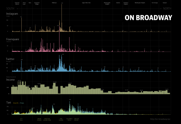
You start with an overview of 13 layers, where each layer represents a dataset. It is a mix of images from Google Street View, which provide a sense of buildings and skyline, and Instagram photos, which provide a sense of the people who move through the street. In between you get layers that represent taxi pickups, median household income, and other demographics.
Completely abstracted, you have a view of two distinct sections of Broadway. Peaks on the left and a low plateau on the right.
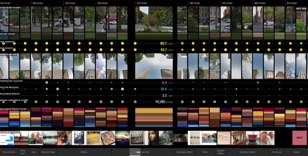
Zoom in and you see these vertical slices. Each represents a location.
There’s a lot to explore, so have a look yourself. I suggest a modern browser, a large screen, and a mouse or touchpad that lets you scroll left to right to maximize the experience. I found myself flicking the view left to right and back again just to play with the interface. For so many images, everything moves and loads relatively quickly, which is important in getting that feeling of sprinting through the city.
Good stuff all around.
On Broadway is also on display at the Public Eye exhibition at New York Public Library until January 3, 2016.
 Visualize This: The FlowingData Guide to Design, Visualization, and Statistics (2nd Edition)