CompStat is a program that started in the New York Police Department, and several other departments have implemented it since. Officers are held accountable by tracking crime over time. Crime goes up, based on the data, and you can ask why. It seems like a fine idea, but problems arise when humans game the system to fill quotas. FiveThirtyEight highlights one such case within the NYPD.
Watch the Documentary
-
-
I was flipping through the channels the other night and happened on the Tour de France. It’s cycling, in case you’re unfamiliar, and it’s not the most interesting sport to watch. But when you get a sense of what these athletes are actually doing — how fast they ride, how high they climb — it’s a whole lot more impressive.
The Guardian put together a wide view of one of the major climbs, up Alpe d’Huez, to help you see. My legs are tired just thinking about it.
-
-
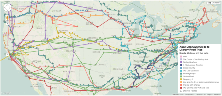
Ever wanted to follow in the footsteps of a famous writer or literary character in their journey across the country? Well now you can. Richard Kreitner for Atlas Obscura hand-cataloged the road trips — more than 1,500 entries — from twelve works of literature and Steven Melendez mapped the paths.
Read More -
This is a fun one. Software Galaxies by Andrei Kashcha visualizes popular software package managers as interactive galaxies. Each node is a package and connections indicate dependencies between packages. Use the keyboard and mouse to explore the 3-D world, rotating and shifting through clusters in each galaxy. Mouse over nodes to see what you’re looking at.
I don’t know much about the makeup or structure of the package managers, but it’s fun to fly around nevertheless. It feels like a game.
Find out more about the process or download the code on Github. [Thanks, Andrei]
-
There’s been all sorts of weird stuff going on at Reddit lately, but who’s got time for that when you can download 1.6 billion comments left on Reddit, since 2007 through May 2015?
This is an archive of Reddit comments from October of 2007 until May of 2015 (complete month). This reflects 14 months of work and a lot of API calls. This dataset includes nearly every publicly available Reddit comment. Approximately 350,000 comments out of ~1.65 billion were unavailable due to Reddit API issues.
Timestamp, comment ids, controversiality score, and of course the comment text. It’s 5 gigabytes compressed and available over torrent.
Git er done.
-
You’ve probably seen those “maps” where people from other countries draw the United States and end up with a wobbly New York, Los Angeles, and some stuff in the middle. Here’s what happens when cartographers draw boundaries by hand. It’s called Project Linework.
Read More -
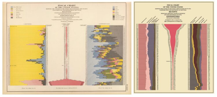
Geoff McGhee for National Geographic highlights a handful of projects that form a genre that he calls “Steampunk” infographics. When I was remaking the Statistical Atlas with current data I didn’t have steampunk in mind, but I like it.
By the way, if you haven’t seen McGhee’s documentary on visualization and journalism from a few years back, it’s worth marking for later.
-
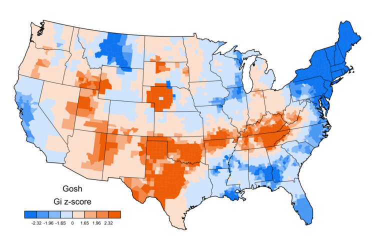
Linguist Jack Grieve posted a bunch of maps that show swearing geographically, based on geotagged tweets. Above is the map for “gosh”. The more red, the higher the relative usage in a county and the more blue, the less usage.
Read More -
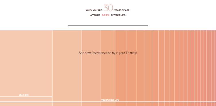
When you’re a kid, a year seems like forever. Appending “and a half” to an age seems significant and necessary. But as you get older, the years seem shorter. Heck, I can’t even remember how old I am half the time. Maximilian Kiener uses an interactive timeline to argue why this is. The more years you’re alive, the lower the percentage a year actually is of your life. And eventually, one year is just a tiny sliver.
-
The Aral Sea in Uzbekistan, formerly one of the largest lakes in the world, has been drying up since the 1960s and is currently 10% its original size. Peter Vojtek made a 3-D paper model that shows the shrinkage — from 1957 on top, down to 2007. Each layer represents the surface outline during the corresponding year on the right.
Vojtek also provides his paper template in case you want to fashion your own box. Nice.
-
Somehow these space-in-perspective graphics and interactives never get old. I guess the size of space is just that mind-blowing. In the latest addition to the collection, Josh Worth imagines the moon as one pixel for size and from there provides “a tediously accurate scale model of the Solar System.”
Read More -
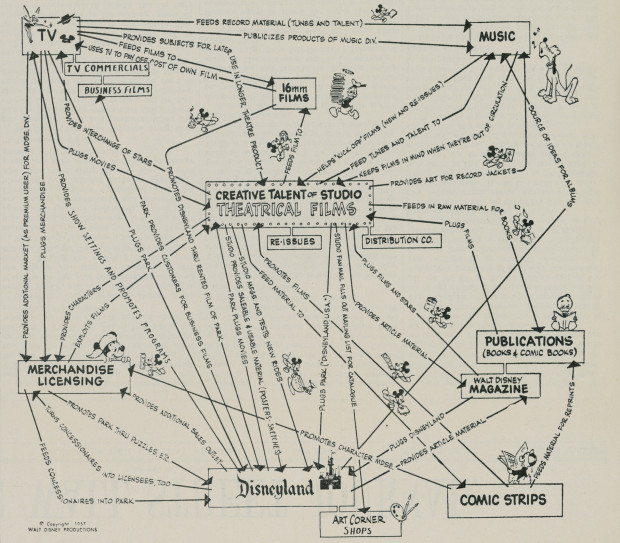
This is Walt Disney’s corporate strategy from 1957. The theatrical films serve as a foundation, and everything else — TV, music, Disneyland, etc — feed off of and back into the Disney universe. I like how each little Mickey Mouse runs in the direction of the arrow he is on and holds something unique to the place he’s running to.
See also: the Disney org chart.
-
Hawk-Eye is a collection of technologies that allows high-granularity sports tracking, most notably in tennis. It’s similar to what we see with basketball, football, soccer, and basically every sport where a lot of money is on the line. That means there’s a lot of data to analyze gameplay these days.
The New York Times uses Hawk-Eye data to examine the serve. More specifically, they look at the fastest serve in tennis — coming at your face. Don’t blink.
-
Japan has a new weather satellite in stationary orbit, Himawari-8, that takes a picture of Earth every ten minutes. String those together and you get a super-detailed time-lapse video of the living planet, which is what Derek Watkins from the New York Times did.
-
By way of Chris Volinsky, a quiz dilemma for students who want extra credit. It’s a variation on the Prisoner’s Dilemma, a popular game theory example that uses two criminals instead of students and lesser jail time instead of extra credit.
What’s your answer? I take the two.
-
Claire Cain Miller for the Upshot on when algorithms discriminate:
There is a widespread belief that software and algorithms that rely on data are objective. But software is not free of human influence. Algorithms are written and maintained by people, and machine learning algorithms adjust what they do based on people’s behavior. As a result, say researchers in computer science, ethics and law, algorithms can reinforce human prejudices.
I bring this up often, because I apparently still hold a grudge, but I will always remember the time I told someone I study statistics. He responded skeptically, “Don’t computers do that for you?”
In the words of Jeffrey Heer: “It’s an absolute myth that you can send an algorithm over raw data and have insights pop up.”
-
Kind of fun. Branden Rishel mapped just the time zones. No borders or countries for context. In case you’re confused and want to know where these lines come from, BBC News made an interactive that explains why time zones are the way they are.
-
-
Map posters are easy to come by for major cities. But if you want one for a less densely populated area of the world, you might be out of luck. Mapiful can help. Select anywhere in the world, and get a streamlined black and white poster, based on OpenStreetMap data.
After you have your location, pan and zoom to get the exact area you want, and then customize the labeling and choose between four simple themes.
Posters not your thing? Maybe you want map clothing.




 Visualize This: The FlowingData Guide to Design, Visualization, and Statistics (2nd Edition)


