Government data is, shall we say, not the easiest to use and look at, which is why there are so many ongoing efforts to make it more accessible to both practitioners and the average citizen. There’s no doubt that the data is useful. The Sunlight Foundation does fine work with various projects, Census Reporter provides data at a glance, and efforts like IPUMS make certain large datasets easier to subset and grab.
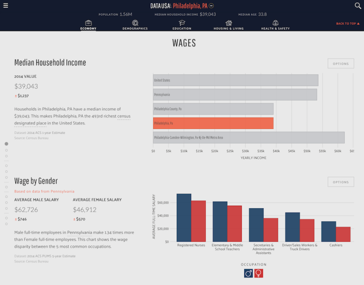
Data USA, a collaboration between Deloitte, Macro Connections at the MIT Media Lab, and Datawheel, is another hefty project that aims to make government data feel less hairy. It uses data from a number of sources — the American Community Survey, the Bureau of Economic Analysis, and the Bureau of Labor Statistics, to name a few — to create profiles for locations, industries, occupations, and education.
Read More

 The
The 


 Visualize This: The FlowingData Guide to Design, Visualization, and Statistics (2nd Edition)


