Counting the Hours

Time is limited, as we’ve seen. How do you spend your days? Since 2003, the Bureau of Labor Statistics has sponsored the American Time Use Survey asking thousands of people this question. The Census Bureau conducts the survey.
More specifically, participants recount their time spent from 4 a.m. the previous day to 4 a.m. the survey day. The data is processed and weighted so that days and demographics closer represent the population, which is necessary, because a majority of responses happen on weekends, and some demographic groups are less likely to respond. Only civilians who are 15 and older are included.
So there are two main sources of uncertainty here. One, we rely on peoples’ memory to measure time use, and two, this is a sample rather than a census.
Oh, and the survey doesn’t delve too deeply into “personal activities.” (I like that I just read the words “cuddling” and “making out” in government data documentation.)
Nevertheless, with thousands of responses, the distributions are still interesting, and you can see how your use of time compares to others’. Plus, the Bureau of Labor Statistics provides anonymized micro-data, so we can look at time use beyond just the averages. I downloaded the data from ATUS-X, a system maintained by the Minnesota Population Center that makes the data easier to manage.
The charts below show the number of hours Americans spent in 2014 with various activities. Each chart is a histogram that shows the distribution of hours spent on an activity on an average day, out of the people who actually did that activity.
So the taller a bar, the more people who did that activity for the corresponding amount of time.
Use the sliders to see how your spending compares.
As expected, the peak of work hours is around 8, but the spread is quite wide, with a good number of people who work less than or more than than the typical 8 hours. Although this includes commute, as well as time spent interviewing for jobs, which are partially responsible for the spread.
Naturally, age plays a big part in how this distribution plays out. For example, work hours for teenagers typically skew left with fewer hours worked per day. The same goes for those who are retired.
We’ll save demographic breakdowns for next time though. For now, we’ll keep the wideout, national view.
This includes things like housework, food preparation, and yard care. I expected this distribution to look a bit more jagged with people either spending a significant or insignificant amount of time, but this is pretty smooth. I suspect a contrast between men and women, but again, we’ll keep the wideout view for now.
The distribution for care of household members is similar in shape to household activities, but only 26% of people did this activity, whereas the previous was at 74%. Household care also skews farther left towards zero, which I suspect is from people who come home from work and only have a short while with their kids before bedtime.
Sleep looks how you would expect. It centers at 8 hours and everyone does it. Although I wonder if there’s some overestimation by respondents with quite a few people who get 8 and a half and 9 hours (or more) of sleep.
If only I could spend my days on the right side of the long tail.
Socializing, watching television, etc. Almost everyone took at least some time each day.
This is the jagged distribution of the bunch. Remember that the survey covers people who are 15 and older. Eight percent of this population spent time with education in 2014, and my bet for the spikes is that different types of schooling — high school, college, adult education — tends towards different but more fixed hours.
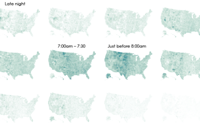
Nearly everyone had some form of travel time to get places. As the saying goes, no man is an island.
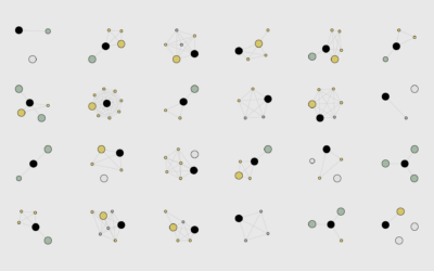
 A Day in the Life of Americans
I used this data to simulate an average day for Americans.
Become a member. Support an independent site. Get extra visualization goodness.
See What You Get