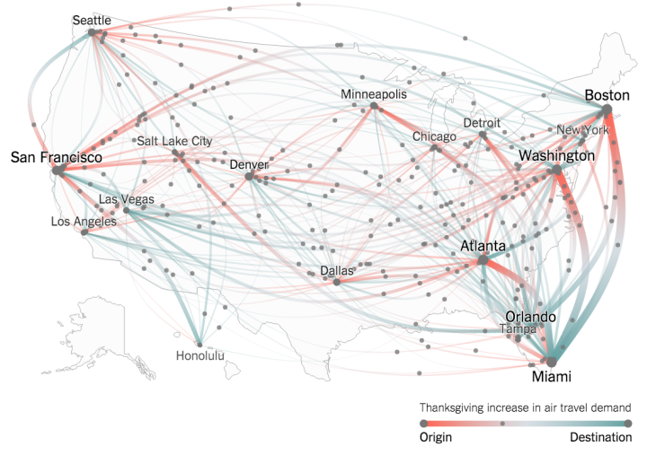
Millions of Americans will fly home this Thanksgiving weekend. (Based on my morning commute, the holiday already started a couple of days early.) Josh Katz and Quoctrung Bui for the New York Times mapped the difference in flight volume for this weekend against the norm, based on Google Flights search data.
Color from red to turquoise provides direction from origin to destination, respectively, and the thickness of the lines represent the change in volume. Then to double up on the representation, dots move along the paths to also show direction and volume. Mouse over airports to focus.
Good stuff.
By the way, the dots on the national view were kind of choppy for me in Safari but moved smoother when there were fewer dots on the screen and in Chrome.
 Visualize This: The FlowingData Guide to Design, Visualization, and Statistics (2nd Edition)