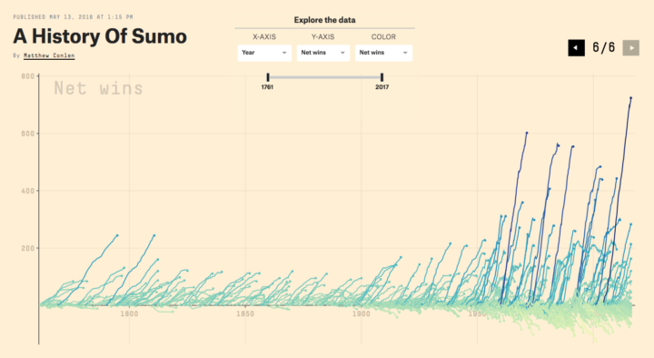
Joel Somerfield created this motion graphic to Carl Sagan’s Pale Blue Dot monologue. Good stuff:
[via Brain Pickings]
Joel Somerfield created this motion graphic to Carl Sagan’s Pale Blue Dot monologue. Good stuff:
[via Brain Pickings]
Every day is a bit different, but here is a wideout view of how Americans spend their days. Compare with your own time use.
As an experiment, Linda Dong used Keynote, typically for your everyday slide presentations, to put together a motion graphic. The result does not look like it came from Keynote.
The available animations may seem basic, but they can get you through most situations. I primarily used default Keynote transitions for this video and very rarely had to set up custom animation paths. Using the Magic Move feature and some clever masking can get you through most complex transitions.
I love it when people use everyday software to make unexpected things. There’s often a lot of balking about various programs, but at the end of the day, if you know the principles of what you’re making, you can often make the software do what you want. My favorite is still Tatsuo Horiuchi’s paintings in Excel. [via Waxy]
Daang, NASA. Using images of the sun taken in space, NASA constructed this super-detailed view of what the star looks like.
In space, NASA’s Solar Dynamics Observatory, or SDO, keeps an eye on our nearest star 24/7. SDO captures images of the sun in 10 different wavelengths, each of which helps highlight a different temperature of solar material. In this video, we experience SDO images of the sun in unprecedented detail. Presented in ultra-high definition, the video presents the dance of the ultra-hot material on our life-giving star in extraordinary detail, offering an intimate view of the grand forces of the solar system.
The results are mesmerizing.
We saw a similar video of boundary development over the centuries before, but I like this one as a contrast to it. The first is really default-looking, whereas this one has a little bit of production value.
Get the data files here to put together your own version. [via kottke]
Wikipedia has a list of predicted dates for when apocalypse strikes, because of course it does. For kicks and giggles, Jeff Fletcher put the dates on a timeline. The horizontal position of each dot represents the predicted date. The vertical position doesn’t mean so much, other than there are a lot of dates around that time.
Luckily, we got past the most recent September 1, 2015 prediction and the grip of ones before that. Phew. Next up: 2020.
Make a bunch of charts, string them together like a flip book, and there’s your animation. Sometimes good for showing changes over time. Always fun to play with.
Meat as a cause of cancer has been the news as of late. Aaron Carroll for the Upshot describes why we should make a note but not freak out about it.
This means that, if I buy what the W.H.O. is saying, if I decided today to start eating an extra three pieces of bacon every day for the next 30 years, my risk of getting colon cancer might go from 2.7 percent to 3.2 percent. In other words, if 200 people like me made that decision, one extra person might get cancer. The other 199 would be unaffected.
We recently fell back an hour with the end of this year’s Daylight Saving Time, and as per usual, we had to discuss why or why not we should shift out clocks at all. But the main question is — what it all really comes down to — what have you done for me lately, Daylight Saving Time? Keith Collins for Quartz put together an interactive that shows you an answer, based on the waking and sleeping times.
The blue area shows the daylight you experience, and the black represents the dark you get. Some quick math on the bottom of the chart shows how many more hours of daylight you get, thanks (or no thanks) to Daylight Saving. [Thanks, Steve]
This map-centric piece from the New York Times is good. They keep refining the art of storytelling with a mix of mediums and are clearly a step above the rest. In this case, the map navigates you as you scroll and shows you where to look.
From Gemma Correll. I am amused.
To introduce Convolutional Neural Networks, Andrej Karpathy looked at millions of selfies, left the computer to its own devices, and tried to find what makes a good selfie.
Read More
This is years old, but it still tickles the neurons every time. It’s a straightforward demonstration of the Pythagorean theorem, also known as
With a right triangle, the hypotenuse squared is equal to the sum of squares of the other two sides. It will now be referred to as glub, glub, glub.
There are a lot of great craft breweries in the United States, but there is only so much time. This is the computed best way to get to the top rated breweries and how to maximize the beer tasting experience. Every journey begins with a single sip.
Vizable is a free iPad app from Tableau Software that helps you explore data, specifically through tap interactions. The focus seems to be exploration that’s quick, easy, and fun. Gonna have to find a working iPad to try this with.
Gavin Schmidt shows different types of particles that swirl around in our atmosphere:
“Different kinds of particles are a different color,” explains climate scientist, Gavin Schmidt. “The easiest to see are the reddy-orange particles; those are dust and you can see them streaming them off the Sahara,” Also worth noting: white particles (pollution from burning coal and volcanoes); red dots (fires over a particular period); and blue color (seasalt being whipped up into air by the wind).
Nice.
Data wrangling — formatting and cleaning — is a sore spot and stumbling block for many, but you often can’t do much visualization- or analysis-wise until the data is in order. My projects folder is filled with one-off Python scripts written for specific datasets (and steps within steps).
Trifacta Wrangler aims to streamline the process with a click interface and automation. The desktop software is free to use and available for PC and Mac.
Read More
Bloomberg Business has an interesting stock trading game with a simple premise. A time series line starts at the beginning of a stock’s life and runs its course all the while you buy and sell trying to profit.
Click and hold the mouse button to buy, and release to sell. The key is to click when the stock price is low and to release when it’s high. Of course, this is when uncertainty comes into play and is what makes the game fun.
DaveE from the Brickset Forum was curious about the changing LEGO color palette, so he looked at newly released bricks over the years and charted the color results. I would’ve preferred a stacked area chart (more like this) over the multiple pies, but I appreciate the topic more than I dislike the layout.