We’ve seen many one-off projects that show the distortions you get when you project a map. There’s just no avoiding them, when you convert a 3-D object onto a two-dimensional plane. Vox demonstrates and explains with an inflatable globe.
-

Separately, we looked at marrying age, divorce rates, and those who never married. Now let’s look at marital status all together, with the addition of the widowed status.
-
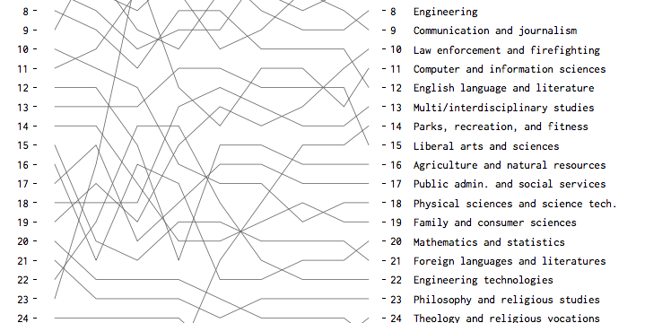
Based on bachelor’s degrees conferred, here are the fields that were and are currently popular.
-
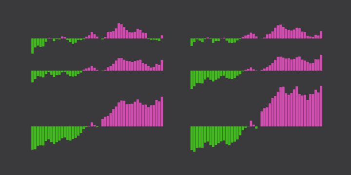
Looking at American time use for various combinations of sex, age, and employment status, on weekdays and weekends.
-
A few years back, Google released a time-lapse feature in Google Earth that let you see change through satellite imagery. They updated the feature last week. It’s more detailed and higher resolution than the first version, based on the pixels from about five million images.
We took the best of all those pixels to create 33 images of the entire planet, one for each year. We then encoded these new 3.95 terapixel global images into just over 25,000,000 overlapping multi-resolution video tiles, made interactively explorable by Carnegie Mellon CREATE Lab’s Time Machine library, a technology for creating and viewing zoomable and pannable timelapses over space and time.
Pretty cool to see my own neighborhood develop into what it is today.
Update: See also The New York Times’ take on some of the water bodies around the world, using the same data.
-
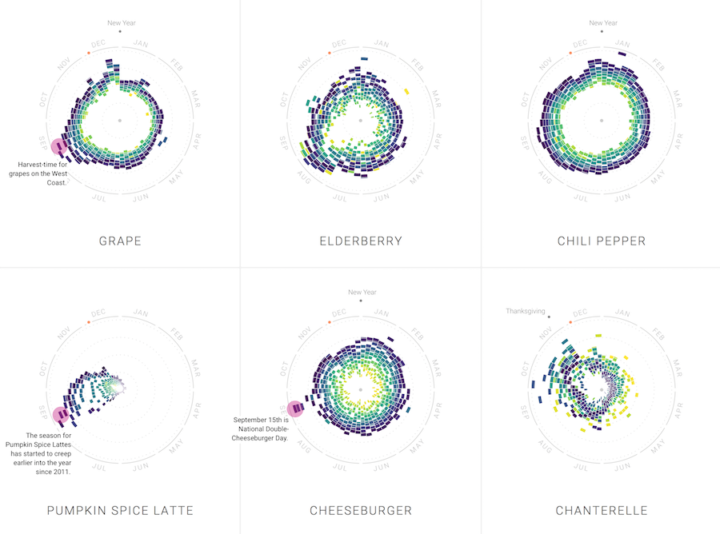
Food trends come and go. Some stay longer than expected, and others come back a certain time every year. With their new project, The Rhythm of Food, Google News Lab and Truth & Beauty explore these patterns through twelve years of search trends.
Read More -
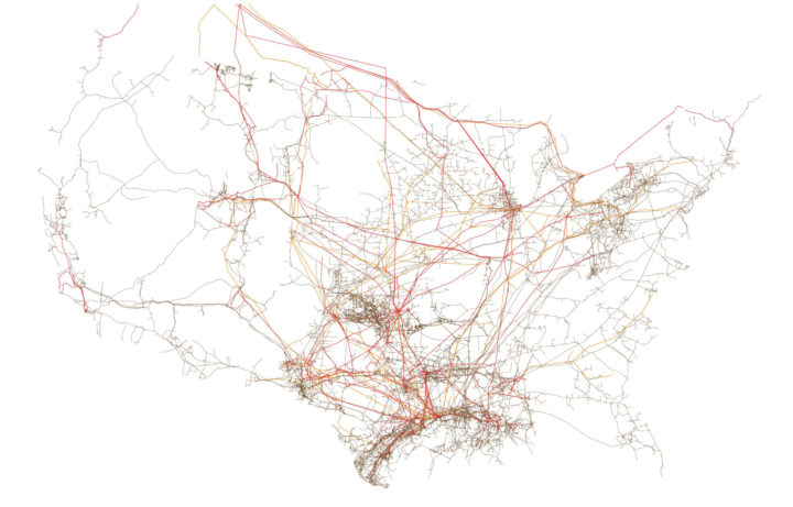
I can always find time to enjoy me some minimal maps. Tim Meko for The Washington Post visualized American infrastructure in a series of six maps, from the electric grid to bridges and railroads. The above is pipelines.
-
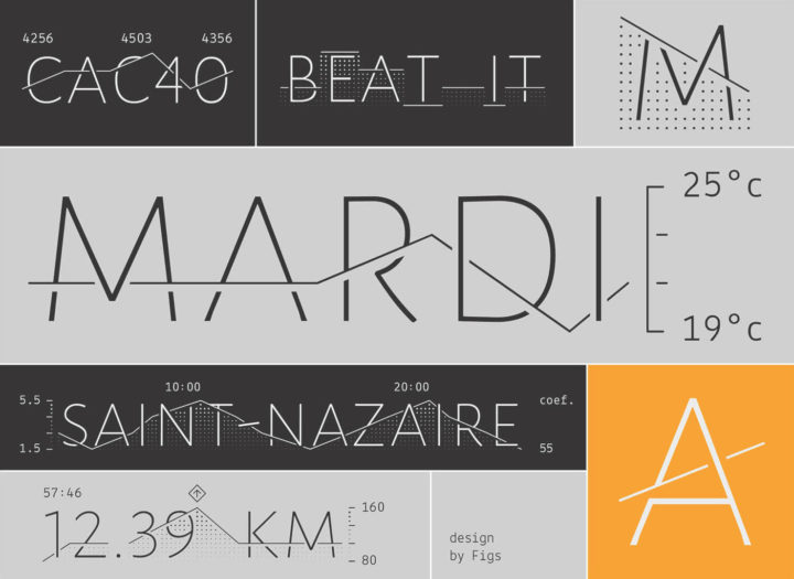
Datalegreya is a new typeface by Fig that lets you intertwine a graph into the words.
Datalegreya can be used in all contexts where small space is available to synthetically display graphical data: connected objects, embedded displays, annual reports, weather report, stock prices, etc. It doesn’t need any specialized software: users just have to install it in the operating system and launch any software able to display OpenType fonts, such as Microsoft Word, Apple TextEdit, Adobe Suite etc. Standards compliance makes it equally available on the web or software embedded.
I rarely find myself searching for more space on the computer screen, and on the phone, I’d rather just scroll further down. Maybe useful on a smartwatch? Dashboard?
-
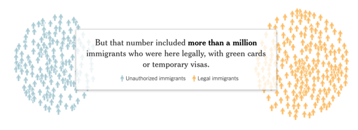
There was a lot of talk about deporting millions of illegal immigrants immediately, but as The New York Times shows, the actual number that could be deported is much less. Haeyoun Park and Troy Griggs use a clustered, force-directed graph to show the pool of 11 million immigrants and then filter down as you scroll. The transitions are key.
-
Here’s a short illustrated animation on introverts and extroverts by Julia Rodrigues.
This is basically me. I enjoy the company of friends and family, but I do feel like I need to recharge my battery at times with some alone-time.
-
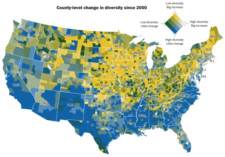
Dan Keating and Laris Karklis for The Washington Post map the change in diversity since 2000. The color scale, shown in the top right, represents two things: level of diversity and change in diversity. I’m not so sure the dual scale is interesting as a whole, as my brain just wants to split out each category individually or see each one separately. But keep scrolling and you can get that separation, which is a lot more visually helpful.
See also: percentage of white people, majority minorities, and predominant race.
-
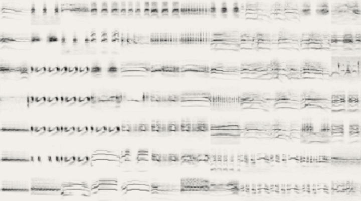
Different species of birds make different sounds. However, the sounds are so quick and compressed that it can be tough to pick out what is what. So Kyle McDonald, Manny Tan, and Yotam Mann created a “fingerprint” for each bird song and used machine learning to classify. Through the visual browser, you can play sounds and search for bird types. Similar sounds are closer to each other.
-
In the latest addition to the put-big-numbers-in-context genre, here’s the history timeline of our planet in the context of 100 yards.
-
How good or bad something is depends on what you compare against.
-
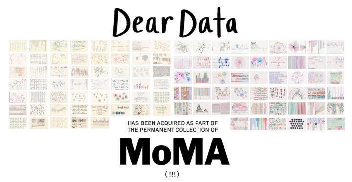
What started as a personal project and then turned into a book, Dear Data was a collaboration between pen pals through data. Now Giorgia Lupi and Stefanie Posavec’s work is headed to the Museum of Modern Art’s permanent collection.
[O]ur 104 original postcards and the many sketchbooks we filled with intermediate data drawings every week have found the best possible home for years to come. They will live in the archives and catalogue of one of the world’s most prestigious institution (well, we think so, at least!), humbled by being in the presence of the dazzling company of the great masters of art of the past two centuries.
This is amazing. Congratulations to Giorgia and Stefanie.
-

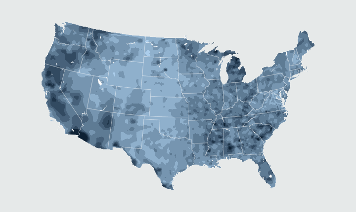
A hundred bucks in one state doesn’t always get you the same thing in another. Using calculations by the Bureau of Economic Analysis, here’s a state map from The New York Times that shows the relative purchasing power in each state.
To better understand, imagine a store offering a range of goods and services, each for sale at the national-average price for that particular item. Now, imagine a shopping cart filled with $100 worth of items from that store.
In Hawaii, $100 buys about 85 percent of the goods in the cart thanks to the high prices there. In other words, $100 in Hawaii feels more like $85.60, compared to the national average.
In Mississippi, the opposite is true. With $100, you would be able to buy the cart’s contents and more: the equivalent of $115.30 of goods and services from the national-average store.
You can grab the data over at the BEA site.
-
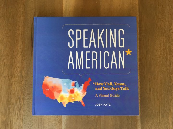
In 2013, Josh Katz put together a dialect quiz that showed where people talk like you, based on your own vocabulary. Things like coke versus soda. It’s a fine example of how we’re often talking about the same thing but say or express it differently. Speaking American is the book version of the dialect quiz results.
It’s a fun coffee/kitchen table book to flip through casually. It’s not just a book maps. It’s a highlight of the interesting bits and provides some short explanations for why the differences exist. I’ve been enjoying bits and pieces on the occasion my son takes an unreasonable amount of time to finish his dinner.
-
D3.js, or Data-Driven Documents, version 4.0 was released a few months ago, so Jim Vallandingham updated his tutorial for categorized bubble charts to use the new version of the library. I’ve been slow getting to the new d3.js, but maybe this’ll move things along.
-
Transitioning Map, Part 3: Animate Change Over Time
How to make a bunch of maps and string them together to show change.
-
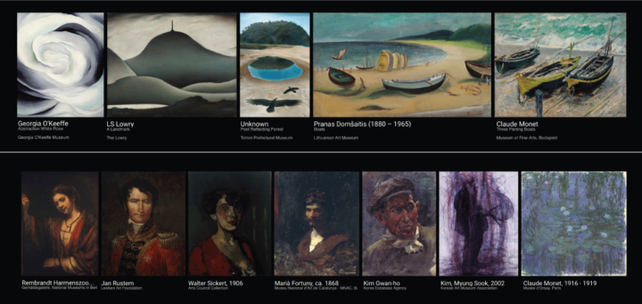
This is neat. A Google Arts & Culture Experiment, X Degrees of Separation shows a path of visual connections between two art pieces of your choosing. It’s like Six Degrees of Kevin Bacon but with art, computer vision, and machine learning.
Recently for Members
Second Edition
 Visualize This: The FlowingData Guide to Design, Visualization, and Statistics (2nd Edition)
 Visualize This: The FlowingData Guide to Design, Visualization, and Statistics (2nd Edition)
New tools, refined process.
Browse by Chart Type See All →


