• The Powerball FAQ was most likely written by a slightly annoyed statistician. You’d think the FAQ would be full of legalese and vague statements, but it reads more like notes from the know-it-all in your Stat 101 class. The answer to, “Your odds and probabilities are wrong.”:

    Are not. Sure, the odds of matching 1 red ball out of 26 are 1 in 26, but we are not giving the odds for matching a red ball. We give the odds for winning a prize for matching one red ball ALONE. If you match the red ball and one or more white balls, you win some other prize, but not this prize. The odds of matching one red ball ALONE are harder than 1 in 26 because there is some risk that you will also match one or more white ball numbers – and then win a different prize.

    Some persons who enjoy statistics (they do really exist) will come up with odds of 1 in 17 billion for the jackpot prize. Remember that you don’t need to match the numbers in exact order – we use combinations to determine the probabilities for the first five white balls and not permutations.

  • What do you get if you take famous literary works, strip out all the words, and only look at the punctuation? Between the Words by Nicholas Rougeux:

    Between the Words is an exploration of visual rhythm of punctuation in well-known literary works. All letters, numbers, spaces, and line breaks were removed from entire texts of classic stories like Alice’s Adventures in Wonderland, Moby Dick, and Pride and Prejudice—leaving only the punctuation in one continuous line of symbols in the order they appear in texts.

    [via @giorgialupi]

  • Keith Collins for Quartz ran some quick numbers for people who visited the hospital emergency room in 2014 for punching a wall, based on data from the US Consumer Product Safety Commission. Because, sure, why not.

    More importantly, you can grab data directly from the CPSC, including and most recently for estimated injuries due to inflatable amusement rides.

  • The New York Public Library just made over 180,000 digital items in the public domain available for high resolution download, and the data for those items is free to download too.

    Did you know that nearly one-third of the items in our Digital Collections are in the public domain — that is, they have been designated as having no known U.S. copyright restrictions? This means that everyone has the freedom to enjoy and reuse these materials in almost limitless ways. To help you explore, visualize, and repurpose these items, we’ve gathered all of their metadata into a single data release.

    You can also browse the items by century of creation, genre, and color with this explorer by Brian Foo of NYPL Labs.

  • American immigration history is chock full of policies and restrictions, and you can see the effects in the distribution of immigrants into this country over the years. Alvin Chang for Vox steps you through the major policy shifts since 1820.

    The graphic above shows how these policies affect who enters the country. It shows 200 years of legal immigration into the United States — and how different policies and international dynamics affect the patterns of who gets let in. Migration into the United States has ebbed and flowed in tandem with who policymakers believe ought to be allowed refuge and who doesn’t qualify.

  • Members Only
    Tutorials  /  ,

    For presentation purposes, it can be useful to adjust the style of your axes and reference lines for readability. It’s all about the details.

  • We take antibiotics. Bacteria dies, but some lives, evolves and develops a resistance to the antibiotic. To better understand why this is such a problem, Keith Collins for Quartz provides a scrolling history of antibiotic development through a series of charts.

    The animated transitions between charts keep you connected through the text. Although this feels more like it should be a stepper. The boxed text kind of gets in the way as you scroll, and at each step the text really only fits in one place anyways. Maybe scrollers work better for mobile?

  • The Powerball Lottery is big news in the United States right now. The jackpot sits at $800 million, they draw the numbers on Saturday, and it’s likely someone is going to suddenly be rich soon.

    This naturally comes not long after the Gaming Commission changed the rules last October, which increases the odds of winning something but decreases the odds of winning the jackpot.

    In case you’re not familiar with the rules of the game: Players choose five numbers and one “Powerball” number. The first five numbers used to range from 1 to 59 but since October, they range from 1 to 69. Conversely, the Powerball number used to range from 1 to 35, but now they’re 1 to 26. That shifts the odds of winning the jackpot from about 1 in 175 million to 1 in 292 million.

    So something very unlikely, became much more unlikely. Hence the current big jackpot.

    Screw the odds though. That’s a lot of money and will buy you enough tacos to make your head spin. Jon Schleuss for the Los Angeles Times provides a simulator to try your hand.

    Lose your paycheck for pretend here.

  • In their book Ingredients, Dwight Eschliman and Steve Ettlinger explore additives in common foods with pictures of the actual ingredients:

    Focusing on 75 of the most common food additives and 25 ordinary food products that contain them, acclaimed photographer Dwight Eschliman and science writer Steve Ettlinger demystify the contents of processed food. Together they reveal what each additive looks like, where it comes from, and how and why it is used.

    Amazon link.

  • We tend to think of life in terms of cause and effect. Do this. That happens. The point of view is often too narrow in scope though, and really what we’re looking at is a small part of a more complex system. Do this, that happens, then this again, then that, and so on.

    Nicky Case made a tool that lets you simulate such a system, using emojis and a simple set of rules. See how patterns can emerge from what seems like nothing and how factors can play into another and each other.

    Case explains the thought process in the context of trees, plants, and forest fires, but the main point is that you can model a lot of things in life with a simple set of rules that collectively form a more complex system.

  • Forget about Shakespeare. Let’s look at a real classic: Love Actually. Somehow I made it through the entire holiday season without watching the movie, as someone in my household who is not me really likes it. I’m more of a It’s a Wonderful Life guy.

    Anyways, David Robinson, a data scientist at Stack Overflow, did a quick analysis of character appearances in Love Actually. The chart above shows how characters appear together in each scene. The vertical axis represents characters and the horizontal axis is scene number. Each vertical line essentially represents a scene and dots signal character appearances.

    Check out that last scene where everyone comes together and we learn that love actually is all around. Tear.

  • There are many ways to die. Cancer. Infection. Mental. External. This is how different groups of people died over the past 10 years, visualized by age.

  • A lot of data you get are estimates with uncertainty attached. Plus or minus something. Standard error. So when you try to do math with those numbers straight up, ignoring the uncertainty, you end up with a result that seems concrete but it’s actually more squishy.

    Guesstimate, made by Ozzie Gooen, is an effort to include the uncertainty in your spreadsheets.

    The first reaction of many people to uncertain math is to use the same techniques as for certain math. They would either imagine each unknown as an exact mean, or take ‘worst case’ and ‘best case’ scenarios and multiply each one. These two approaches are quite incorrect and produce oversimplified outputs.

    Guesstimate works like a regular spreadsheet where you input numbers into cells. But you can also include the uncertainty estimates, which is where it gets interesting. Piece together cells, and then using a Monte Carlo method, Guesstimate generates a new estimate with its own uncertainty.

    Give it a go.

  • My first post on FlowingData was in June 2007, and since September of that year, a post has gone up every weekday, save holidays and special occasions. I think that makes me a grandpa in internet time.

    Visualization-Tutorials-on-FlowingData

    2015 was the second full year of FlowingData as my actual job. I spent a lot of time learning new things by working with as much data that time allowed, and then tried to help others understand their data through guides and tutorials. Then there’s the four-week visualization course in R, which seems to be something many were looking for.

    The best way to learn and really understand something is to do it yourself. Not only does it help you with your own data, but it also provides another level of appreciation for the work of others’, because you know the challenges and limitations.

    This is your life.

    Like last year, the most popular things on FlowingData in 2015 were my own projects, by a lot. The Data Stories folks spoke briefly about visualization blogs falling out of style this year, and it’s true to an extent. The sharing and linking aspect is on Facebook and Twitter more these days. But I can’t imagine putting your own work anywhere else besides a place that you own.

    Here are the ten most popular FlowingData projects from 2015:

    1. Years You Have Left to Live, Probably — This is when you will die.
    2. A Day in the Life of Americans — This is how America runs.
    3. Top Brewery Road Trip, Routed Algorithmically — This is going to happen.
    4. Work Counts — There are others just like you.
    5. How Americans Get to Work — Working from home is best.
    6. When Do Americans Leave For Work? — Yay, rush hour.
    7. How We Spend Our Money, a Breakdown — It depends.
    8. Reviving the Statistical Atlas of the United States with New Data — Old becomes new again.
    9. Who Earned a Higher Salary Than You? — This is all anyone really cares about.
    10. Real Chart Rules to Follow — Some rules aren’t meant to be broken.

    I made an extra effort this year, especially in the last few months, to work on interactive graphics. I used to think of interaction as a way for readers to look at data more deeply. As they say, provide an overview first and then let the reader dig into the details.

    But lately, I’ve been thinking of interaction for the other way around. Let people go with specifics first to “find themselves” in the data and then if they want, they can take a step back for the wideout view. It seems like data at the individual level provides a good mode of comparison and personal context that can sometimes be missed. I’ll have to explore more in 2016.

    Next year brings with it more interaction, animation, and simulation I am sure. Plus data. Of course. Probably more beer, too. Definitely more beer.

    I think next year might also be one where I step out of my comfort zone. Or at least I’ll try. I’m starting to feel a bit too comfortable and that leads to boredom, which leads to the dark side. I think this is where the beer comes into play.

    In any case, 2015. Another year in the bag. Thanks for reading and your support. I couldn’t do this without you.

    See you in 2016.

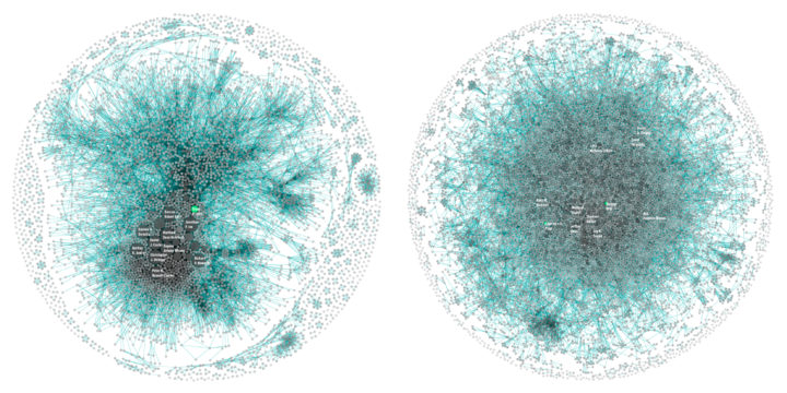
  • Martin Grandjean looked at the structure of Shakespeare tragedies through character interactions. Each circle (node) represents a character, and each connecting line (edge) represents two characters who appeared in the same scene.

    [T]he longest tragedy (Hamlet) is not the most structurally complex and is less dense than King Lear, Titus Andronicus or Othello. Some plays reveal clearly the groups that shape the drama: Montague and Capulets in Romeo and Juliet, Trojans and Greeks in Troilus and Cressida, the triumvirs parties and Egyptians in Antony and Cleopatra, the Volscians and the Romans in Coriolanus or the conspirators in Julius Caesar.

    At first glance, the eleven charts in total look hairball-ish. The above have similar network densities, which suggests similar story structures, but look at the ones that are more separated (lower network density) for contrast and then go from there.

    Look a bit deeper? See also Understanding Shakespeare from a few years back, which visualized word usage and structure.

  • In a collaboration between the Digital Scholarship Lab at the University of Richmond and Stamen Design, American Panorama combines United States history, geographic mapping, and individual narratives to create a visual atlas of history.

    They currently cover four topics — forced migration of enslaved people, overland trails, foreign-born population, and canals — with one map and chart interface for each. Each also uses a time component that lets you see changes by year. The first two are the most interesting though. They couple geographic data with personal stories that lend an important context, which tends to get lost as with time.

  • There isn’t a complete government record for people killed by police, which is why efforts such as the Guardian’s The Counted project exists. Mapping Police Violence is another source to look at, and they have a dataset for download for shootings from 2013 to present.

    We believe the data represented on this site is the most comprehensive accounting of people killed by police since 2013. The most liberal estimates project the total number of people killed by police in the U.S. to be about 1,200-1,300 per year. And while there are undoubtedly police killings that are not included in our database, these estimates suggest that our database captures at least 90-98 percent of all police killings that have occurred since 2013. We hope these data will be used to provide greater transparency and accountability for police departments as part of the ongoing campaign to end police violence in our communities.

    The data includes each victim’s name, location, race, agency responsible, news source, and more.