How to Spot Visualization Lies
It used to be that we’d see a poorly made graph or a data design goof, laugh it up a bit, and then carry on. At some point though — during this past year especially — it grew more difficult to distinguish a visualization snafu from bias and deliberate misinformation.
Of course, lying with statistics has been a thing for a long time, but charts tend to spread far and wide these days. There’s a lot of them. Some don’t tell the truth. Maybe you glance at it and that’s it, but a simple message sticks and builds. Before you know it, Leonardo DiCaprio spins a top on a table and no one cares if it falls or continues to rotate.
So it’s all the more important now to quickly decide if a graph is telling the truth. This a guide to help you spot the visualization lies.
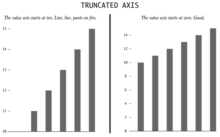
Bar charts use length as their visual cue, so when someone makes the length shorter using the same data by truncating the value axis, the chart dramatizes differences. Someone wants to show a bigger change than is actually there.
I went into far too much detail about this misstep here.
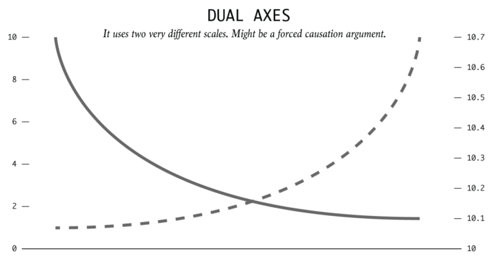
By using dual axes, the magnitude can shrink or expand for each metric. This is typically done to imply correlation and causation. “Because of this, this other thing happened. See, it’s clear.”
The spurious correlations project by Tyler Vigen is a great example.
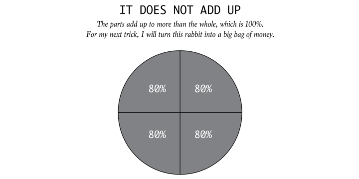
Some charts specifically show parts of a whole. When the parts add up to more than the whole, this is a problem. For example, pie charts represent 100 percent of something. Wedges that add up to more than that? Peculiar.
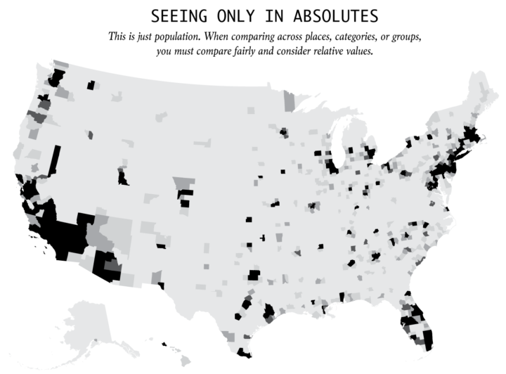
Everything is relative. You can’t say a town is more dangerous than another because the first one had two robberies and the other only had one. What if the first town has 1,000 times the population that of the first? It is often more useful to think in terms of percentages and rates rather than absolutes and totals.
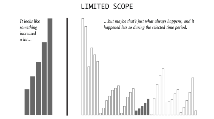
It’s easy to cherrypick dates and timeframes to fit a specific narrative. So consider history, what usually happens, and proper baselines to compare against.
Interesting things can show up when you look at the big picture.
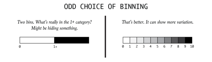
Instead of showing the full range of variation in a dataset, someone might try to oversimplify a complex pattern. It’s easy to transform a continuous variable into a categorical one.
Broad binning can be useful, but complexity is often what makes things worth looking at. Be wary of oversimplification.
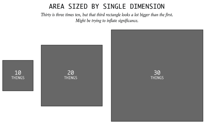
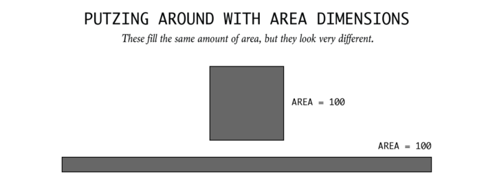
If area is the visual encoding, then one has to size by area. When someone linearly sizes an area-based encoding, like a square or a circle, they might be sniffing for dramatics.
Sometimes, it’s an honest mistake. So be wary.
Maybe someone knows how area as a visual encoding works, and then they go and do something like the above. I haven’t seen anything that dramatic, but it’s only a matter of time. I bet it will be in the form of pictograms. Watch out.
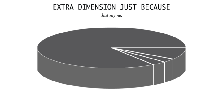
When you see a three-dimensional chart that is three dimensions for no good reason, question the data, the chart, the maker, and everything based on the chart.
Important: It doesn’t absolutely mean a visualization is lying just because it exhibits one of the previously mentioned qualities. As Darrell Huff puts it in How to Lie with Statistics:
The title of this book and some of the things in it might seem to imply that all such operations are the product of intent to deceive. The president of a chapter of the American Statistical Association once called me down for that. Not chicanery much of the time, said he, but incompetence.
Of course, that doesn’t make it much better. It’s still not the truth. But with that in mind, make sure you have the right reaction before you call someone a liar.
As a rule of thumb, scrutinize charts that shock or seem more dramatic than you thought.
A chart doesn’t make something true. Data doesn’t make something true. It bends. It shows many things. So keep your eyes open.
Chart Types Used


Become a member. Support an independent site. Get extra visualization goodness.
See What You Get