• Membership
  • Newsletter
  • Projects
  • Learning
  • About
  • Member Login
  • Adjusting map data with Mapshaper

    October 26, 2016

    Topic

    Apps  /  mapping, shapefile

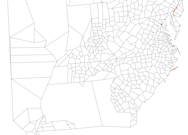
    Map making is a finicky challenge where oftentimes your map data — points, lines, and polygons — must align just right with your external data that exists as a CSV file or related. Mapshaper is an online tool that helps you massage your geographic data to where it needs to be.

    The online application has been around for a while, but I only recently used it, and it’s kind of magical. It’s one of those things where you half expect the whole thing to fail, and then when it seems to be working you still expect there to be some wrinkle that makes using the tool a pain. Not so with Mapshaper.

  • R graph gallery

    October 25, 2016

    Topic

    Coding  /  R

    One of best ways to learn visualization in any given software is to look at examples and apply to your own data. The R graph gallery helps you with the first part providing plenty of examples and the code snippets to make them. It’s still relatively new, but it should prove useful as it grows (hopefully). [via Revolutions]

  • Ad spending for Clinton and Trump

    October 24, 2016

    Topic

    Statistical Visualization  /  election, New York Times, spending, streamgraph

    Adam Pearce for the New York Times charted ad spending for Clinton and Trump, starting 20 weeks out from the election up to present. I like the John McCain, Mitt Romney, and Barack Obama spends as a point of reference.

  • Transitioning Map, Part 1: Mapping Irregular Data with Interpolation in R

    Rarely do you have evenly-spaced data across an entire geographic space. Here is a way to fill in the gaps.

  • Trump bar chart baselines are the worst baselines. Sad.

    October 21, 2016

    Topic

    Ugly Charts  /  baseline, election, Washington Post

    The Donald Trump campaign has a habit of highlighting poll results with a bar chart that just shows the top portion. The bottom baseline fades away somewhere or the values follow a random scale. They’re supposed to start at zero.

    John Muyskens for the Washington Post highlights the campaign’s bar chart usage, and why it’s problematic. Sometimes if the bars were placed correctly, the results would show more favorable for Trump. The bar charts are just decorative, basically.

  • Interactive charts in R

    October 21, 2016

    Topic

    Coding  /  interactive, R

    Interactive charts in R are still so-so, but if you don’t mind giving up some flexibility and just want something quick without having to learn a new language, there are a handful of options. RStudio highlights the highcharter package, which is a wrapper around the JavaScript-based Highcharts.

    So the story goes that Torstein Hønsi, the founder and Chief Product Officer of Highcharts. was looking for a simple charting tool for updating his homepage with snow depth measurements from Vikjafjellet, the local mountain where his family keeps a cabin. Frustrated with the common flash plug-ins, and other proprietary solutions available at the time, he decided to build a standards-based solution of his own and then, of course, share it.

    Write R. Get an interactive chart to export.

    While we’re at it, you might also be interested in the R wrapper for Plotly, which is another JavaScript charting library, and htmlwidgets, which lets you work with JavaScript libraries within R (and highcharter makes use of).

  • Composite photos of airplanes in flight

    October 20, 2016

    Topic

    Data Art  /  compositing, flights, photography

    Photographer Mike Kelley visited airports around the world, took pictures of airplanes leaving, and then pieced the photos together in a series of composite photos. The result was Airportraits.

    A bit about the arduous process:

    I often get asked exactly just how ‘real’ these images are. And on one hand, they are as real as they get. I’d sit in one place for an entire day, and take a burst of pictures of each plane as it crossed in front of me. I’d then take one of those captures, wherever I thought I’d like that plane to be, and put it on my base image. Every plane in every picture was actually right in front of me at that point in time, and they are all exactly where they were relative to other planes in the frame. If you went to some of these spots, you’d see the exact same thing that I saw.

    I want to buy a camera.

  • Data Underload  /  election, Twitter

    @HillaryClinton vs. @realDonaldTrump

    A comparison of the words unique to the candidates on Twitter.

    Read More
  • Using clustering to make a color scale

    October 19, 2016

    Topic

    Statistics  /  color, d3js

    Choice of color scale can make a big difference in how the data reads. A careless choice might make the data appear skewed too far low or too far high, so you need to look at the data and decide what’s right for the context. But, sometimes you just gotta make a lot of charts or maps. Or, you just don’t feel like manually picking the colors.

    David Schnurr describes a way to use clustering to pick the natural breaks in a more automatic fashion. The best part:

    In an effort to make it easier for anyone to use this technique in data visualizations, I’ve ported this new algorithm to JavaScript and created a custom d3 scale called d3-scale-cluster. You can find d3-scale-cluster on Github and npm–give it a try and shoot me a tweet @dschnr with your thoughts!

    More on GitHub.

    And I await for someone to make an R package.

  • Seeking solace in data

    October 18, 2016

    Topic

    Statistics  /  election, FiveThirtyEight, Wired

    I think many of us can relate to this during the odd election cycle. Marcus Wohlsen for Wired describes the constant visits and refreshes to FiveThirtyEight for new polls and projections.

    Evan is a poll obsessive, FiveThirtyEight strain—a subspecies I recognize because I’m one of them, too. When he wakes up in the morning, he doesn’t shower or eat breakfast before checking the Nate Silver-founded site’s presidential election forecast (sounds about right). He keeps a tab open to FiveThirtyEight’s latest poll list; a new poll means new odds in the forecast (yup). He get push alerts on his phone when the forecast changes (check). He follows the 538 Forecast Bot, a Twitter account that tweets every time the forecast changes (same). In all, Evan says he checks in hourly, at least while he’s awake (I plead the Fifth).

    This was me for a while, and no matter what the forecasts say, I never feel good about what I see. Because there’s always a chance.

  • Visions penned by the 18th century king of Prussia

    October 18, 2016

    Topic

    Infographics  /  documents, sketches

    Past Visions, a visual archive of Frederick William IV’s, shows thousands of drawings penned by the Prussian king.

    Frederick William IV of Prussia (1795 – 1861) left a collection of drawings behind. They bear witness to historical events such as wars and revolutions, literary influences or personal obsessions with the devil. Numerous sheets reveal the planning eye of the King in the form of architectural visions and dreamy drafts.

    Quickly browse the drawings by time and by category, all in high resolution. Nice.

  • Data Underload  /  unemployment

    Unemployment in America, Mapped Over Time

    Watch the regional changes across the country from 1990 to 2016.

    Read More
  • Tron-style slippy map

    October 14, 2016

    Topic

    Maps  /  Mapzen, Tron

    Mapzen just released a Tron-style slippy map.

    Today we introduce TRON version 2 as a fully realized Mapzen house style, rebuilt from the ground up to take advantage of the latest features of the Tangram graphics engine and Tangram blocks. With this new version, visual forms and elements transform per zoom, revealing new cartographic details and a deep exploration of scale transformations.

    It’s slick. Be sure to zoom in.

  • How one man shifts national polls

    October 14, 2016

    Topic

    Statistics  /  election, polling, Upshot

    I love the statistics lessons coming out of the Upshot, in the context of the upcoming election. In their most recent, Nate Cohn goes into varying statistical weights and how just one man can unknowingly shift the polls.

    Our Trump-supporting friend in Illinois is a surprisingly big part of the reason. In some polls, he’s weighted as much as 30 times more than the average respondent, and as much as 300 times more than the least-weighted respondent.

    Alone, he has been enough to put Mr. Trump in double digits of support among black voters. He can improve Mr. Trump’s margin by 1 point in the survey, even though he is one of around 3,000 panelists.

    He also put Hillary Clinton ahead recently, because he wasn’t in the sample.

  • Tilegrams in R

    October 13, 2016

    Topic

    Software  /  cartogram, R

    Last month Pitch Interactive launched an online tool for tiled cartograms, or tilegrams for short. Upload your state-by-state data, and it does the rest. Now you can make them in R, thanks to Bhaskar Karambelkar, since I know you’re just itching to make your own election maps.

  • All the Harry Potter spells, when they were used

    October 12, 2016

    Topic

    Statistical Visualization  /  fiction, Harry Potter

    I often stare far into the distance and ponder world’s greatest questions — like when specific spells were used in the Harry Potter books. No longer. This straightforward chart by Skyler Johnson pinpoints when each spell was explicitly said in the books and what each does.

  • Deep fried data

    October 11, 2016

    Topic

    Statistics  /  archive, machine learning, privacy

    Maciej Ceglowski, the creator of bookmarking site Pinboard, spoke at the Library of Congress a couple of weeks ago about deep-fried data.

    In our case, the deep-fryer is a toolbox of statistical techniques. The names keep changing—it used to be unsupervised learning, now it’s called big data or deep learning or AI. Next year it will be called something else. But the core ideas don’t change. You train a computer on lots of data, and it learns to recognize structure.

    These techniques are effective, but the fact that the same generic approach works across a wide range of domains should make you suspicious about how much insight it’s adding.

    And in any deep frying situation, a good question to ask is: what is this stuff being fried in?

    Deep fried food is often delicious, regardless of what’s inside the golden breading. But deep inside — or really right there in the front of our minds — we know it’s not good for us. Moderation. Or at least make sure you go to the good food stand at the carnival that uses the clean oil.

    See the talk and many others here.

  • Century of Florida hurricanes

    October 10, 2016

    Topic

    Maps  /  Florida, hurricane, weather

    Florida has seen a lot of hurricanes come and go. Lazaro Gamio for the Washington Post looks at all the hurricanes that made their way towards the state over the past 100 years.

    The thought of a hurricane freaks me out. This must be how non-Californians feel about earthquakes.

  • Doctors’ political leanings

    October 7, 2016

    Topic

    Statistical Visualization  /  medicine, politics, Upshot

    Based on data from researchers at Yale, the Upshot charts party registration by medical profession. Surgery and anesthesiology lean Republican, whereas psychiatry and infectious disease leans Democrat. As Margot Sanger-Katz notes, income between specialties likely plays a role. [Thanks, Bea]

  • Learning R Versus d3.js for Visualization

    October 7, 2016

    Topic

    Guides  /  d3js, R

    For those who work with R and d3.js, the differences between the two are obvious. But for those who are brand new to this world, the names might as well be gibberish. This quick primer is for the latter group.
    Read More

  • Page 172 of 392
  • <
  • 1
  • ...
  • 169
  • 170
  • 171
  • 172
  • 173
  • 174
  • ...
  • 392
  • >

Analyze, visualize, and communicate data usefully, beyond the defaults.

Become a member →

Recently for Members

May 15, 2025
Step Chart, Enhanced

May 8, 2025
When the data is not what it seems

May 1, 2025
Finding the Right Charts

April 24, 2025
Visualization Tools, Datasets, and Resources – April 2025 Roundup

April 17, 2025
Breaking Out of Chart Software Defaults

Browse by Chart Type See All →

Spike Map Surface Plot Chord Diagram Box Plot Voronoi Diagram Square Pie Chart Choropleth Map Stacked Area Chart Bar Chart Race Dot Density Map

Browse By Topic

  • Visualization

    Seeing data

  • Maps

    Seeing geographic data

  • Infographics

    Explaining data

  • Networks

    Connecting data

  • Statistics

    Analyzing data

  • Software

    Working with data

  • Sources

    Getting data

  • Design

    Making data readable

Get the Book

Visualize This: The FlowingData Guide to Design, Visualization, and Statistics

Available now.

Order: Amazon / Bookshop

Made by FlowingData

  • The Process

  • Data Underload

  • Chart Everything

  • Guides

  • Books

  • Shop

  • About
  • Contact
  • Newsletter
  • LinkedIn
  • Instagram
  • Bluesky
  • RSS
Copyright © 2007-Present FlowingData. All rights reserved.