
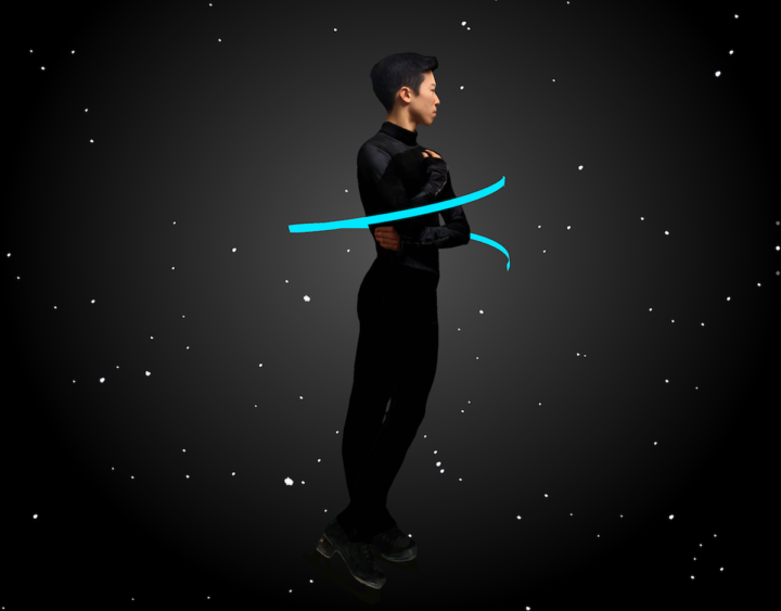
Well this is awesome. The Winter Olympics start this Friday, and The New York Times published this piece using augmented reality. Point your phone’s camera somewhere flat in your room, and you see four olympians in a still action shot. Walk around them, walk up to them, and see the details.
My four-year-old got a kick out of it.
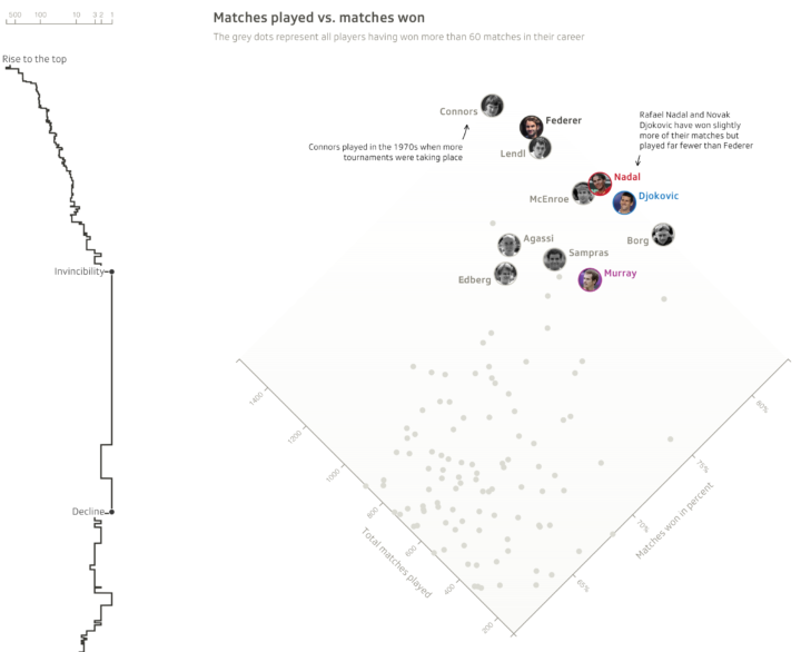
For the last Winter Olympics, The Times aimed to make the extreme scales that athletes compete on more relatable. So it’s interesting to see them go the other direction, zooming in close to individuals.
I’m looking forward to the 2022 Winter Olympics when I get to experience the events through the athletes themselves and then pick the tricks that they do Choose-Your-Own-Adventure style.


 Visualize This: The FlowingData Guide to Design, Visualization, and Statistics (2nd Edition)


